For a working RSS feed, copy and paste https://kradeelav.com/diary/tegalog.cgi?mode=rss& amp; into your feed reader (delete the space). Enjoy!
No.243
- ユーザ「名無し」の投稿だけを見る (※時系列順で見る)
- この投稿と同じカテゴリに属する投稿:
- この投稿日時に関連する投稿:
- この投稿を再編集または削除する
Powered by てがろぐ Ver 4.2.0.
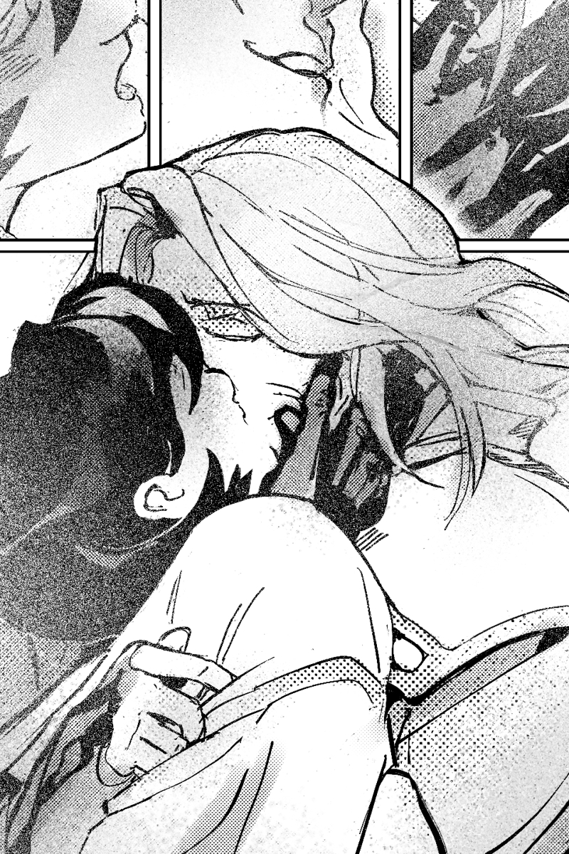
I joke these lines should be called “load bearing lines’ - borrowing a term from building construction (load bearing beam) where if you remove the beam, the house becomes structurally unstable.
these load bearing lines are different than outlines around the form, or even invisible skeletal lines. these can be as subtle as curving around the waist as a belt and transforming into a cloth fold, and back into hair. the key is the load bearing line keeps the eye moving in an arc.
below you can see the few lines in the torso that i’d say fit the description, and a before/after.
the red line is the key since it wraps around the form in 3 axis (left/right, towards you/behind the guy, and from bottom/up, and also is a guide-line for your eye to follow along. there’s other "echoes” of the load bearing line particularly in the hair; always a good idea to have to keep that one smooth motion going.
see what I mean?
these load bearing lines “can” be briefly broken up (see blue line around left shoulder) but should still attempt to use negative space as part of the continuation. try it! :>