For a working RSS feed, copy and paste https://kradeelav.com/diary/tegalog.cgi?mode=rss& amp; into your feed reader (delete the space). Enjoy!
カテゴリ「resource」に属する投稿[15件]
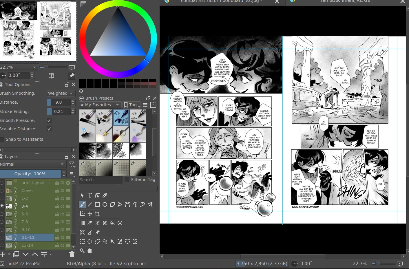
Here's my guide to making comics with Krita, down to the details such as layer setup, borders, speech bubbles, and SFX.
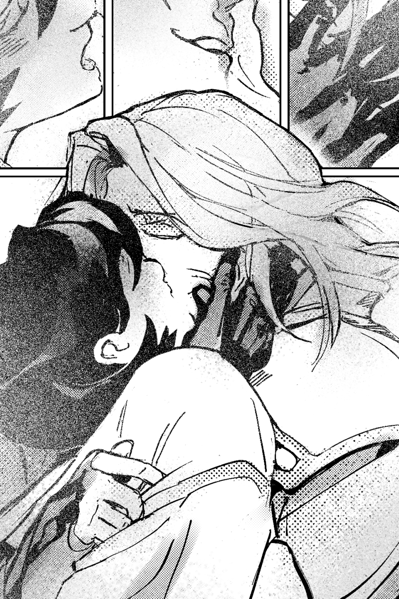
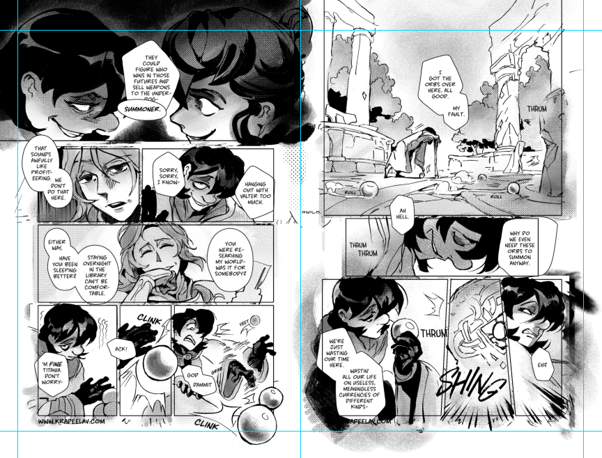
preface: it took me at least a year to figure this process out; but once when you've figured out the system & a template, it's smooth sailing. let's use this finished spread from the selfship comic last year to go through the process:
i'm going to assume a certian level of digital program proficiency (knowing what layers are, having a general idea of what vector vs raster graphics are, etc) since otherwise this post would be a book. rest of the post under the cut; this one's going to be a long one as is.
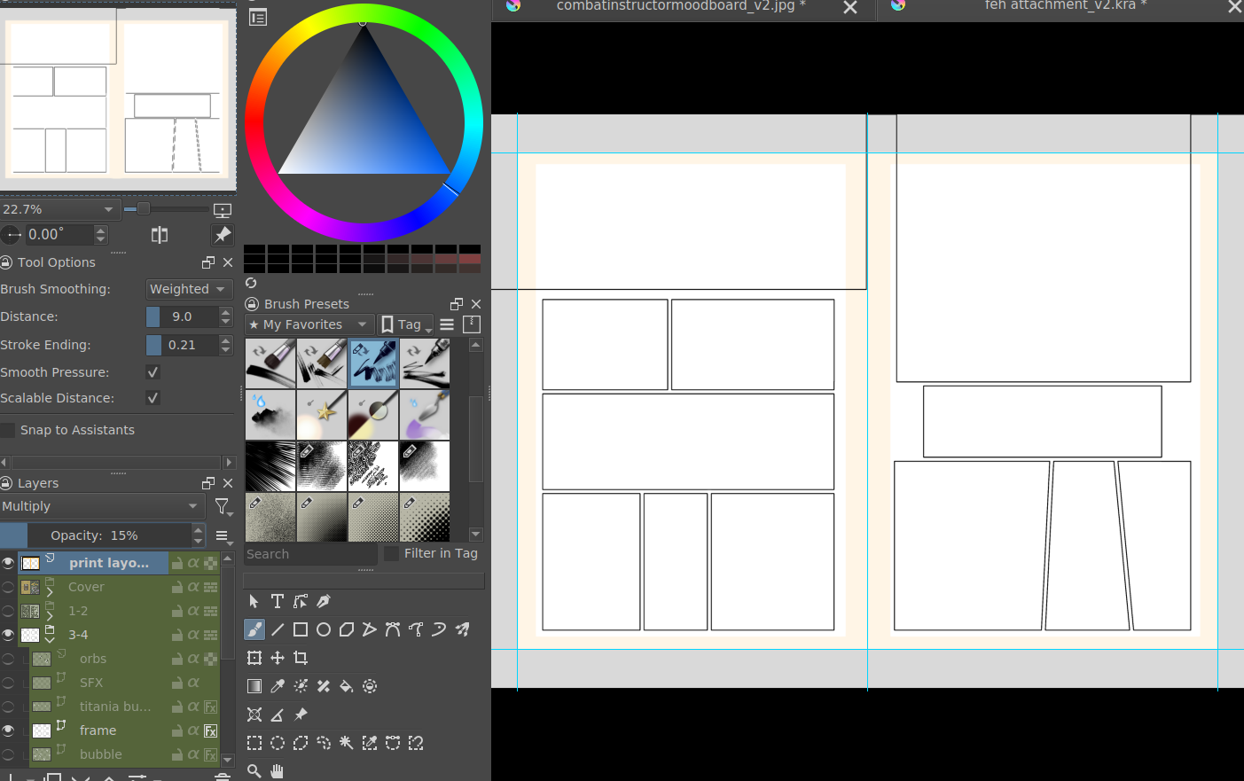
let's start with talking about the layers for a single page of the above comic image.
(ignore the "orbs" and "titania bubble" layers - those were oddities for this specific spread.) Going from the top downwards:
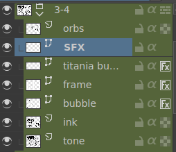
- SFX - sound effects. this is an optional layer to have if you don't have a lot of sound effects. you can use either render the sound effects by drawing them out (raster) or vector SFX; whatever you're most comfortable with. more on that below.
- frame - this is the comic page borders.
- speech bubbles - self explanatory. contains both the text inside the bubble and the bubbles themselves.
- ink - main lineart & drawing layer; self explanatory.
- tone - the shading layer.
- (deleted) ruff/sketch - this is the sketchy thumbnail layer that is imported when i first start working on each spread, and naturally gets deleted when the lineart starts looking good on its own.
so!
there's two types of digital rendering krita can do: raster (most similar to drawing with a pencil or tablet) and vector (computer draws mathematical lines and shapes and text that you can manipulate). a lot of programs fully specialize in one or the other but the killer feature of krita is it can do both on a single page; you just need separate layers depending on the rendering..
that's what this "fx" symbol stands for by the way - these are the vector layers....
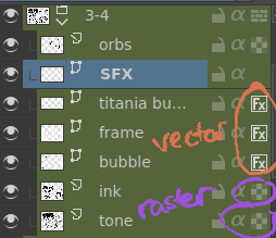
... and the symbols circled in purple clue you in that they're raster layers (ink, tone, sketch) where you do the actual drawing. with me so far?
speaking of those:
borders/frame
here's what the borders layer looks like + (the print layout layer above everything in black/yellow). the print layout layer is really only useful if you're physically printing this comic (it's basically bleed/trim if you've heard of those terms, ignore this otherwise).
i really struggled with doing borders in krita until finding this tutorial. since the thing is i make a lot of last minute changes. i need to be able to move and edit borders around easily if a panel's not working for me. so the method above makes it incredibly flexible to just ... up and move one, or to make a gutter wider.
i also really need to be able to see what's behind the borders while i'm drawing it to check anatomy sometimes -- the beautiful thing is you can simply turn the layer style to "multiply" and it's effectively transparent with one click.
like this, voila!
lettering
here's the lettering layer(s) with one bubbles' text selected.
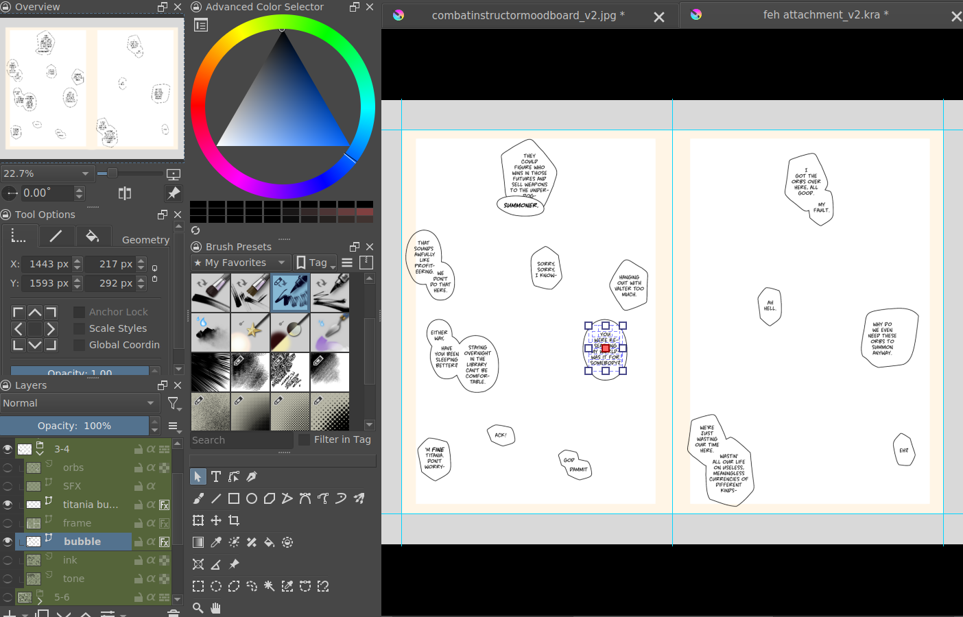
fair warning: krita is absolute ass with the text tool. it's the biggest failing but in newer versions i do believe they're slowly working on improvements. thankfully this program can do just enough to letter bubbles.
essentially, i use the same trick as the frames shown in the video above. if you slap a "layer style > stroke" on the whole "bubbles" layer, that's where that 2px black border comes from, and that layer-style-as-a-border "follows" every bubble so it's consistent.
(rule of thumb aesthetics-wise is speech bubble borders should be slightly thinner than frame borders, and on average about as wide as your lineart.)
SFX (sound effects)
technically you can hand-ink all of your SFX if vector art scares you or if you don't intend on doing much, but the vast majority of pros use vector work for efficiency. hentai/erotic work also has a lot of SFX versus other (non-NSFW) genres for the immersion factor with bodily functions.
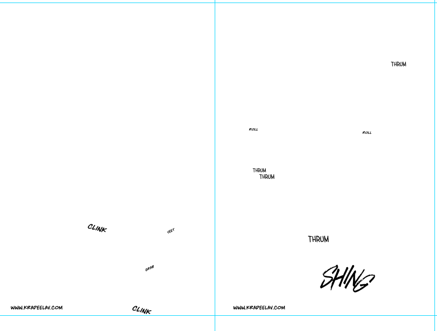
the spread above didn't need a lot, though. as you can see it's mostly the inorganic orb clinks and then the big SHING. (i put my for-the-web-kradeelav.com signature on the same layer for laziness).
here's part of my current sfx library below just to show you what i start with for erotic strips; usually i start with some base fonts and start moving the letters around individually.
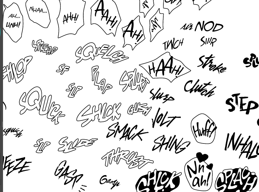
(a lot of these are redone for every project; there's some in here that are already "outdated" in my eyes.)
miscellaneous
my favorite inking brushes are from this free resource pack. my favorite halftone (shading) brushes are from this (also free).
thanks for reading! COLLAPSE
preface: it took me at least a year to figure this process out; but once when you've figured out the system & a template, it's smooth sailing. let's use this finished spread from the selfship comic last year to go through the process:
i'm going to assume a certian level of digital program proficiency (knowing what layers are, having a general idea of what vector vs raster graphics are, etc) since otherwise this post would be a book. rest of the post under the cut; this one's going to be a long one as is.
let's start with talking about the layers for a single page of the above comic image.
(ignore the "orbs" and "titania bubble" layers - those were oddities for this specific spread.) Going from the top downwards:
- SFX - sound effects. this is an optional layer to have if you don't have a lot of sound effects. you can use either render the sound effects by drawing them out (raster) or vector SFX; whatever you're most comfortable with. more on that below.
- frame - this is the comic page borders.
- speech bubbles - self explanatory. contains both the text inside the bubble and the bubbles themselves.
- ink - main lineart & drawing layer; self explanatory.
- tone - the shading layer.
- (deleted) ruff/sketch - this is the sketchy thumbnail layer that is imported when i first start working on each spread, and naturally gets deleted when the lineart starts looking good on its own.
so!
there's two types of digital rendering krita can do: raster (most similar to drawing with a pencil or tablet) and vector (computer draws mathematical lines and shapes and text that you can manipulate). a lot of programs fully specialize in one or the other but the killer feature of krita is it can do both on a single page; you just need separate layers depending on the rendering..
that's what this "fx" symbol stands for by the way - these are the vector layers....
... and the symbols circled in purple clue you in that they're raster layers (ink, tone, sketch) where you do the actual drawing. with me so far?
speaking of those:
borders/frame
here's what the borders layer looks like + (the print layout layer above everything in black/yellow). the print layout layer is really only useful if you're physically printing this comic (it's basically bleed/trim if you've heard of those terms, ignore this otherwise).
i really struggled with doing borders in krita until finding this tutorial. since the thing is i make a lot of last minute changes. i need to be able to move and edit borders around easily if a panel's not working for me. so the method above makes it incredibly flexible to just ... up and move one, or to make a gutter wider.
i also really need to be able to see what's behind the borders while i'm drawing it to check anatomy sometimes -- the beautiful thing is you can simply turn the layer style to "multiply" and it's effectively transparent with one click.
like this, voila!
lettering
here's the lettering layer(s) with one bubbles' text selected.
fair warning: krita is absolute ass with the text tool. it's the biggest failing but in newer versions i do believe they're slowly working on improvements. thankfully this program can do just enough to letter bubbles.
essentially, i use the same trick as the frames shown in the video above. if you slap a "layer style > stroke" on the whole "bubbles" layer, that's where that 2px black border comes from, and that layer-style-as-a-border "follows" every bubble so it's consistent.
(rule of thumb aesthetics-wise is speech bubble borders should be slightly thinner than frame borders, and on average about as wide as your lineart.)
SFX (sound effects)
technically you can hand-ink all of your SFX if vector art scares you or if you don't intend on doing much, but the vast majority of pros use vector work for efficiency. hentai/erotic work also has a lot of SFX versus other (non-NSFW) genres for the immersion factor with bodily functions.
the spread above didn't need a lot, though. as you can see it's mostly the inorganic orb clinks and then the big SHING. (i put my for-the-web-kradeelav.com signature on the same layer for laziness).
here's part of my current sfx library below just to show you what i start with for erotic strips; usually i start with some base fonts and start moving the letters around individually.
(a lot of these are redone for every project; there's some in here that are already "outdated" in my eyes.)
miscellaneous
my favorite inking brushes are from this free resource pack. my favorite halftone (shading) brushes are from this (also free).
thanks for reading! COLLAPSE
i don’t know if i consciously started talking more about process and resources, but there’s a few possible explanations…
one, is i guess i’ve always found it neat when peers and mentors explained changes in their work. maybe you get bored. maybe you level up so much that it requires a different process (more complex comic projects aiming to evoke emotions vs single page doodles). maybe you want to showcase your work to a different audience (a background painter wanting to pivot to animation for work, or to simply study character design for fun). maybe you want to get into specific kinds of nsfw art; either for “yolo” reasons or something else.
maybe my reasons have absolutely nothing in common with yours. maybe they do, and it sparks more understanding. talking to satisfy curiosity’s sake, basically - it’s a bonus if more happens.
another take is i feel that a large part of my workflow (both dayjob design management and hobby work) is asking the “why” and then iterating off of that. just my humble opinion but in the age of ai images, the biggest missing step between those images and a sentient creative is the capability of asking the why, (why this as a illust? why are those three lines stylistically drawn like that? why is that prop in there? why is that line arced like so?) and using your slew of mental, physical, and digital tools to execute the work in aim of an unspoken goal (or several).
maybe artists misstepped by not extending an olive branch and illuminating that missing reasoning, in a similar way to educating others on critical thinking (but with visual arts). maybe selfishly i want to leverage this as a way to separate myself from the goopy grey morass of images in a unique way.
maybe this is half a diary to my future self to track what actually works, or to get past an area that i feel stuck in. there’s a concept in tech called rubber duck debugging that’s essentially talking about that why until you get past a mental roadblock.
i also miss how resources back in 2008 just used to be … free. not “technically” free if you sign up for a newsletter/class/etc, but freely given, sincere - no strings attached. honoring the ethos of early-internet ‘information wants to be free’ culture, even if it’s mostly extinct now. mindfully knowing that you’re lifting the current & next generation of artists up, if there’s a need for a reason to go with the extra effort.
i never do anything without multiple reasons why.
perhaps some of these are the answers. COLLAPSE
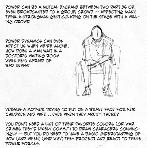
Not sure if this has been asked before but: do u have any advice for drawing old men?
-Asked by holdinglines
KRAD: Appreciate you asking, this post would be most relevant there ~ I also did two artbook reviews covering JP-styled ossans, if that’s the specific angle you’re looking for.
Otherwise good ol’ observation, practice, and dignity goes a long way.
Observation (preferably from real life if it’s possible, documentaries or gifs if not) to equip the mental library with how skin ages and how bones are a wonderful map underneath. Almost every time I’m talking to a person, I’ll be mentally sketching out how I would draw their interactions and the curvature of the face. If you’ve ever played the videogame Okami, it’s a remarkably similar notion to “drawing” on top of that world. :)
On the other side, I like documentaries specifically because you get a wider variety of folks and you can see the specific body language as well, and how age affects how people move.
Practice, if only for the (unfortunately unavoidable) fact that learned repetition over time teaches you what lines are critical and what lines aren’t needed for the sake of clarity. There’s also going to be a period of adjustment time in getting used to drawing those different shapes, lines, and motions especially if favorite subjects have skewed younger before. It’s totally natural and nothing to be ashamed of - I find it takes me a solid year before I’m truly comfortable drawing a brand new subject.
And last but greatest: dignity, as they’re no less visually interesting than any one of us, regardless if you’re coming from a place of personal attraction or not. You can (and should) draw breathtakingly erotic, kinky, sexual pieces that channel that dignity hand in hand - but it’s dignity in how you breathe a lived life into those lines, both on paper and what you’re depicting.COLLAPSE
ANONYMOUS: What are your favorite brushes?
KRAD: Ha, you timed that well as I was considering making a ‘what tools do I use’ post. information wants to be free and all of that ~
Before I get into specific brushes, I need to mention hardware. Two years ago i switched permanently to linux (Ubuntu distro), via a system76 laptop . Linux isn’t for the tech-fainthearted, but if you hav a passion for playing with computers and are feeling increasingly constricted with the subscription BS that mac/win is pushing, consider giving it a trial run.
Krita is an open-sourced free paint/vector program that’s available on all major OS’s (win/mac/linux), but is by far the best one for linux. Frankly, I adore Krita; it reminds me of the best of paint tool SAI way back in the day, a little of photoshop CS2, and I just discovered in the past two weeks it’s got some deceptively powerful vector tools for speech bubbles and comics. open source programs used to be pretty pathetic compared to “professional” ones but the gap between krita and say, CSP is pretty nil.
Now to talk brushes: I uploaded a slightly older version of my go-to brushes here on mediafire some which have been slightly tweaked from krita defaults. there’s a solid pen one, a halftone brush, and some watercolor ones.
however, I discovered these brushes (thanks to @am-herrington) a few months ago and am convinced the linked newer brushes are going to make everything else I have obsolete - the natural/textural inking is just that good. tl;dr - just grab these.
some other odds and ends to my process: i could not draw without the hydrus network which is essentially a booru-esque media organizing program. stores gifs, images, can mass-download images, and has a robust tagging ability. taco’s drawing book is one of the one I’ll also reliably flip through when my brain’s trying to figure out a piece of tricky anatomy. lastly, blambot is my trusted go-to font store when I’m in need of a manga/comics related font; there’s some very generous pricing and freebies for indie comics. COLLAPSE
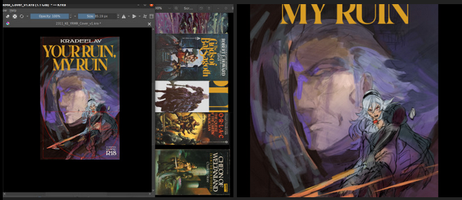
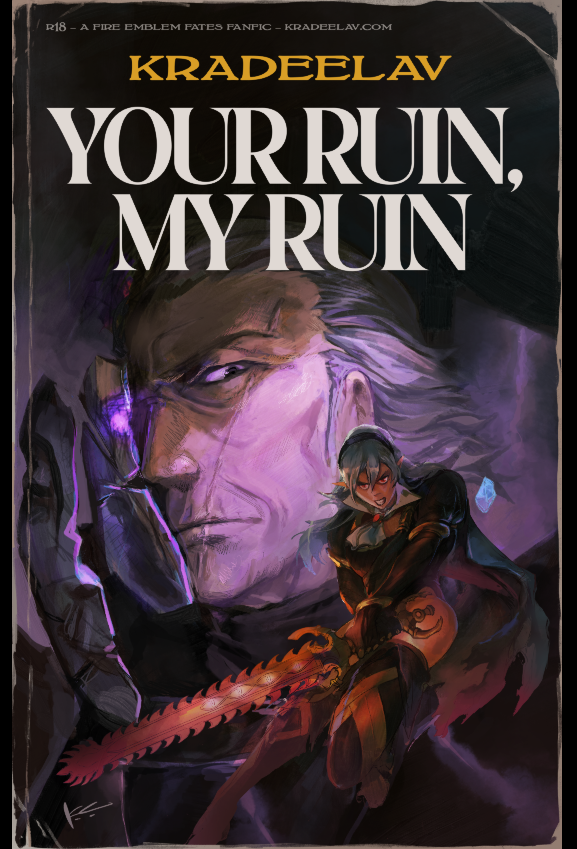
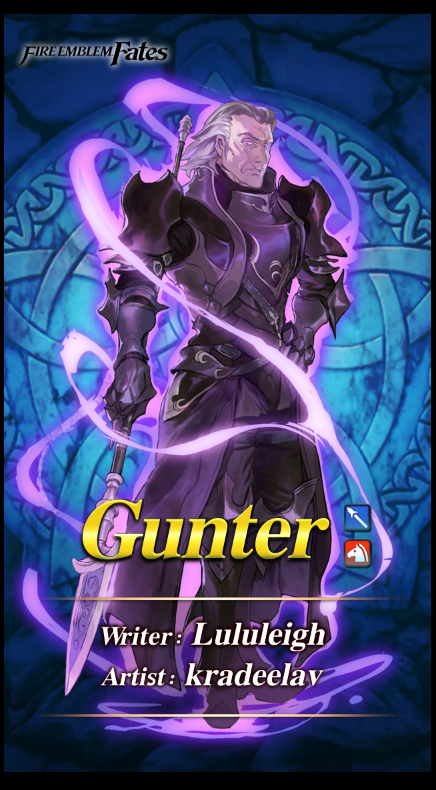
i made a cover for my #fefates gunter/corrin 120k fanfiction, your ruin, my ruin
here's the step-by-step cover progress for the curious, under the cut!
before drawing, there were a few things i knew that the cover had to have/show:
*critically, had to have vibes of an enemies-to-lovers dynamic in the sense of … the power tilt? even though that’s not “technically” the true nature of their dynamic. gunter’s not a nice guy in this fic, even aside from the possession, and i also didn’t want anybody to run into this unsuspecting the darker parts to the fic. him more looming/threatening than you’d expect in base game, etc.
* wanted to emulate kozaki’s style through the whole cover in line qualitty, coloring, and composition. thankfully he gives a few tips over on his twitter. it’s both a neat little nod at the source material, and also as a style experiment.
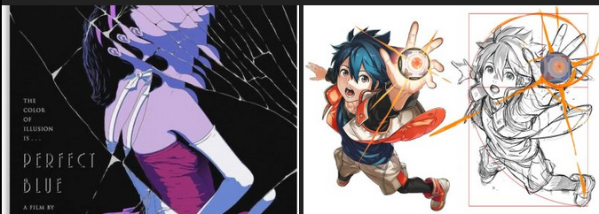
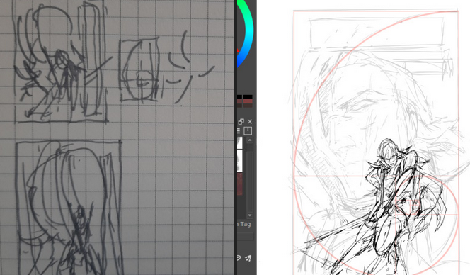
* a big theme in this fic is gunter being made of so many masks/shells (there’s a perfect blue cover, see below, that specifically made me think this composition could work.)
* learning that kozaki hews pretty close to grids + the golden ratio was another big lightbulb moment, here’s a drawing yoinked from his twitter where he shows it himself.
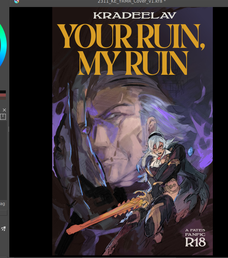
after scraping/studying from kozaki’s twitter, i made one or two thumbnail doodles below. you can see the solid one had a golden ratio + general line dynamic check squiggled to the side. there’s room for the title, the focus is on corrin, it’ll work both in a horizontal and vertical crop, looking good so far.
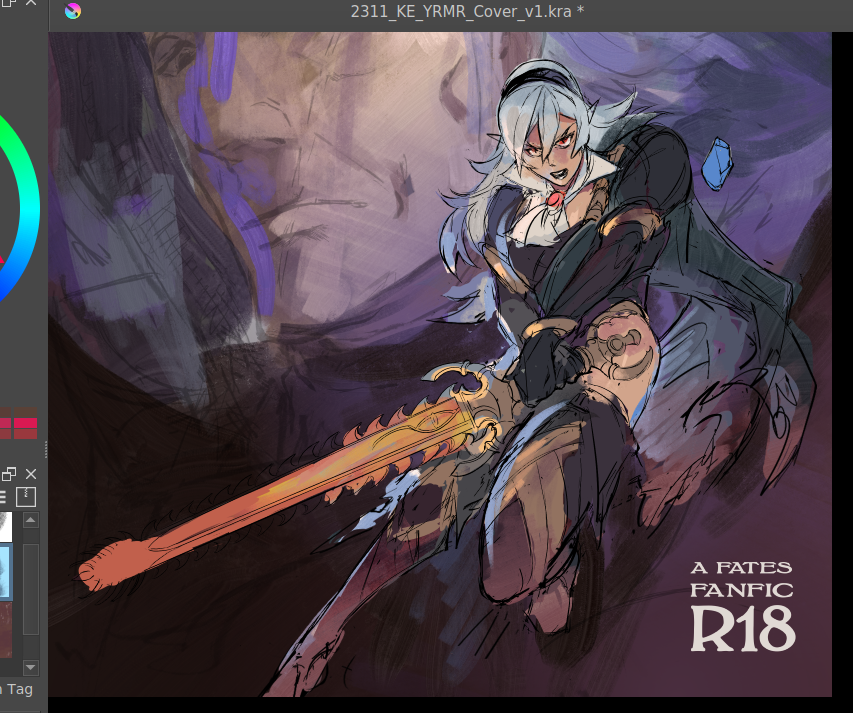
you can see how pretty tightly to the thumbnail i kept, other than moving the vertical text to the top since i didn’t have as much room there. i’m a little worried about the different line quality between how big the face is vs corrin but we’ll see. something i also realized i like about the composition is corrin “could” look like she’s attacking the viewer, but she also looks like she could be guarding him with her back to him, which…. heh. comes up in some interesting ways in the last third of the fic (possession wise). bunch of cleaning up.
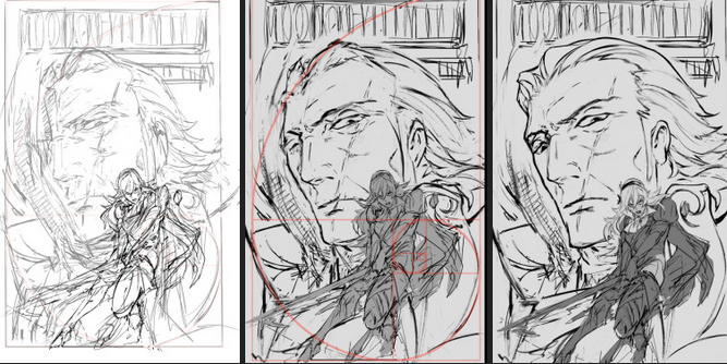
as I suspected since this is 11x17in (much bigger than what i normally draw) i had to grab a different brush for gunter since thin lines were not going to work as they did for corrin. i think kozaki’s real genius is how he treats texture with his linework; where he does thin lines, where he puts the thick ones, etc. corrin’s coming along great but there’s a spirit to the first face on the left i think i’m missing now, so i’ll probably re-insert that. (also decided to at least draw in his face there even though the masks/slices will distort that). i think what also helps is gunter’s face is very low contrast and needs to remain low contrast, to help corrin pop out in front.
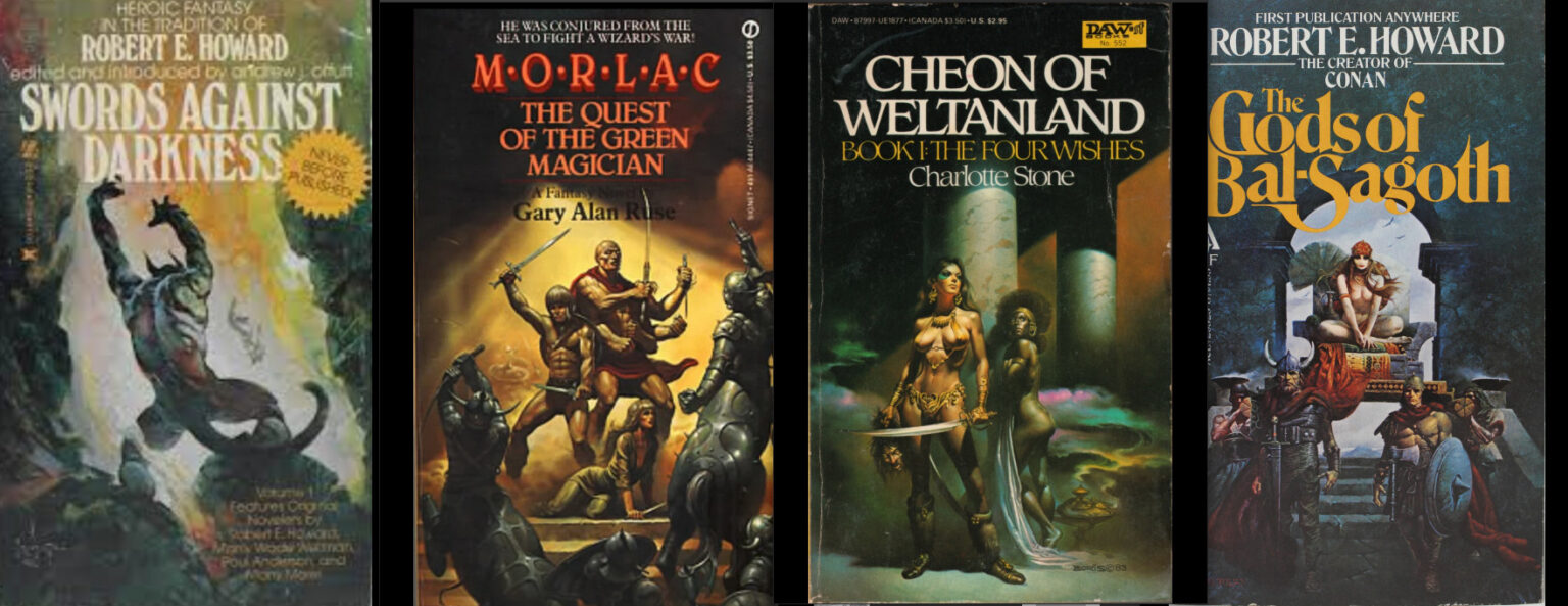
then i started thinking about typography. a lot of the fonts i had were either way too masculine/bland/modern, or way too feminine/curvy. this title needs a hint of masculinity to nod at FE’s general action-adventure RPG roots, but it’s also very distinctly the kind of erotica that doesn’t easily lend itself to a genre. it’s tender horror, it’s daddy kink, it’s vicious romance, it’s … a lot of things. here’s another thing: when thinking about title typography, another consideration is genre. briefly i considered something like lovecraftian covers; my doujin circle and i had been sharing pictures of old pulp covers. i also noticed a lot of my favorite JP erotic horror doujin have very spiky titles. this title also needs to be scrunched up in a tight space so it’s not like we got a sprawl of acreage here either. what doesn’t help is enemies to lovers doesn’t really have a visual language in mainstream media. it’s a staple of Ao3 (written) genres, but the closest you’d get otherwise would be romantic horror (kind of says a lot about who makes what huh?). for example, the shape of water (movie) isn’t a 1:1, but it’s pretty damn close — unfortunately that poster dodged the question by using an art deco-inspired font typeface that was more about the setting than the genre. and then i had an epiphany. maybe i was approaching this from the wrong direction: it’s the knight/liege romance that’s the heartbeat to YRMR. think more old dragonlance novels. old medieval/fantasy pulp novels; plenty of kinky sex and ass in there, and still close enough to FE. remember everyone and their mamma having a bi ass crush for bad boy raistlin? that’s the vibe i want.
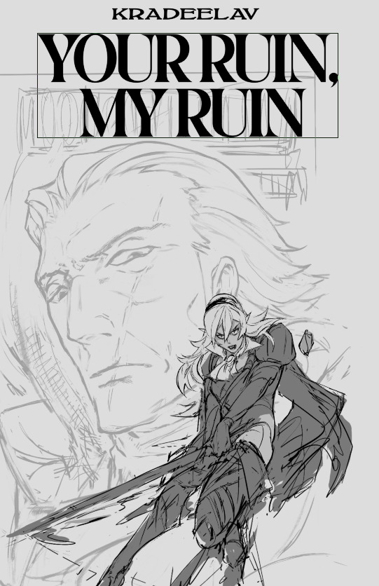
this kind of glorious deranged shit. you’re not gonna be surprised at possessed grandpa whip kink if you read these on the regular. after ~*arcane designer magic*~ (I do this for a living) bolton and magiona display were the two fonts that were gonna work just fine together. god that looks so much better. this looks believable now.
the thin/thick line weight contrast in magiona display is going to accentuate the lineart in a way that might be tricky with other fonts that work better on painted covers. bolton’s “squished” vertically enough it doesn’t compete with the other one, and makes for a good secondary/tertiary font. few other things happened. i shrunk gunter’s face because not being able to see his jawline (sex appeal u see) was bothering me from a composition standpoint. it’s the same reason frank frazetta didn’t censor his glorious asses. (said seriously, by the way. so many people don’t give their lust in art enough credit.)
i also needed more room for the title to show, and the line quality/scale difference between his face was also bugging me. does this mess up the golden ratio composition? sure, temporarily, but his armor’s weirdly flexible that we can adapt it pretty easily. it’s about this time i’m also looking through my hydrus network stash of favorite covers for what color palette and contrast to use. kozaki tends to skew purple/cooler hues for nohr characters, and that’d go well with these two. purple/green hues that play well with light purple and the yellow from those old covers i love so much, low contrast midground, and something that’d contrast well with text above. dark/black background for the gothic vibes, and the text will probably need to be white or some sort of light-warm hue for that “pop”. doing color tests is more of a leap of faith and intuition than an exact science, but damn it is it satisfying when you nail it in one go and go ‘holy shit i want to read this. 😀
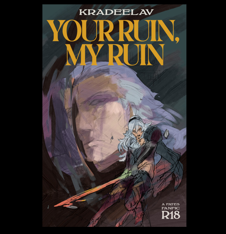
(green/gold for the hint of anankos’ mask, also matching the yato and her warmer skin tone. purple flames for him, but the high contrast armor to separate her from his larger shapes. we’ve got the dragonstone and the yato as flexibility for lighting and emphasizing contrast with her. ) i kind of like how i accidentally made the mask shards reflect(?) a bit of his own face. hell yeah throw it in. this is something that’s more likely to work than not. this is something that has that mix of id and horror i’ve been going after. here’s another version with references to the side and the golden ratio laid on again.
honestly a lot of it at this step is going ‘dude you know what would be SO DOPE…. PURPLE FIRE…’ ‘dude….. fuck yes….’ ‘what about some sick ass sword effects?’ ‘YEAH….’ and saving a bunch of backups in case of the idea didn’t work out. (am i going so much harder on a literal gilf porn fanfic cover than i need to? hell yeah. gunterfuckers deserve better. 😀 ) anyway here is when i start questioning everything, so i’ll take a break from the colors to tighten up the lineart. now that the composition’s settling in much tighter, i’m also thinking about how the two shapes interact with each other and if there’s any potential issues with tangent points (where two lines intersect each other in a way that makes an optical illusion.)
that said i love how his jawline “points” at her face, that kind of line you want. grinding away on corrin’s lineart. also double checking that the shapes/colors/forms for her “make sense” both standalone and with the composition too. what’s nice is she’s at the point where i can just turn off my brain and polish up. naturally couldn’t resist poking at it more and this is when the rest of it clicked after figuring out which bit was anankos’ mask, which bit was possessed!gunter vs himself (polished up the armor a bit too. at this point i’m pretty confident that it’ll stay “set”; the biggest thing i’m likely to change is the blue silhouette to the dragonstone side for corrin.
thanks for reading. 😀 COLLAPSE
here's the step-by-step cover progress for the curious, under the cut!
before drawing, there were a few things i knew that the cover had to have/show:
*critically, had to have vibes of an enemies-to-lovers dynamic in the sense of … the power tilt? even though that’s not “technically” the true nature of their dynamic. gunter’s not a nice guy in this fic, even aside from the possession, and i also didn’t want anybody to run into this unsuspecting the darker parts to the fic. him more looming/threatening than you’d expect in base game, etc.
* wanted to emulate kozaki’s style through the whole cover in line qualitty, coloring, and composition. thankfully he gives a few tips over on his twitter. it’s both a neat little nod at the source material, and also as a style experiment.
* a big theme in this fic is gunter being made of so many masks/shells (there’s a perfect blue cover, see below, that specifically made me think this composition could work.)
* learning that kozaki hews pretty close to grids + the golden ratio was another big lightbulb moment, here’s a drawing yoinked from his twitter where he shows it himself.
after scraping/studying from kozaki’s twitter, i made one or two thumbnail doodles below. you can see the solid one had a golden ratio + general line dynamic check squiggled to the side. there’s room for the title, the focus is on corrin, it’ll work both in a horizontal and vertical crop, looking good so far.
you can see how pretty tightly to the thumbnail i kept, other than moving the vertical text to the top since i didn’t have as much room there. i’m a little worried about the different line quality between how big the face is vs corrin but we’ll see. something i also realized i like about the composition is corrin “could” look like she’s attacking the viewer, but she also looks like she could be guarding him with her back to him, which…. heh. comes up in some interesting ways in the last third of the fic (possession wise). bunch of cleaning up.
as I suspected since this is 11x17in (much bigger than what i normally draw) i had to grab a different brush for gunter since thin lines were not going to work as they did for corrin. i think kozaki’s real genius is how he treats texture with his linework; where he does thin lines, where he puts the thick ones, etc. corrin’s coming along great but there’s a spirit to the first face on the left i think i’m missing now, so i’ll probably re-insert that. (also decided to at least draw in his face there even though the masks/slices will distort that). i think what also helps is gunter’s face is very low contrast and needs to remain low contrast, to help corrin pop out in front.
then i started thinking about typography. a lot of the fonts i had were either way too masculine/bland/modern, or way too feminine/curvy. this title needs a hint of masculinity to nod at FE’s general action-adventure RPG roots, but it’s also very distinctly the kind of erotica that doesn’t easily lend itself to a genre. it’s tender horror, it’s daddy kink, it’s vicious romance, it’s … a lot of things. here’s another thing: when thinking about title typography, another consideration is genre. briefly i considered something like lovecraftian covers; my doujin circle and i had been sharing pictures of old pulp covers. i also noticed a lot of my favorite JP erotic horror doujin have very spiky titles. this title also needs to be scrunched up in a tight space so it’s not like we got a sprawl of acreage here either. what doesn’t help is enemies to lovers doesn’t really have a visual language in mainstream media. it’s a staple of Ao3 (written) genres, but the closest you’d get otherwise would be romantic horror (kind of says a lot about who makes what huh?). for example, the shape of water (movie) isn’t a 1:1, but it’s pretty damn close — unfortunately that poster dodged the question by using an art deco-inspired font typeface that was more about the setting than the genre. and then i had an epiphany. maybe i was approaching this from the wrong direction: it’s the knight/liege romance that’s the heartbeat to YRMR. think more old dragonlance novels. old medieval/fantasy pulp novels; plenty of kinky sex and ass in there, and still close enough to FE. remember everyone and their mamma having a bi ass crush for bad boy raistlin? that’s the vibe i want.
this kind of glorious deranged shit. you’re not gonna be surprised at possessed grandpa whip kink if you read these on the regular. after ~*arcane designer magic*~ (I do this for a living) bolton and magiona display were the two fonts that were gonna work just fine together. god that looks so much better. this looks believable now.
the thin/thick line weight contrast in magiona display is going to accentuate the lineart in a way that might be tricky with other fonts that work better on painted covers. bolton’s “squished” vertically enough it doesn’t compete with the other one, and makes for a good secondary/tertiary font. few other things happened. i shrunk gunter’s face because not being able to see his jawline (sex appeal u see) was bothering me from a composition standpoint. it’s the same reason frank frazetta didn’t censor his glorious asses. (said seriously, by the way. so many people don’t give their lust in art enough credit.)
i also needed more room for the title to show, and the line quality/scale difference between his face was also bugging me. does this mess up the golden ratio composition? sure, temporarily, but his armor’s weirdly flexible that we can adapt it pretty easily. it’s about this time i’m also looking through my hydrus network stash of favorite covers for what color palette and contrast to use. kozaki tends to skew purple/cooler hues for nohr characters, and that’d go well with these two. purple/green hues that play well with light purple and the yellow from those old covers i love so much, low contrast midground, and something that’d contrast well with text above. dark/black background for the gothic vibes, and the text will probably need to be white or some sort of light-warm hue for that “pop”. doing color tests is more of a leap of faith and intuition than an exact science, but damn it is it satisfying when you nail it in one go and go ‘holy shit i want to read this. 😀
(green/gold for the hint of anankos’ mask, also matching the yato and her warmer skin tone. purple flames for him, but the high contrast armor to separate her from his larger shapes. we’ve got the dragonstone and the yato as flexibility for lighting and emphasizing contrast with her. ) i kind of like how i accidentally made the mask shards reflect(?) a bit of his own face. hell yeah throw it in. this is something that’s more likely to work than not. this is something that has that mix of id and horror i’ve been going after. here’s another version with references to the side and the golden ratio laid on again.
honestly a lot of it at this step is going ‘dude you know what would be SO DOPE…. PURPLE FIRE…’ ‘dude….. fuck yes….’ ‘what about some sick ass sword effects?’ ‘YEAH….’ and saving a bunch of backups in case of the idea didn’t work out. (am i going so much harder on a literal gilf porn fanfic cover than i need to? hell yeah. gunterfuckers deserve better. 😀 ) anyway here is when i start questioning everything, so i’ll take a break from the colors to tighten up the lineart. now that the composition’s settling in much tighter, i’m also thinking about how the two shapes interact with each other and if there’s any potential issues with tangent points (where two lines intersect each other in a way that makes an optical illusion.)
that said i love how his jawline “points” at her face, that kind of line you want. grinding away on corrin’s lineart. also double checking that the shapes/colors/forms for her “make sense” both standalone and with the composition too. what’s nice is she’s at the point where i can just turn off my brain and polish up. naturally couldn’t resist poking at it more and this is when the rest of it clicked after figuring out which bit was anankos’ mask, which bit was possessed!gunter vs himself (polished up the armor a bit too. at this point i’m pretty confident that it’ll stay “set”; the biggest thing i’m likely to change is the blue silhouette to the dragonstone side for corrin.
thanks for reading. 😀 COLLAPSE
one of the best and most unironic pieces of art advice i can give is to draw yourself with your favorites. whatever you want to call it, self insert, self shipping, hanging out with your muse, doesn’t matter; draw yourself and your favorite characters in the same space and interacting.
you don’t have to post it, but make it for the love of god.
I’m serious, by the way, and it doesn’t matter what kind of dynamic you’re imagining, either.
if it’s platonic or familial– play with the body language. does your favorite’s body language change around you versus other people? if they’re a villain, how would they relax in that sense of privacy versus in the public or “keeping the face”? what are the gestures you’d draw for both of you talking? do they touch their face while talking? how would you draw yourself leaning in with attention?
if it’s romantic– how do you draw them relaxing in the space with you, and/or vice versa? if they give comfort with tactile quality, how would they give a hug, and how does the overlapping forms of the bodies interact on paper? how do you draw longing vs satisfaction, and playing with the distance of space of both?
(and yes, if it’s sexual– what kind of kinks have you always hidden away? what’s the shit you can’t imagine poking at with a stick in daylight or in reality? how would you render the textural implements of fetish items? how does the anatomy work in 3D/perspective/the space itself? how do you draw the raw tension lines of intimacy to the point you “feel” the intimacy and/or it feels believable? how do you convincingly portray shyness or lust?)
this exercise, for lack of a better word, also has a funny but cool side effect of letting you play with how you want to present yourself too. are you not feeling your own shape language? change it up! want to wear the clothes you’ve always felt a little too scared to put on? want to play drag? use this chance to study how clothes look, how to render the tactile quality of fabric, what makes silk feel different than leather, how would you draw confidence in a person?
how would you erase the idea of artistic shame in your vocabulary?
so one of the technical bits i challenged myself with this gunter/corrin doujin was to:
(a) figure out an efficient process for professional multi-page artistic works in linux/true OSS programs - from ideation all the way to printer hand-off.
(b) and a process that fit well with my brain and kept me from spinning my wheels endlessly redoing pages. it’s a common problem with longer projects (aka why you see reboots of webcomics all the time, and also why i haven’t been able to get “what greater sin” out for three years cuz i sucked at this lol).
why the focus on process though?
after mastering a certian degree of technical proficiency. it’s what separates the hobbyist artists from the pros. not to toot my horn, but i’m quite good at project management process at work, and about two years ago it dawned on me to take some of that learned knowledge and actually apply it here if only to save eyestrain/wrist-strain time.
worklazier smarter, not harder etc.
before i get into the process outline, there’s two programs that are doing the heavy lifting since i gave them a trial run with the last anthology and they worked great in tandem. (both cost no money and are available on all major OS’s btw)
krita - my main drawing program. sketching/inking/speech bubbles/coloring/vector stuff can all be done here.
libreoffice writer - basically microsoft word for linux. i use it for arranging multiple pages, reordering, and exporting as .pdf to give to the printer (while amazing at rendering, krita can’t export as pdf or show multi-pages)
so!
process wise, it occurred to me not too long ago that i needed to consolidate my multi-page creative projects into 3 major gates.
thumbnail sketches
proof of concept layout
“last 10” final
thumbnail sketches
thumbnails are a common concept in comics, but they’re great for print front/back matter too. thumbnails ain’t here to look pretty, their sole purpose to get the idea from your noggin to on the page.
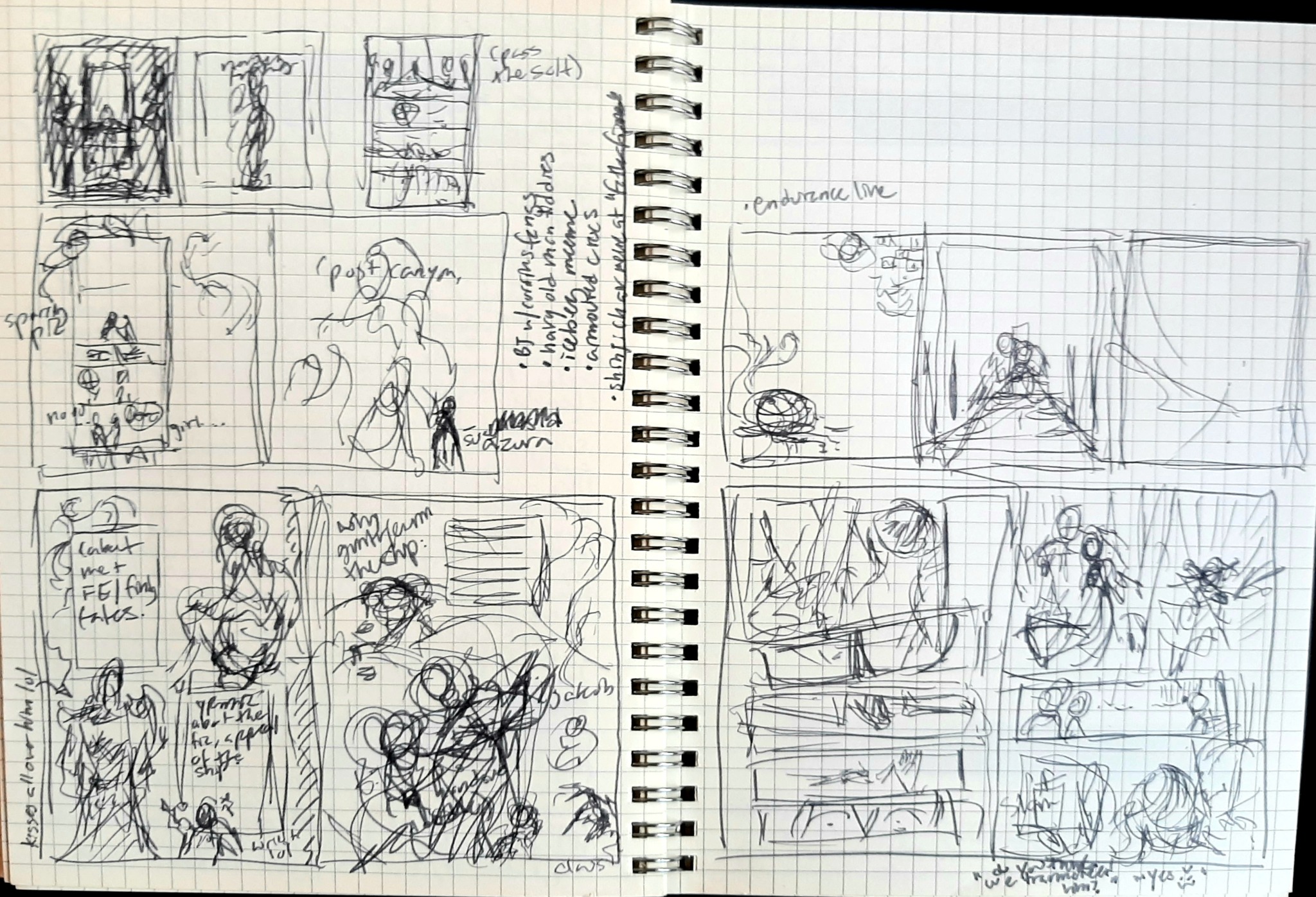
here’s a completely unaltered spread from my journal with a ton of thumbs and notes for this doujin.
so what’s the kind of stuff i think about with thumbs?
how panels in a comic fit together with the major emotional beats + line of action. does the eye follow the pages naturally? do you “feel” the emotional impact?
does the compositions work with each other? negative/positive space, weight on top or bottom or diagonally, etc. do the pages feel claustrophobic or too empty? do they breathe?
decorative framing elements that reflect the tone you want + how they generally lead the eye across the page
random notes about overall tone or potential future pages
etcetc
at this point i import that digitally, and start drawing a proper sketch off of it.
fast forward from that sketch to: “proof of concept” layout
i’m calling this proof of concept instead of a draft as they serve different purposes. a draft is a half-finished work you can just screenshot and show to anyone for feedback (like comms). proof of concept here is showing a certian level of completeness across draft pages to measure consistency.
lack of consistency is the mind killer killer of comics.
proof of concept is specifically meant to nip the ‘fizzled out halfway’ issues in the bud. it’s to show you how cool it looks altogether already, but also shed a light on problem areas that are potentially popping up on the earlier side, so there’s less time wasted.
this is a little premature in the process for a proof of concept screenshot, but you get the idea here in a later strip, shown here as screenshots imported into libreoffice writer:
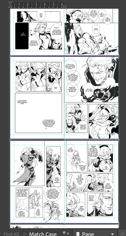
another reason that made libreoffice writer essential is the accurate 2-page spread view. between that, being able to resize the page to whatever you need, and the very easy pdf exporter (with customizable compression), i don’t know if i could do this kind of project here.
now, backing up - what kinds of consistency are we checking for here?
does the inking/coloring style change noticeably in a jarring way?
is there one comic strip that the pacing/paneling sucks in comparison to the others? or feels awkwardly added in tone and perhaps better saved for a different project?
is there one panel within a sequential series that’s torturing you? what’s the best way to throw it out and redo it even faster?
do the front/back matter support the meat of the inside in a clever, on-tone way?
did you accidentally change the font halfway through after you liked your new shiny toy? which one works better?
etc
keep in mind we’re not just checking the consistency in one strip, it’s for the book as a whole.
and then lastly, “the last ten” final
“the last ten” is a mental concept i’ve used for the last ten years for single comic pages. it’s especially tempting to noodle over endlessly making one comic page perfect, when you could have done ten reasonably good ones in the same time, and so i made this my last step making IC pages.
once when you approach a level of reasonably done, but kinda hate the page and are procrastinating on getting it out, stop, rest your eyes overnight, and list the last ten minor things you’d change.
once when you’ve changed those? out the door it goes. now, i’m gonna switch to a different project but here’s a good example of a “last ten” stage applied to illustrations when i did fallen!gunter’s FEH mockups.
looks pretty complete, right? WRONG :D i can’t remember the exact last ten i used, but it was something like:
too much of one specific glowy purple on both, i wanted more contrast with the red glow + “water” texture
needed more effects on the first image to better match FEH’s aesthetic
change Leigh’s credits after they got a chance to see it and give the thumbs up
knee/shin on left looks unfinished painting wise, clean up
missing chest plate silver decorations on left, clean up
etc
this is the last hail mary check to hack your brain into being satisfied with the page. you’ve had your say, onwards to the next one. now, you can also have an additional 'last ten’ for the project as a whole. but it’s especially critical for comic pages to help keep the momentum/tempo/pace going.
anyway! we’ll see how all of this actually works in practice depending on how fast i can get this doujin out. :)
COLLAPSE
(a) figure out an efficient process for professional multi-page artistic works in linux/true OSS programs - from ideation all the way to printer hand-off.
(b) and a process that fit well with my brain and kept me from spinning my wheels endlessly redoing pages. it’s a common problem with longer projects (aka why you see reboots of webcomics all the time, and also why i haven’t been able to get “what greater sin” out for three years cuz i sucked at this lol).
why the focus on process though?
after mastering a certian degree of technical proficiency. it’s what separates the hobbyist artists from the pros. not to toot my horn, but i’m quite good at project management process at work, and about two years ago it dawned on me to take some of that learned knowledge and actually apply it here if only to save eyestrain/wrist-strain time.
work
before i get into the process outline, there’s two programs that are doing the heavy lifting since i gave them a trial run with the last anthology and they worked great in tandem. (both cost no money and are available on all major OS’s btw)
krita - my main drawing program. sketching/inking/speech bubbles/coloring/vector stuff can all be done here.
libreoffice writer - basically microsoft word for linux. i use it for arranging multiple pages, reordering, and exporting as .pdf to give to the printer (while amazing at rendering, krita can’t export as pdf or show multi-pages)
so!
process wise, it occurred to me not too long ago that i needed to consolidate my multi-page creative projects into 3 major gates.
thumbnail sketches
proof of concept layout
“last 10” final
thumbnail sketches
thumbnails are a common concept in comics, but they’re great for print front/back matter too. thumbnails ain’t here to look pretty, their sole purpose to get the idea from your noggin to on the page.
here’s a completely unaltered spread from my journal with a ton of thumbs and notes for this doujin.
so what’s the kind of stuff i think about with thumbs?
how panels in a comic fit together with the major emotional beats + line of action. does the eye follow the pages naturally? do you “feel” the emotional impact?
does the compositions work with each other? negative/positive space, weight on top or bottom or diagonally, etc. do the pages feel claustrophobic or too empty? do they breathe?
decorative framing elements that reflect the tone you want + how they generally lead the eye across the page
random notes about overall tone or potential future pages
etcetc
at this point i import that digitally, and start drawing a proper sketch off of it.
fast forward from that sketch to: “proof of concept” layout
i’m calling this proof of concept instead of a draft as they serve different purposes. a draft is a half-finished work you can just screenshot and show to anyone for feedback (like comms). proof of concept here is showing a certian level of completeness across draft pages to measure consistency.
lack of consistency is the mind killer killer of comics.
proof of concept is specifically meant to nip the ‘fizzled out halfway’ issues in the bud. it’s to show you how cool it looks altogether already, but also shed a light on problem areas that are potentially popping up on the earlier side, so there’s less time wasted.
this is a little premature in the process for a proof of concept screenshot, but you get the idea here in a later strip, shown here as screenshots imported into libreoffice writer:
another reason that made libreoffice writer essential is the accurate 2-page spread view. between that, being able to resize the page to whatever you need, and the very easy pdf exporter (with customizable compression), i don’t know if i could do this kind of project here.
now, backing up - what kinds of consistency are we checking for here?
does the inking/coloring style change noticeably in a jarring way?
is there one comic strip that the pacing/paneling sucks in comparison to the others? or feels awkwardly added in tone and perhaps better saved for a different project?
is there one panel within a sequential series that’s torturing you? what’s the best way to throw it out and redo it even faster?
do the front/back matter support the meat of the inside in a clever, on-tone way?
did you accidentally change the font halfway through after you liked your new shiny toy? which one works better?
etc
keep in mind we’re not just checking the consistency in one strip, it’s for the book as a whole.
and then lastly, “the last ten” final
“the last ten” is a mental concept i’ve used for the last ten years for single comic pages. it’s especially tempting to noodle over endlessly making one comic page perfect, when you could have done ten reasonably good ones in the same time, and so i made this my last step making IC pages.
once when you approach a level of reasonably done, but kinda hate the page and are procrastinating on getting it out, stop, rest your eyes overnight, and list the last ten minor things you’d change.
once when you’ve changed those? out the door it goes. now, i’m gonna switch to a different project but here’s a good example of a “last ten” stage applied to illustrations when i did fallen!gunter’s FEH mockups.
looks pretty complete, right? WRONG :D i can’t remember the exact last ten i used, but it was something like:
too much of one specific glowy purple on both, i wanted more contrast with the red glow + “water” texture
needed more effects on the first image to better match FEH’s aesthetic
change Leigh’s credits after they got a chance to see it and give the thumbs up
knee/shin on left looks unfinished painting wise, clean up
missing chest plate silver decorations on left, clean up
etc
this is the last hail mary check to hack your brain into being satisfied with the page. you’ve had your say, onwards to the next one. now, you can also have an additional 'last ten’ for the project as a whole. but it’s especially critical for comic pages to help keep the momentum/tempo/pace going.
anyway! we’ll see how all of this actually works in practice depending on how fast i can get this doujin out. :)
COLLAPSE
notes on drawing old people:
* morpho’s skin + fat book is an invaluable reader for an easily-digested anatomy study. here’s that book plus a few others. please support the author if you can.
* like other naturalistic carbon life forms in nature, lines don’t have to be perfect. (personally i find tiktok-standard young people the hardest ones to draw because if you draw a line with the eye a smidge off, it looks weird. old people, you got a lot of forgiveness in them lines. hell, multiple lines just look good as wrinkles.)
*fleshy things sag, and they always sag towards gravity (down). if you had to pick three major areas to draw, the bit under people’s chin, the tits (unisex), and the belly are generally the main three.
* a cluster of wrinkles tend to pop up in joints that bend a lot, notably knuckles, elbows, and knees. those same joints have a habit of enlarging, whether due to inflammation, or the surrounding muscle wasting away a bit.
* you move real slowly and your range of motion is a lot more limited because joints hurt in particular. (aka your hands/elbows/neck/shoulders can’t reach shit they used to.) old people’ll often have canes/back-scratchers/etc discretely within range to help with this, to almost act as a limb-extender.
* with necks in particular, you tend to move your whole upper body in one piece rather than your neck twisting independently from the shoulders.
* … and you really don’t want to fall, and maybe your eyesight’s going too. so you’re always double checking whether or not your surroundings are stable. old people sit down gingerly (hands might grasp a table or railing several times for the best position), and gravity is not your friend getting up either.
* backs tend to hunch over and stay in the bent position. because of this, and the muscles wasting a way, old people often tend to look like they “shrink” slightly versus an adult in their prime. a notable exception is people who’ve had military training, and the difference is striking.
* lastly, when in doubt, watch some videos of some old people even just for a few seconds, and mentally sketch out how you’d draw the freeze-frames. which bits move, and which bits stay stationary?
drawing tip! when i clean up a gestural sketch straight into a clean line work (I don’t sketch on different layers), there’s some lines that if you erase these specific lines, the picture immediately looks pretty fugly.
I joke these lines should be called “load bearing lines’ - borrowing a term from building construction (load bearing beam) where if you remove the beam, the house becomes structurally unstable.
these load bearing lines are different than outlines around the form, or even invisible skeletal lines. these can be as subtle as curving around the waist as a belt and transforming into a cloth fold, and back into hair. the key is the load bearing line keeps the eye moving in an arc.
below you can see the few lines in the torso that i’d say fit the description, and a before/after.
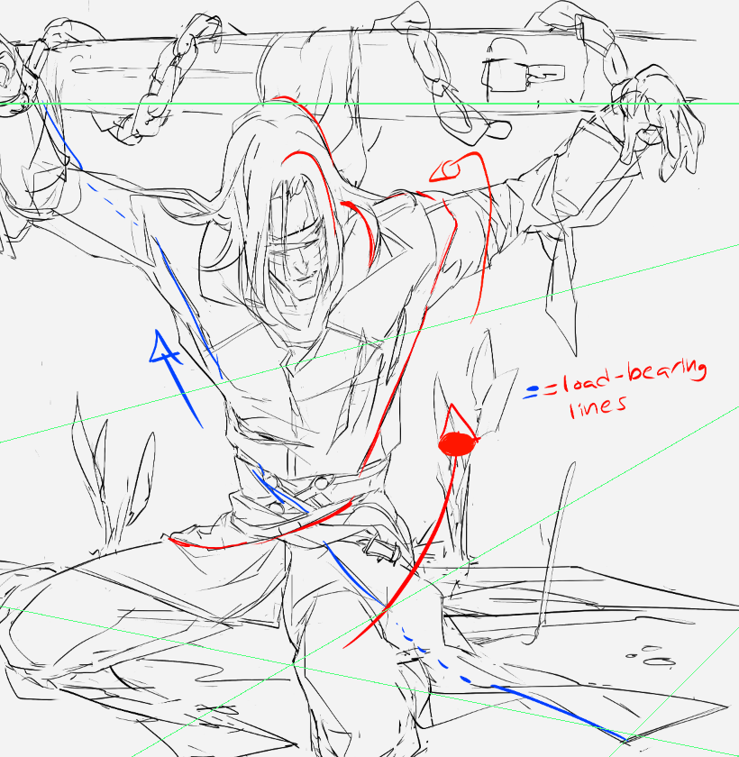
the red line is the key since it wraps around the form in 3 axis (left/right, towards you/behind the guy, and from bottom/up, and also is a guide-line for your eye to follow along. there’s other "echoes” of the load bearing line particularly in the hair; always a good idea to have to keep that one smooth motion going.
see what I mean?
these load bearing lines “can” be briefly broken up (see blue line around left shoulder) but should still attempt to use negative space as part of the continuation. try it! :>
I joke these lines should be called “load bearing lines’ - borrowing a term from building construction (load bearing beam) where if you remove the beam, the house becomes structurally unstable.
these load bearing lines are different than outlines around the form, or even invisible skeletal lines. these can be as subtle as curving around the waist as a belt and transforming into a cloth fold, and back into hair. the key is the load bearing line keeps the eye moving in an arc.
below you can see the few lines in the torso that i’d say fit the description, and a before/after.
the red line is the key since it wraps around the form in 3 axis (left/right, towards you/behind the guy, and from bottom/up, and also is a guide-line for your eye to follow along. there’s other "echoes” of the load bearing line particularly in the hair; always a good idea to have to keep that one smooth motion going.
see what I mean?
these load bearing lines “can” be briefly broken up (see blue line around left shoulder) but should still attempt to use negative space as part of the continuation. try it! :>
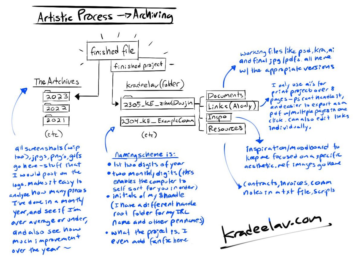
no art in this post, but i’d like to share a little about how i organize files! (i’ve intentionally kept this on one image so you can easily save it on your desktop, or repost elsewhere; just keep the signature if you do.)
I started the “Artchives” folder back in college a decade ago when I needed one place to dump every final work i drew, whether it be taking pictures of a sketchbook, screenshots to the now-deleted twitter, or meme-art to share to friends. it’s been a wonderful way to have an organized set of yearly time capsules for my work, and to track improvements over time. if I remember vaguely what season and what year I drew something, it also makes it very easy to hunt for old art.
The $kradeelav (root folder for projects) system was actually borrowed from my dayjob’s server, naming scheme and all. (I manage an international household-name brand at work, with a need to organize tons of mini-projects within). when i started doing larger and more ambitious zines, comic projects, and freelance work – this is a secondary system that helps to house these in a similarly-ordered set of folders without invoices and reference images and who knows what else getting absolutely blasted all over my desktop. usually i’ll have 2-3 active projects going on at one time, with the folders on the desktop; they get moved into this root folder when they’re closed.
happy to answer questions about these!
(posting some tips about art i answered back on the NSFW blog)
ANONYMOUS: Any tips on drawing leather? Yours always looks so realistically shiny
A: Thank you! Honestly feel like I only cracked that code in the last few weeks; it's absolutely much trickier than it looks at first glance. A few tips that helped recently:
- Have an idea where the light source is in the picture, likewise where ridges/creases tend to build up. It doesn't need to be an exact science, but it'll give a sense of consistency (for example, underlighting versus side-lighting versus above will all change how creases look - and they tend to build up around joints, the crotch, and/or if it's folded up in places.)
- I tend to color it all in black, and then go in with an eraser and "draw" out the highlights/creases organically. Much less time consuming.
-Spend the time familiarizing yourself with how it feels in real-life, for example to see if your style works better with textures added or not. if you don't have access to a jacket or gear, movies are a decent option. (ironically the last Tom of Finland biopic was an *excellent* example for research not to mention a deeply moving piece of art on the subculture.) (... there are also, ahem, certain online stores and lifestyle photographers that have a proliferation of handy pictures, if definitely NSFW. :v)
- spend time checking out how different artists do it. I render leather differently than say, how @/kmclaude (twitter), the aforementioned Tom of Finland, @/hawklewds (twitter), or other JP artists do - there's a myriad of delicious takes, and no wrong way. Wishing you the best!
(posting some tips about art i answered back on the NSFW blog)
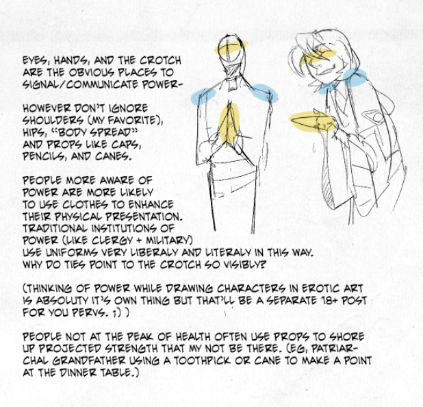
ANONYMOUS: Do you use references for your nsfw art? If not, how do you get two characters to look right in a nasty setting?
A: "references", snerk. (I actually don't with erotic art, but had to grin at that. :>)
That's a really good question, though - and appreciate the ask! Personally have done live figure drawing (and would heartily recommend that at least in some portion of time in any artist's training), though most of that happened a long time ago.
Interestingly I would say that studying animation and drawing_comics_ as a generality has helped me the most to "get them to look right" - once when an artist has a basic handle on anatomy, it's almost more important to get the gestural, posing, and body language part right. Clear body language has always been one of my top priorities - Walt Stanchfield's two "Drawn to Life" books are the masterclass on this. Read those books, if nothing else.
Now, to be perfectly blunt, I also think kink in general has a lot to teach here.
it's many things to many different people - but very often it's about power dynamics, power play, who controls the scene, how the sub follows, introducing tools/toys/props - but always, always, keeping the magnetic charge the whole way. Even vanilla erotica has some of this to an extent as - thank god - every individual is different and is going to approach intimacy with their own preferences.
However, with kink, by getting into the id and mind of the characters (like an actor) and recognizing the physical cues of someone who controls the moment - the tilt of an observant head, whether they (as a character) prefer subs who kneel (what kind of kneeling? there's plenty. are they a brat? how?), do you use the camera angles to show it from the dom's point of view (or not)? are you going for a rom-com silly- intimate angle or the energy of a hard scene? you get a *lot* of mileage. And, with a bit of elbow grease - get to breathe life in them. Good luck.
Powered by てがろぐ Ver 4.2.0.
i've already shown this to the doujin circle, but seeing the final shop visits for the latest comic campaign per incoming domain is *fascinating*. here's the breakdown:
bsky --------- 830
itchio -------- 155
kradeelav.com 115
tumblr ------- 90
google ------ 25
dreamwidth - 9
other -------- 4
a few notes:
*there was roughly equal marketing on bsky/kradeelav.com/tumblr/(mastodon!baraag).
*kradeelav.com being above tumblr (solidly no3!) shows you the power of personal websites, doesnt it?
*itchio's visits started slow but then ramped up when the comic hit the front page for a few tags.
this whole campaign was not profit focused in the least (the slim $$ after shipping/printing is mentally sorted as "seed money" for future doujin), but broad data like this is still useful for estimating where to focus for pre-orders to save on mental energy. work smarter, not harder.
why the transparency?
indie doujin/comics is horrifically niche and opaque money-wise with a lot of headwinds (to use a corporatism) right now. i don't believe in competition with your peers. i really don't. the more mental pain i can erase for somebody through knowledge sharing is a net benefit.