For a working RSS feed, copy and paste https://kradeelav.com/diary/tegalog.cgi?mode=rss& amp; into your feed reader (delete the space). Enjoy!
2025年の投稿[64件]
2025年12月 この範囲を時系列順で読む この範囲をファイルに出力する
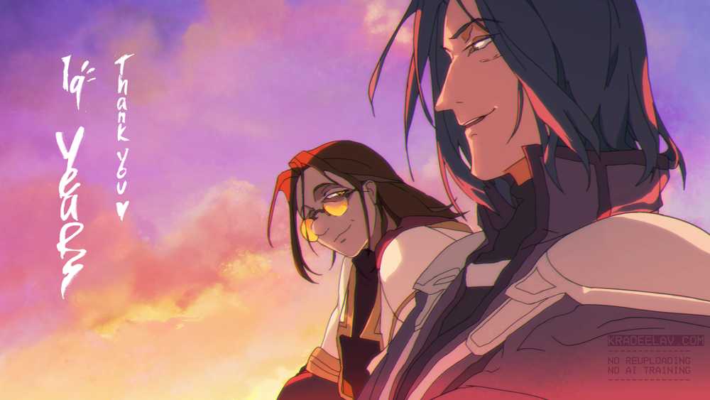
"Krad's Art Dump 2.0" is here with all of my art from the past five years minus ~100 pieces of NDA artwork. I started this gift last decade as a way to give back to the old internet that mentored me, and it ended up a very poignant way to archive my work.
Before you download, please be aware there are many NSFW/R18 pieces as well as potentially disturbing artwork. You are welcome to save/delete whatever you want, all I ask is you do not reshare, or use it for AI training.
Download link (1.1 GB)
Previous 2011-2020 dump: https://www.mediafire.com/file/3hqo6ltou...
2025年11月 この範囲を時系列順で読む この範囲をファイルに出力する
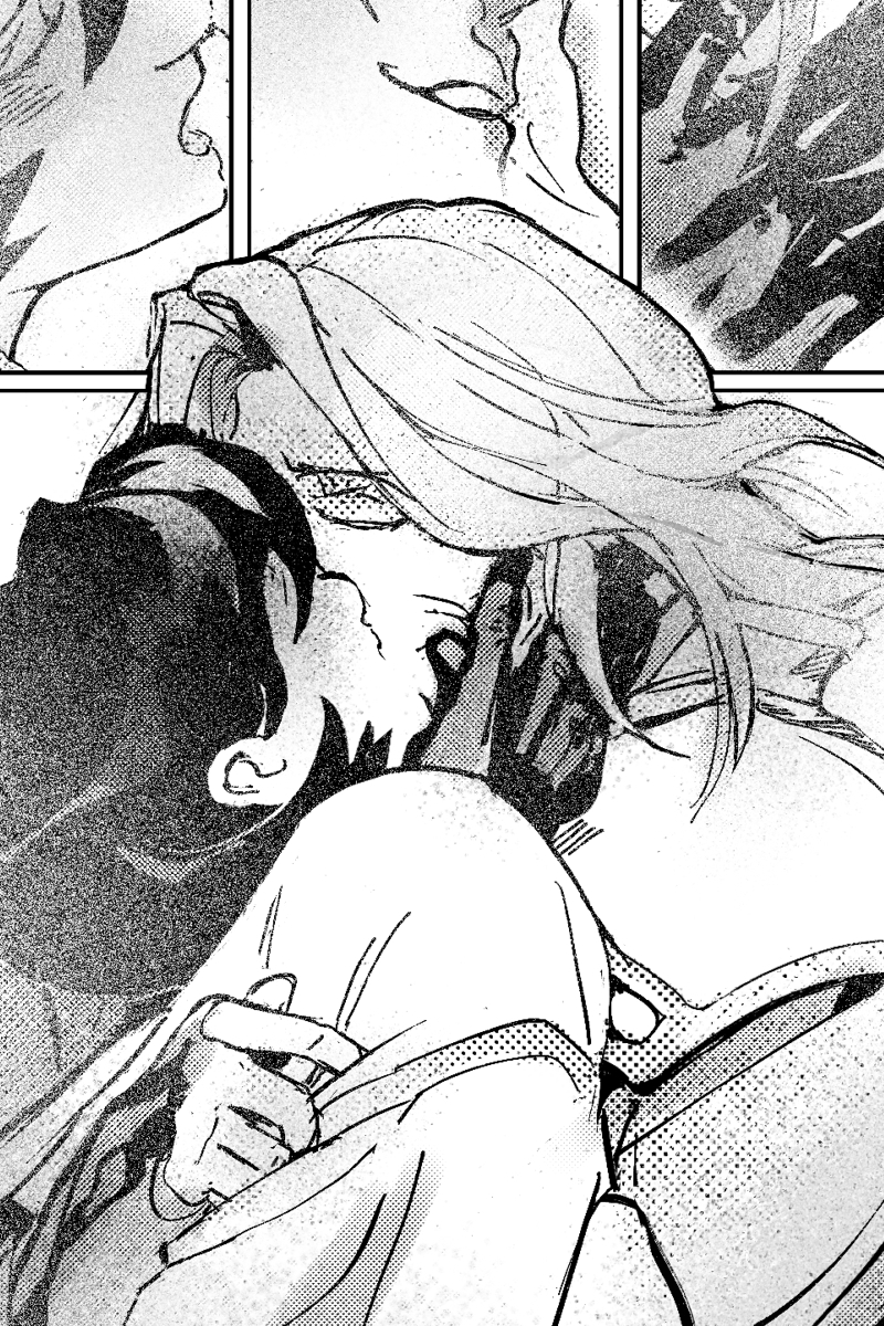
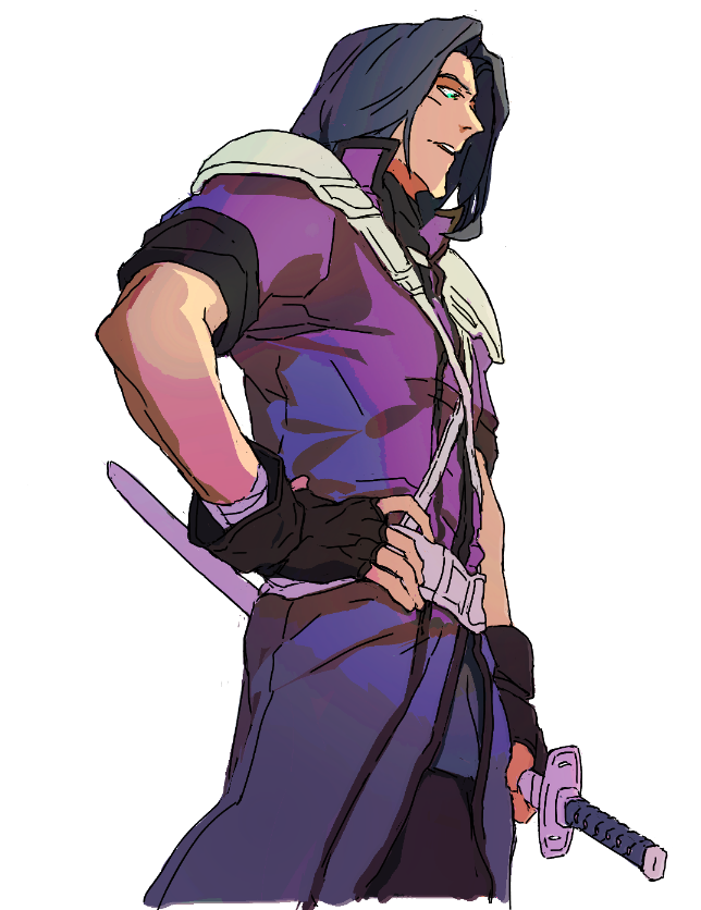
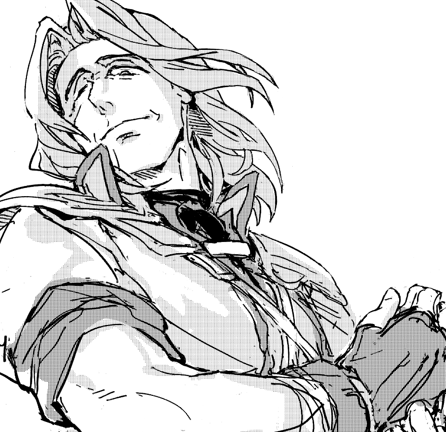
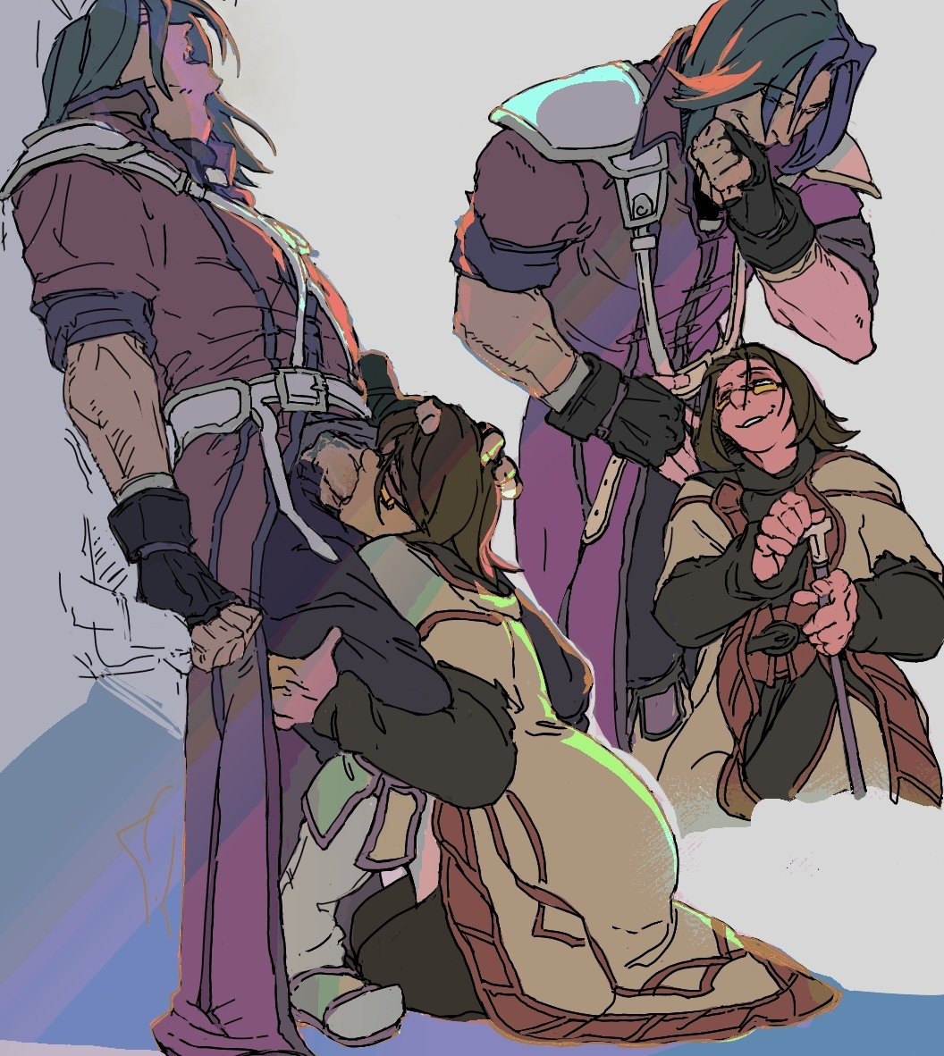
i wish i could say this was inspired by an angsty encounter in RD P4 but. reality is: playing as #zihark in elden ring and thought he was hot covered in blood :)c
#fetellius
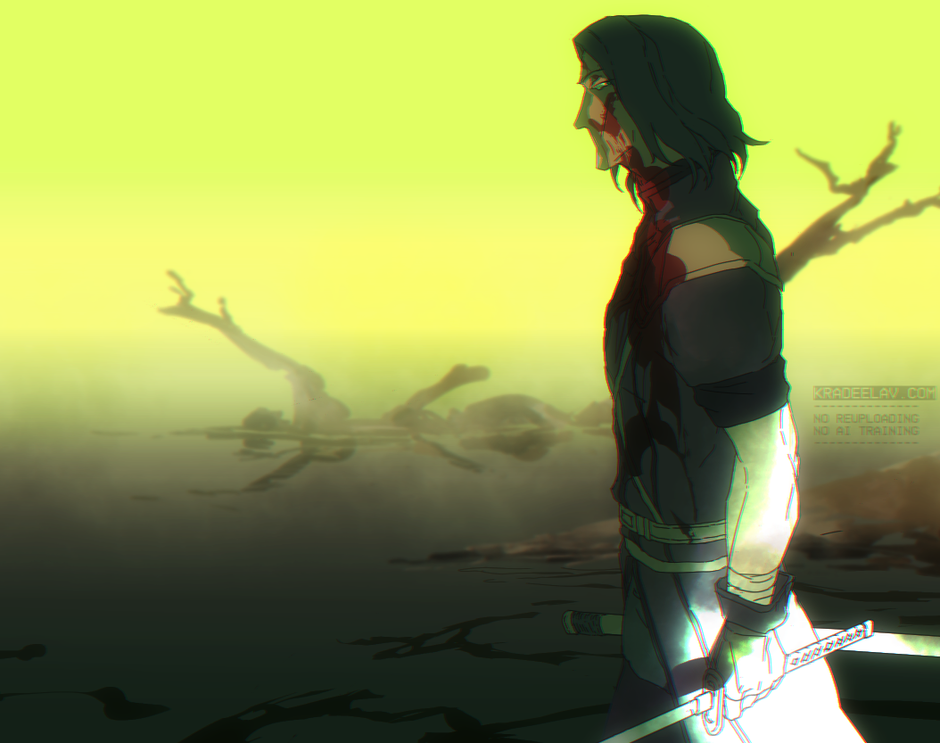
#fetellius
2025年10月 この範囲を時系列順で読む この範囲をファイルに出力する
2025年9月 この範囲を時系列順で読む この範囲をファイルに出力する
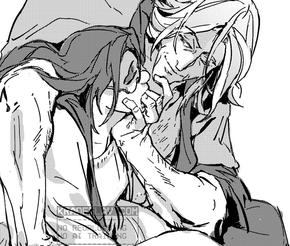
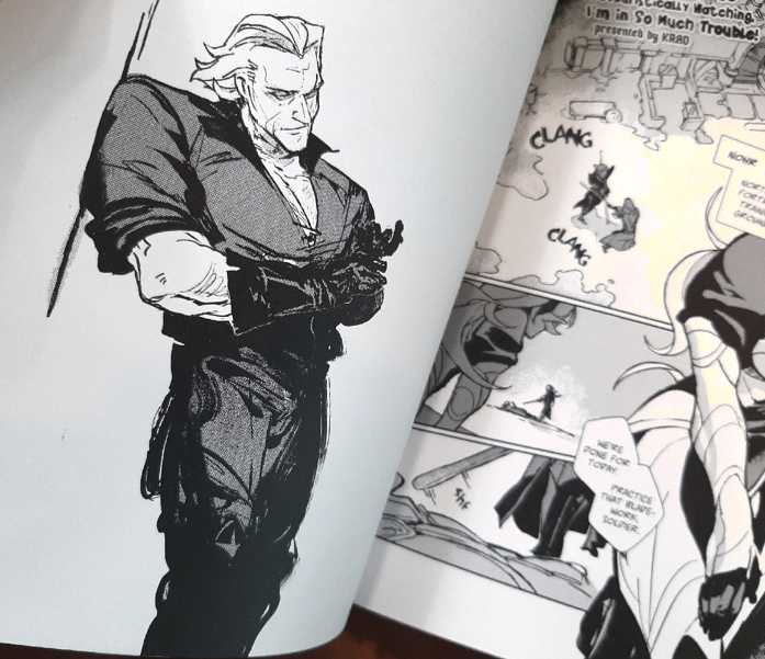
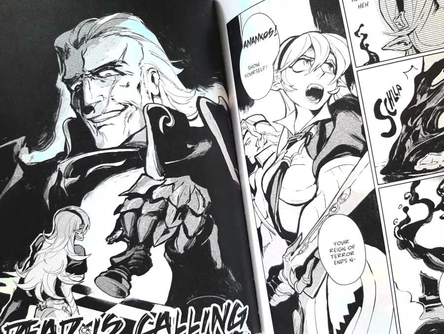
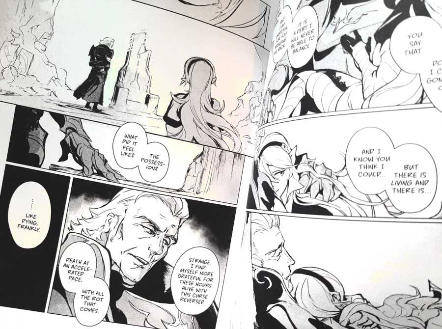
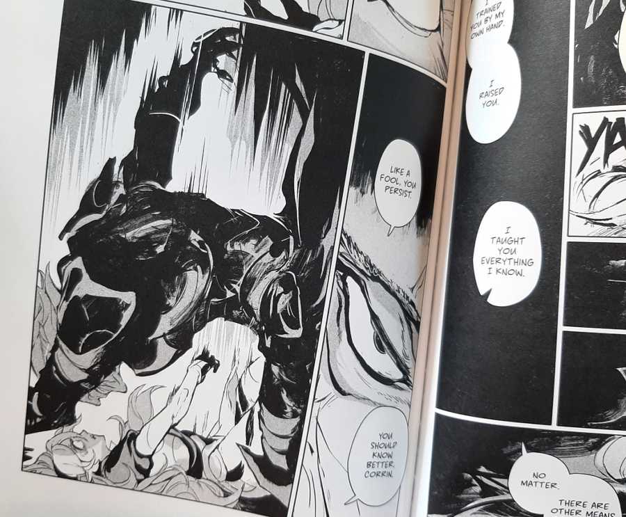
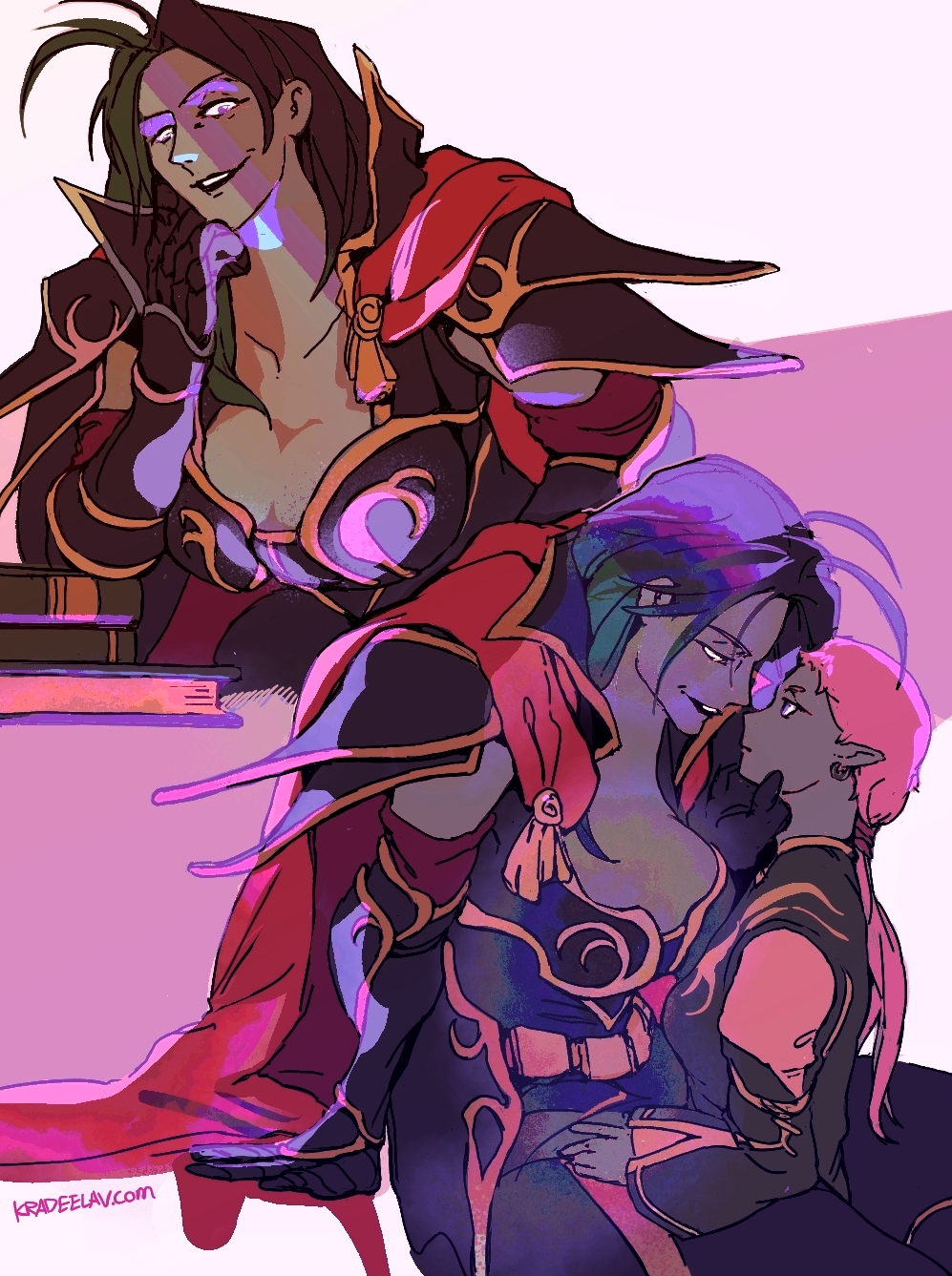
■ Your Ruin, My Ruin - Chapter 16 [ Sacrifice ]
□ https://archiveofourown.org/works/522583...
[ illustrating my #fefates Gunter/f!Corrin slowburn romance fic where they both earn their happy ending. Revelation route. ]
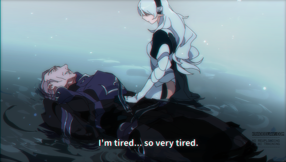
□ https://archiveofourown.org/works/522583...
[ illustrating my #fefates Gunter/f!Corrin slowburn romance fic where they both earn their happy ending. Revelation route. ]
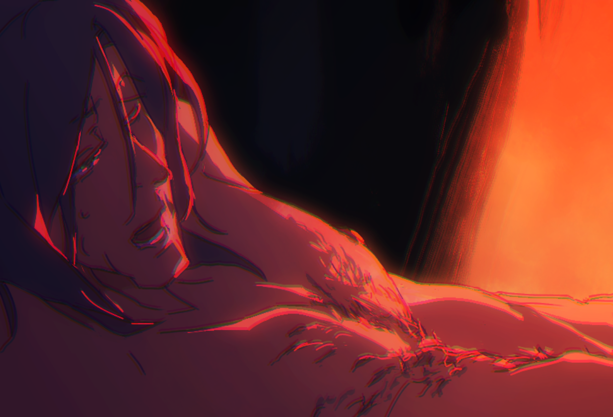
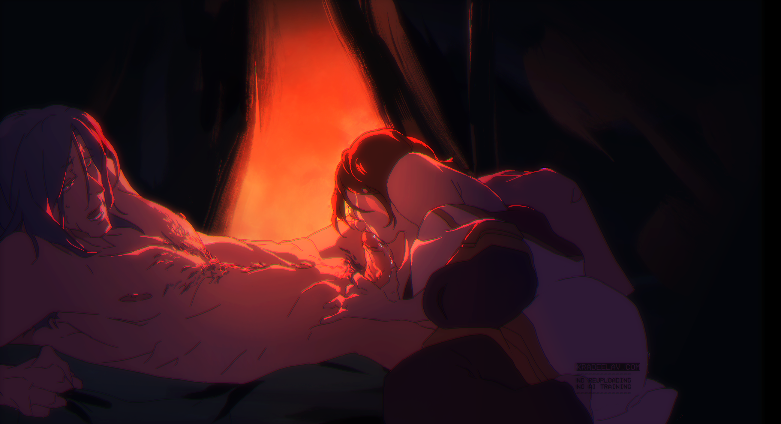
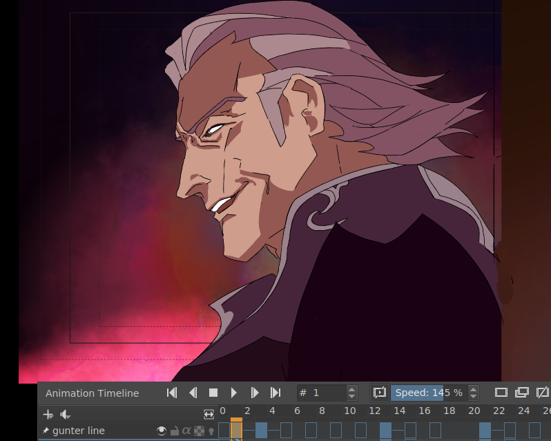
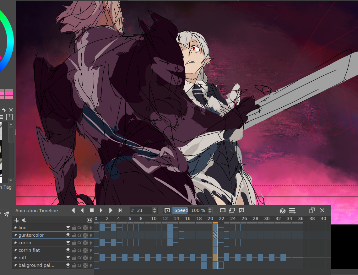
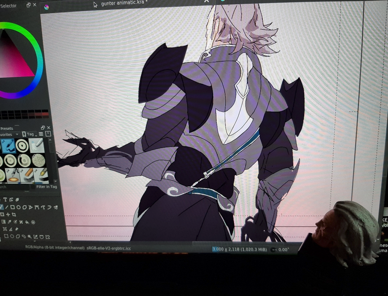
HOW TO MAKE A 2010's ANIME CELL IN KRITA - QUICK WALKTHROUGH
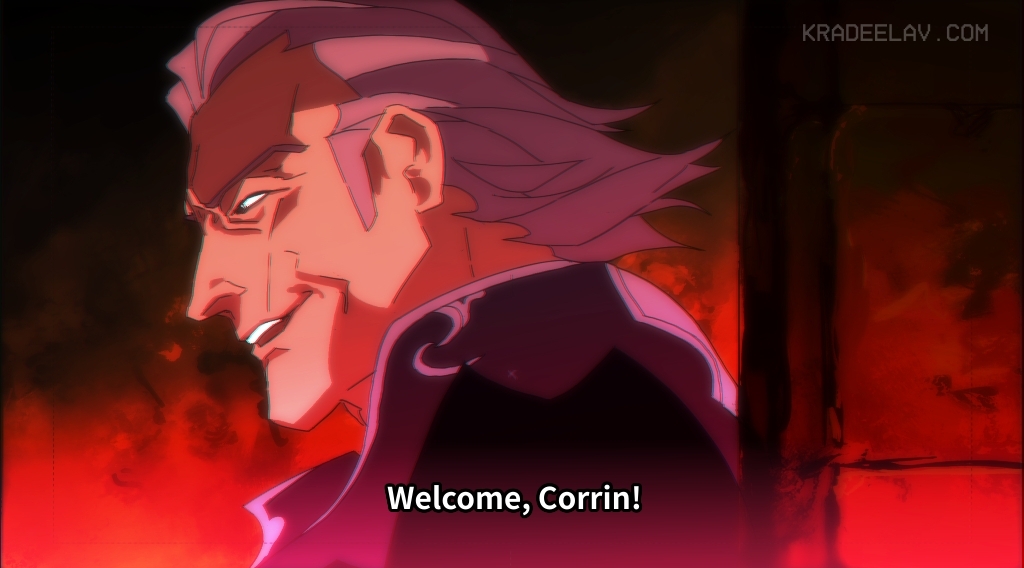
this past week, i went on a bender making a #fefates animatic(?), it ended up being a crash course in how to make realistic anime stills entirely in krita. below is a bullet-point list of critical steps for interested parties. it's not very detailed but should point you to things that helped.
file setup
* use animation template, jp style. delete everything that isn't the white bg + the layout guides
* size: 3000px x 2118, 300dpi
drawing the cell
* generally my "thin line" style that i do roughs and ink with is a "basic 5" brush (in default krita bundle). anti-alias is turned off for crispiness. frankly any small inking pen would do.
* general things to keep in mind: use FEWEST LINES as possible. try to keep shadows also to a minimum or have them cover large simplified shapes.
* tip for cell cleanup: if you go into tool options while using the fill bucket, and under 'reference' 'obtain region with a merged copy of all layers' and the multiple fill 'fill regions only in similar color' and use the fill bucket to paste the same color everywhere you want it, makes cleanup 1000% easier
here's how the cell looked with a previous bg i scrapped, and also some other wip cells
drawing the background
* going to be different depending on how organic the BG is - though you'll probably always start by slapping some gradients down first
* for rocky cave texture, big fudopen with flow down to 18 (for all brushes mentioned, here's the bundle i think i got them from. https://www.youtube.com/watch?v=nI_DFuSf... )
* smudge with inkP 25 blender water as needed
* finesse stone texture with inkp 25 penpoc (incidentally my favorite chonky b/w manga inking pen)
* throw down more layers with freeze-reflect style (layer style might not be in the defaults, you might have to look for it and tick the check box on)
compositing
* watch all of this video! https://www.youtube.com/watch?v=jv4axtpn... it's not krita but it's a very in depth tutorial teaching you why anime composites look like that.
* here's the funny part.... SCREENSHOT your final merged cell+bg. this will naturally give it the 'jpg 360dpi crunch'.
* in your new composite file, add a few more freeze-reflect gradients aiming for a specific color hue. this was actually originally more a dusty brown/yellow overall but red fit better.
* below, see critical trio of layer effects:
-> copy of merged cell/bg, 50% opacity (guass blur, 15px, hard overlay layer style)
-> copy of merged cell/bg 50% opacity (guass blur, 15px, lighten layer style)
-> background - (no blur, normal layer style)
-> possibly add an "addition" gradient layer along the bottom or top if it needs it
* subtitles: my font: noto sans jp (but lots of good alternatives and research here: https://www.md-subs.com/blog/saa-subtitl... )
* at the very very end: YA GOTTA SEPARATE CHANNELS and then nudge them by a pixel left or right. i have tried every other trick to get the color bleed approach and nothing looks nearly as realistic. here's how to do it in krita https://docs.krita.org/en/reference_manu...
fin!COLLAPSE
2025年8月 この範囲を時系列順で読む この範囲をファイルに出力する
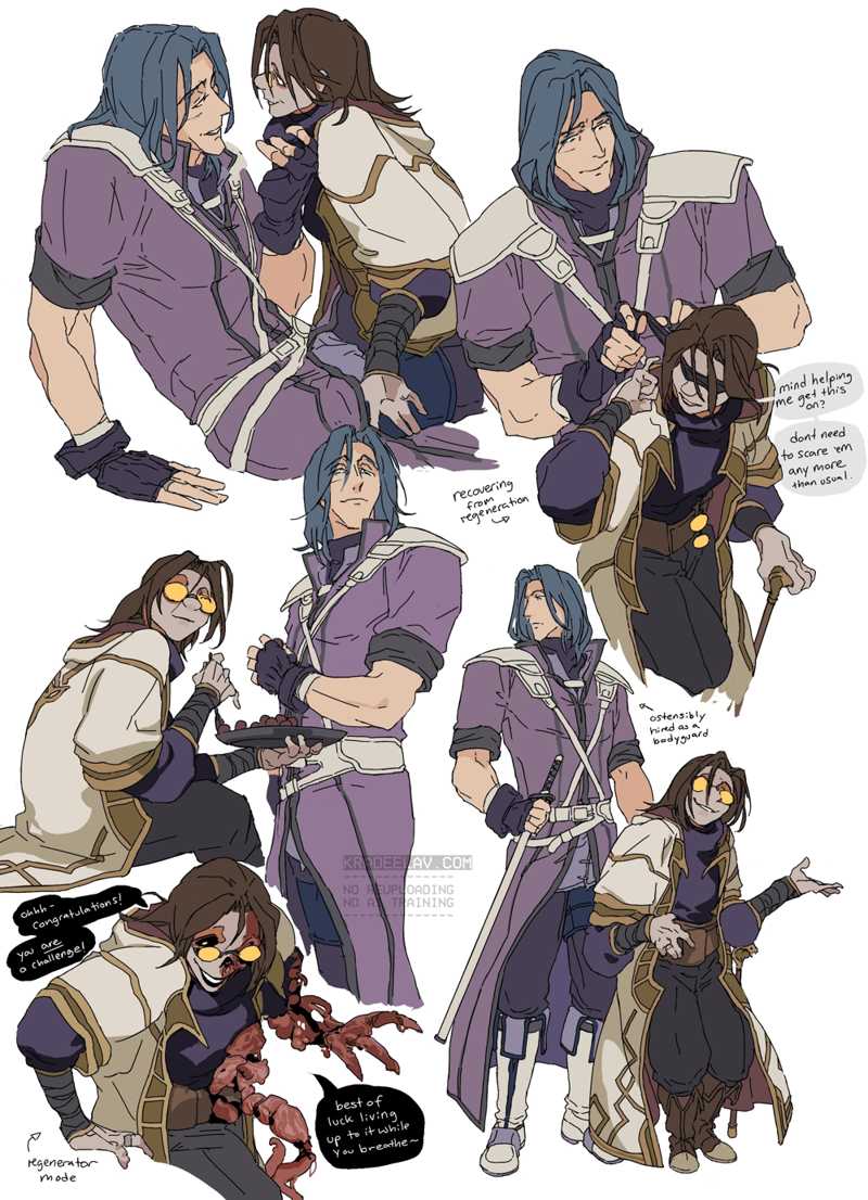
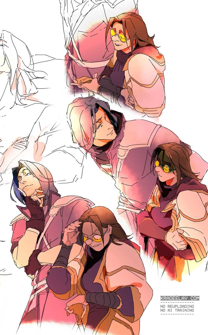
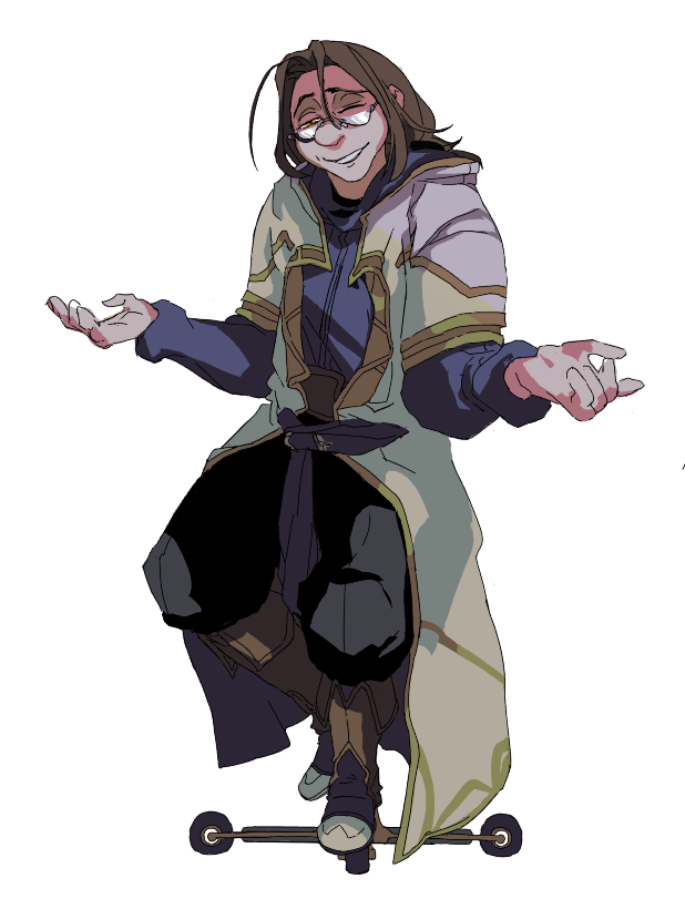
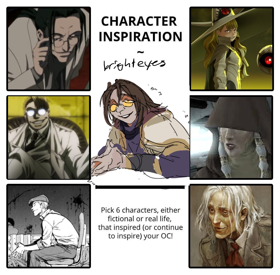
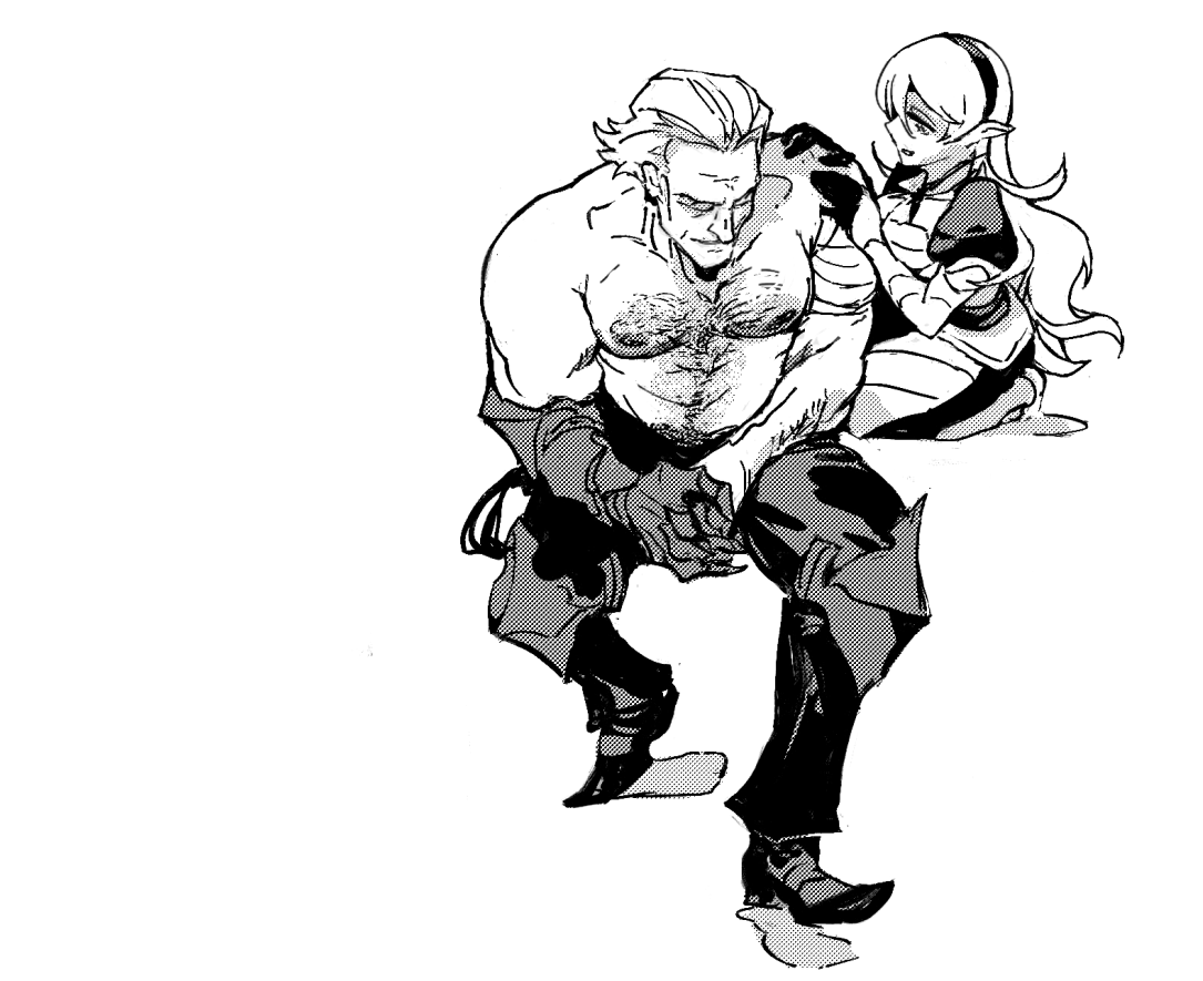
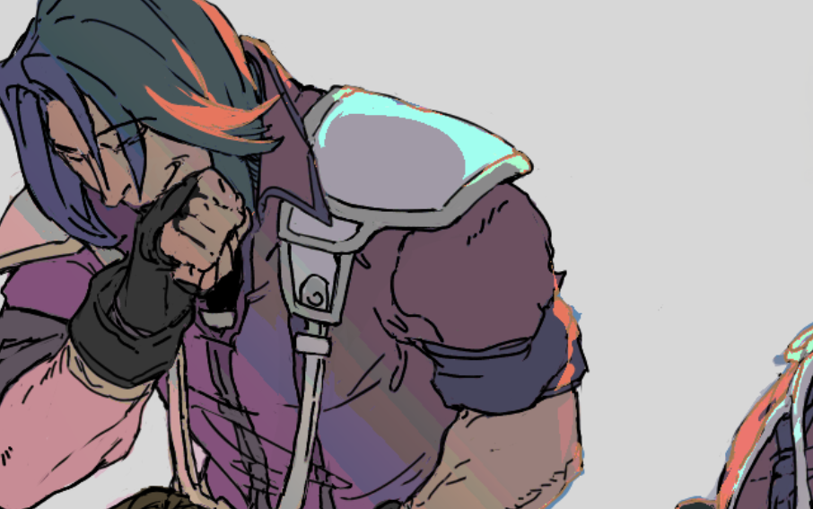
bright eyes x #zihark ~ (fire emblem oc/canon selfship)
finished sketchdump! more context on the ship at dreamwidth . character design workshop thoughts below ~
i was telling my doujin circle recently it's been neat finally getting the confidence to tackle my body type as a cool character design puzzle to solve since the combination is so rare (coughnonexistent) to see.
(also with the rancid villain vibes that "I" want. because it's hot. /send tweet.)
something a lot of artists underestimate is good character design is always problem solving -- you want them to be not just cookie cutter copypasta original character 2044223 but unique in a way that they're tangible, iconic, have quirks of body language that tells volumes about how they live, and so forth.
for example, few things I was thinking of:
* every character i design (since the iron crown days and before that) has some sort of intentional raw sleazy sex appeal and this was no exception. :3 along with this inspiration board i was pulling from yzma as a good example of said appeal; extremely unique body type (same knobby fingers as me, villain vibes even), great range of comedy and drama, also Would. it ain't even a 'hear me out' with her ~
frankly i also wanted low key masc-ish vibes for bright eyes; it annoys me to no end about the stranglehold of femme presentation in character design for chicks. i've joked before my favorite way of presenting is leather drag king, and folks with eyes and a nose for history probably see more than one allusion here ~
* there's no reference out there in terms of designing younger(ish) characters with a hunchback so you have to start from scratch in a lot of ways, or reference the elderly characters. (the grandma from mulan is one of the few professional character design sheets that that alludes anywhere near the "physics" of the shapes.)
likewise naturally with the height, clothes ain't gonna fit right, and i can absolutely see the summoner robes lookin' oversized over the shoulders, the centre circle sagging /less circle-like, etc. i figure the bottom of the robe is hemmed off as well since that's a hasty easy fix. there's also a subtle concealment of the larger joints.
* one of these days i'll probably animate a walk cycle for the lulz b/c it's so fucked :D
* there's also an intentionality with bright eyes feeling off, somehow. (greyer skin, all of the above because Society is still unfortunately Like That so might as well lean into it, the regeneration/body horror/spirit charmer lore, the ridiculously villain coded color pallet of purple/red/bright yellow). i get very annoyed with character design that's obviously softballing representation in a way that sacrifices iconic qualities; it's one of the reasons i love hellsing's whole cast ~ legit the one cast i can see myself sliding in with zero changes.
* still, there's some harmonization here; bright eyes could theoretically slide into FEH's cast like this with minimal tweaks; the coat's still there. details like the arm bandages are common in the series. the purple top is straight up stolen from zihark :3
2025年7月 この範囲を時系列順で読む この範囲をファイルに出力する
going forward, i'm uploading everything with a "Creator Chose Not To Use Warnings" policy and retroactively scrubbing tags when possible. (here, ao3, bsky, etc). I will still put sensitive content under the cut.
(nothing personal if it's a deal breaker for following; also been there.)
(nothing personal if it's a deal breaker for following; also been there.)
copypastin' a bsky thread of mine:
i've already shown this to the doujin circle, but seeing the final shop visits for the latest comic campaign per incoming domain is *fascinating*. here's the breakdown:
bsky --------- 830
itchio -------- 155
kradeelav.com 115
tumblr ------- 90
google ------ 25
dreamwidth - 9
other -------- 4
a few notes:
*there was roughly equal marketing on bsky/kradeelav.com/tumblr/(mastodon!baraag).
*kradeelav.com being above tumblr (solidly no3!) shows you the power of personal websites, doesnt it?
*itchio's visits started slow but then ramped up when the comic hit the front page for a few tags.
this whole campaign was not profit focused in the least (the slim $$ after shipping/printing is mentally sorted as "seed money" for future doujin), but broad data like this is still useful for estimating where to focus for pre-orders to save on mental energy. work smarter, not harder.
why the transparency?
indie doujin/comics is horrifically niche and opaque money-wise with a lot of headwinds (to use a corporatism) right now. i don't believe in competition with your peers. i really don't. the more mental pain i can erase for somebody through knowledge sharing is a net benefit.
2025.07.11 15:43:36 編集
2025.07.06 20:55:10 編集
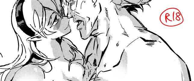
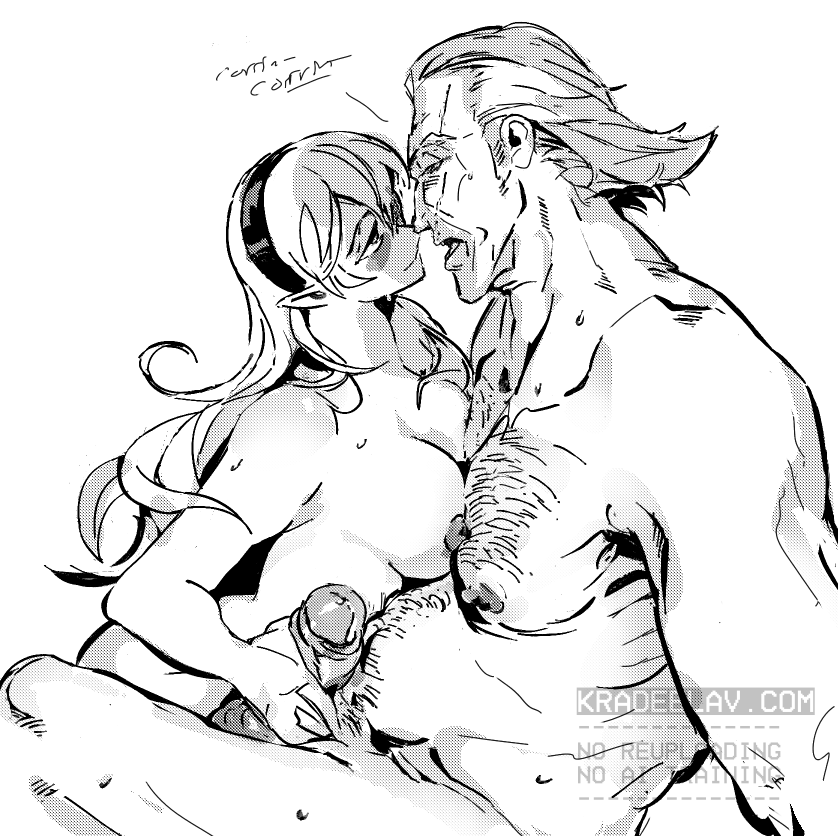
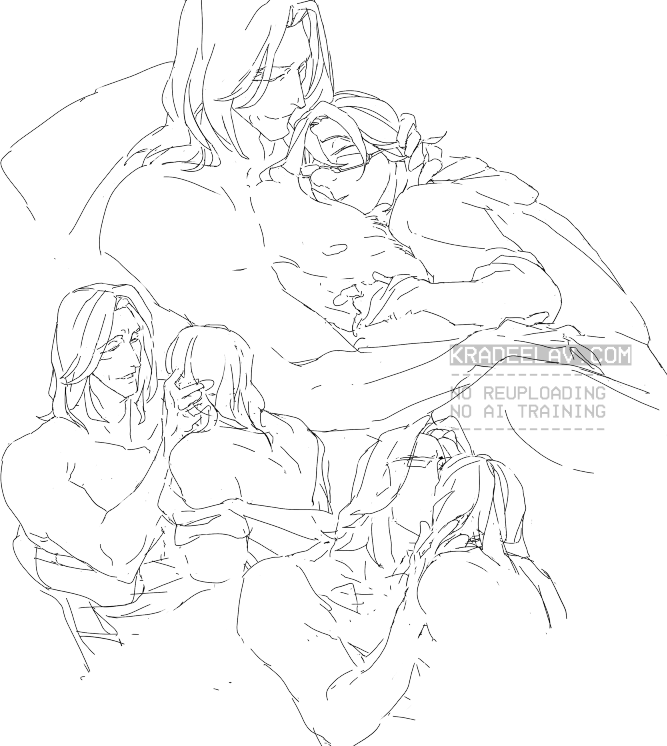
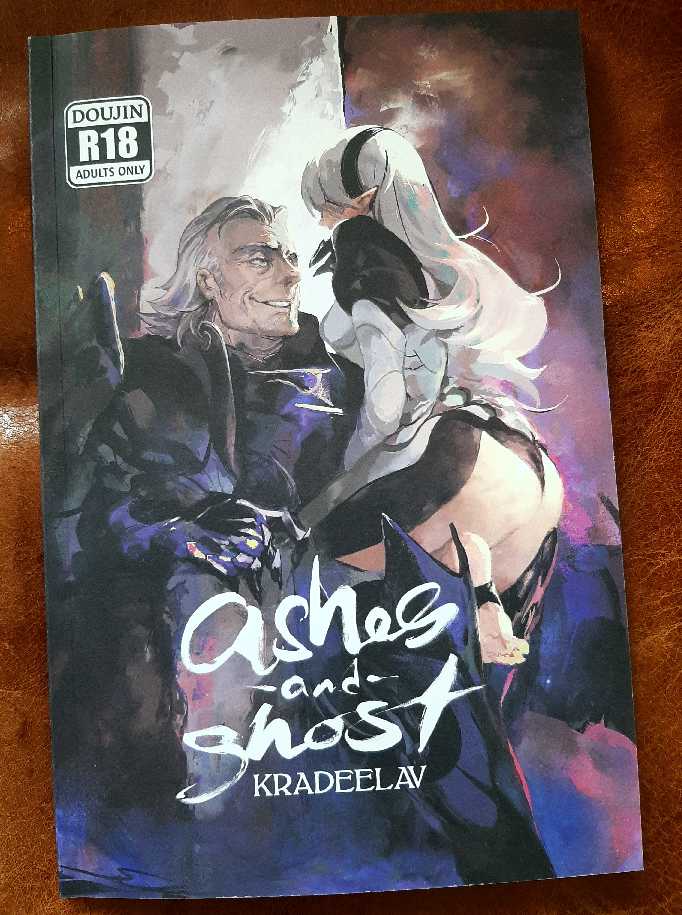
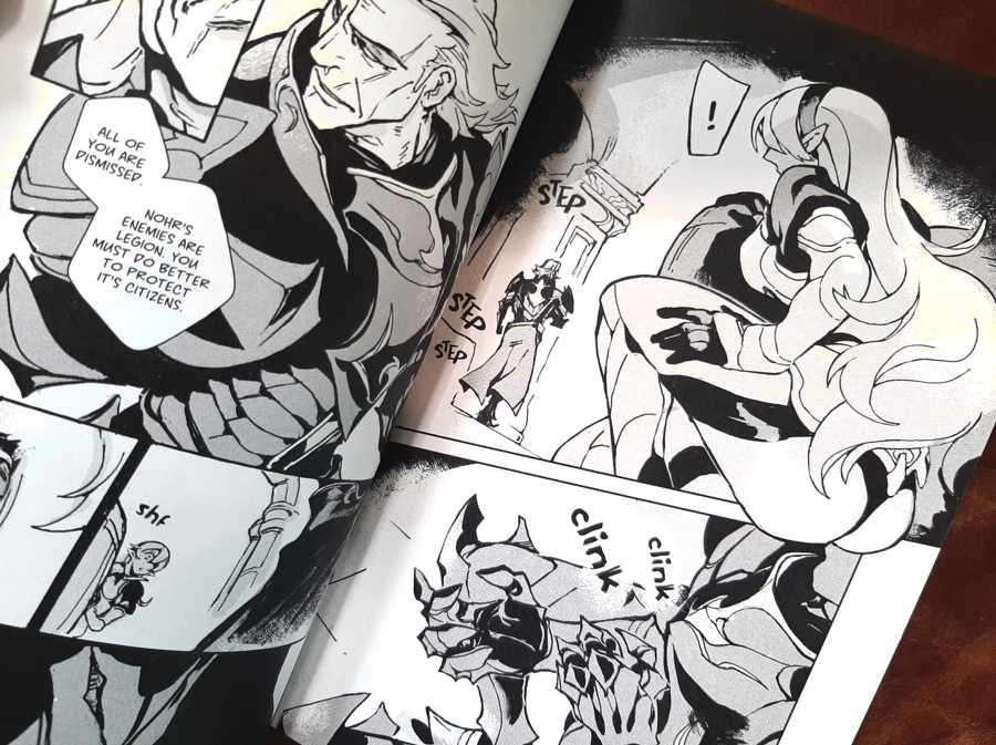
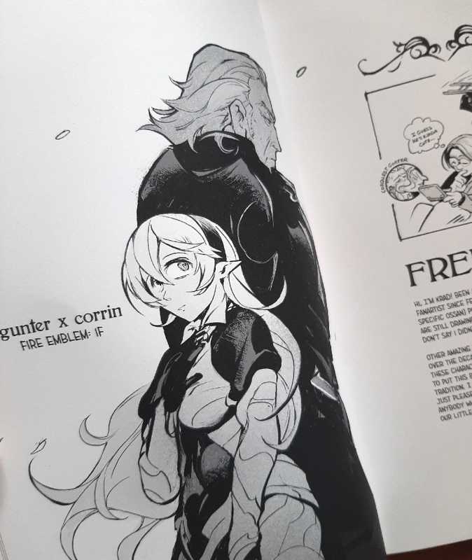
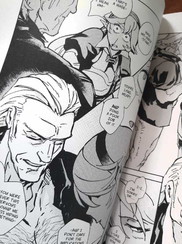
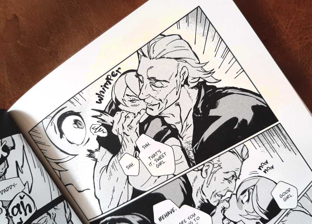
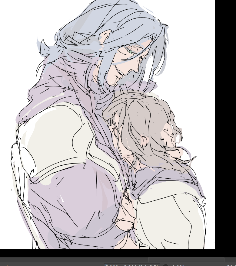
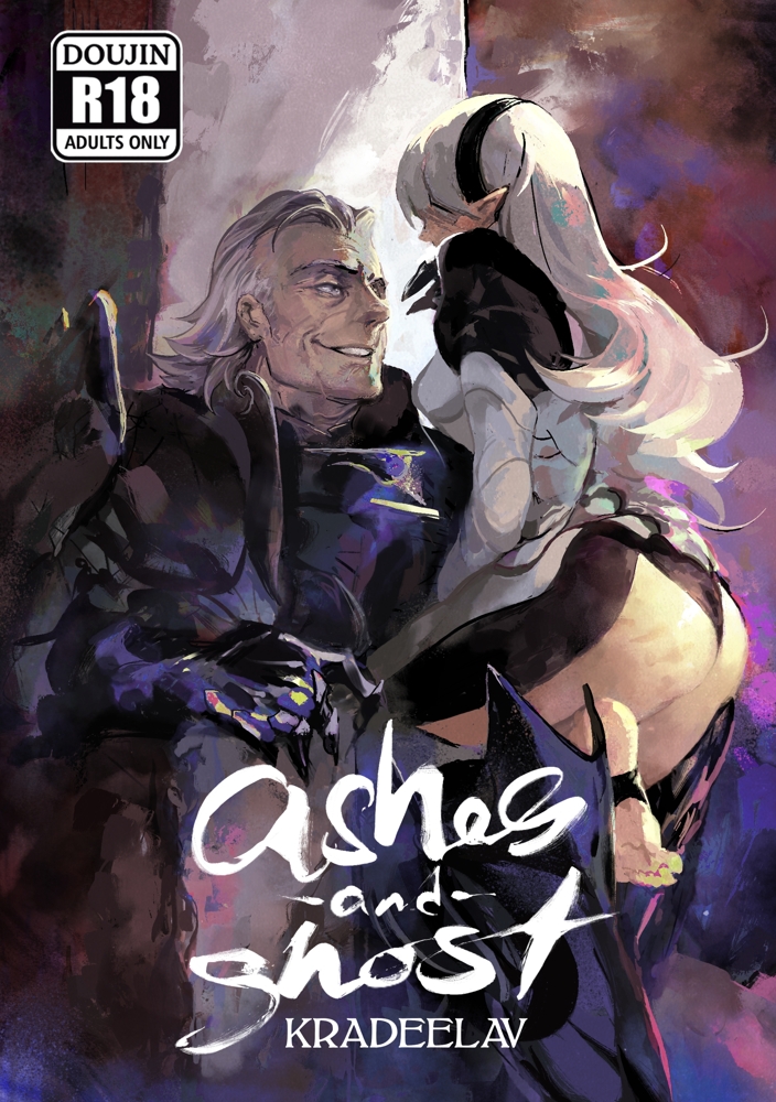
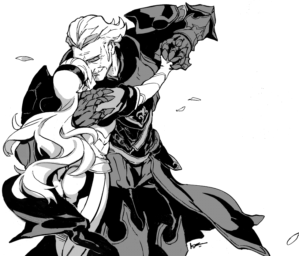
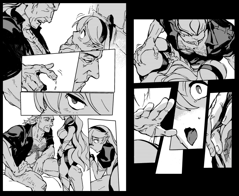
showing off some interiors of this doujin ~ old hats will remember this all got started when I was genuinely annoyed at how it felt like Gunter was the sole #fefates character who didn't have one, haha.
the longer i worked on this, the more I had fun with (dare i say?) the subversiveness of making him as an old man the focus in some incredibly sexy strips, as well as rummaging around the sheer variety of nuanced topics this ship has. i'm glad it resonated with y'all too. thank you ~ ♥
the longer i worked on this, the more I had fun with (dare i say?) the subversiveness of making him as an old man the focus in some incredibly sexy strips, as well as rummaging around the sheer variety of nuanced topics this ship has. i'm glad it resonated with y'all too. thank you ~ ♥
2025年6月 この範囲を時系列順で読む この範囲をファイルに出力する
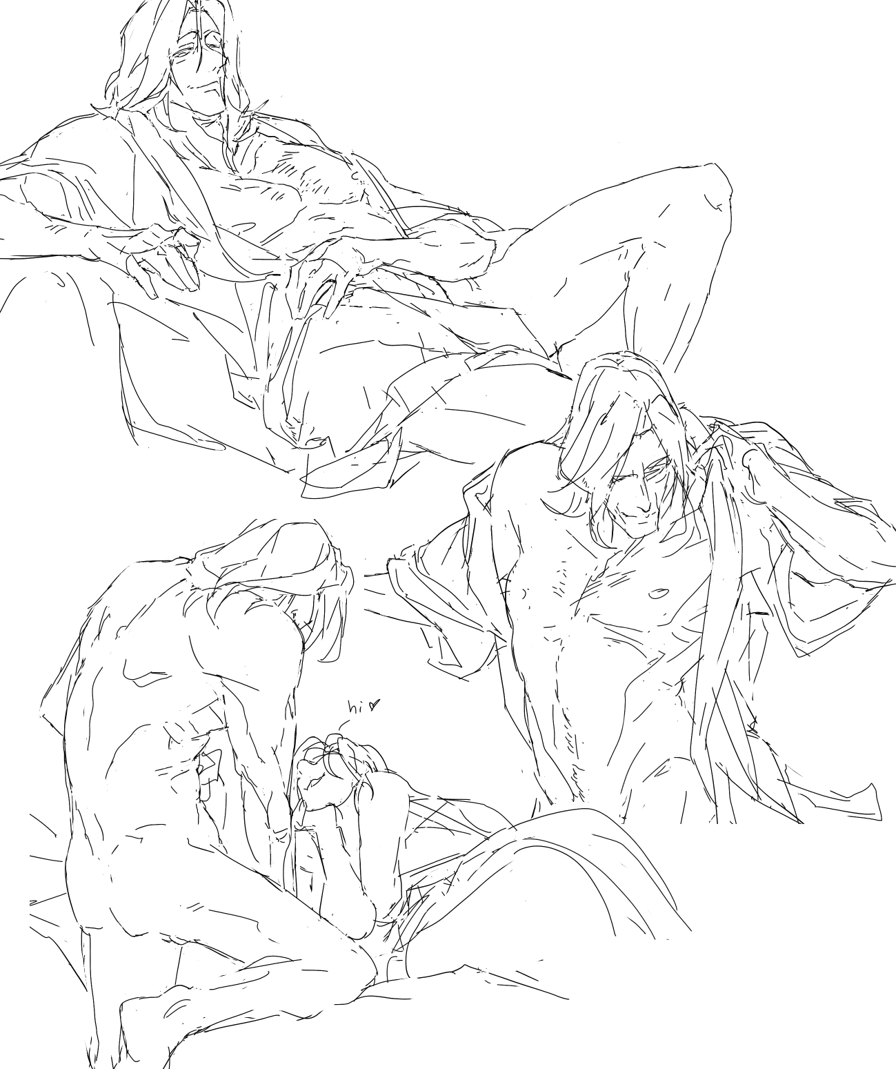
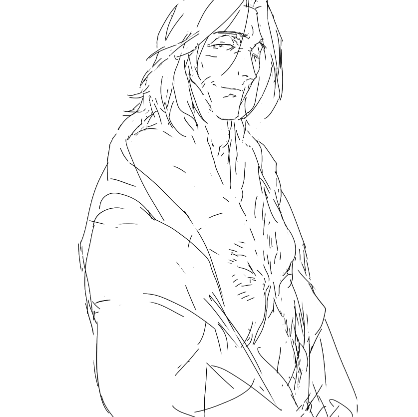
#fetellius #zihark wip. think i'm going to make a doujin for him next, after current projects. :) it's time. been wanting to do it since radiant dawn released. also since i'm quite happy with my inking style now and don't want to immediately change it.
2025.06.16 17:16:46 編集
2025.06.07 23:50:47 編集
2025年5月 この範囲を時系列順で読む この範囲をファイルに出力する
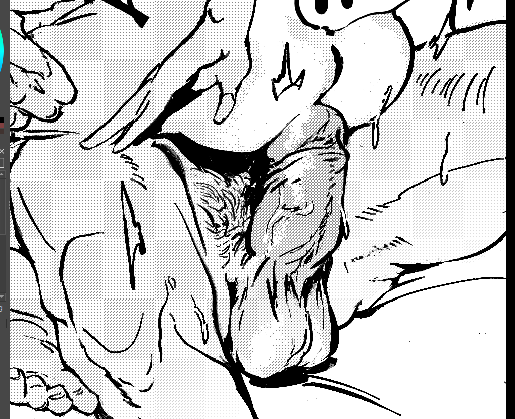
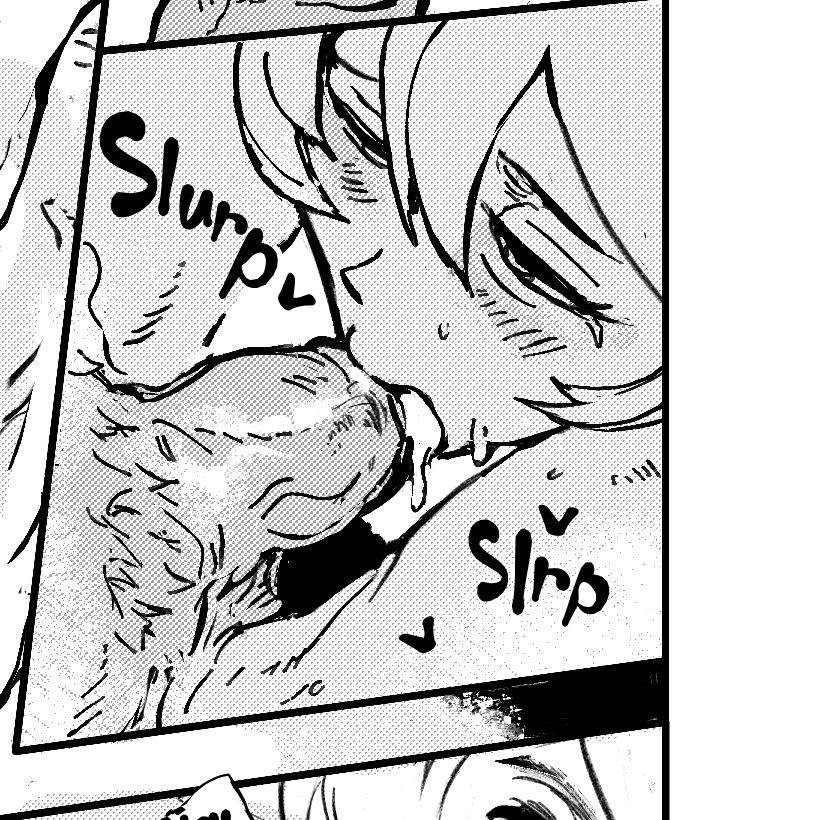
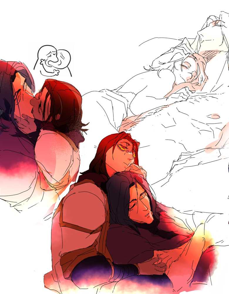
teeny bit of nsfw yume / #zihark art & writing under the cut, don't look at me la la la~
They have a private game every time he wins an arena duel.
____
She had to swallow a few times more before his thick viscosity would allow words without a raven's croak, sweetly savoring how he tasted. The thick salt was like slow and easy victory -- the same tang of his musk in the early hours of the morning when mouths would trail warm flesh and even his war-calloused hands wasn't enough for heedless hunger.
Zihark was making himself decent again, distinctly hampered by the fact of her leaning against his middle. Neither of them seemed to particularly mind the risk of being found out with pants quite literally down.
"You know." Glancing up to see him working his jaw over behind a hand, she smiled. For a man of such grace and poised self control, getting to see him so crudely undone even for a moment was an indulgence. "I hope this doesn't count as bribery or some shit. Some-how I don't think Soren would approve."
Above her, he gave a hard and slight sputter of amusement at that - but it was a real sound of a laugh, the kind he always gave a breath of hesitation after with a hissed intake as if wondering when the last time it had been.
A wave of sudden smothering certainty crashed through her; the kind of boneless certainty that rearranged the guts of the universe itself to where he was indistinguishable from the beating heart itself. Always - her own heart sang, -always - she wanted this beautiful man to have the merest possibility of that laugh. Damn the heavens if it felt otherwise. she would make it happen.
COLLAPSE
2025.05.24 02:22:21 編集
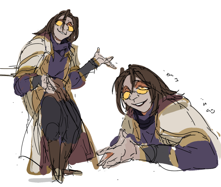
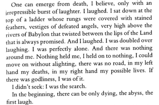
in the beginning, there can be only dying, the abyss, the first laugh.
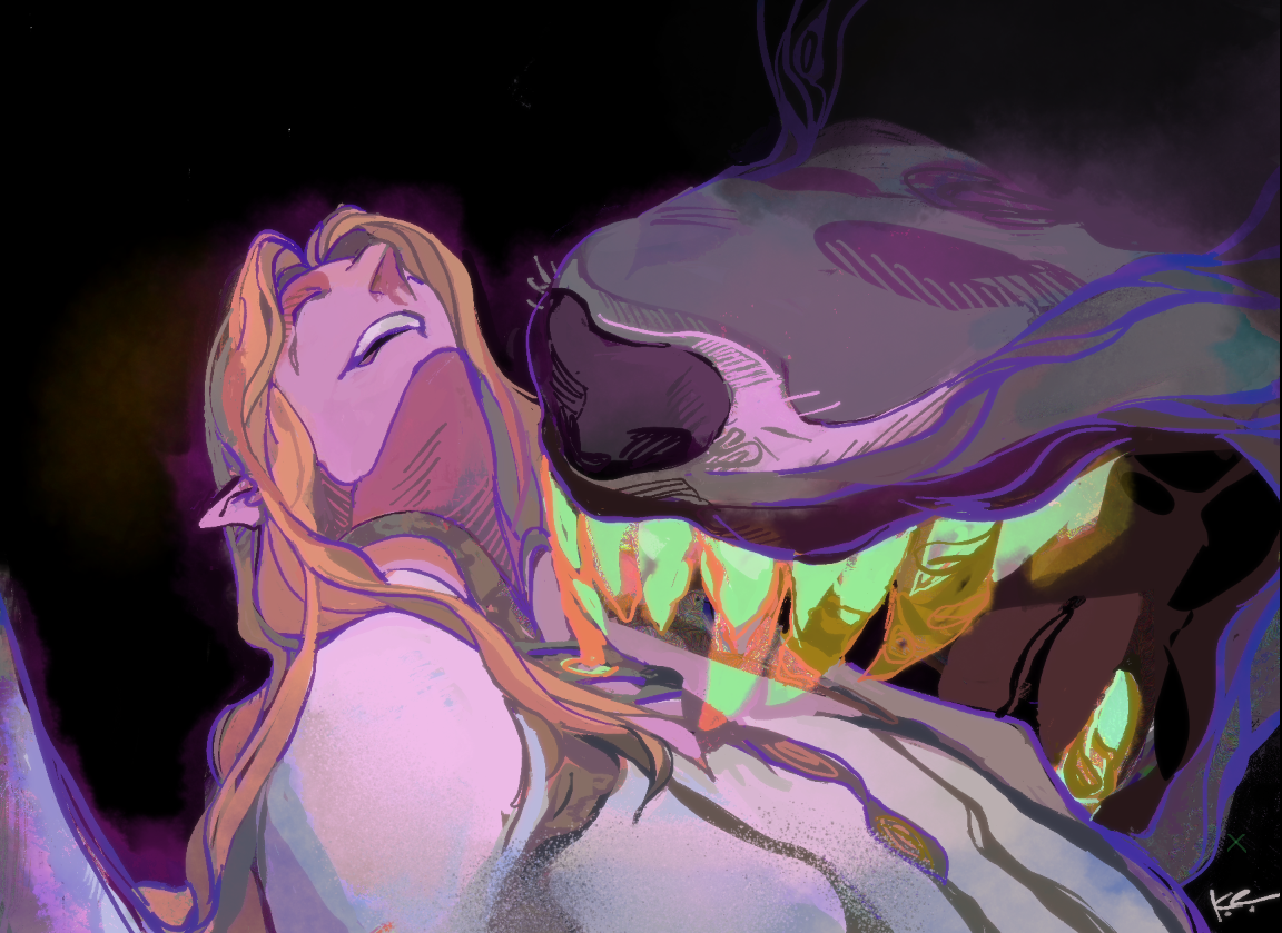
rafiel would have some fuckin kinks.
#fetellius
influences?
"trickster makes the world" book and this line from a different book:
 COLLAPSE
rafiel would have some fuckin kinks.
#fetellius
influences?
"trickster makes the world" book and this line from a different book:
COLLAPSE
2025.05.07 02:49:47 編集
Powered by てがろぐ Ver 4.2.0.
i just think he's neat ~