For a working RSS feed, copy and paste https://kradeelav.com/diary/tegalog.cgi?mode=rss& amp; into your feed reader (delete the space). Enjoy!
2025年9月の投稿[2件]
2025年9月10日 この範囲を時系列順で読む この範囲をファイルに出力する
2025年9月7日 この範囲を時系列順で読む この範囲をファイルに出力する
HOW TO MAKE A 2010's ANIME CELL IN KRITA - QUICK WALKTHROUGH
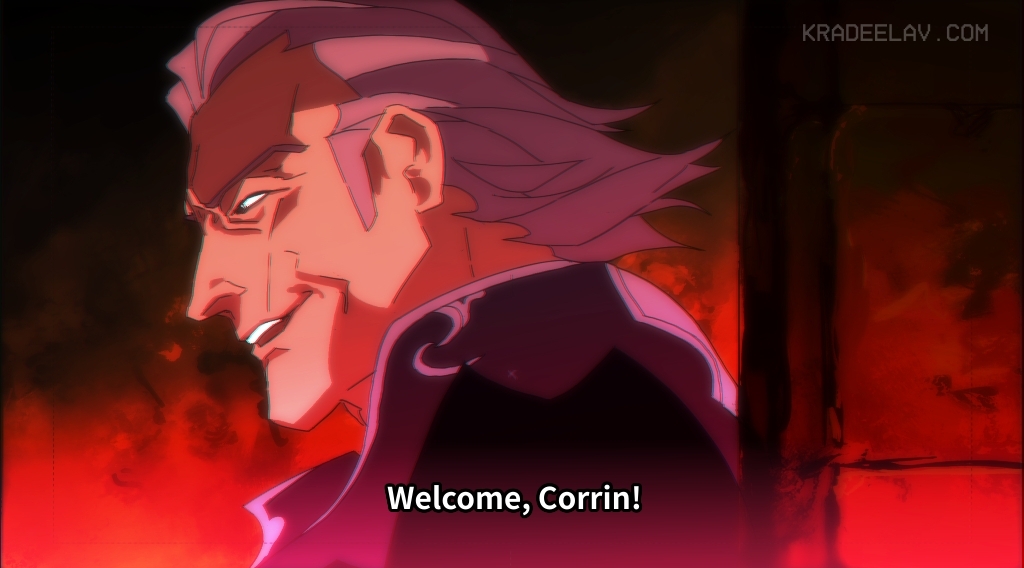
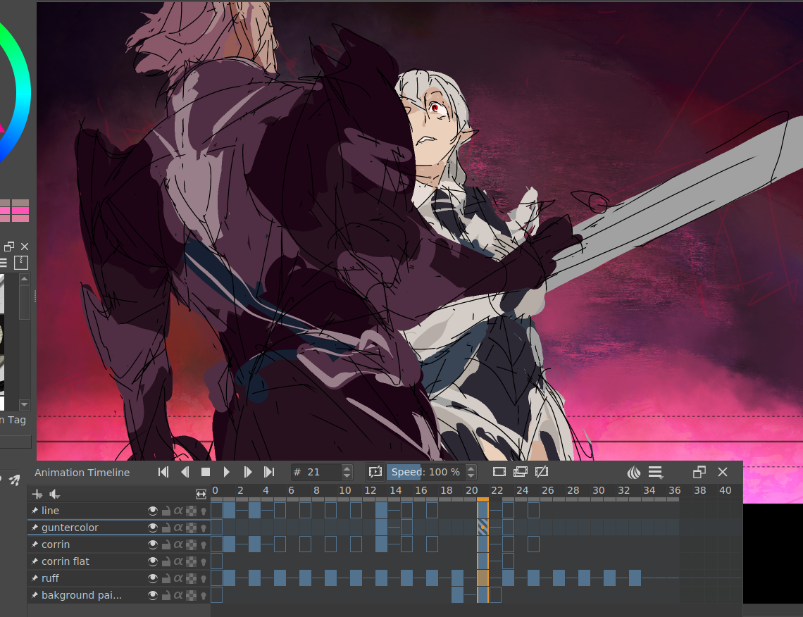
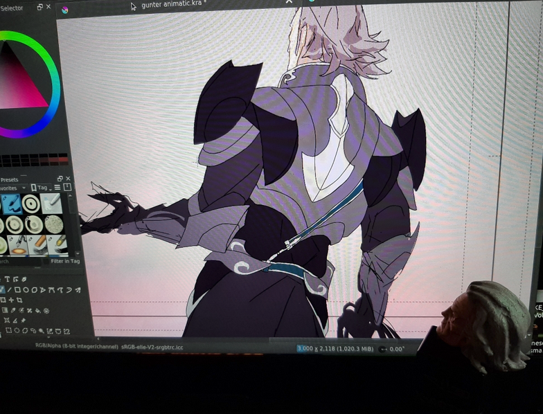
this past week, i went on a bender making a #fefates animatic(?), it ended up being a crash course in how to make realistic anime stills entirely in krita. below is a bullet-point list of critical steps for interested parties. it's not very detailed but should point you to things that helped.
file setup
* use animation template, jp style. delete everything that isn't the white bg + the layout guides
* size: 3000px x 2118, 300dpi
drawing the cell
* generally my "thin line" style that i do roughs and ink with is a "basic 5" brush (in default krita bundle). anti-alias is turned off for crispiness. frankly any small inking pen would do.
* general things to keep in mind: use FEWEST LINES as possible. try to keep shadows also to a minimum or have them cover large simplified shapes.
* tip for cell cleanup: if you go into tool options while using the fill bucket, and under 'reference' 'obtain region with a merged copy of all layers' and the multiple fill 'fill regions only in similar color' and use the fill bucket to paste the same color everywhere you want it, makes cleanup 1000% easier
here's how the cell looked with a previous bg i scrapped, and also some other wip cells
drawing the background
* going to be different depending on how organic the BG is - though you'll probably always start by slapping some gradients down first
* for rocky cave texture, big fudopen with flow down to 18 (for all brushes mentioned, here's the bundle i think i got them from. https://www.youtube.com/watch?v=nI_DFuSf... )
* smudge with inkP 25 blender water as needed
* finesse stone texture with inkp 25 penpoc (incidentally my favorite chonky b/w manga inking pen)
* throw down more layers with freeze-reflect style (layer style might not be in the defaults, you might have to look for it and tick the check box on)
compositing
* watch all of this video! https://www.youtube.com/watch?v=jv4axtpn... it's not krita but it's a very in depth tutorial teaching you why anime composites look like that.
* here's the funny part.... SCREENSHOT your final merged cell+bg. this will naturally give it the 'jpg 360dpi crunch'.
* in your new composite file, add a few more freeze-reflect gradients aiming for a specific color hue. this was actually originally more a dusty brown/yellow overall but red fit better.
* below, see critical trio of layer effects:
-> copy of merged cell/bg, 50% opacity (guass blur, 15px, hard overlay layer style)
-> copy of merged cell/bg 50% opacity (guass blur, 15px, lighten layer style)
-> background - (no blur, normal layer style)
-> possibly add an "addition" gradient layer along the bottom or top if it needs it
* subtitles: my font: noto sans jp (but lots of good alternatives and research here: https://www.md-subs.com/blog/saa-subtitl... )
* at the very very end: YA GOTTA SEPARATE CHANNELS and then nudge them by a pixel left or right. i have tried every other trick to get the color bleed approach and nothing looks nearly as realistic. here's how to do it in krita https://docs.krita.org/en/reference_manu...
fin!COLLAPSE
Powered by てがろぐ Ver 4.2.0.
□ https://archiveofourown.org/works/522583...
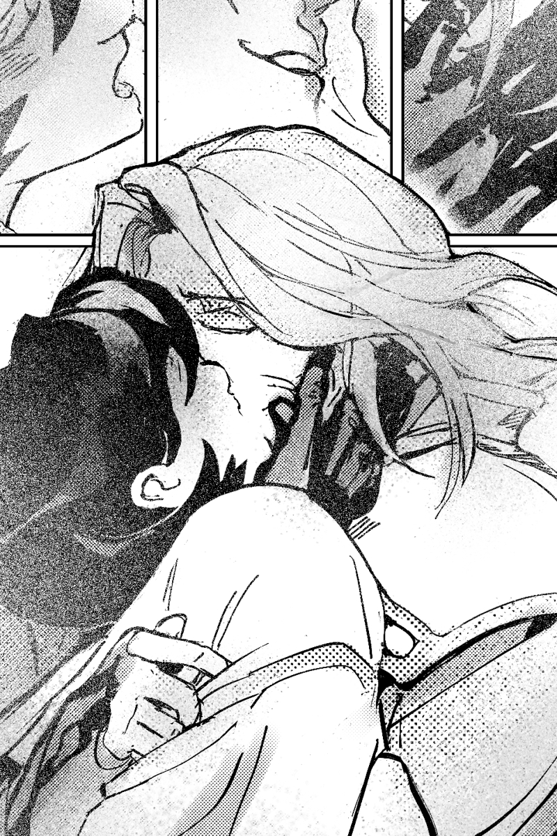
[ illustrating my #fefates Gunter/f!Corrin slowburn romance fic where they both earn their happy ending. Revelation route. ]