For a working RSS feed, copy and paste https://kradeelav.com/diary/tegalog.cgi?mode=rss& amp; into your feed reader (delete the space). Enjoy!
2024年9月の投稿[176件](2ページ目)
2024年9月2日 この範囲を時系列順で読む この範囲をファイルに出力する
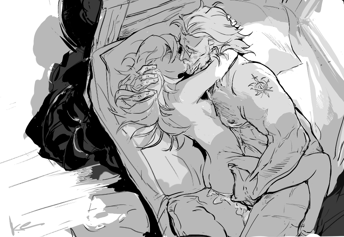
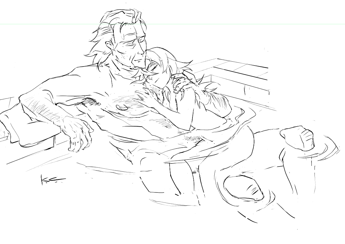
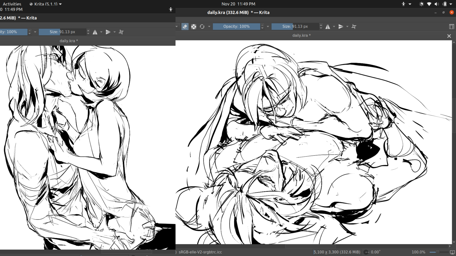
so one of the technical bits i challenged myself with this gunter/corrin doujin was to:
(a) figure out an efficient process for professional multi-page artistic works in linux/true OSS programs - from ideation all the way to printer hand-off.
(b) and a process that fit well with my brain and kept me from spinning my wheels endlessly redoing pages. it’s a common problem with longer projects (aka why you see reboots of webcomics all the time, and also why i haven’t been able to get “what greater sin” out for three years cuz i sucked at this lol).
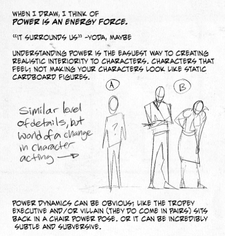
why the focus on process though?
after mastering a certian degree of technical proficiency. it’s what separates the hobbyist artists from the pros. not to toot my horn, but i’m quite good at project management process at work, and about two years ago it dawned on me to take some of that learned knowledge and actually apply it here if only to save eyestrain/wrist-strain time.
worklazier smarter, not harder etc.
before i get into the process outline, there’s two programs that are doing the heavy lifting since i gave them a trial run with the last anthology and they worked great in tandem. (both cost no money and are available on all major OS’s btw)
krita - my main drawing program. sketching/inking/speech bubbles/coloring/vector stuff can all be done here.
libreoffice writer - basically microsoft word for linux. i use it for arranging multiple pages, reordering, and exporting as .pdf to give to the printer (while amazing at rendering, krita can’t export as pdf or show multi-pages)
so!
process wise, it occurred to me not too long ago that i needed to consolidate my multi-page creative projects into 3 major gates.
thumbnail sketches
proof of concept layout
“last 10” final
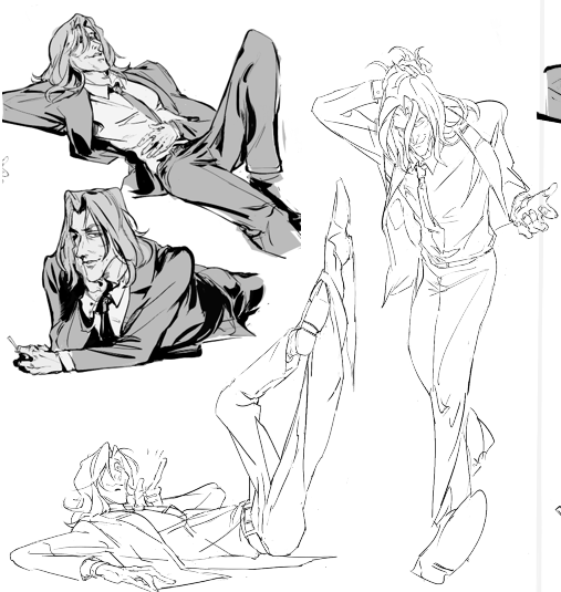
thumbnail sketches
thumbnails are a common concept in comics, but they’re great for print front/back matter too. thumbnails ain’t here to look pretty, their sole purpose to get the idea from your noggin to on the page.
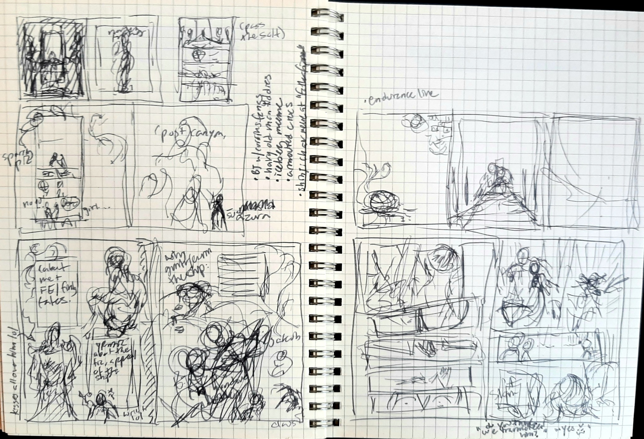
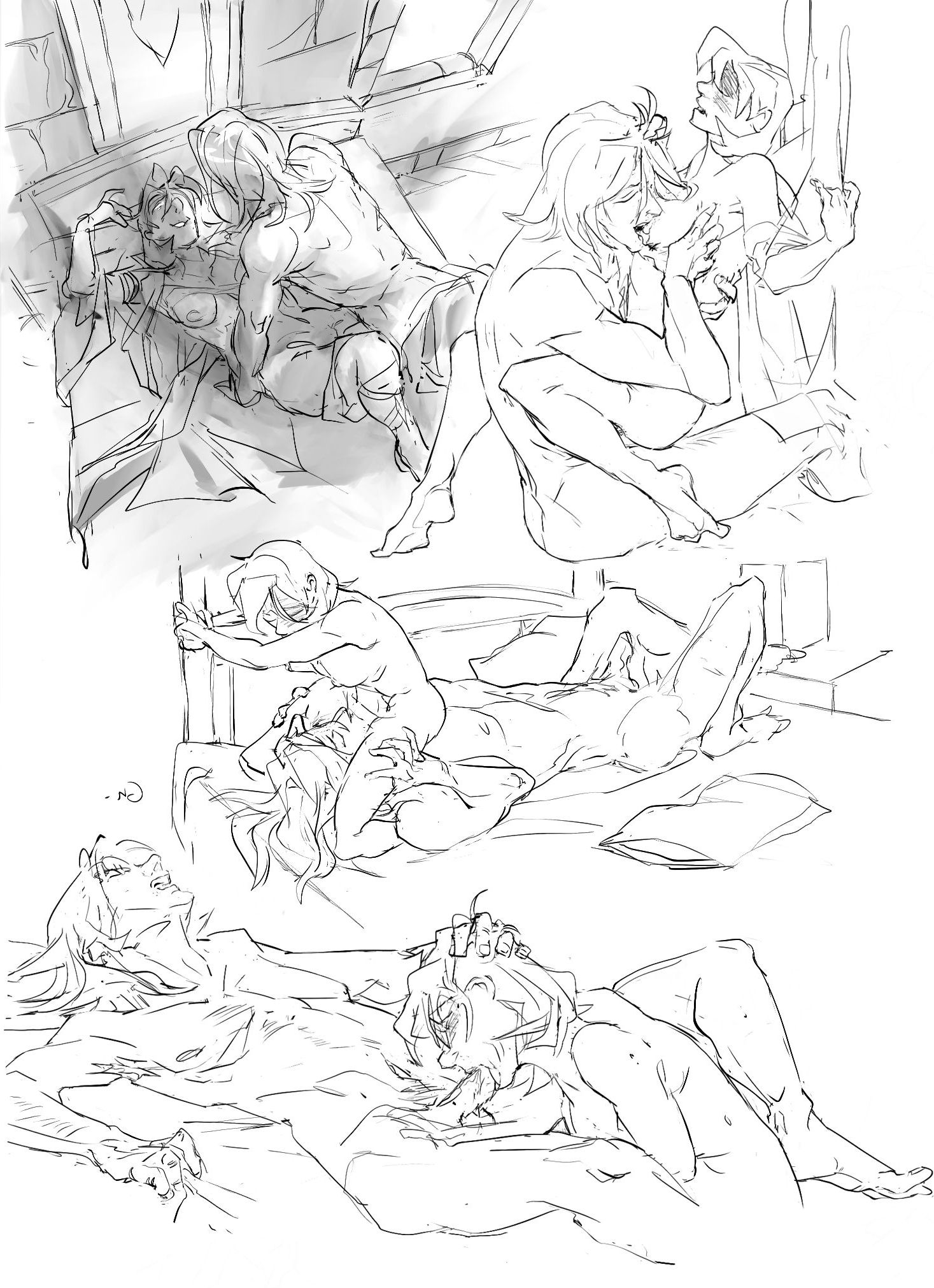
here’s a completely unaltered spread from my journal with a ton of thumbs and notes for this doujin.
so what’s the kind of stuff i think about with thumbs?
how panels in a comic fit together with the major emotional beats + line of action. does the eye follow the pages naturally? do you “feel” the emotional impact?
does the compositions work with each other? negative/positive space, weight on top or bottom or diagonally, etc. do the pages feel claustrophobic or too empty? do they breathe?
decorative framing elements that reflect the tone you want + how they generally lead the eye across the page
random notes about overall tone or potential future pages
etcetc
at this point i import that digitally, and start drawing a proper sketch off of it.
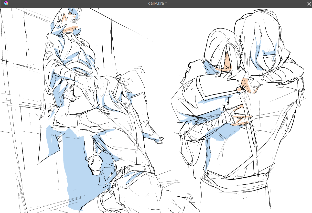
fast forward from that sketch to: “proof of concept” layout
i’m calling this proof of concept instead of a draft as they serve different purposes. a draft is a half-finished work you can just screenshot and show to anyone for feedback (like comms). proof of concept here is showing a certian level of completeness across draft pages to measure consistency.
lack of consistency is the mind killer killer of comics.
proof of concept is specifically meant to nip the ‘fizzled out halfway’ issues in the bud. it’s to show you how cool it looks altogether already, but also shed a light on problem areas that are potentially popping up on the earlier side, so there’s less time wasted.
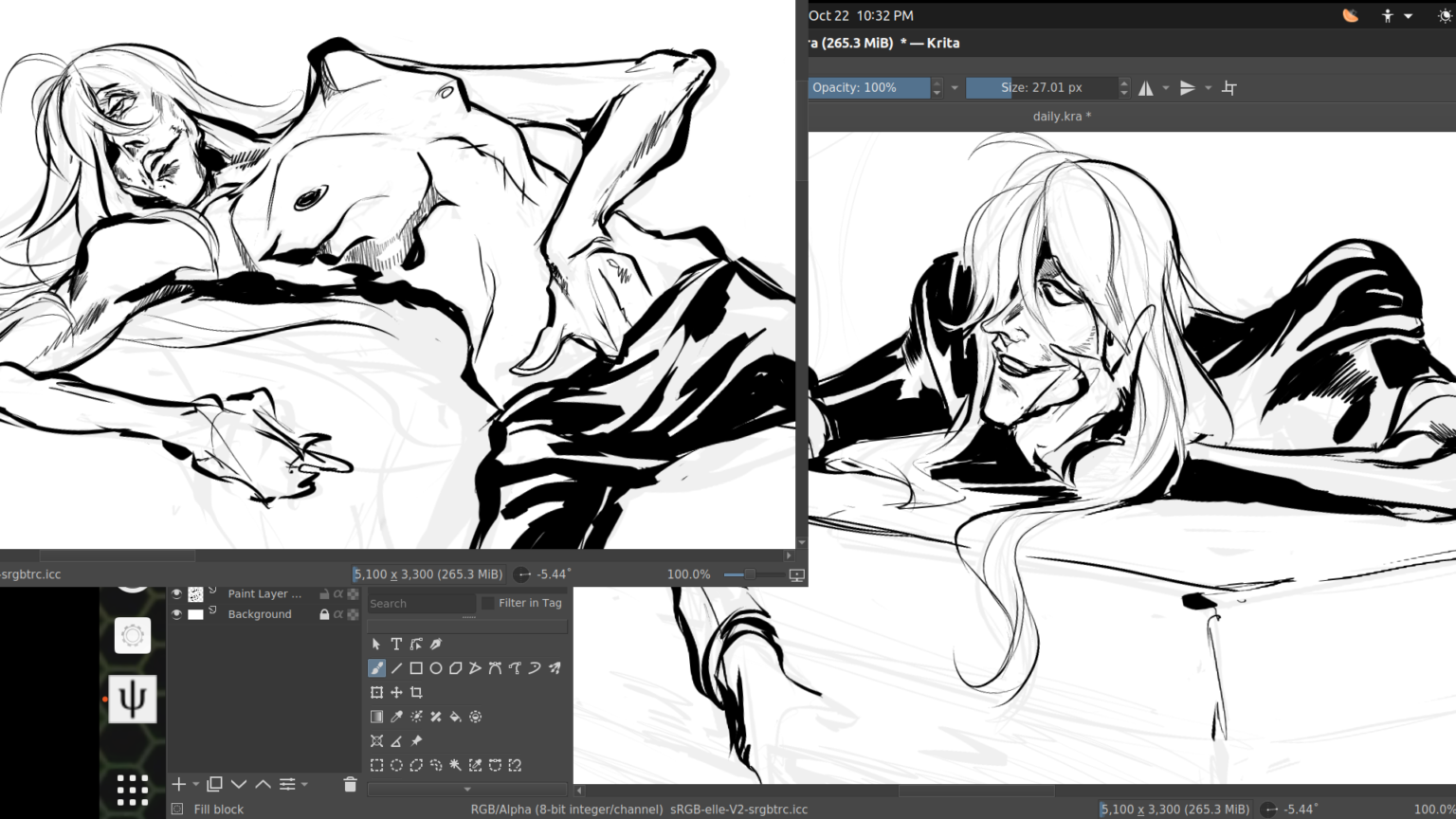
this is a little premature in the process for a proof of concept screenshot, but you get the idea here in a later strip, shown here as screenshots imported into libreoffice writer:
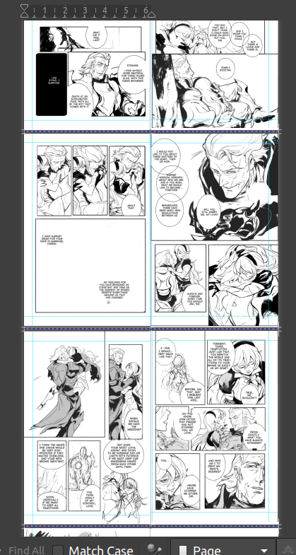
another reason that made libreoffice writer essential is the accurate 2-page spread view. between that, being able to resize the page to whatever you need, and the very easy pdf exporter (with customizable compression), i don’t know if i could do this kind of project here.
now, backing up - what kinds of consistency are we checking for here?
does the inking/coloring style change noticeably in a jarring way?
is there one comic strip that the pacing/paneling sucks in comparison to the others? or feels awkwardly added in tone and perhaps better saved for a different project?
is there one panel within a sequential series that’s torturing you? what’s the best way to throw it out and redo it even faster?
do the front/back matter support the meat of the inside in a clever, on-tone way?
did you accidentally change the font halfway through after you liked your new shiny toy? which one works better?
etc
keep in mind we’re not just checking the consistency in one strip, it’s for the book as a whole.
and then lastly, “the last ten” final
“the last ten” is a mental concept i’ve used for the last ten years for single comic pages. it’s especially tempting to noodle over endlessly making one comic page perfect, when you could have done ten reasonably good ones in the same time, and so i made this my last step making IC pages.
once when you approach a level of reasonably done, but kinda hate the page and are procrastinating on getting it out, stop, rest your eyes overnight, and list the last ten minor things you’d change.
once when you’ve changed those? out the door it goes. now, i’m gonna switch to a different project but here’s a good example of a “last ten” stage applied to illustrations when i did fallen!gunter’s FEH mockups.
looks pretty complete, right? WRONG :D i can’t remember the exact last ten i used, but it was something like:
too much of one specific glowy purple on both, i wanted more contrast with the red glow + “water” texture
needed more effects on the first image to better match FEH’s aesthetic
change Leigh’s credits after they got a chance to see it and give the thumbs up
knee/shin on left looks unfinished painting wise, clean up
missing chest plate silver decorations on left, clean up
etc
this is the last hail mary check to hack your brain into being satisfied with the page. you’ve had your say, onwards to the next one. now, you can also have an additional 'last ten’ for the project as a whole. but it’s especially critical for comic pages to help keep the momentum/tempo/pace going.
anyway! we’ll see how all of this actually works in practice depending on how fast i can get this doujin out. :)
COLLAPSE
(a) figure out an efficient process for professional multi-page artistic works in linux/true OSS programs - from ideation all the way to printer hand-off.
(b) and a process that fit well with my brain and kept me from spinning my wheels endlessly redoing pages. it’s a common problem with longer projects (aka why you see reboots of webcomics all the time, and also why i haven’t been able to get “what greater sin” out for three years cuz i sucked at this lol).
why the focus on process though?
after mastering a certian degree of technical proficiency. it’s what separates the hobbyist artists from the pros. not to toot my horn, but i’m quite good at project management process at work, and about two years ago it dawned on me to take some of that learned knowledge and actually apply it here if only to save eyestrain/wrist-strain time.
work
before i get into the process outline, there’s two programs that are doing the heavy lifting since i gave them a trial run with the last anthology and they worked great in tandem. (both cost no money and are available on all major OS’s btw)
krita - my main drawing program. sketching/inking/speech bubbles/coloring/vector stuff can all be done here.
libreoffice writer - basically microsoft word for linux. i use it for arranging multiple pages, reordering, and exporting as .pdf to give to the printer (while amazing at rendering, krita can’t export as pdf or show multi-pages)
so!
process wise, it occurred to me not too long ago that i needed to consolidate my multi-page creative projects into 3 major gates.
thumbnail sketches
proof of concept layout
“last 10” final
thumbnail sketches
thumbnails are a common concept in comics, but they’re great for print front/back matter too. thumbnails ain’t here to look pretty, their sole purpose to get the idea from your noggin to on the page.
here’s a completely unaltered spread from my journal with a ton of thumbs and notes for this doujin.
so what’s the kind of stuff i think about with thumbs?
how panels in a comic fit together with the major emotional beats + line of action. does the eye follow the pages naturally? do you “feel” the emotional impact?
does the compositions work with each other? negative/positive space, weight on top or bottom or diagonally, etc. do the pages feel claustrophobic or too empty? do they breathe?
decorative framing elements that reflect the tone you want + how they generally lead the eye across the page
random notes about overall tone or potential future pages
etcetc
at this point i import that digitally, and start drawing a proper sketch off of it.
fast forward from that sketch to: “proof of concept” layout
i’m calling this proof of concept instead of a draft as they serve different purposes. a draft is a half-finished work you can just screenshot and show to anyone for feedback (like comms). proof of concept here is showing a certian level of completeness across draft pages to measure consistency.
lack of consistency is the mind killer killer of comics.
proof of concept is specifically meant to nip the ‘fizzled out halfway’ issues in the bud. it’s to show you how cool it looks altogether already, but also shed a light on problem areas that are potentially popping up on the earlier side, so there’s less time wasted.
this is a little premature in the process for a proof of concept screenshot, but you get the idea here in a later strip, shown here as screenshots imported into libreoffice writer:
another reason that made libreoffice writer essential is the accurate 2-page spread view. between that, being able to resize the page to whatever you need, and the very easy pdf exporter (with customizable compression), i don’t know if i could do this kind of project here.
now, backing up - what kinds of consistency are we checking for here?
does the inking/coloring style change noticeably in a jarring way?
is there one comic strip that the pacing/paneling sucks in comparison to the others? or feels awkwardly added in tone and perhaps better saved for a different project?
is there one panel within a sequential series that’s torturing you? what’s the best way to throw it out and redo it even faster?
do the front/back matter support the meat of the inside in a clever, on-tone way?
did you accidentally change the font halfway through after you liked your new shiny toy? which one works better?
etc
keep in mind we’re not just checking the consistency in one strip, it’s for the book as a whole.
and then lastly, “the last ten” final
“the last ten” is a mental concept i’ve used for the last ten years for single comic pages. it’s especially tempting to noodle over endlessly making one comic page perfect, when you could have done ten reasonably good ones in the same time, and so i made this my last step making IC pages.
once when you approach a level of reasonably done, but kinda hate the page and are procrastinating on getting it out, stop, rest your eyes overnight, and list the last ten minor things you’d change.
once when you’ve changed those? out the door it goes. now, i’m gonna switch to a different project but here’s a good example of a “last ten” stage applied to illustrations when i did fallen!gunter’s FEH mockups.
looks pretty complete, right? WRONG :D i can’t remember the exact last ten i used, but it was something like:
too much of one specific glowy purple on both, i wanted more contrast with the red glow + “water” texture
needed more effects on the first image to better match FEH’s aesthetic
change Leigh’s credits after they got a chance to see it and give the thumbs up
knee/shin on left looks unfinished painting wise, clean up
missing chest plate silver decorations on left, clean up
etc
this is the last hail mary check to hack your brain into being satisfied with the page. you’ve had your say, onwards to the next one. now, you can also have an additional 'last ten’ for the project as a whole. but it’s especially critical for comic pages to help keep the momentum/tempo/pace going.
anyway! we’ll see how all of this actually works in practice depending on how fast i can get this doujin out. :)
COLLAPSE
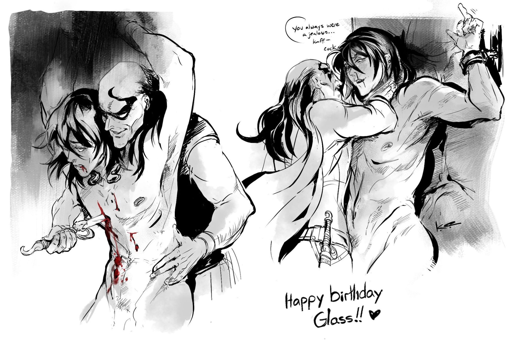
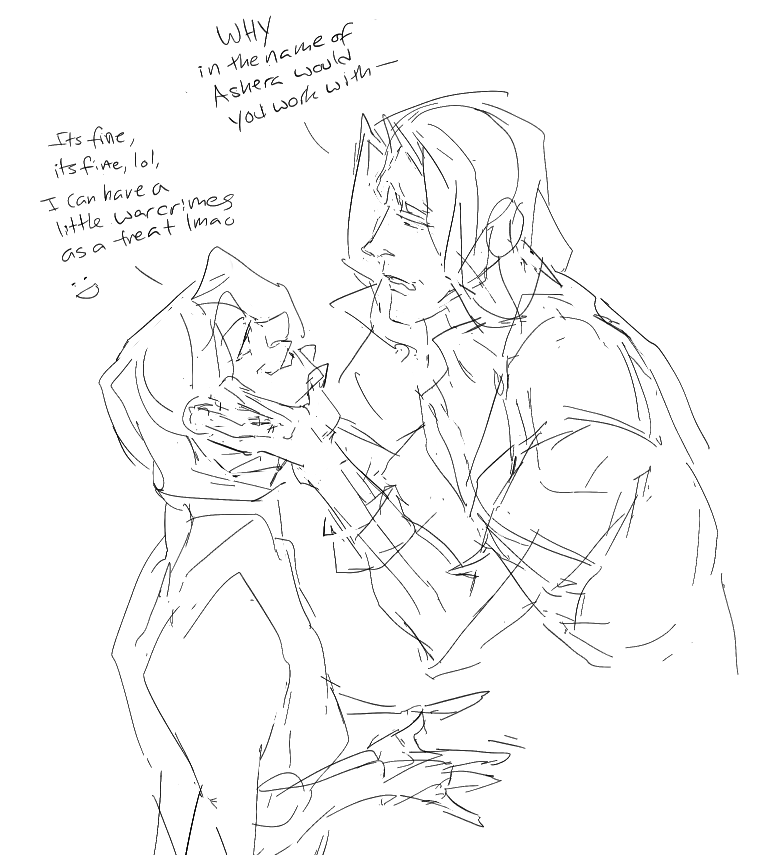
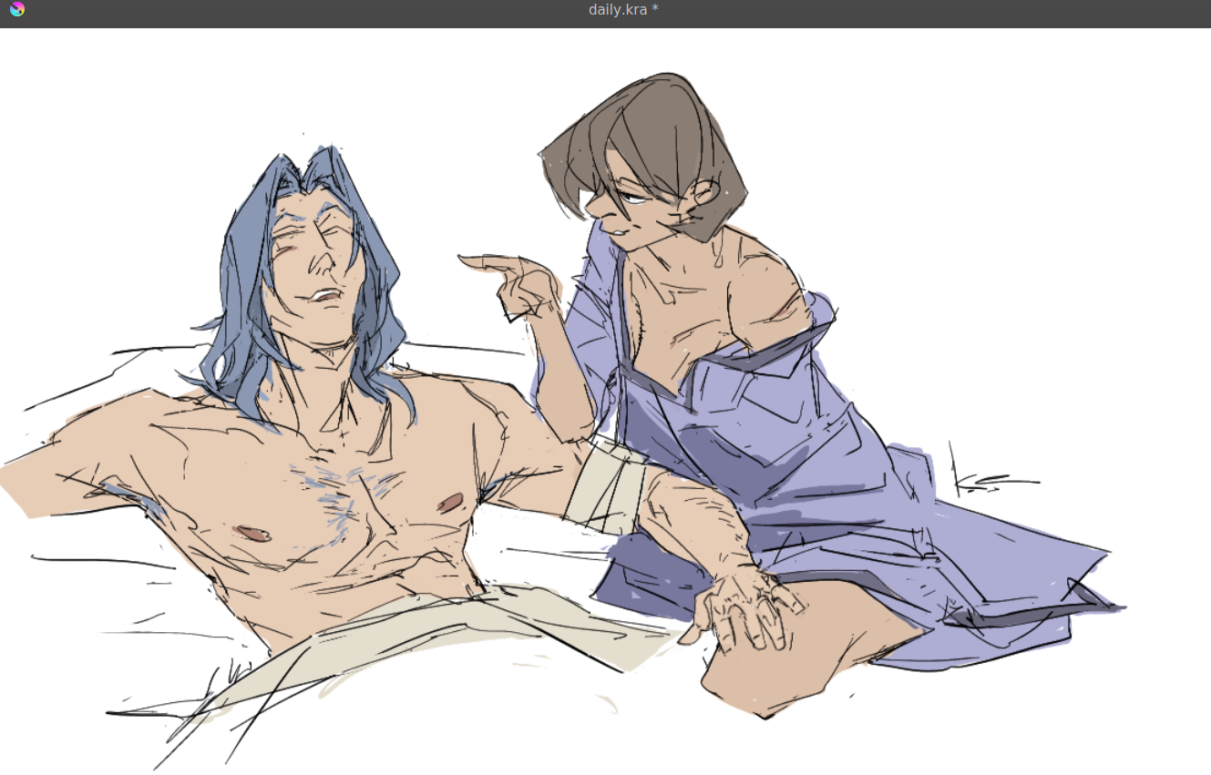
a very, very happy birthday to the incredible @glassshard ! hats off to the dear @forumkedis for instigating this; we figured your boys from unsounded would be a treat for you, especially in such … compromising … positions ~
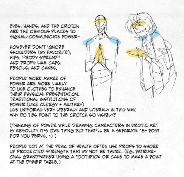
notes on drawing old people:
* morpho’s skin + fat book is an invaluable reader for an easily-digested anatomy study. here’s that book plus a few others. please support the author if you can.
* like other naturalistic carbon life forms in nature, lines don’t have to be perfect. (personally i find tiktok-standard young people the hardest ones to draw because if you draw a line with the eye a smidge off, it looks weird. old people, you got a lot of forgiveness in them lines. hell, multiple lines just look good as wrinkles.)
*fleshy things sag, and they always sag towards gravity (down). if you had to pick three major areas to draw, the bit under people’s chin, the tits (unisex), and the belly are generally the main three.
* a cluster of wrinkles tend to pop up in joints that bend a lot, notably knuckles, elbows, and knees. those same joints have a habit of enlarging, whether due to inflammation, or the surrounding muscle wasting away a bit.
* you move real slowly and your range of motion is a lot more limited because joints hurt in particular. (aka your hands/elbows/neck/shoulders can’t reach shit they used to.) old people’ll often have canes/back-scratchers/etc discretely within range to help with this, to almost act as a limb-extender.
* with necks in particular, you tend to move your whole upper body in one piece rather than your neck twisting independently from the shoulders.
* … and you really don’t want to fall, and maybe your eyesight’s going too. so you’re always double checking whether or not your surroundings are stable. old people sit down gingerly (hands might grasp a table or railing several times for the best position), and gravity is not your friend getting up either.
* backs tend to hunch over and stay in the bent position. because of this, and the muscles wasting a way, old people often tend to look like they “shrink” slightly versus an adult in their prime. a notable exception is people who’ve had military training, and the difference is striking.
* lastly, when in doubt, watch some videos of some old people even just for a few seconds, and mentally sketch out how you’d draw the freeze-frames. which bits move, and which bits stay stationary?
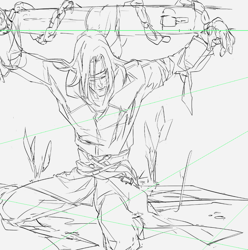
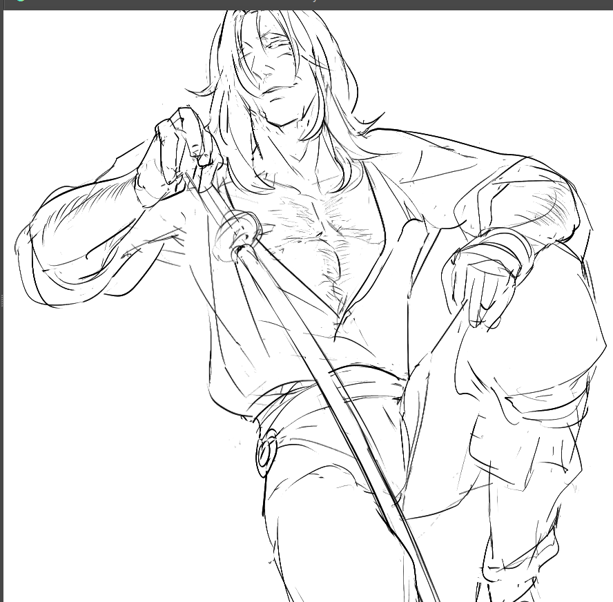
drawing tip! when i clean up a gestural sketch straight into a clean line work (I don’t sketch on different layers), there’s some lines that if you erase these specific lines, the picture immediately looks pretty fugly.
I joke these lines should be called “load bearing lines’ - borrowing a term from building construction (load bearing beam) where if you remove the beam, the house becomes structurally unstable.
these load bearing lines are different than outlines around the form, or even invisible skeletal lines. these can be as subtle as curving around the waist as a belt and transforming into a cloth fold, and back into hair. the key is the load bearing line keeps the eye moving in an arc.
below you can see the few lines in the torso that i’d say fit the description, and a before/after.
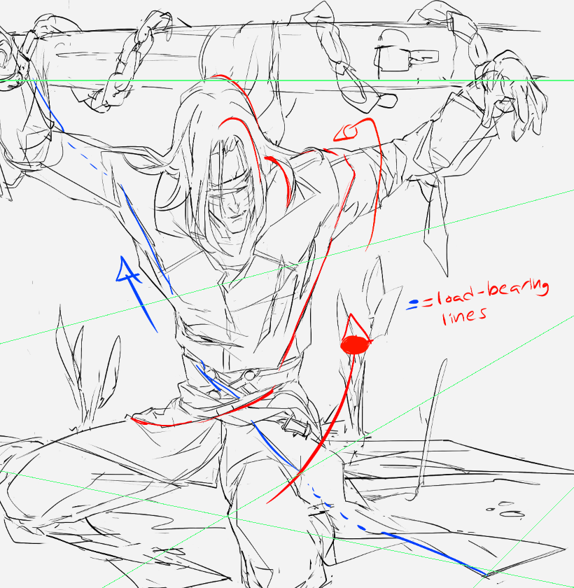
the red line is the key since it wraps around the form in 3 axis (left/right, towards you/behind the guy, and from bottom/up, and also is a guide-line for your eye to follow along. there’s other "echoes” of the load bearing line particularly in the hair; always a good idea to have to keep that one smooth motion going.
see what I mean?
these load bearing lines “can” be briefly broken up (see blue line around left shoulder) but should still attempt to use negative space as part of the continuation. try it! :>
I joke these lines should be called “load bearing lines’ - borrowing a term from building construction (load bearing beam) where if you remove the beam, the house becomes structurally unstable.
these load bearing lines are different than outlines around the form, or even invisible skeletal lines. these can be as subtle as curving around the waist as a belt and transforming into a cloth fold, and back into hair. the key is the load bearing line keeps the eye moving in an arc.
below you can see the few lines in the torso that i’d say fit the description, and a before/after.
the red line is the key since it wraps around the form in 3 axis (left/right, towards you/behind the guy, and from bottom/up, and also is a guide-line for your eye to follow along. there’s other "echoes” of the load bearing line particularly in the hair; always a good idea to have to keep that one smooth motion going.
see what I mean?
these load bearing lines “can” be briefly broken up (see blue line around left shoulder) but should still attempt to use negative space as part of the continuation. try it! :>
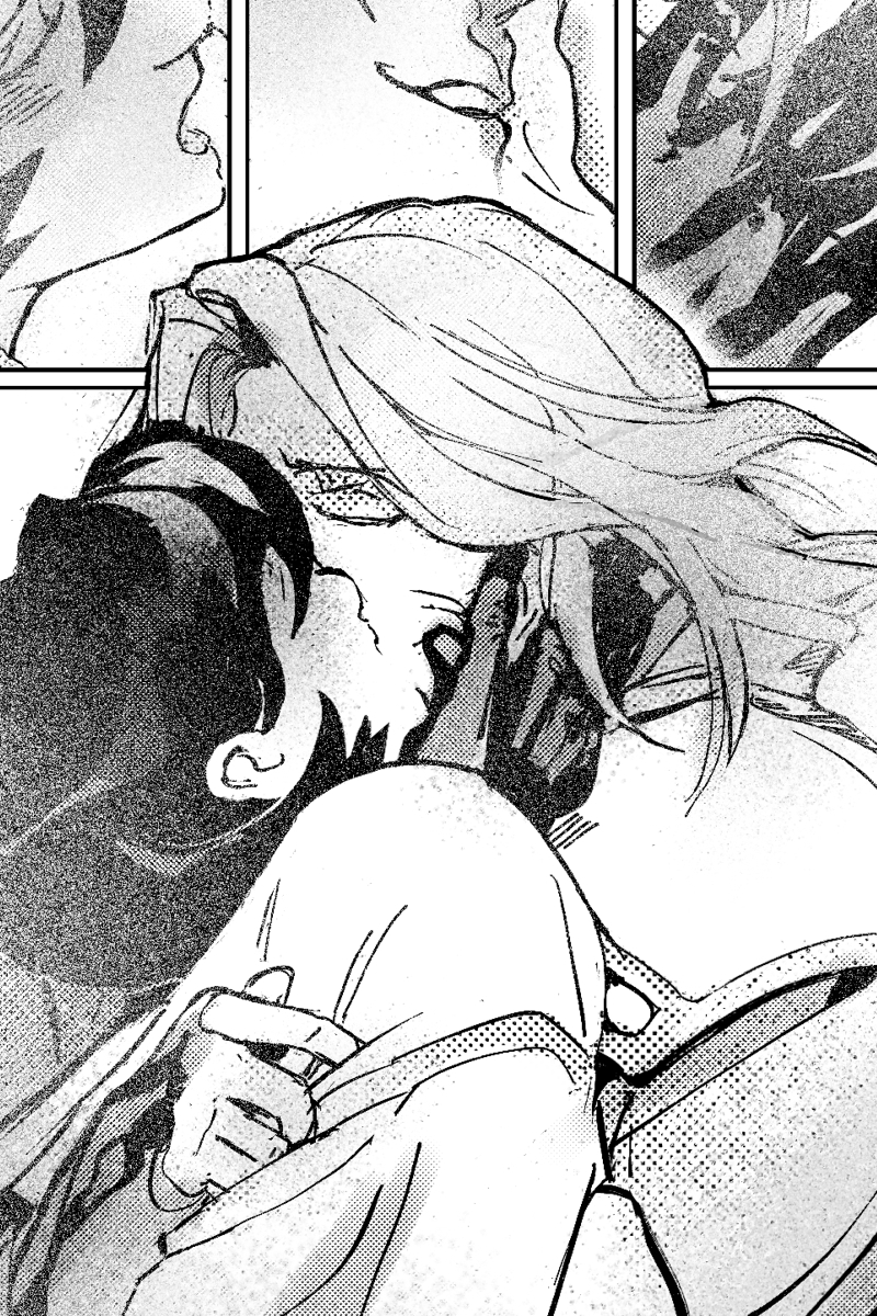
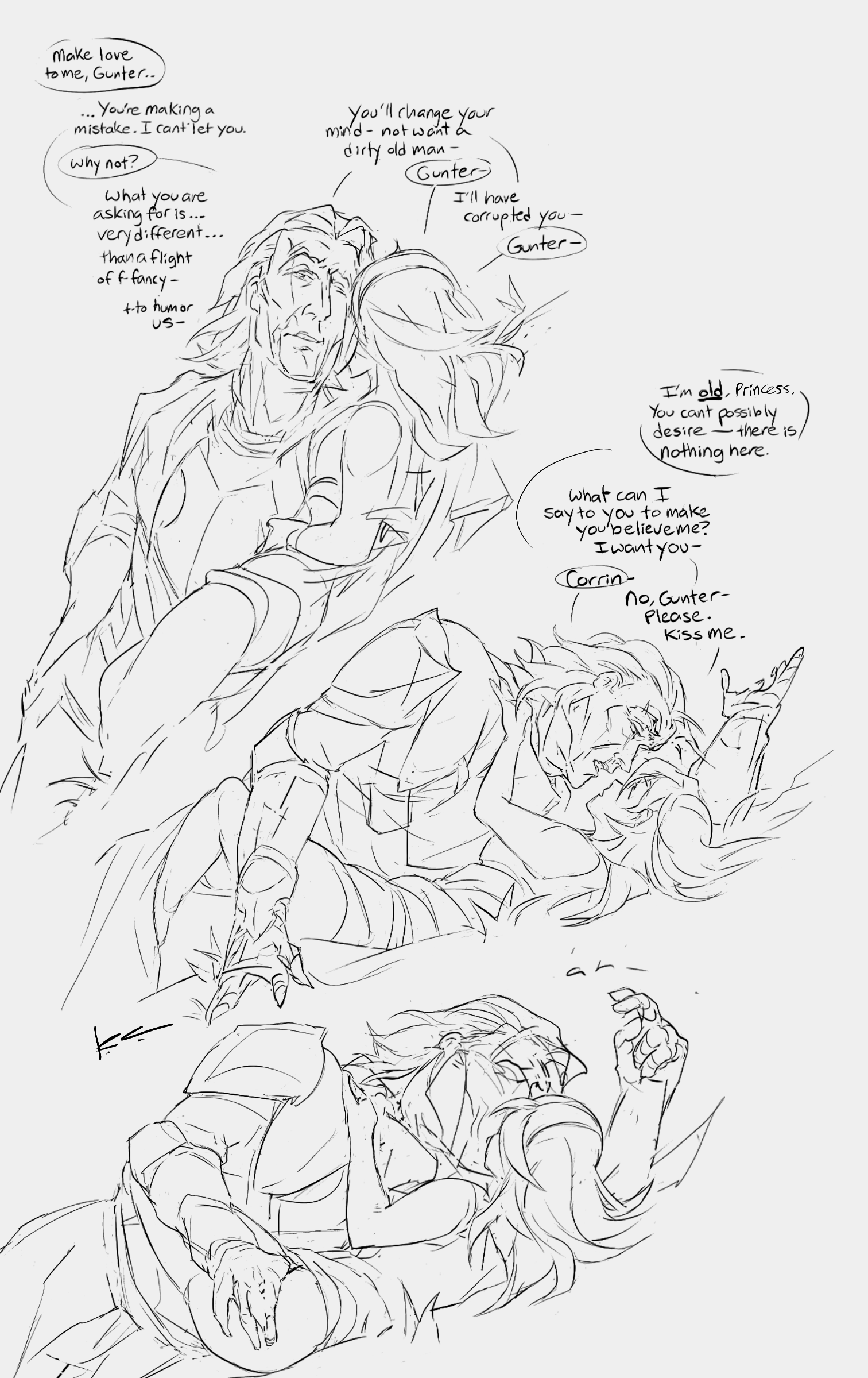
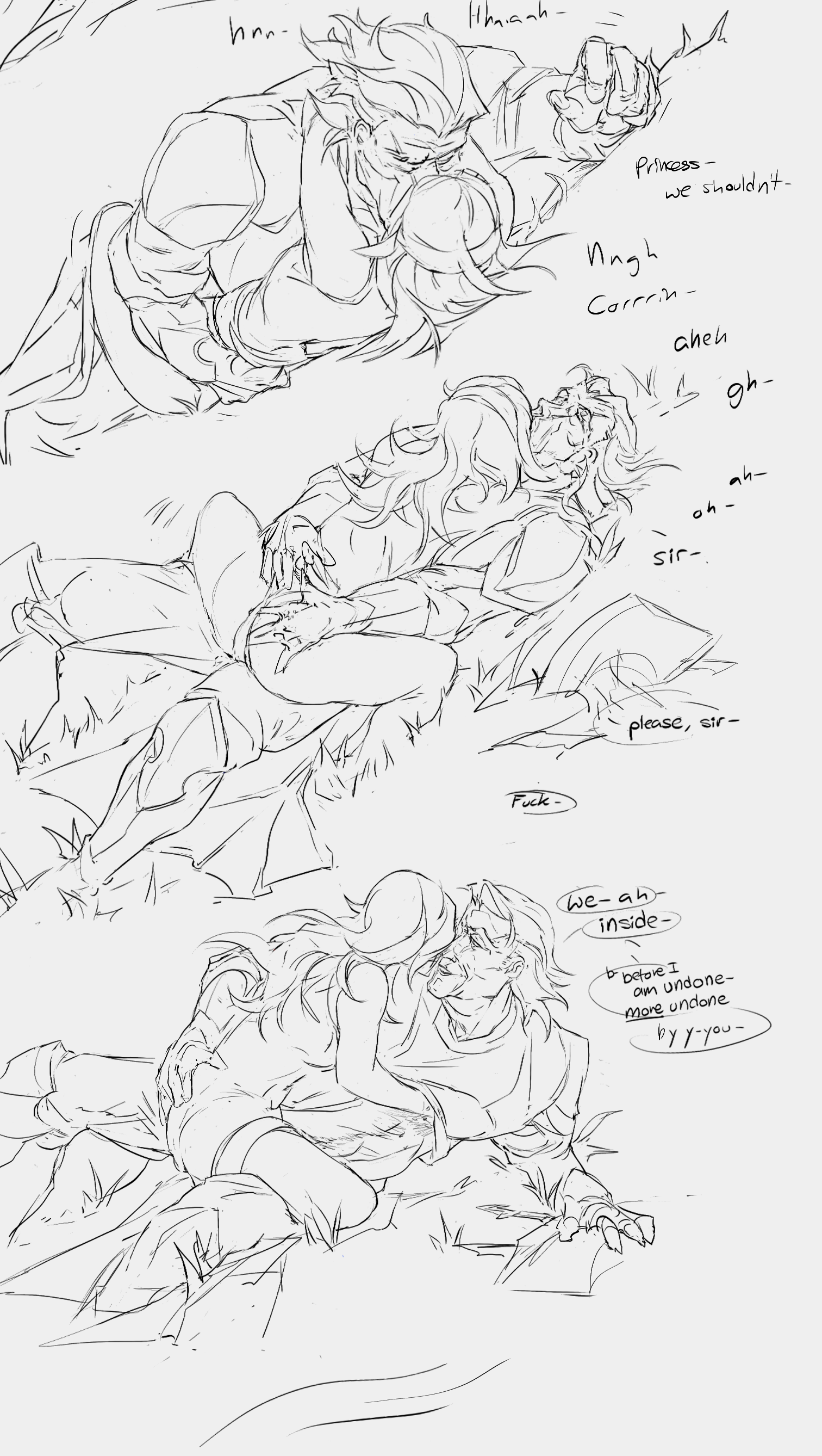
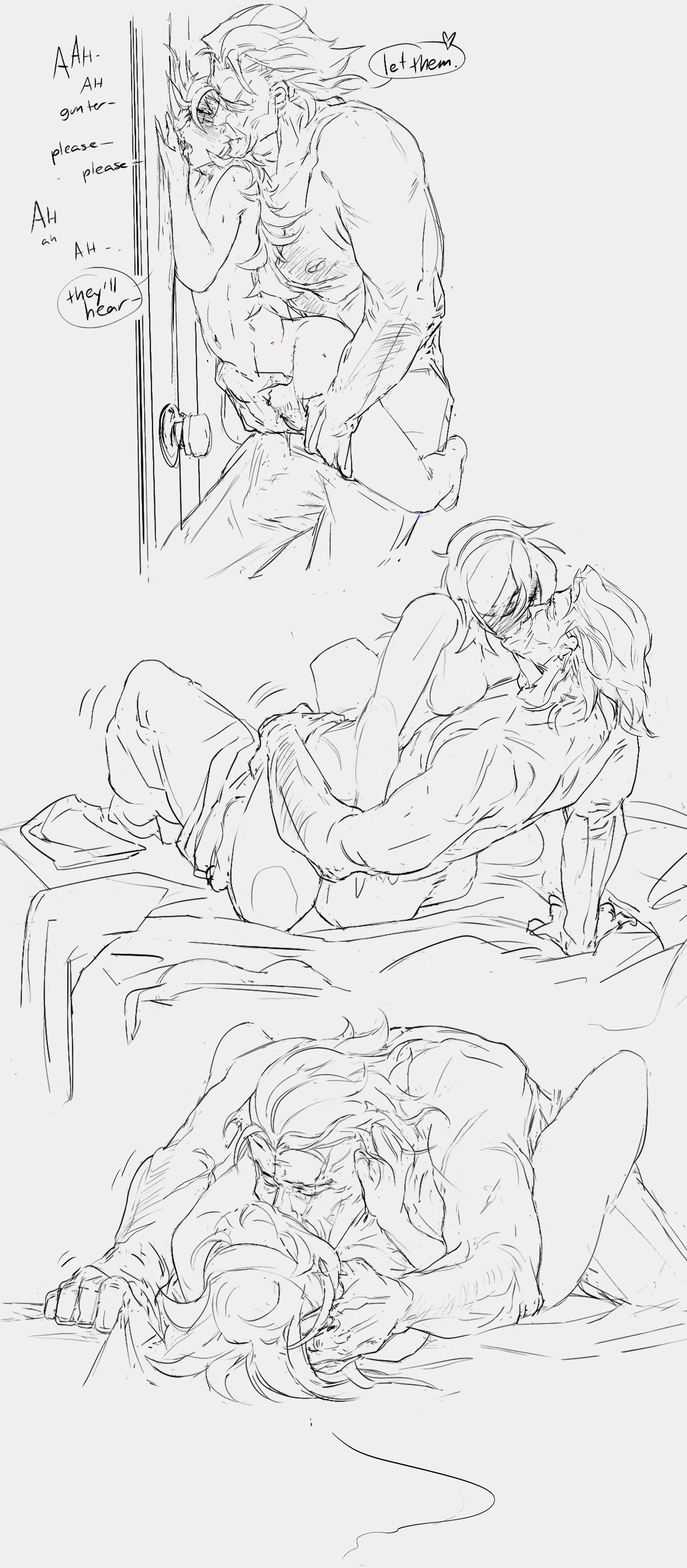
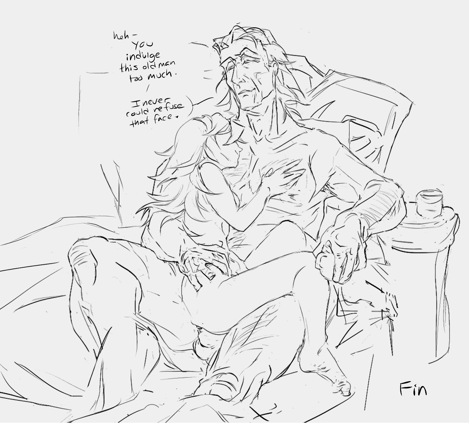
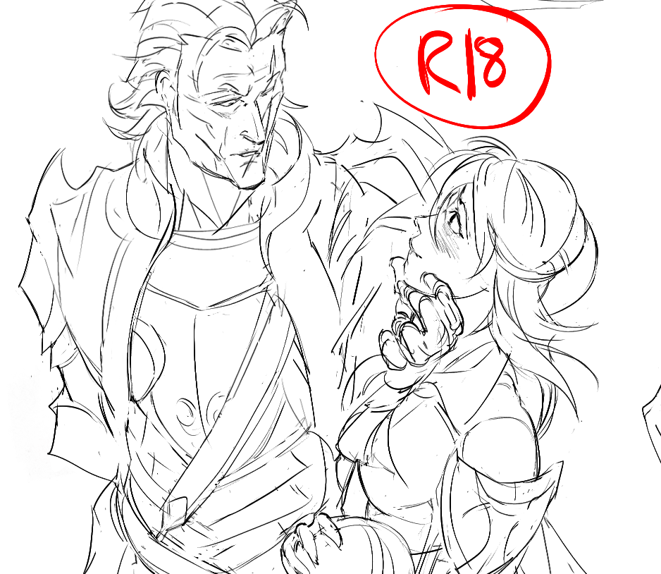
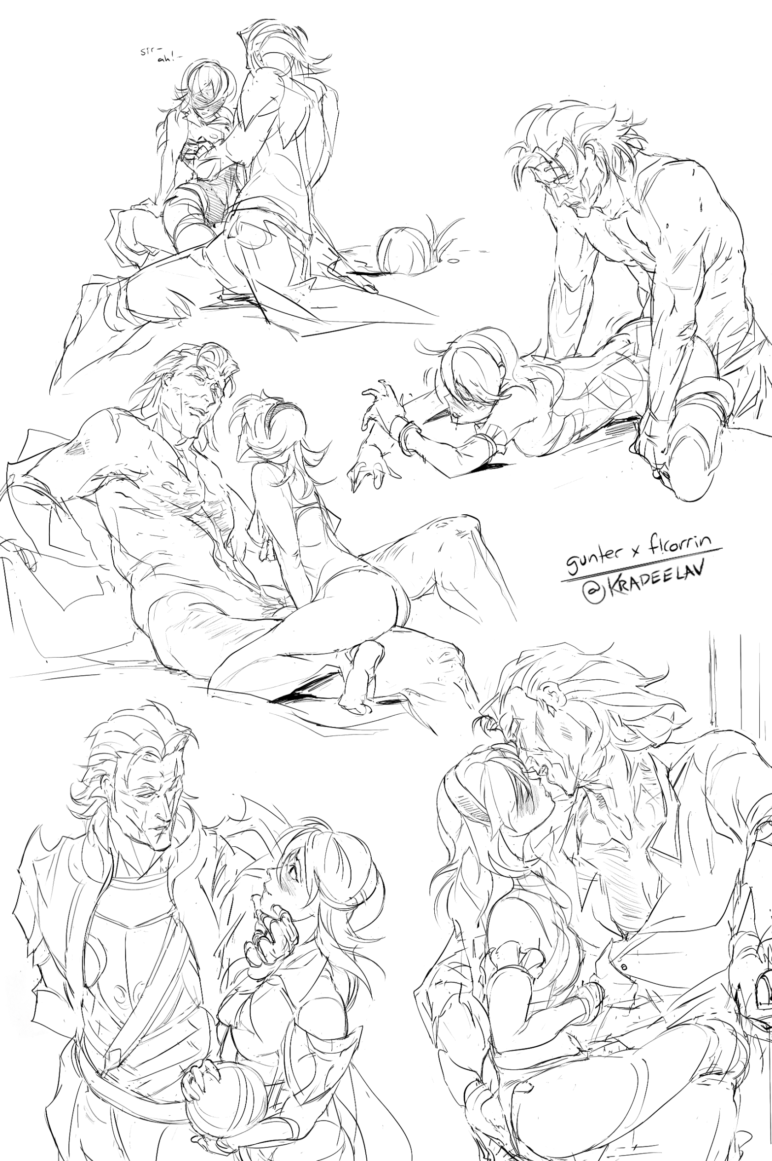
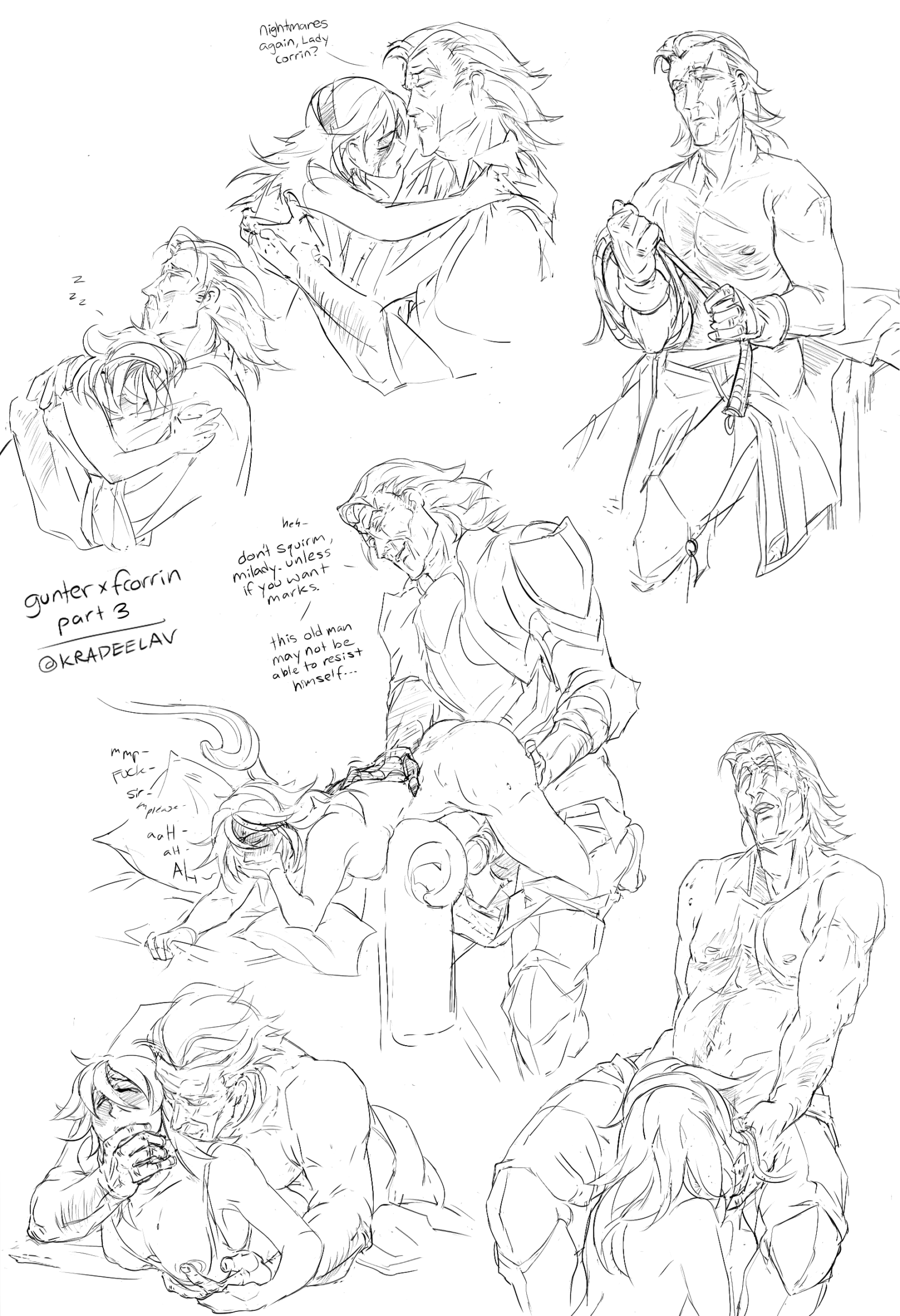
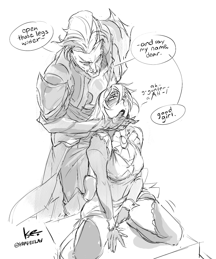
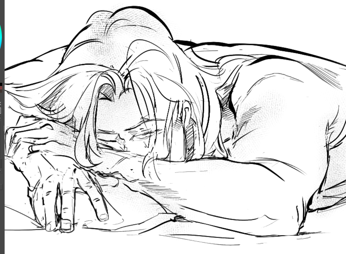
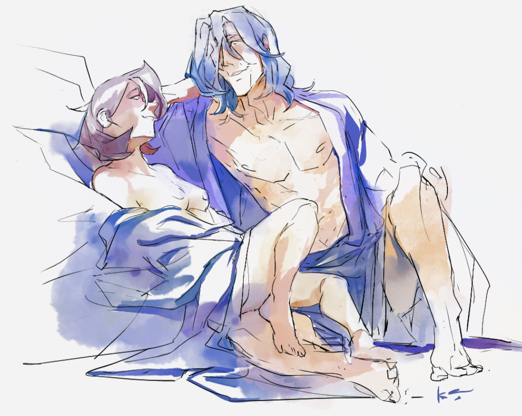
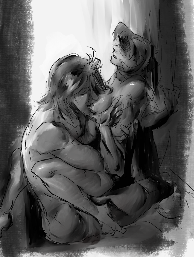
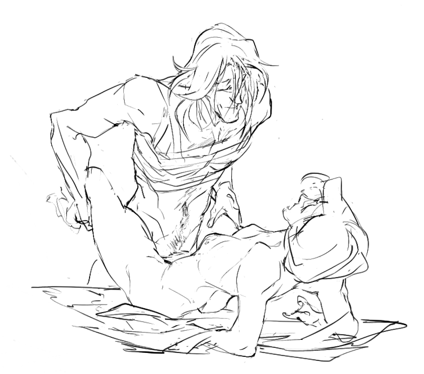
even late blooms need a good watering - for jonphaedrus
crossposted on Ao3
tags: #fefates
Creator Chose Not To Use Warnings
 COLLAPSE
crossposted on Ao3
tags: #fefates
Creator Chose Not To Use Warnings
COLLAPSE
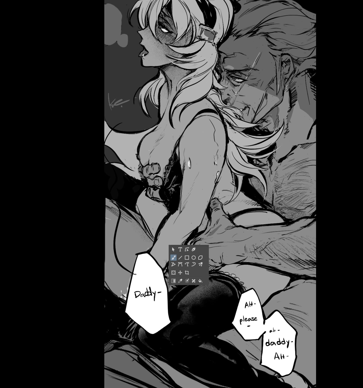
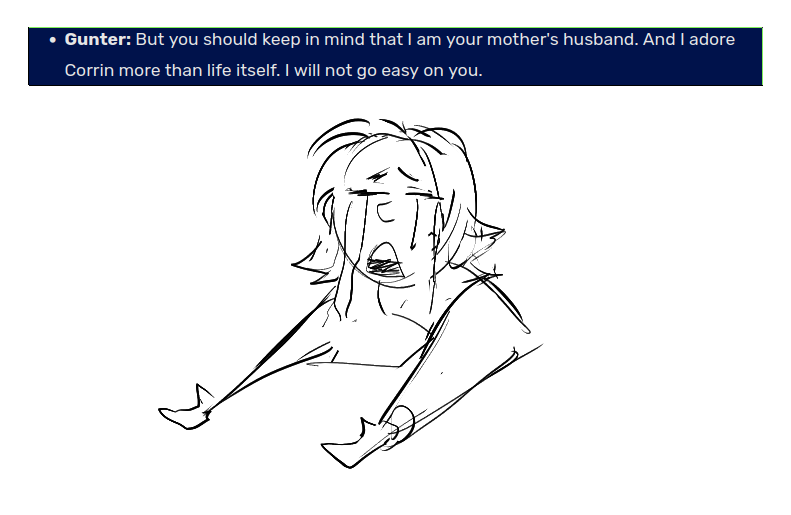
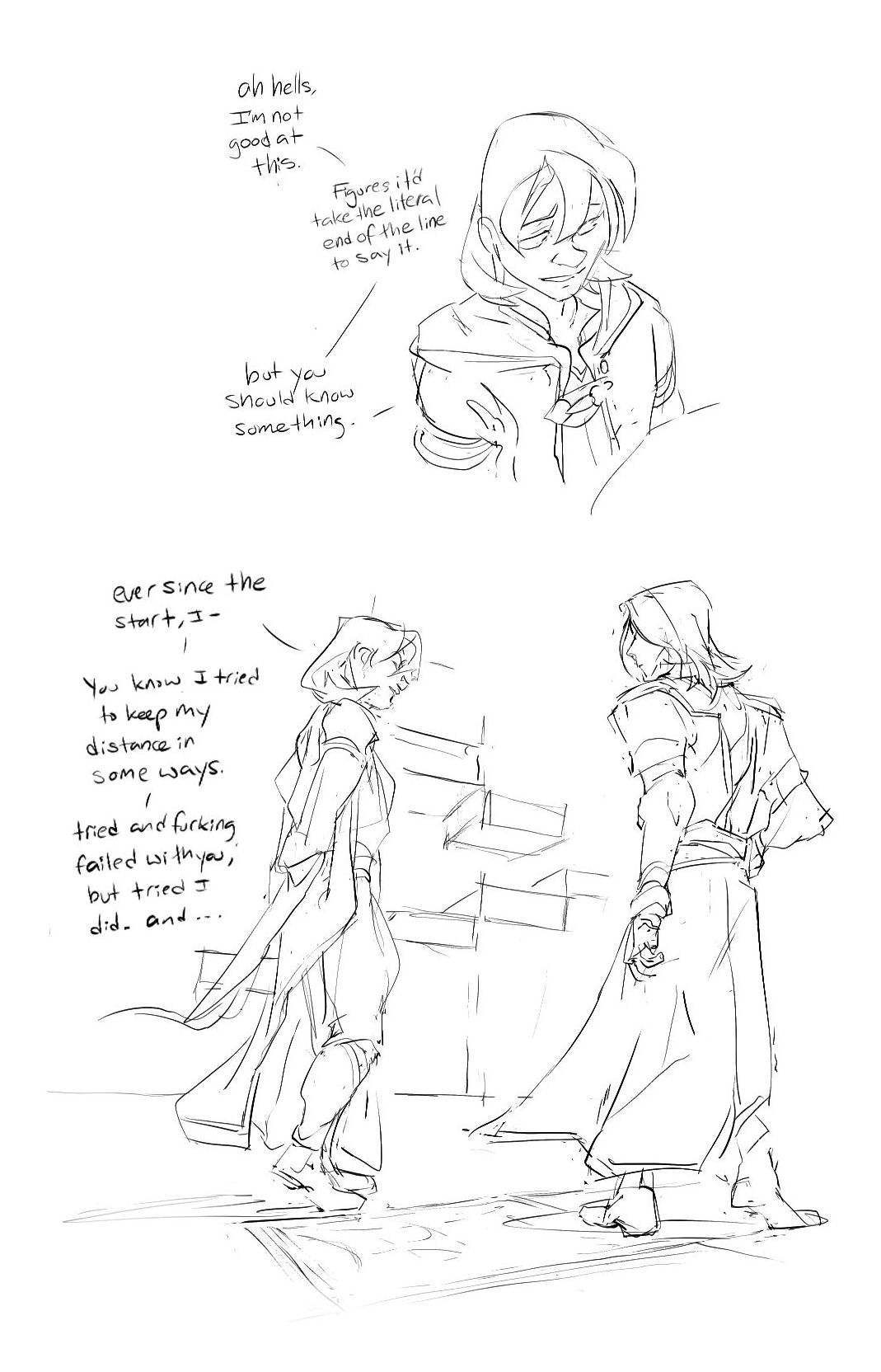
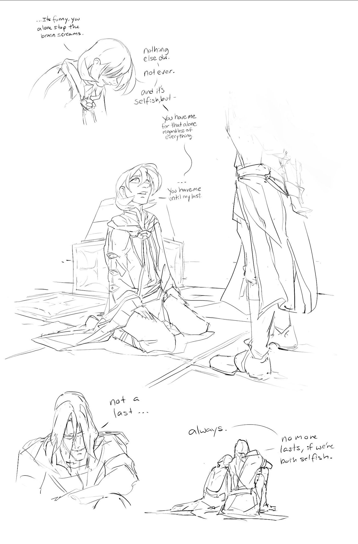
title: first time
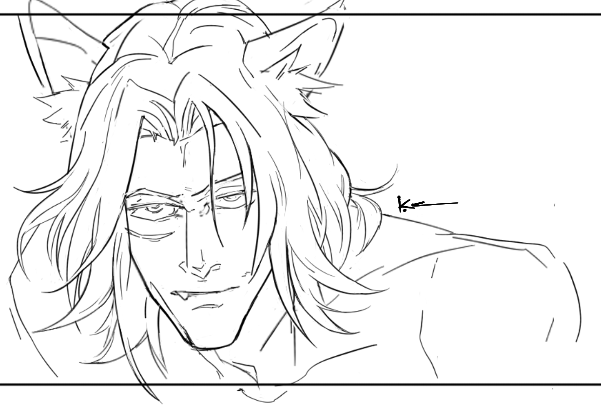
It’s the only time Corrin feels the old veteran’s hands tremble.
Creator Chose Not To Use Warnings
crossposted on Ao3
 COLLAPSE
It’s the only time Corrin feels the old veteran’s hands tremble.
Creator Chose Not To Use Warnings
crossposted on Ao3
COLLAPSE
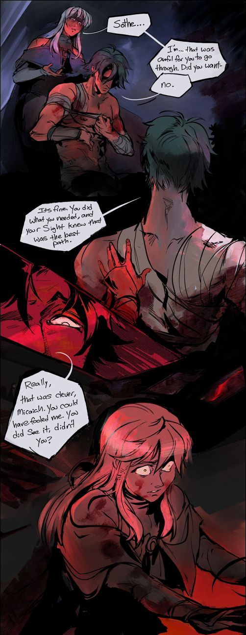
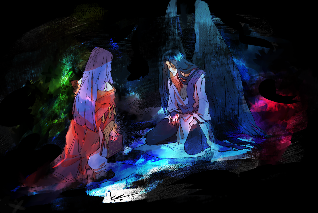
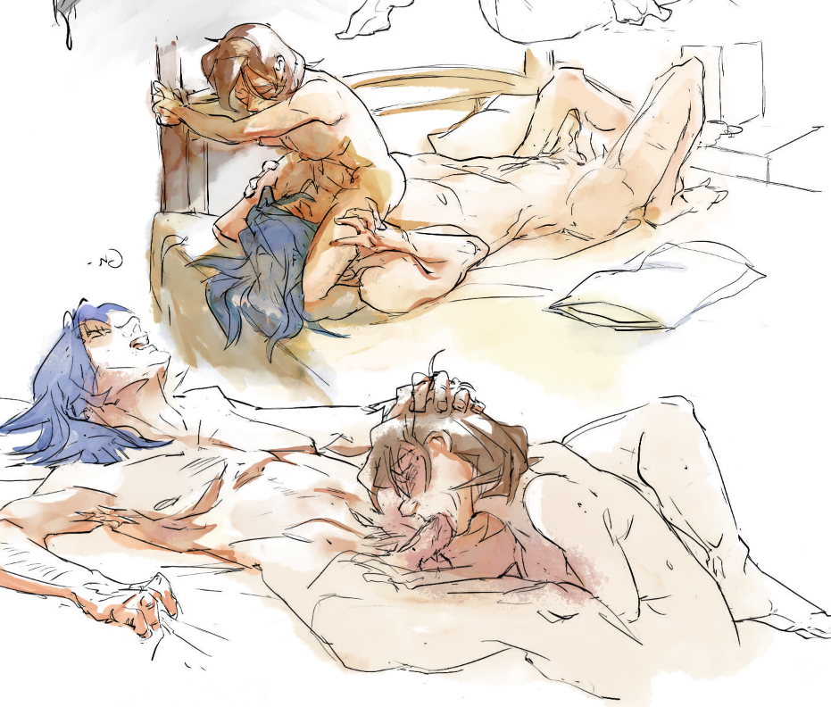
some illustrated scenes from my recent #fetellius Muarim/ #zihark fic, sweet dreams (are made of this), posted on Ao3
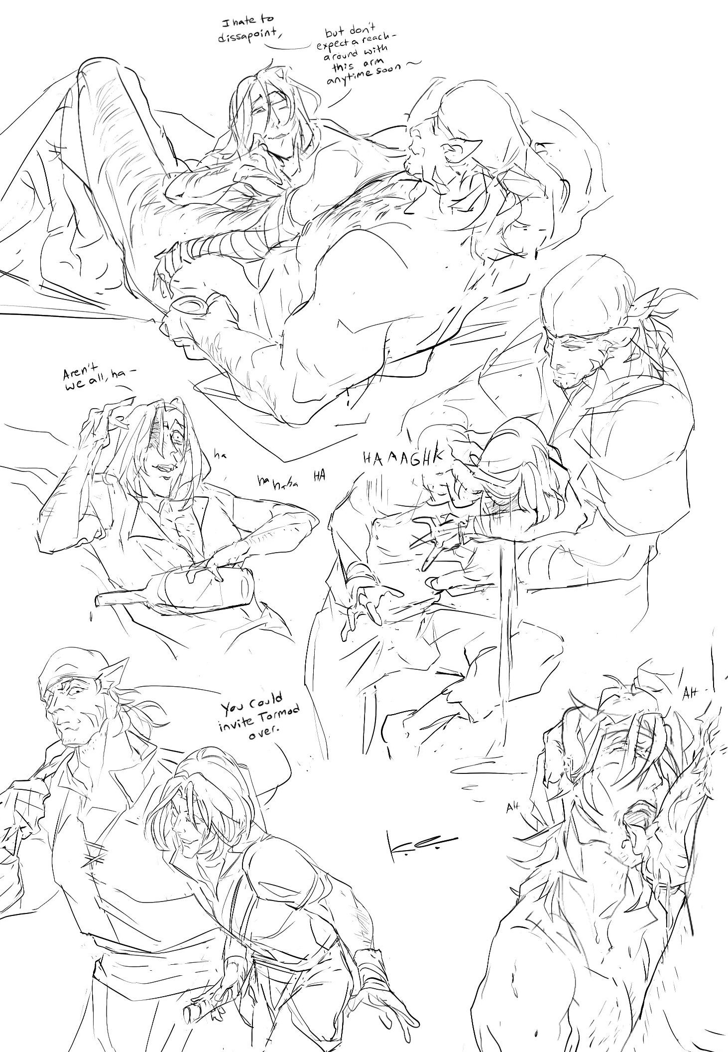
bonus, an accurate representation of the writing process…
 COLLAPSE
bonus, an accurate representation of the writing process…
COLLAPSE
2024.09.02 02:55:18 編集
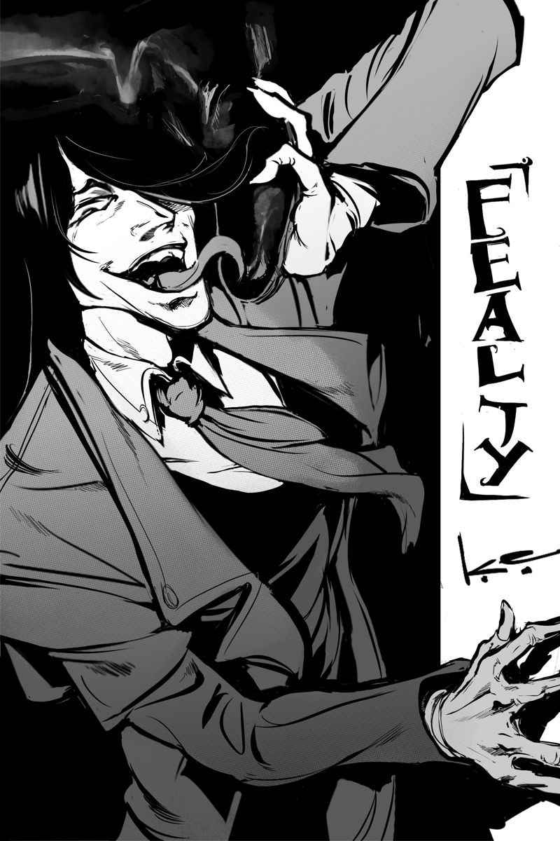
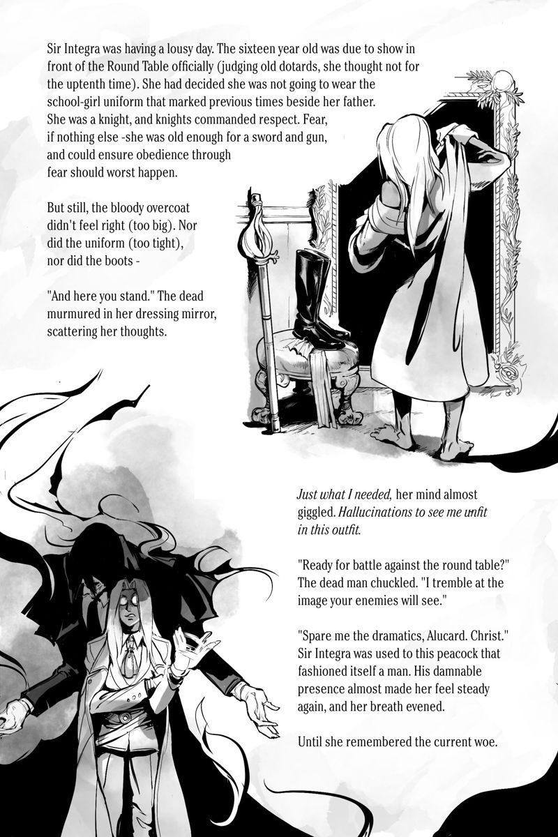
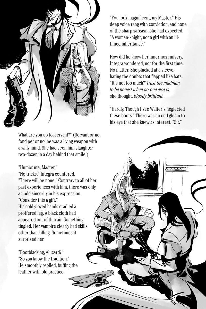
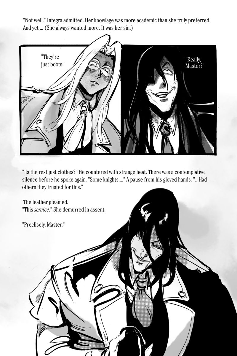
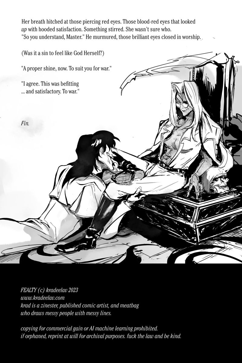
title: FEALTY - #hellsing illustrated fic
Ao3 mirror
summary: a gift Sir Integra Hellsing gets for her sixteenth birthday, and what bootblacking means.
Ao3 mirror
summary: a gift Sir Integra Hellsing gets for her sixteenth birthday, and what bootblacking means.
2024.09.02 02:36:59 編集
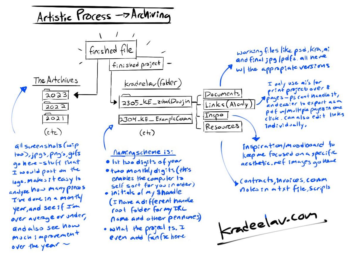
no art in this post, but i’d like to share a little about how i organize files! (i’ve intentionally kept this on one image so you can easily save it on your desktop, or repost elsewhere; just keep the signature if you do.)
I started the “Artchives” folder back in college a decade ago when I needed one place to dump every final work i drew, whether it be taking pictures of a sketchbook, screenshots to the now-deleted twitter, or meme-art to share to friends. it’s been a wonderful way to have an organized set of yearly time capsules for my work, and to track improvements over time. if I remember vaguely what season and what year I drew something, it also makes it very easy to hunt for old art.
The $kradeelav (root folder for projects) system was actually borrowed from my dayjob’s server, naming scheme and all. (I manage an international household-name brand at work, with a need to organize tons of mini-projects within). when i started doing larger and more ambitious zines, comic projects, and freelance work – this is a secondary system that helps to house these in a similarly-ordered set of folders without invoices and reference images and who knows what else getting absolutely blasted all over my desktop. usually i’ll have 2-3 active projects going on at one time, with the folders on the desktop; they get moved into this root folder when they’re closed.
happy to answer questions about these!
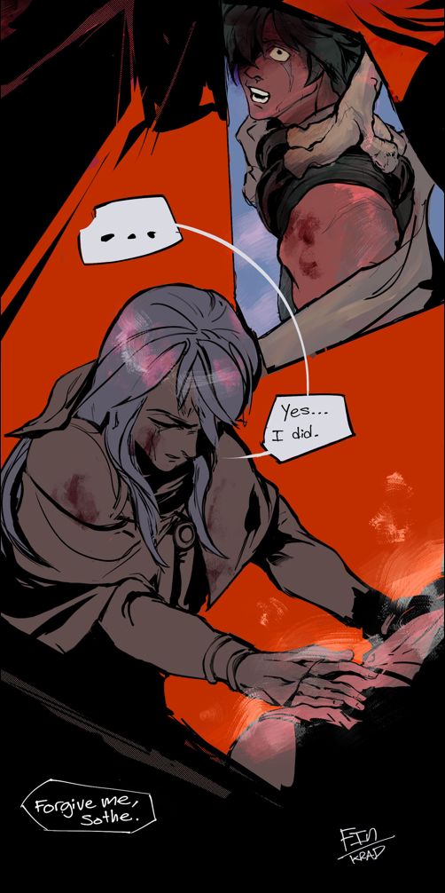
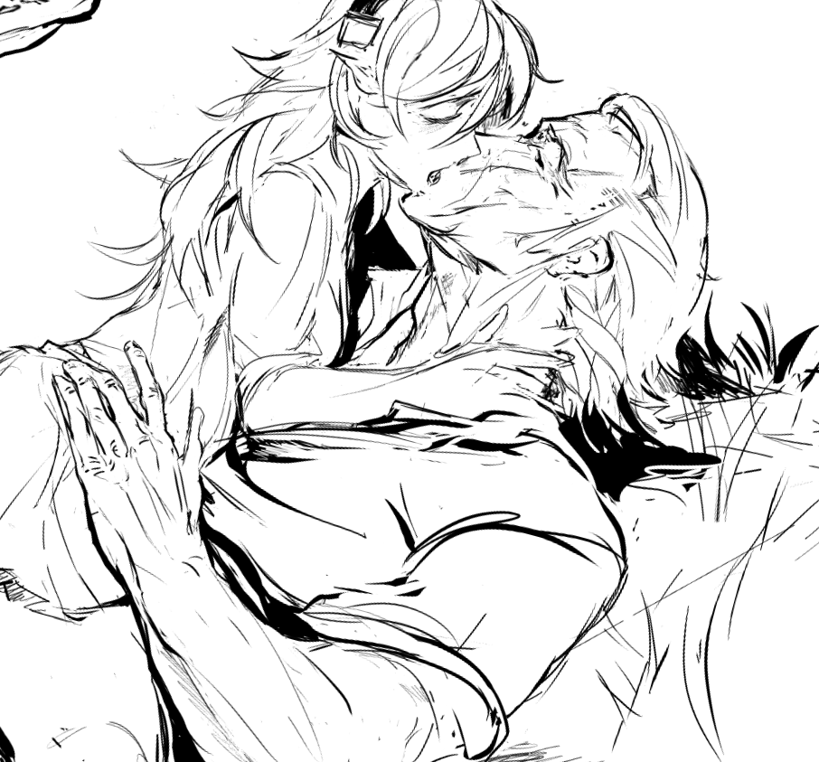
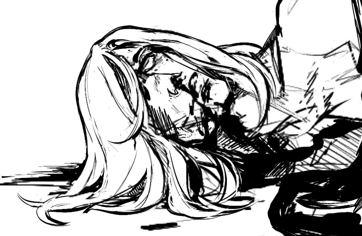
After Sothe narrowly misses death by Tibarn’s talons (and Micaiah’s orders), he offers a lie to the one he loves most. Sometimes lies are easier than the truth, after all.
(or are they?)
2022 #fetellius nagamas gift for seasaltmemories 🙂 crossposted on Ao3
plowed through a bunch of amazing sanaki/sephiran fics recently and remembered why i loved these two so much…
also remembered my fondness for the Kiesha‘ra Series and how the shapeshifters and magic system there gives me SO many heron magic headcanons and this happened. god i need to reread those.
#fetellius
also remembered my fondness for the Kiesha‘ra Series and how the shapeshifters and magic system there gives me SO many heron magic headcanons and this happened. god i need to reread those.
#fetellius
2024.09.02 02:17:34 編集
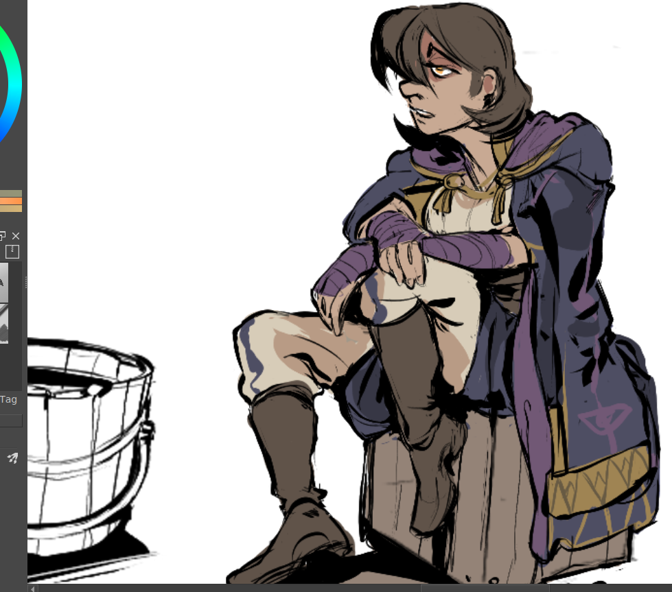
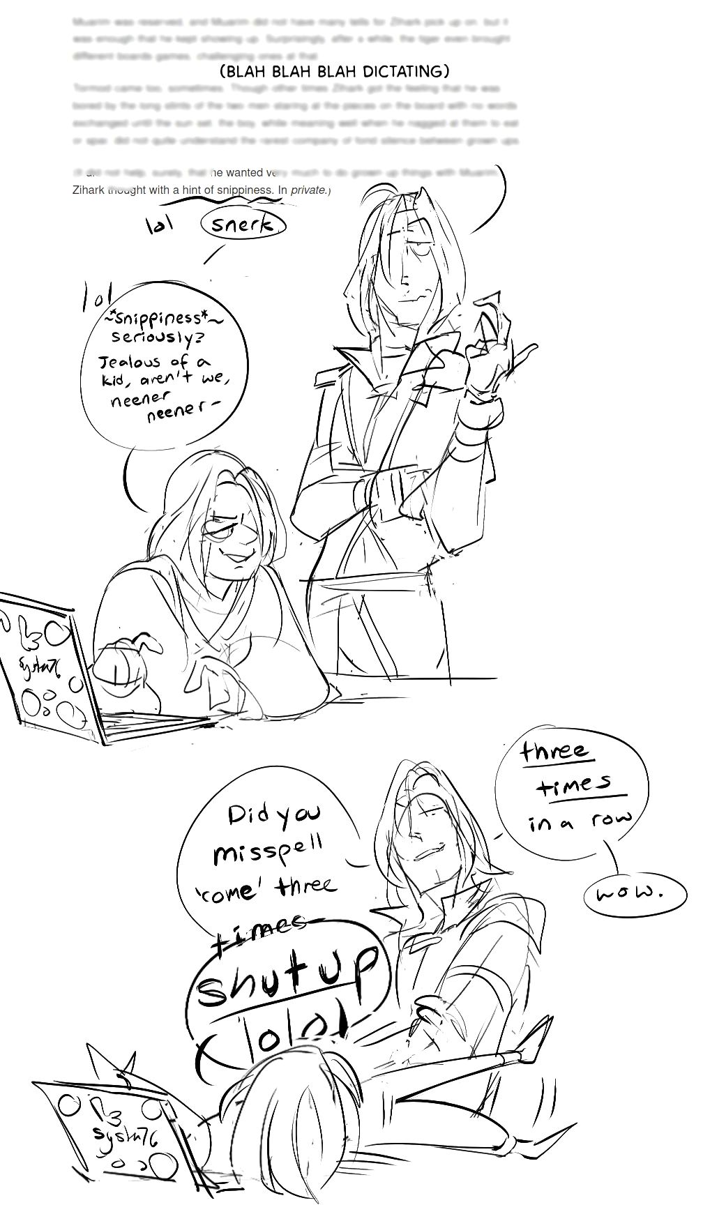
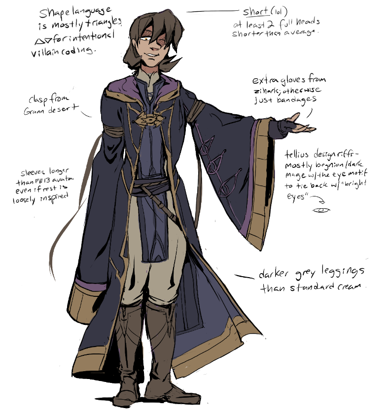
joining in canon x oc week which made me get off my arse and actually nail down my avatar-stand in for tellius. 😛 turns out designing with the mindset of ‘can you tell the characters apart if they were in gloriously polygonal n64/gamecube graphics’ is a good philosophy.
plus a contribution to canon x oc week that i redrew from last jan ~ longer privateish-locked dreamwidth about it here
#zihark
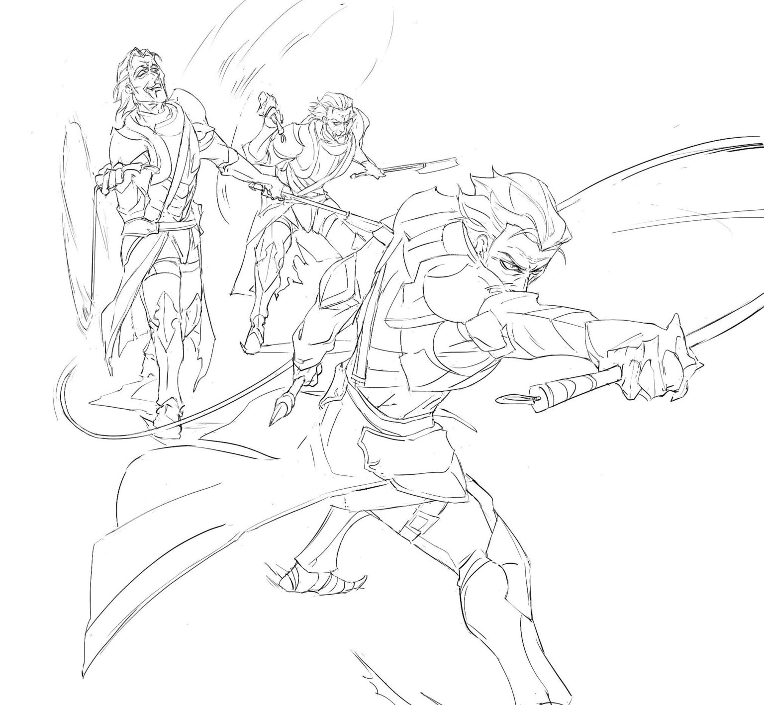
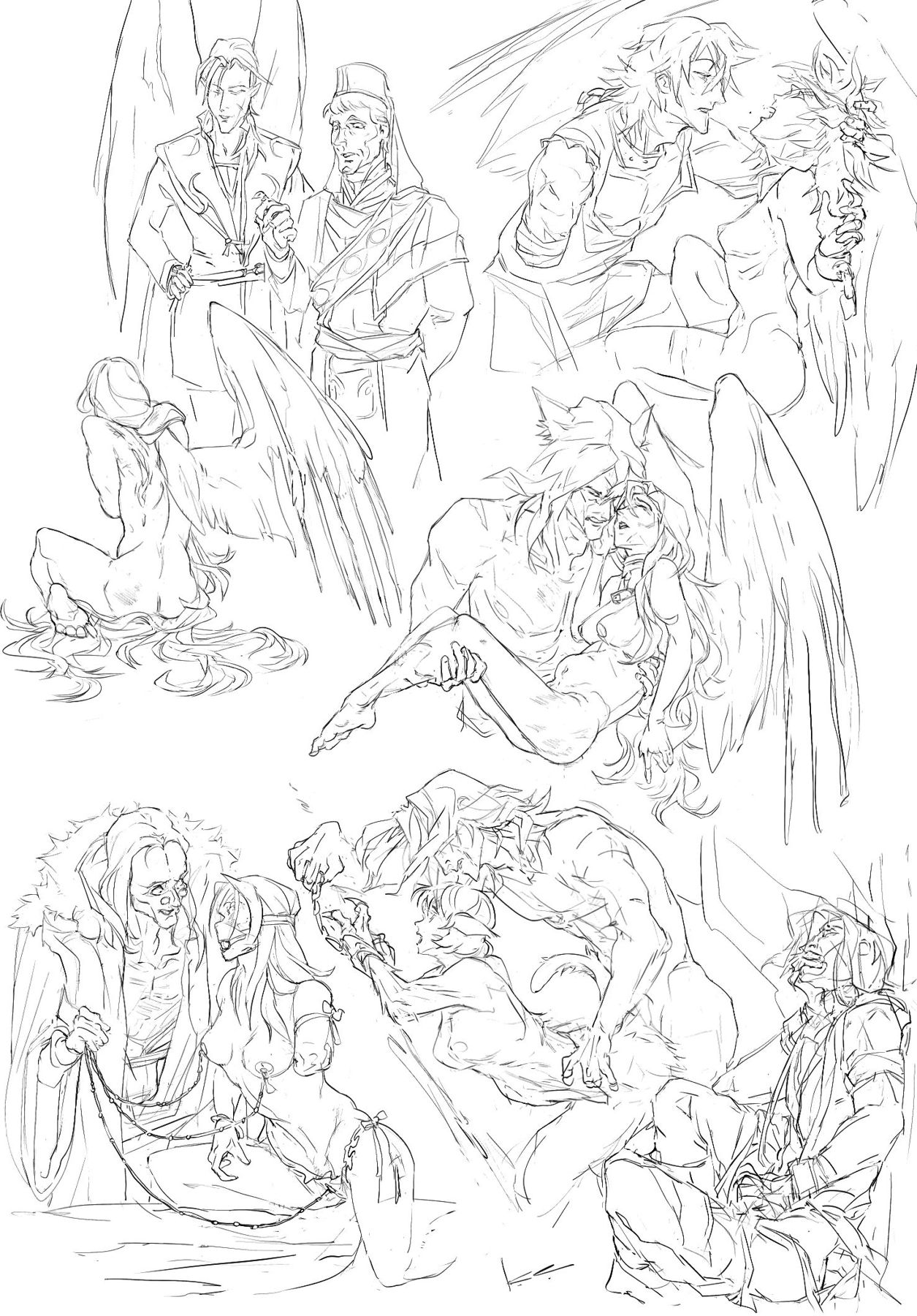
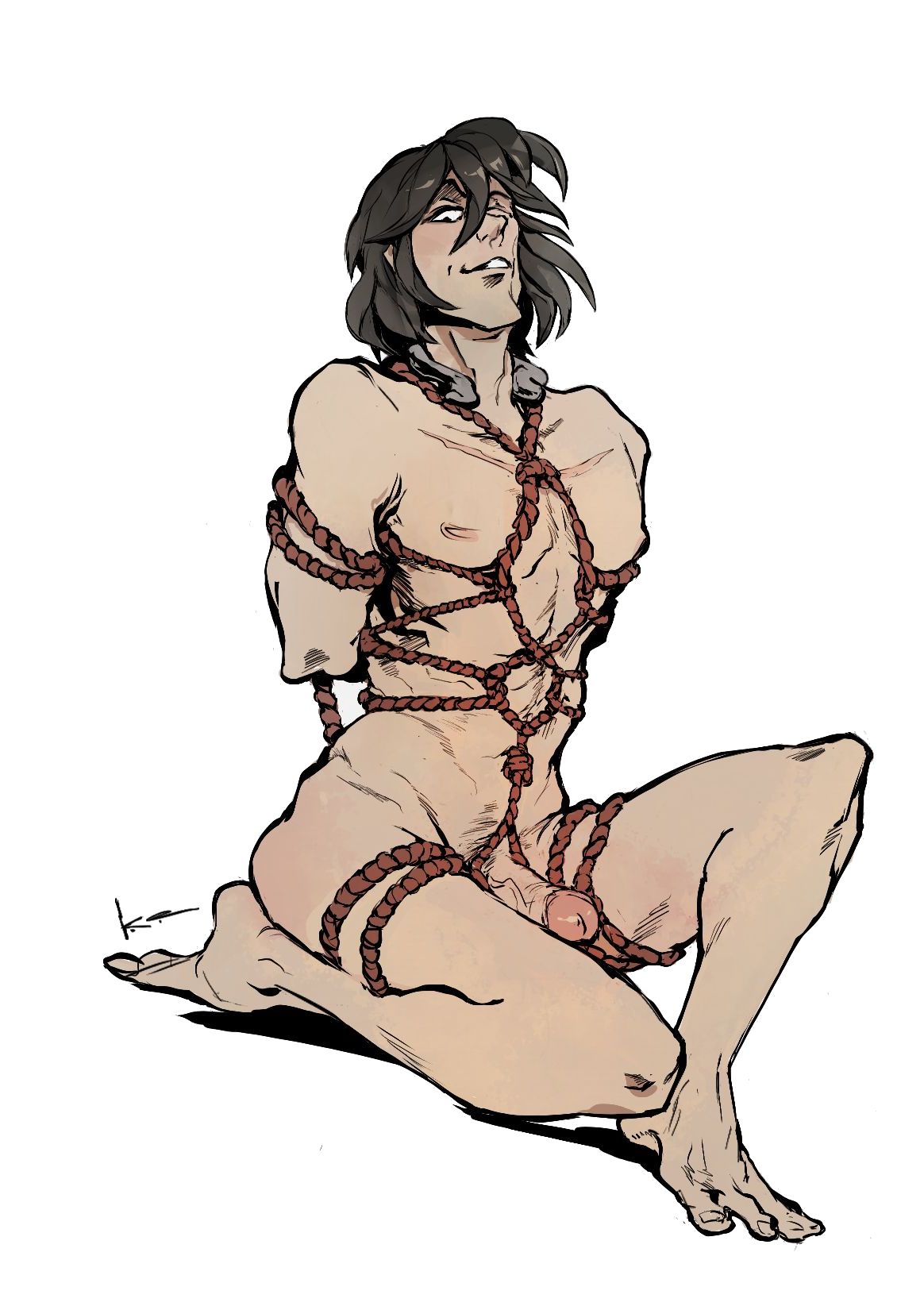
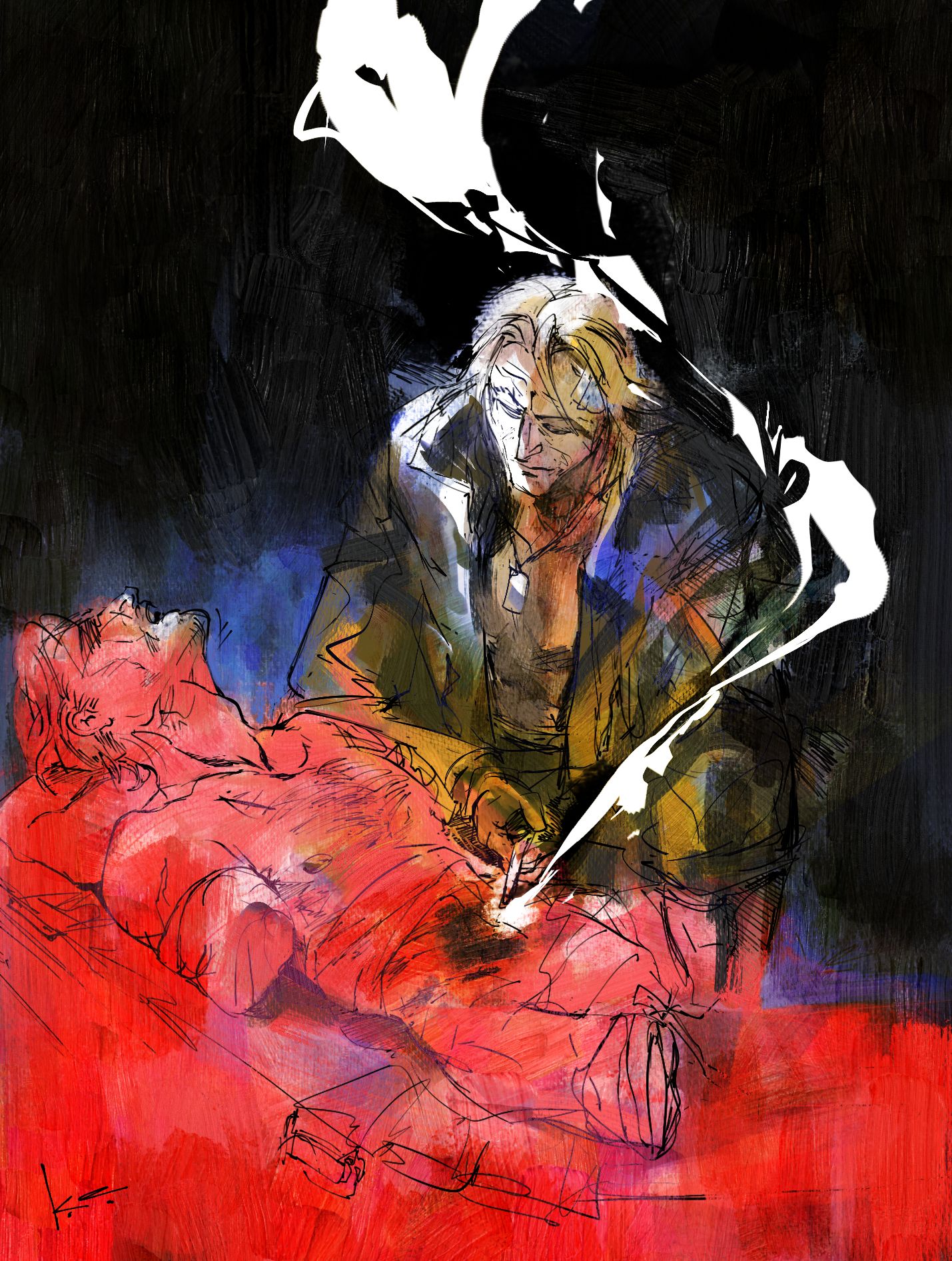
AT THE MERCY OF - For 2023’s prisoner exchange.
ao3 mirror
website mirror
There is a companion drawing with all of the scenes, and 500 word drabbles for each.
Creator Chose Not To Use Warnings
#fetellius & #zihark NSFW under the cut
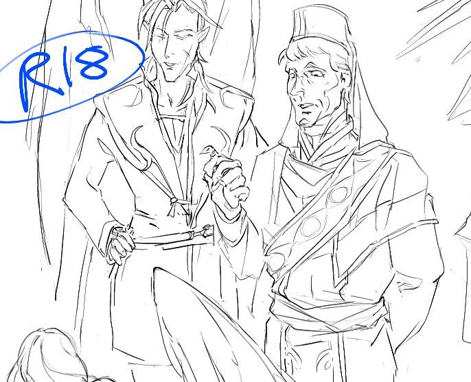
Captor!Naesala+(begnion senator) / Prisoner!Leanne, Prisoner!Stefan / Prisoner!Vika, Prisoner!Leanne / Rescuer!Volug, Captor!Izuka / Prisoner!Micaiah, Captor!Zihark / Prisoner!Lethe
 COLLAPSE
ao3 mirror
website mirror
There is a companion drawing with all of the scenes, and 500 word drabbles for each.
Creator Chose Not To Use Warnings
#fetellius & #zihark NSFW under the cut
Captor!Naesala+(begnion senator) / Prisoner!Leanne, Prisoner!Stefan / Prisoner!Vika, Prisoner!Leanne / Rescuer!Volug, Captor!Izuka / Prisoner!Micaiah, Captor!Zihark / Prisoner!Lethe
COLLAPSE
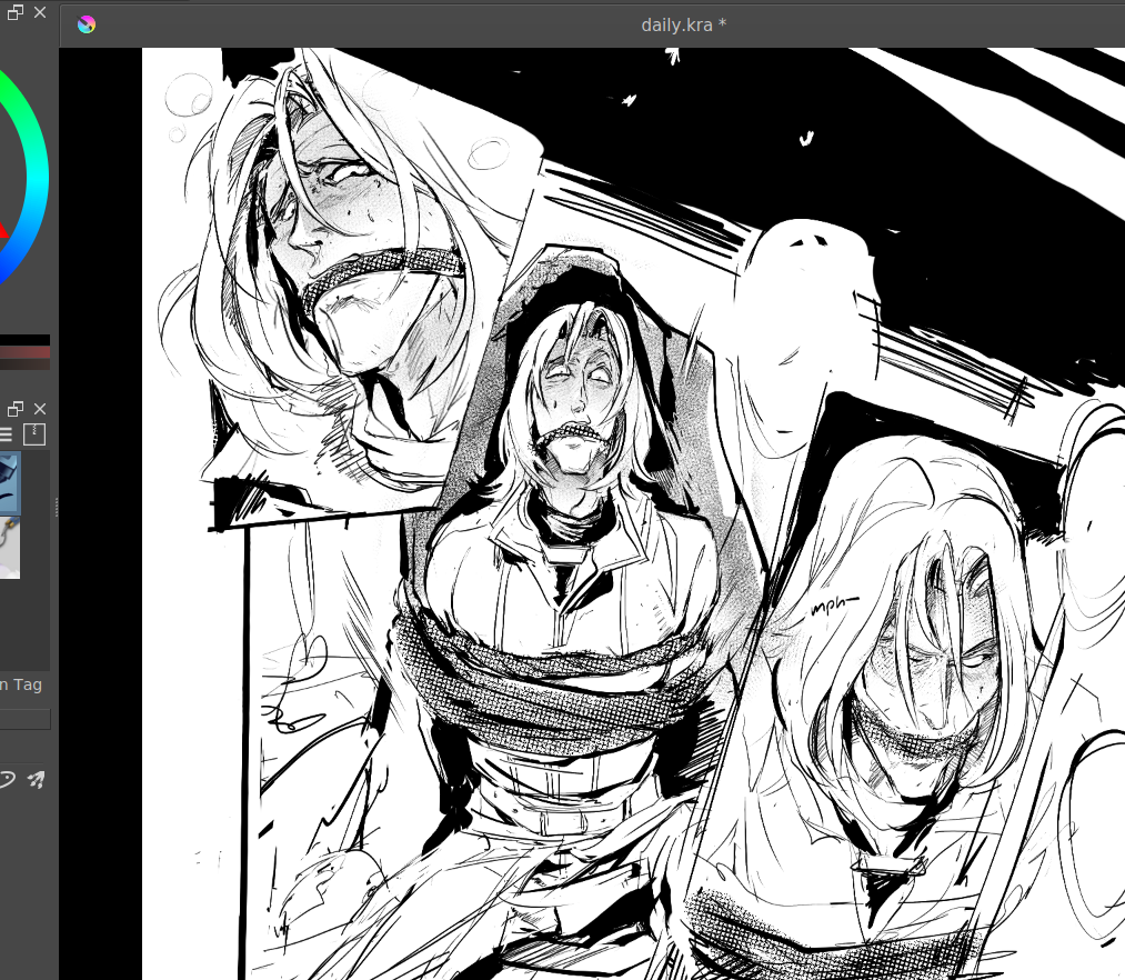
i had the absolutely brilliant idea of doing a whump spread based off of how much HP #zihark had and uh yeah
yeah
#fetellius i guess
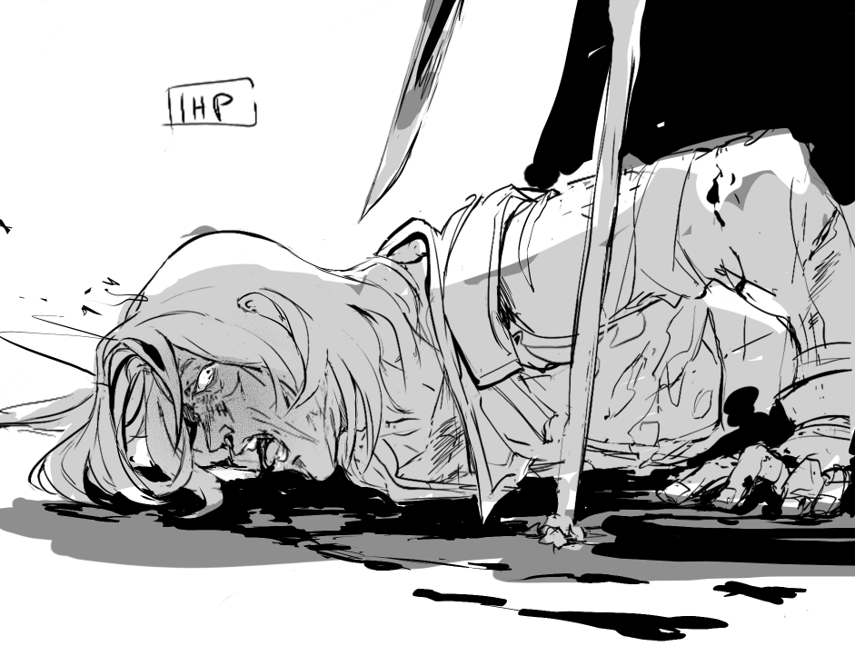
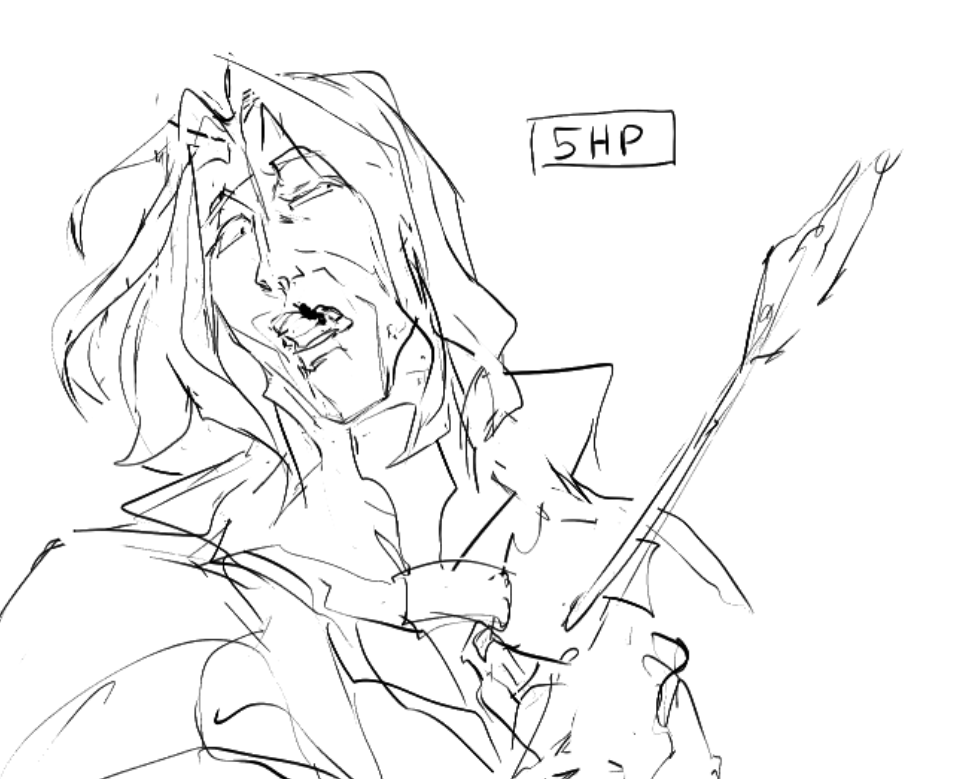
yeah
#fetellius i guess
2024.09.02 01:58:17 編集
no intimacy like that of pain / (and no trust like that of torture)
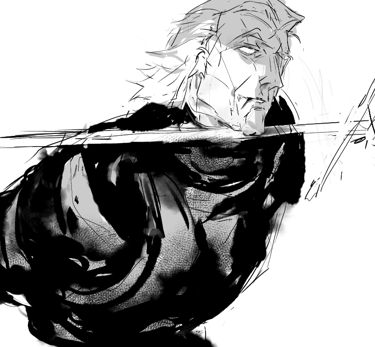
nsfw liquid/solid snake for FaggotTapedeck in the 2022 MGS Exchange, ao3 post here #mscfanart
 COLLAPSE
nsfw liquid/solid snake for FaggotTapedeck in the 2022 MGS Exchange, ao3 post here #mscfanart
COLLAPSE
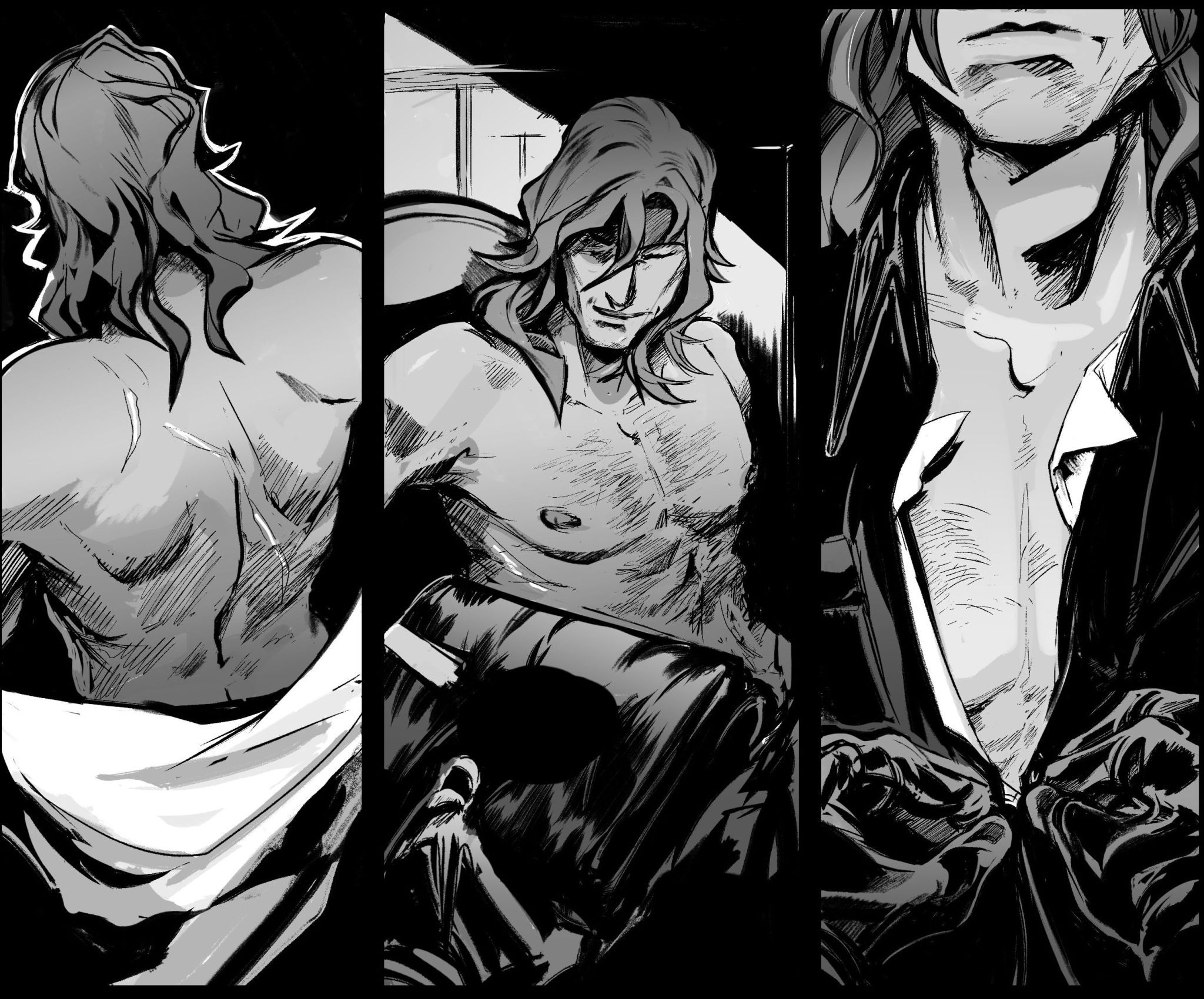
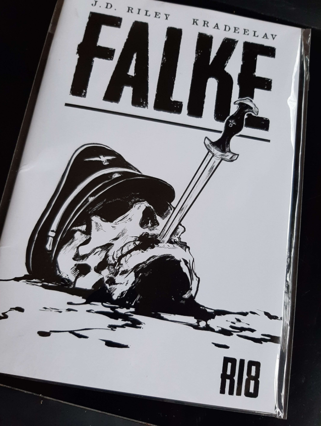
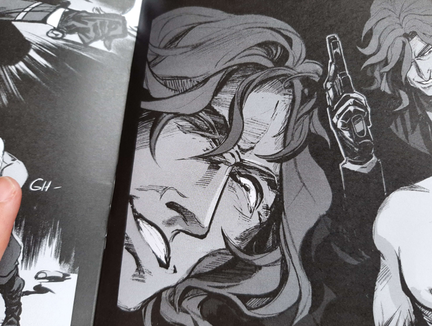
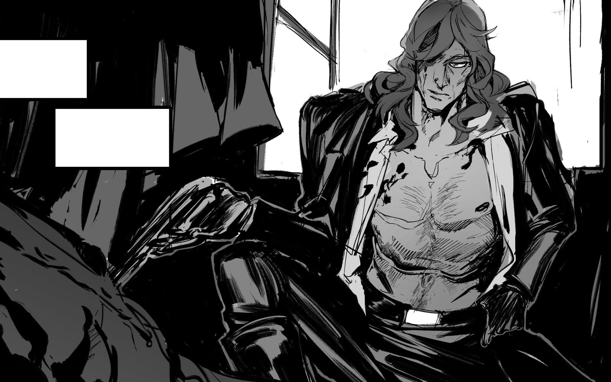
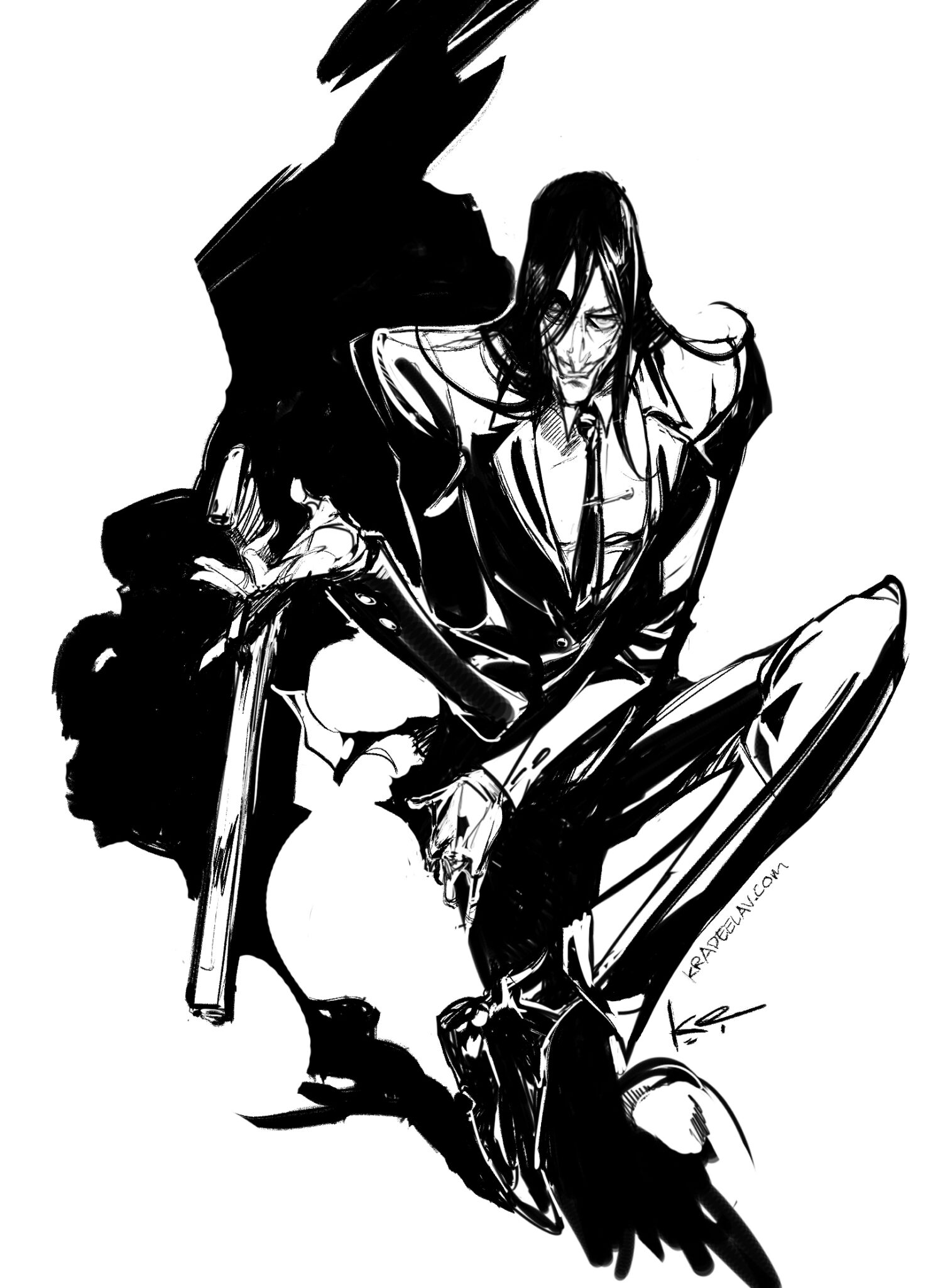
FALKE - 2022 is an #original comic that JD wrote and I drew. physical & digital copies are still available to buy on itch.io
we had been talking about making something like this for a while. tl;dr of the …. plot … is a beautiful man killin’ nazis messily. not a bad zine at all to pick up these days.
Not gonna lie, the recent book-banning culture zeitgeist was a big motivation for both of us; we’ve both been hit directly and indirectly by pressure and harassment to make “safer” creations (JD moreso than me), and wanted to push back on that idea, especially as persons that are typically targeted during fascist regimes.
It’s still one of the creations I’m proudest of, not only of last year and the chaos during multiple eye surgeries but in terms of my whole creative career and pushing me to the envelope craft-and-thematic-wise. JD was a darling to work with; the absolute best kind of zine co-collaborator and writer one could ask for, and is in the process of making more.
Powered by てがろぐ Ver 4.2.0.
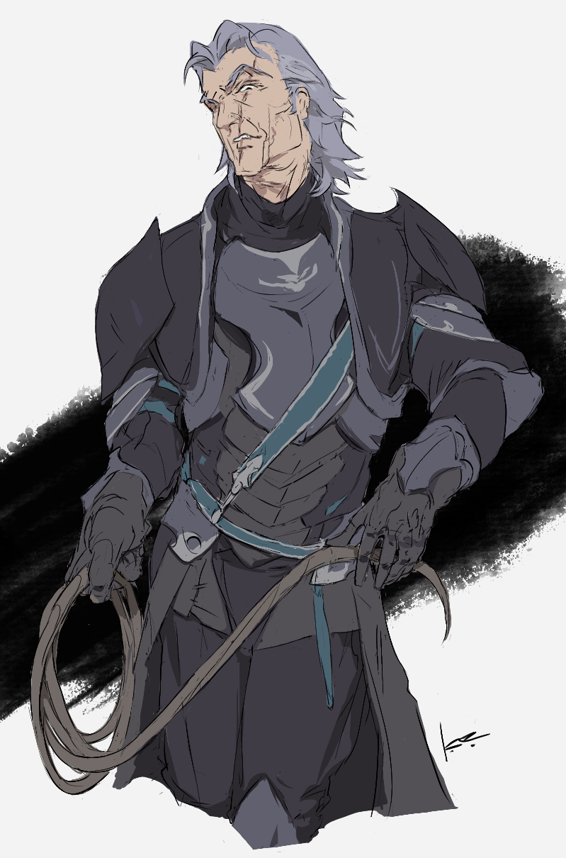
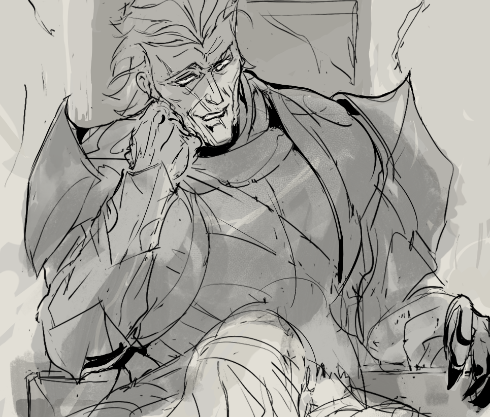
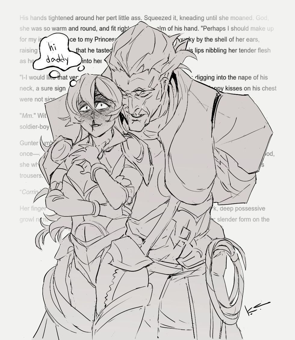
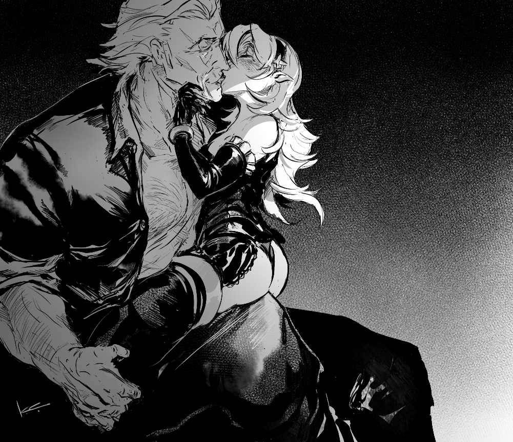
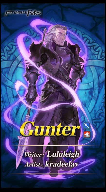
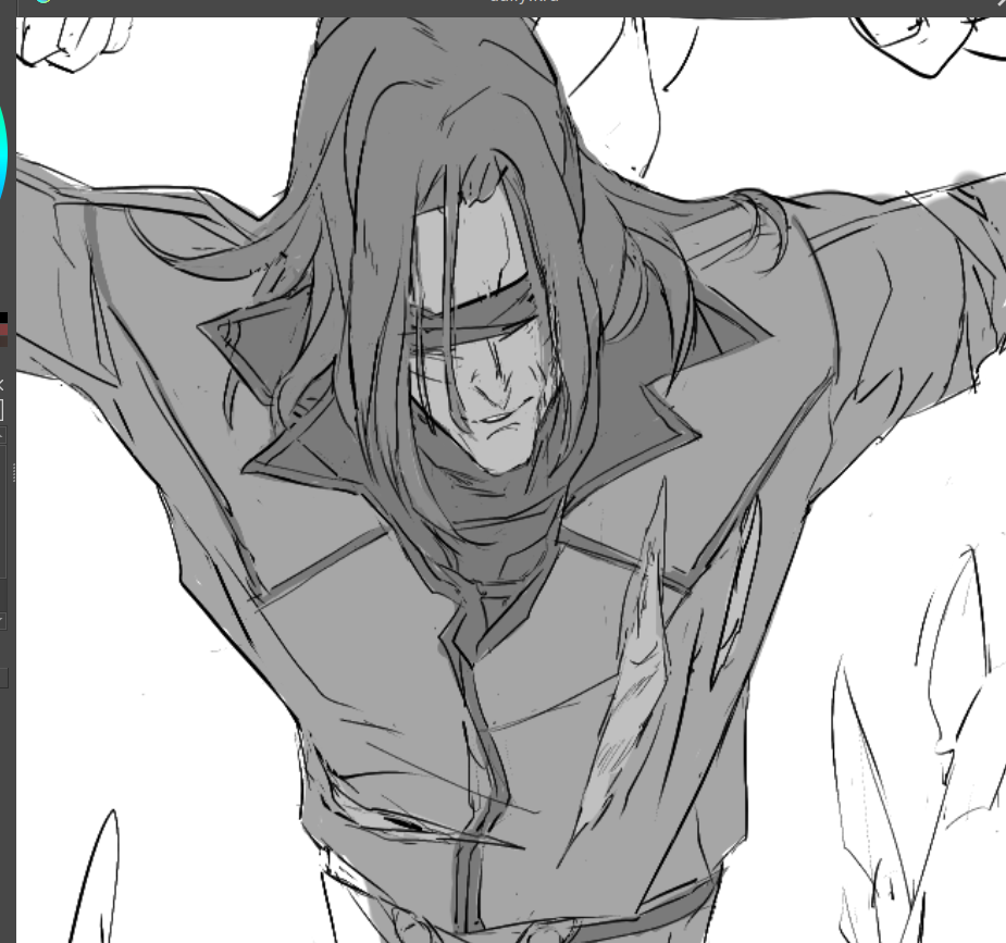
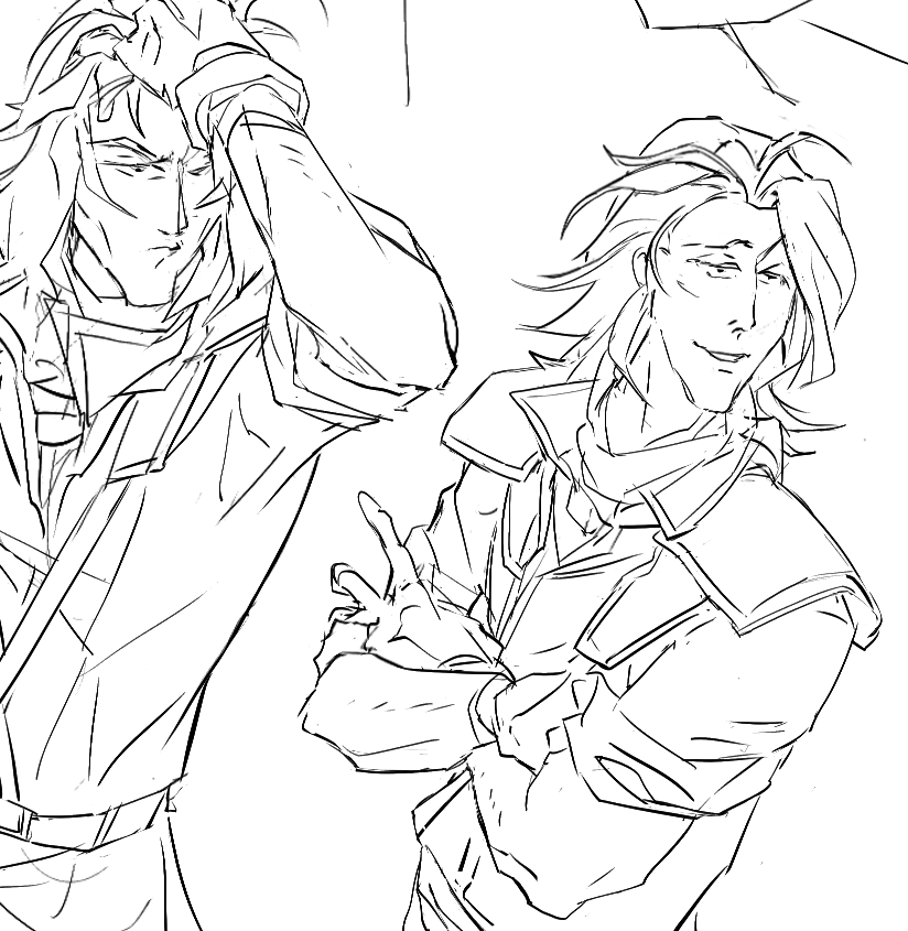
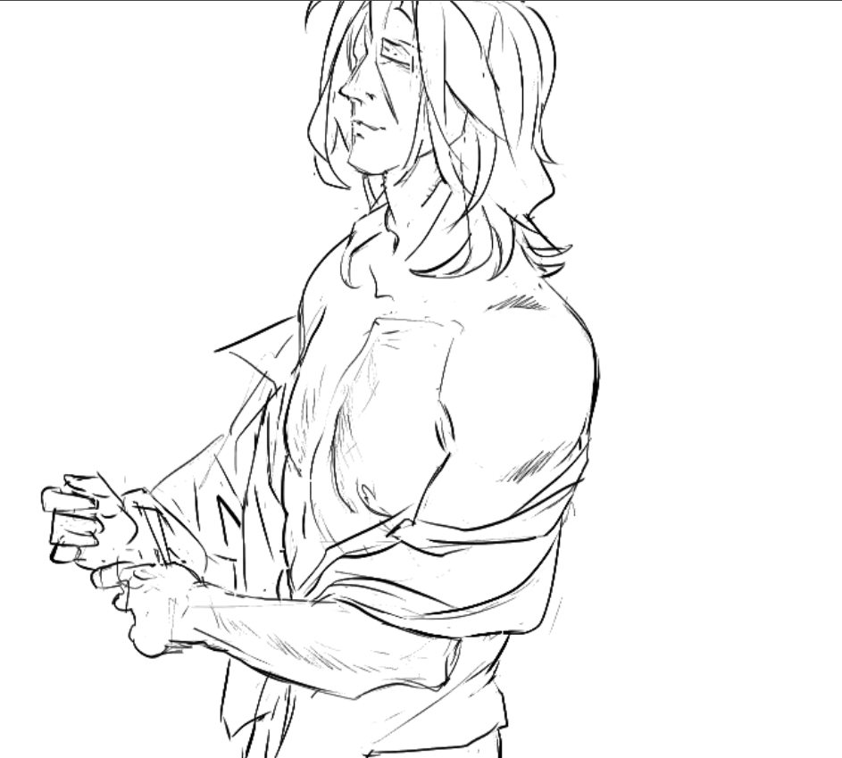
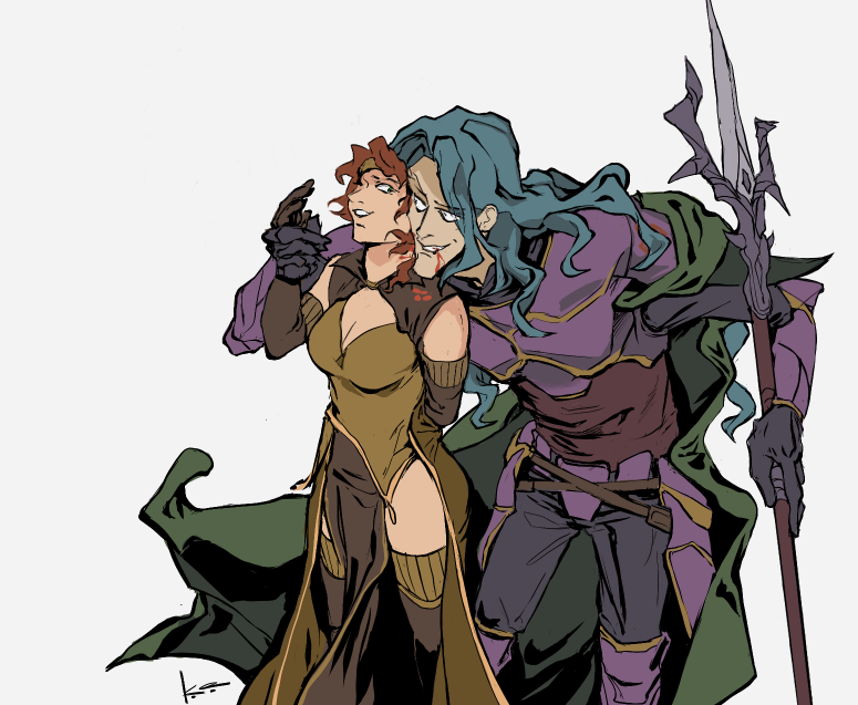
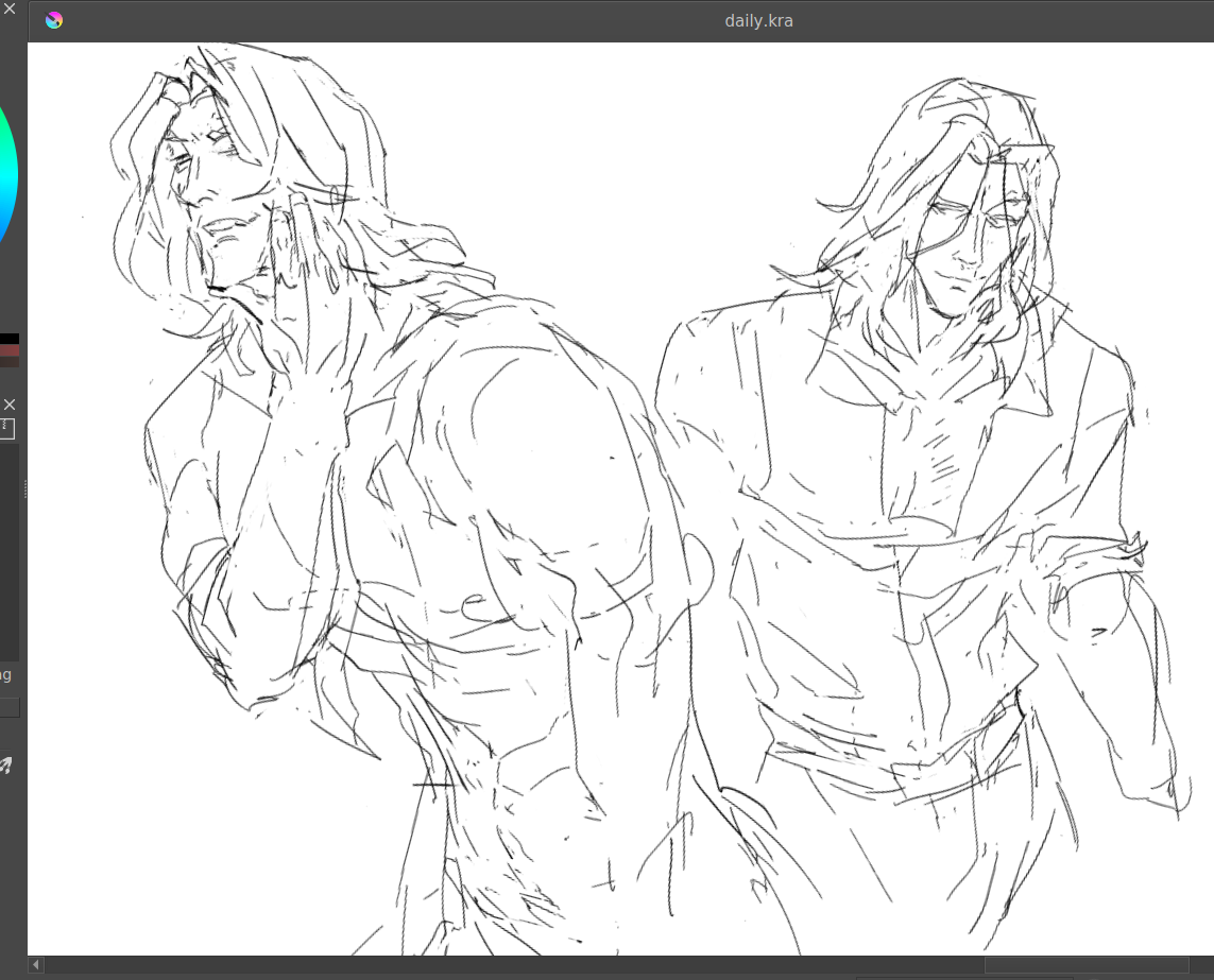
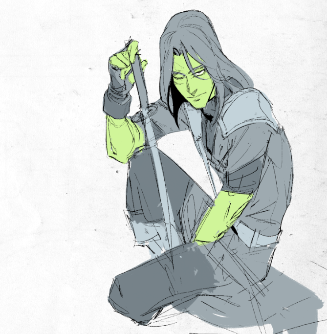
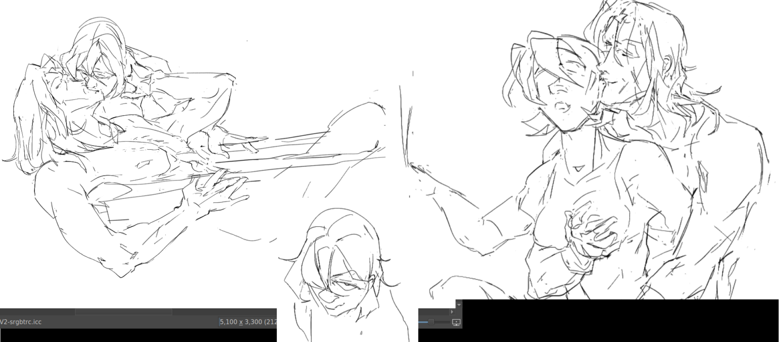
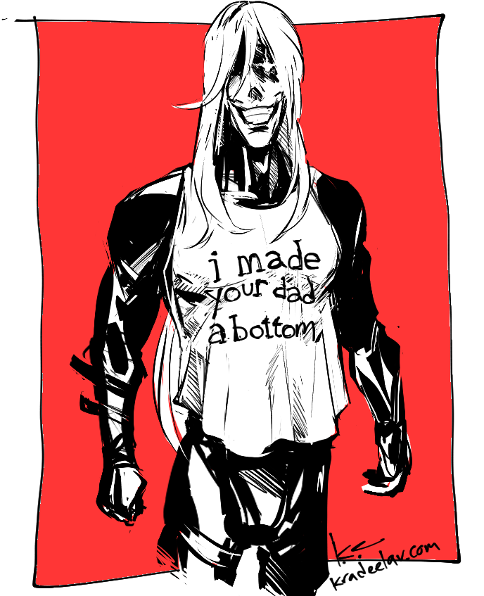
vallite king and queen
#fefates gunter/corrin