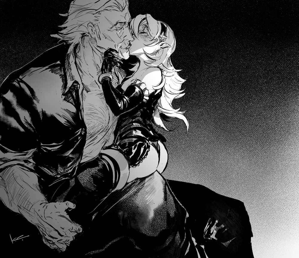
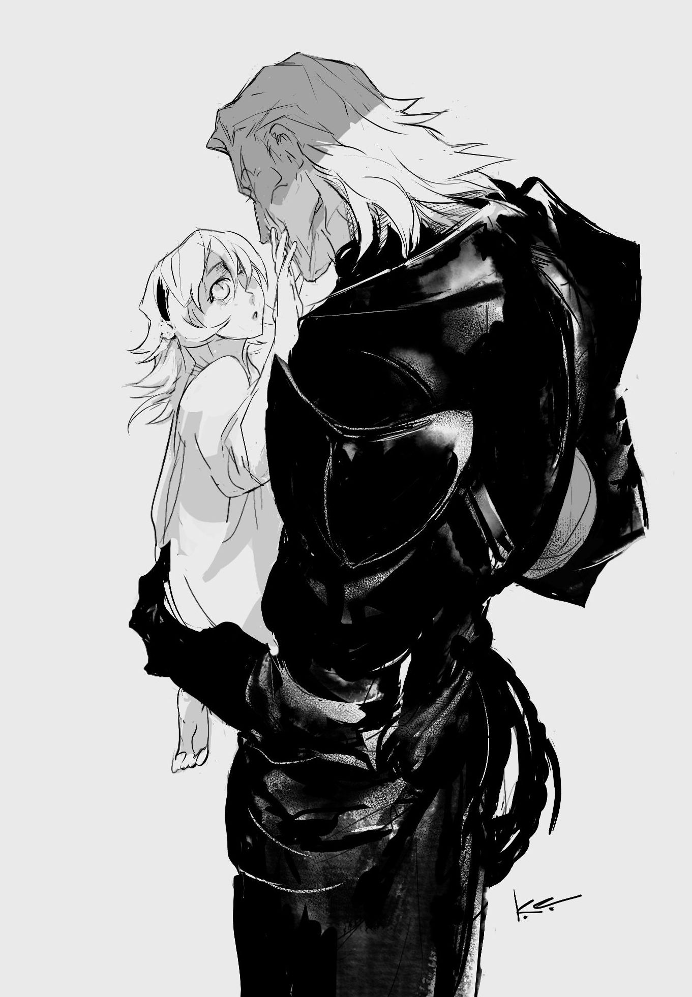
For a working RSS feed, copy and paste https://kradeelav.com/diary/tegalog.cgi?mode=rss& amp; into your feed reader (delete the space). Enjoy!
2024年9月2日の投稿[63件]
2024.09.02 21:19:27 編集
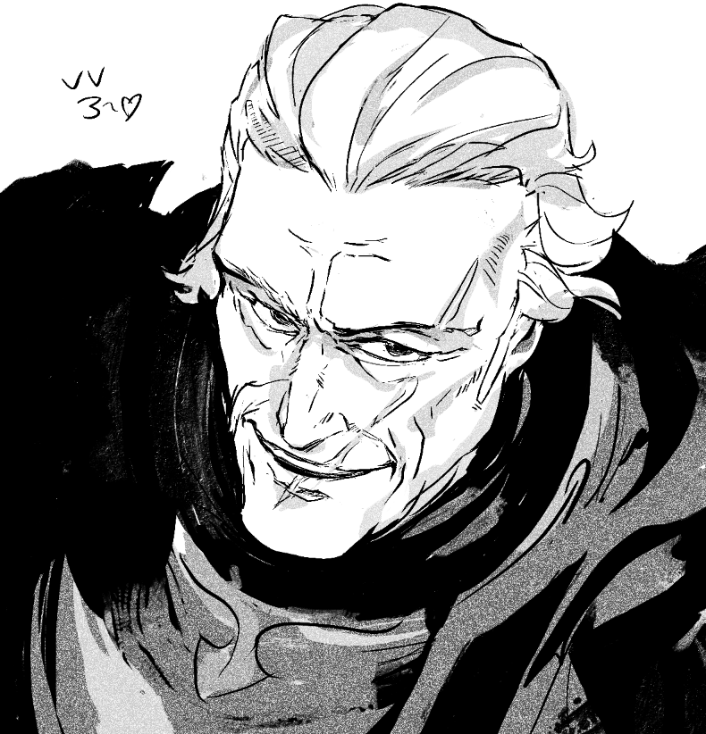
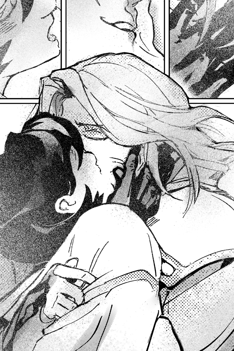
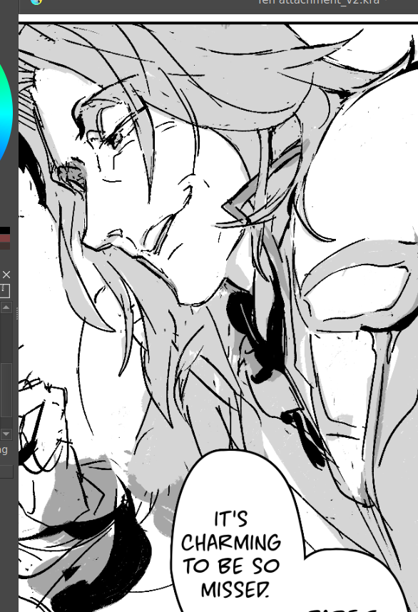
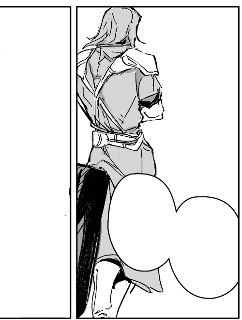
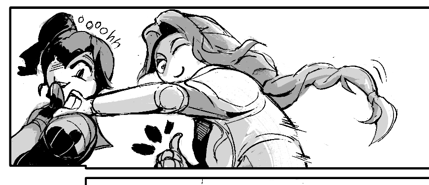
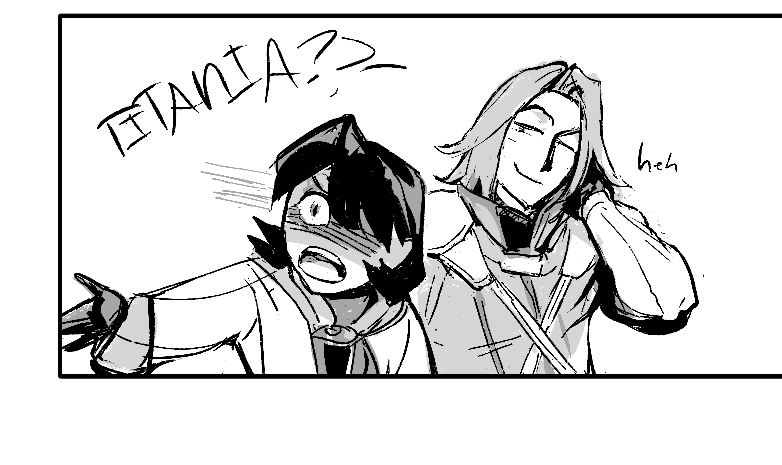
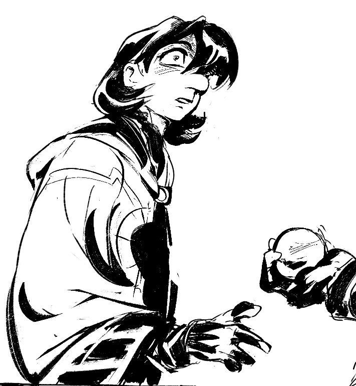
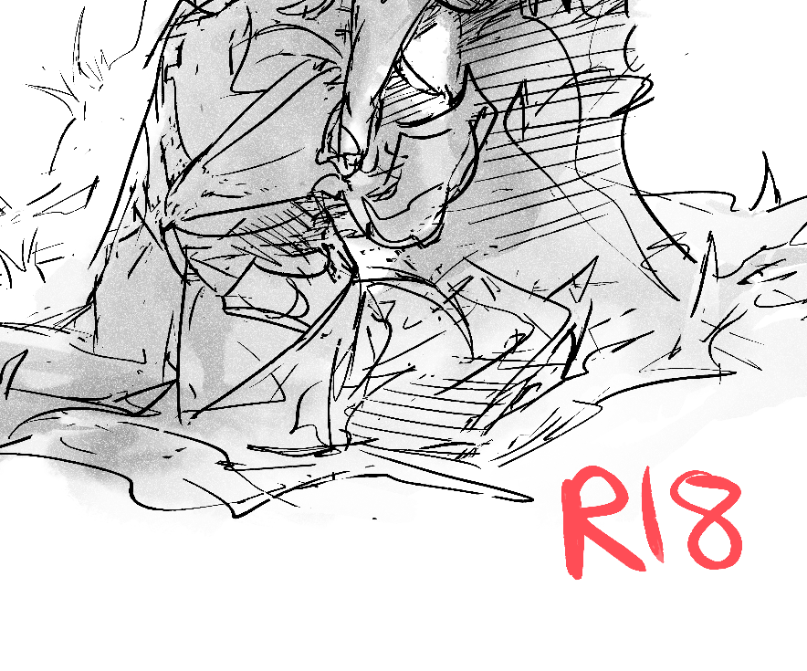
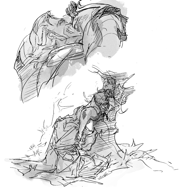
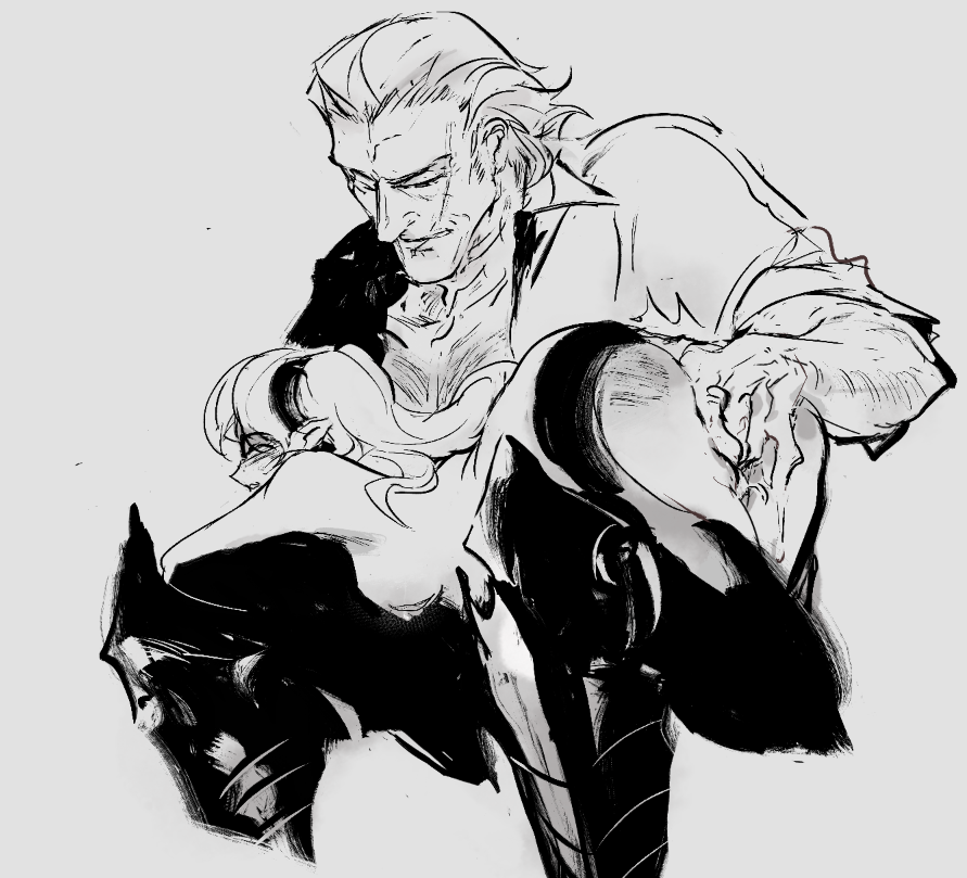
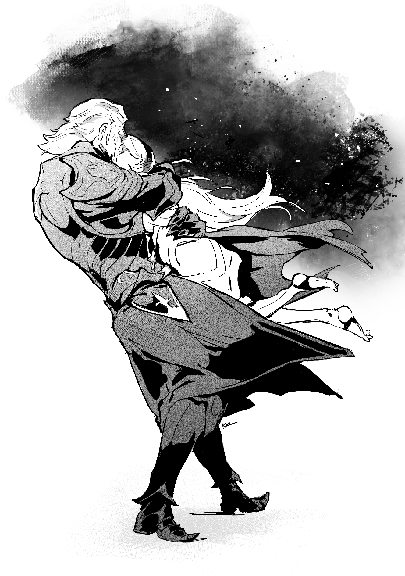
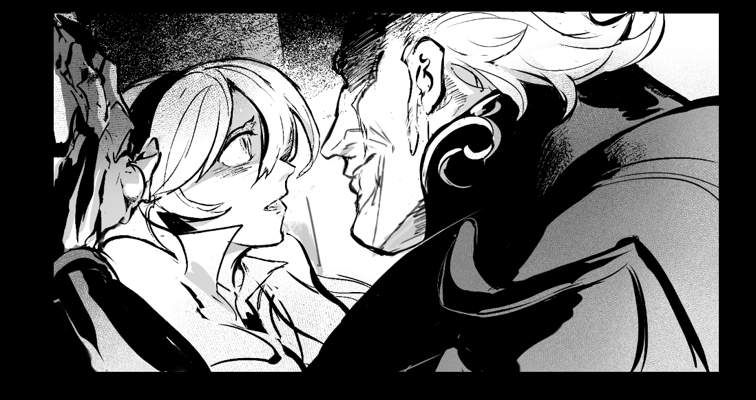
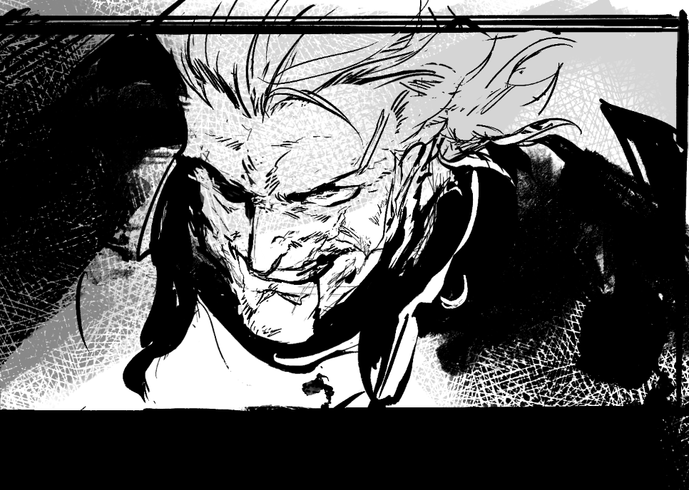
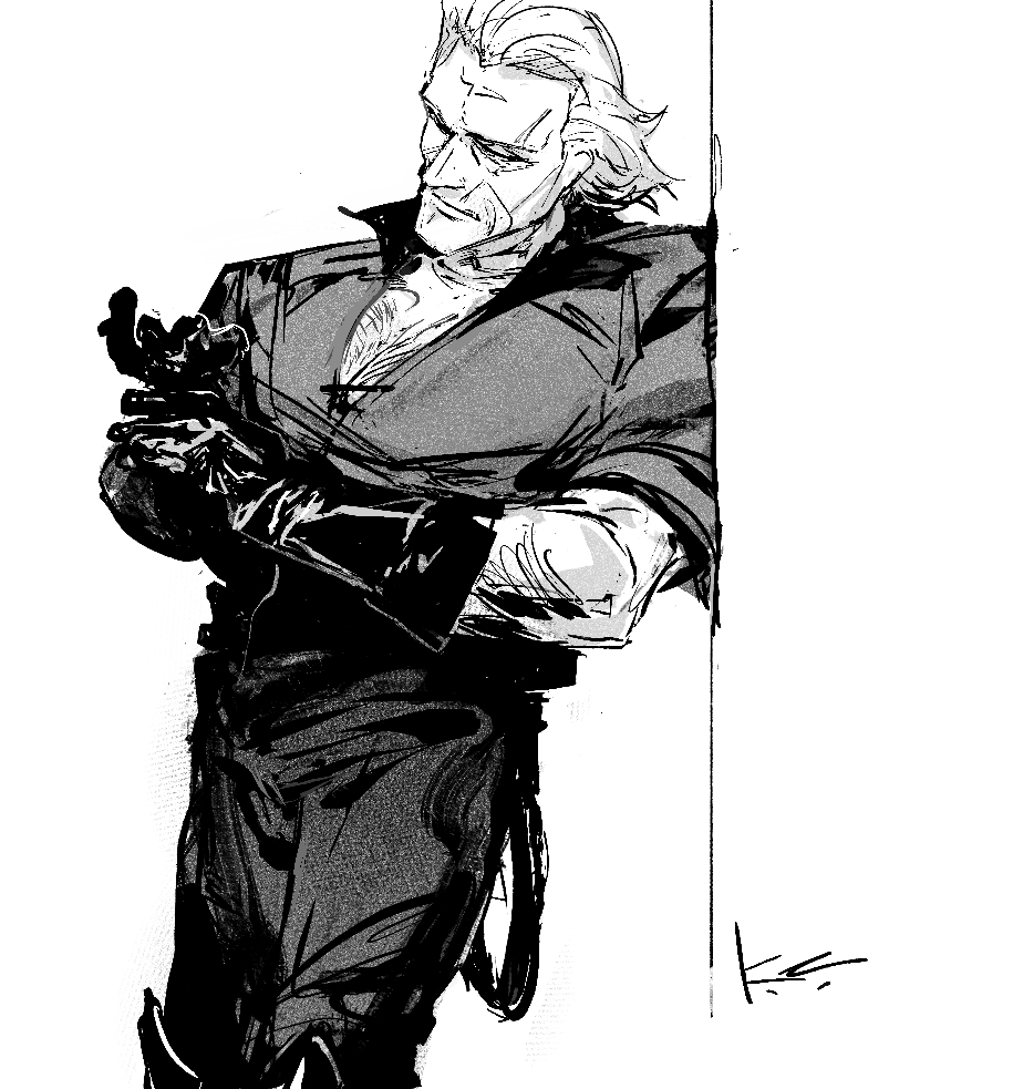
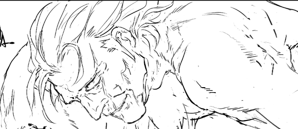
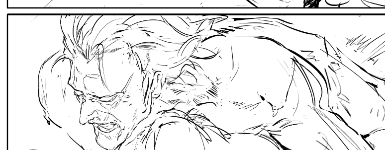
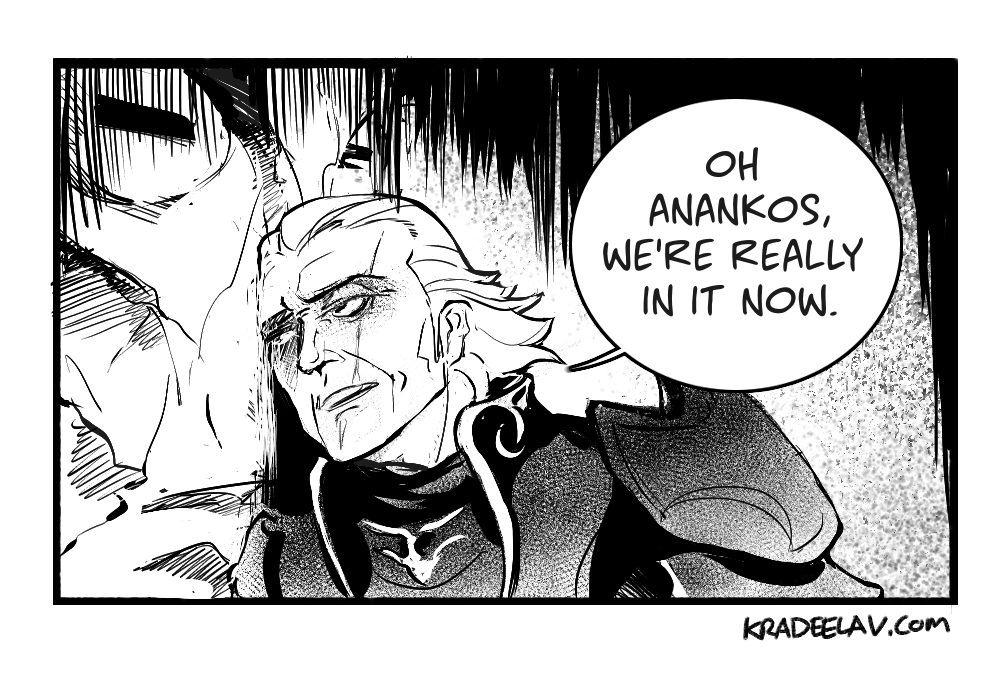
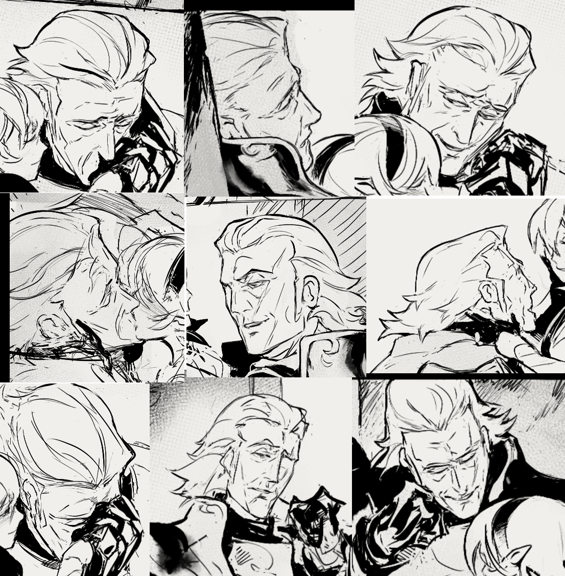
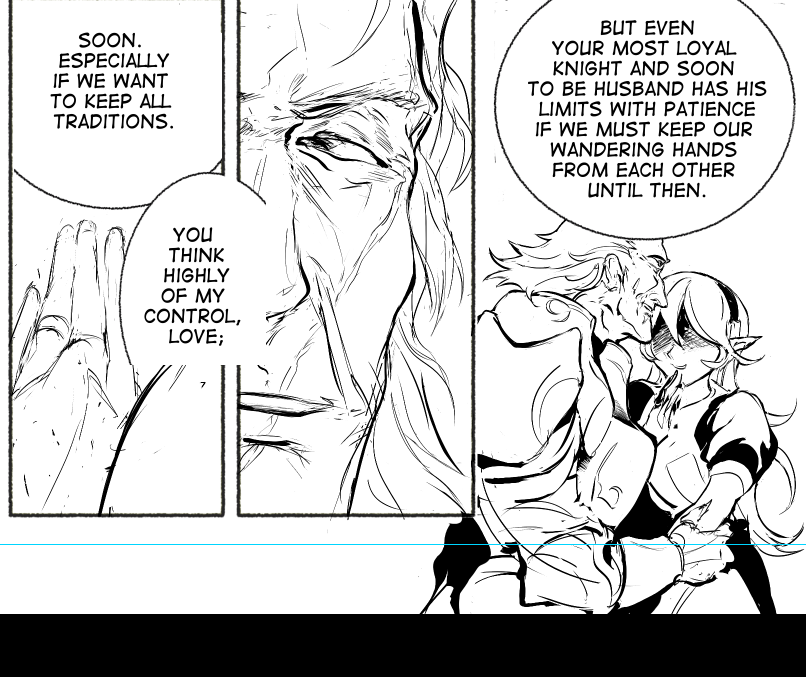
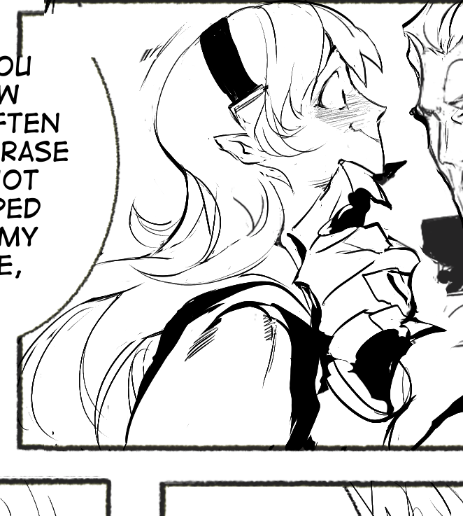
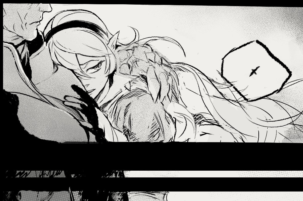
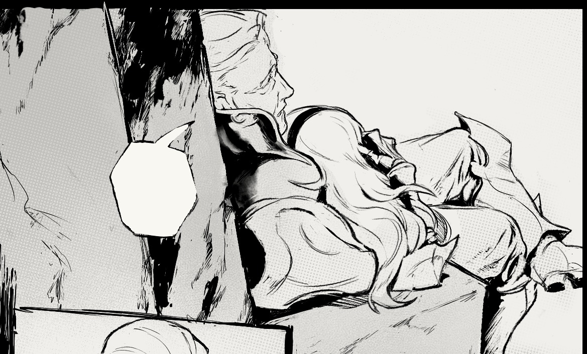
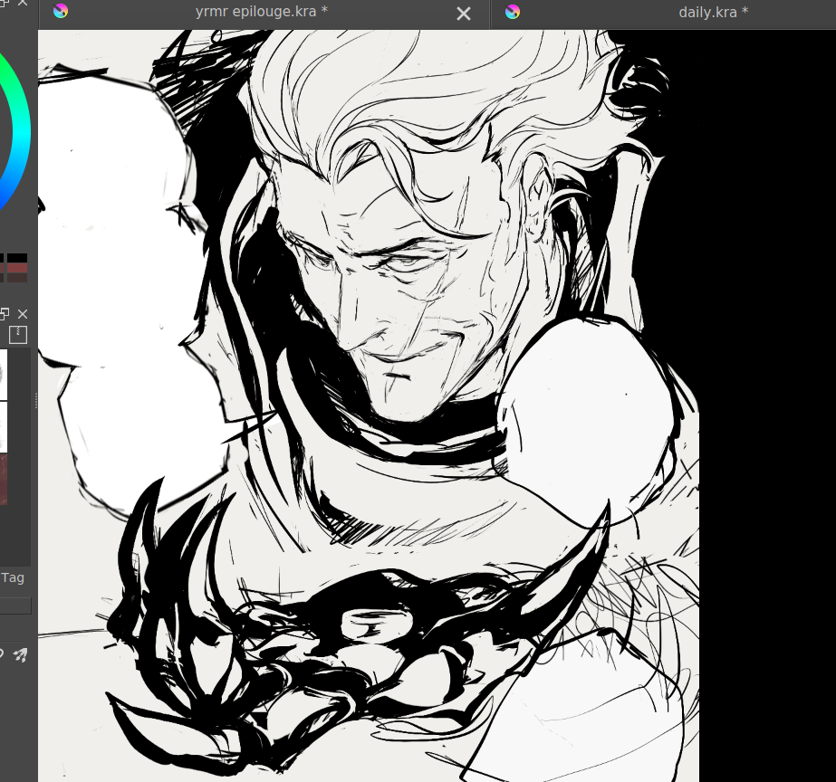
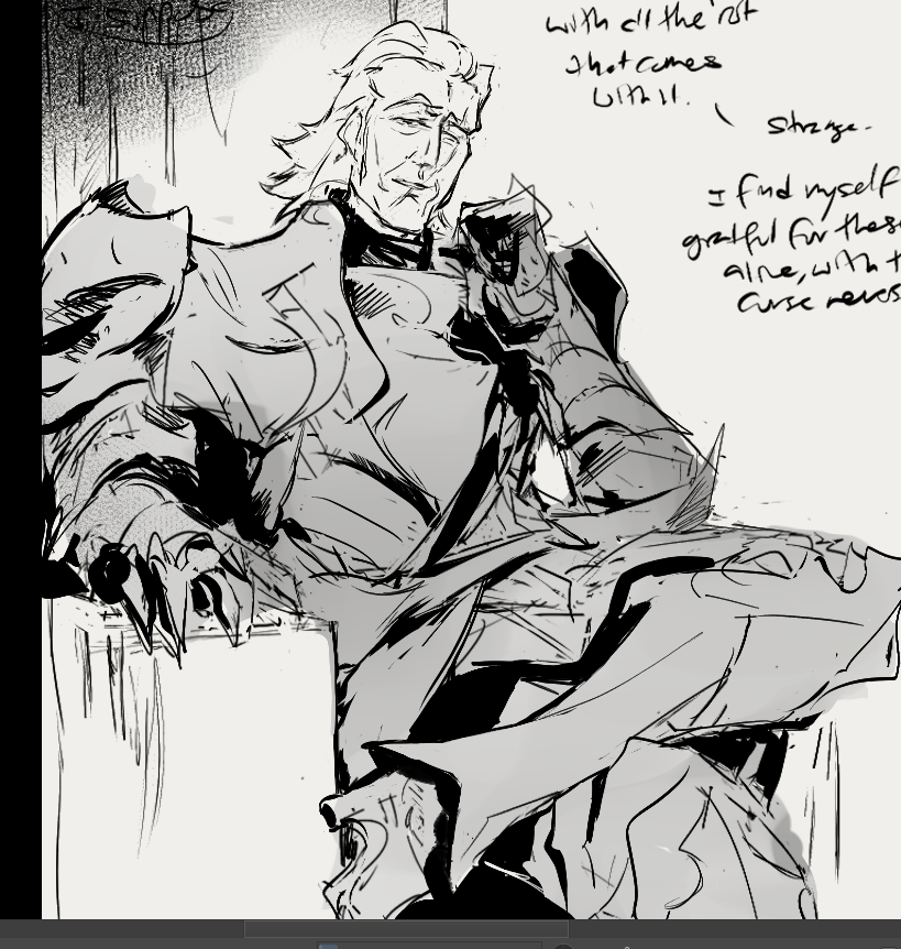
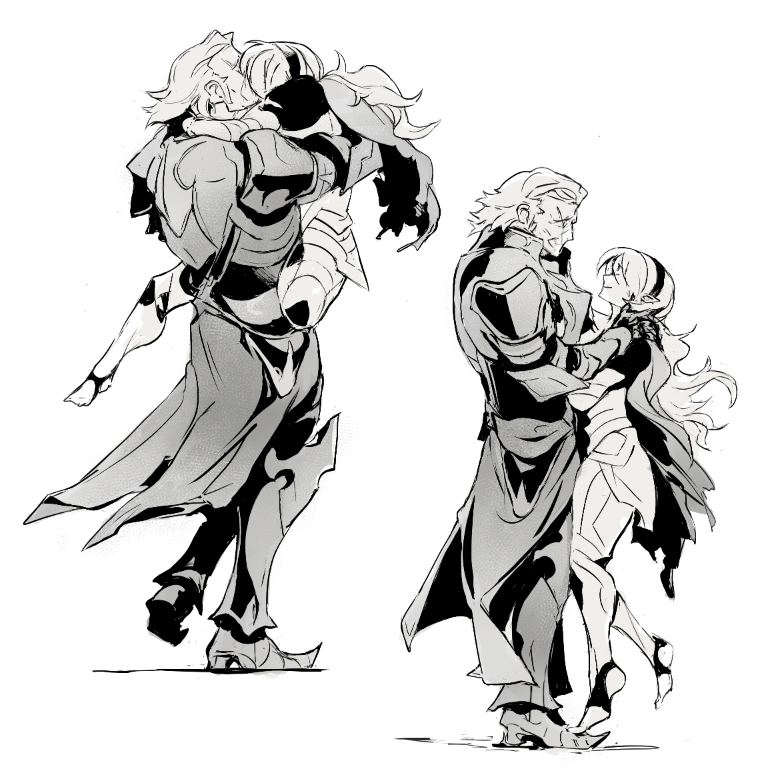
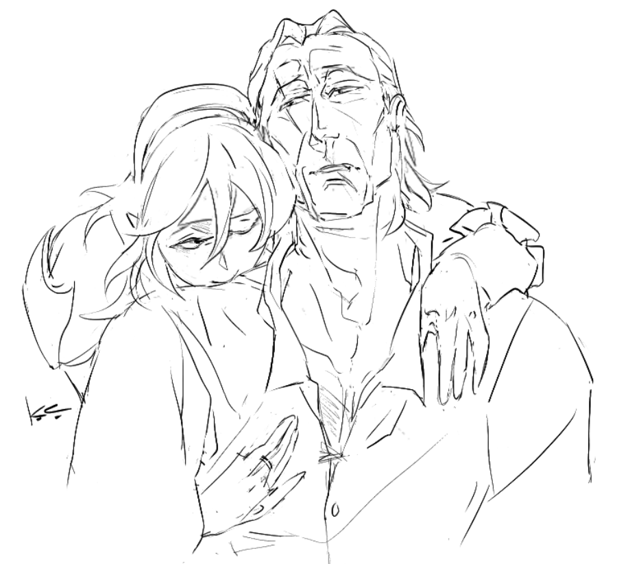
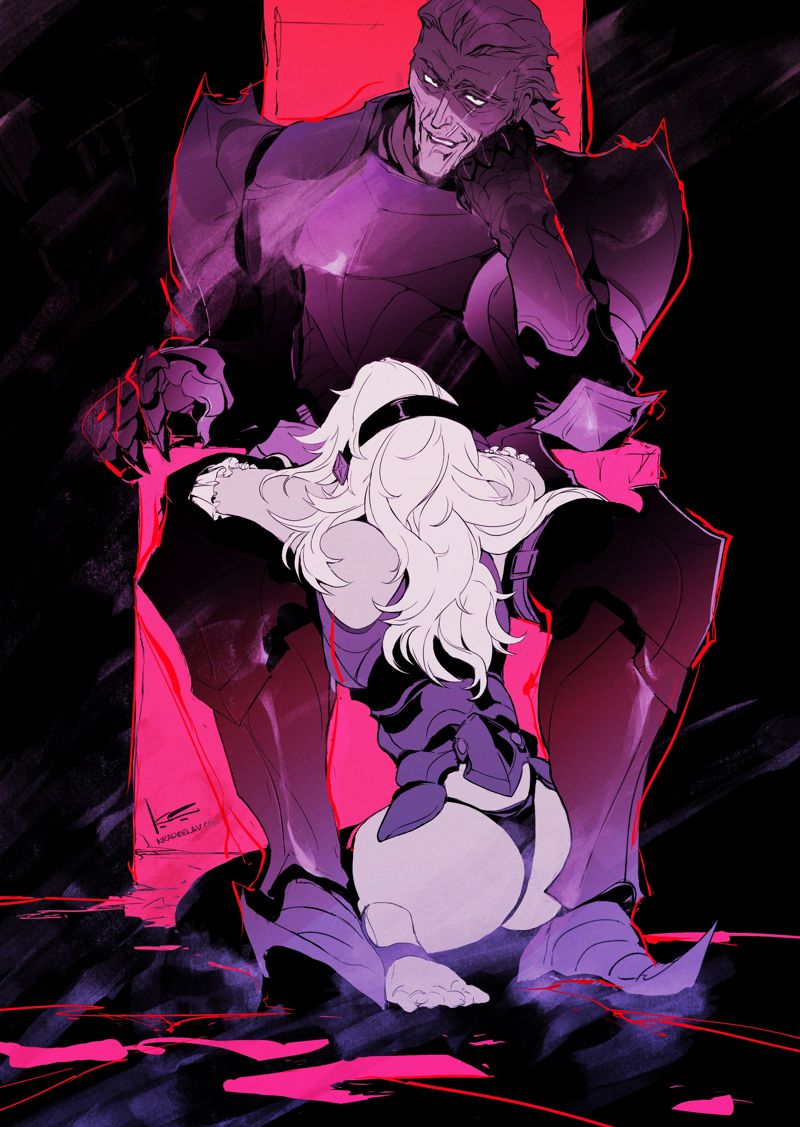
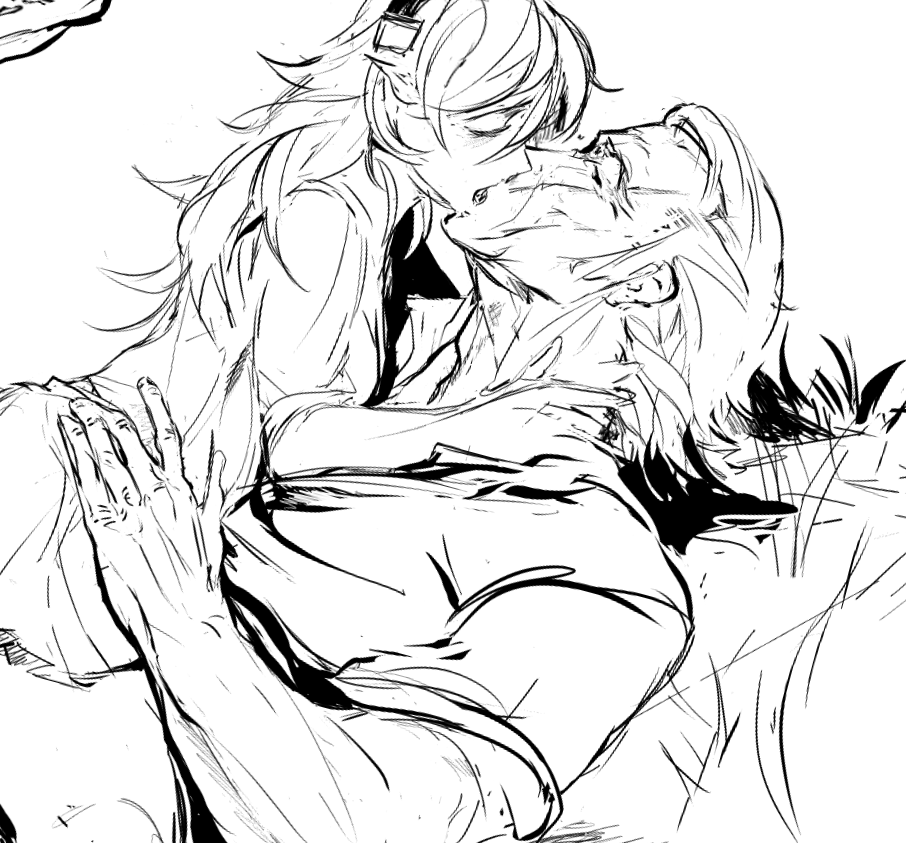
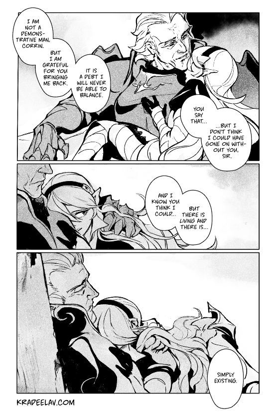
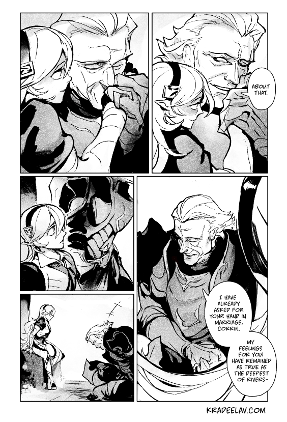
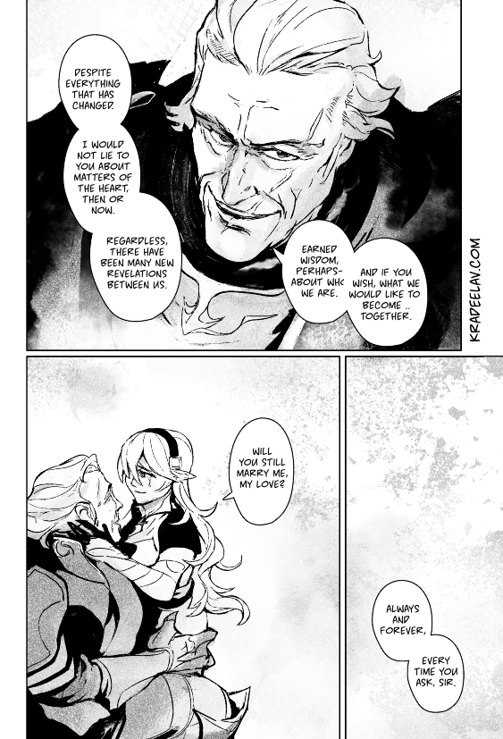
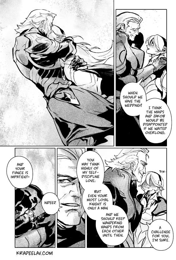
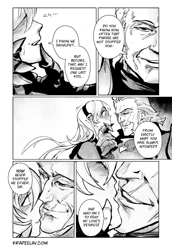
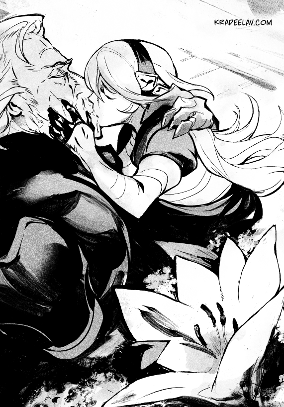
your ruin, my ruin (epilouge) // a #fefates gunter/corrin doujinshi side strip; revelation route. based on the final scene of this fanfic.
after everything – the fight against anankos, the possession, peace between nohr and hoshido – gunter and corrin have one last decision.
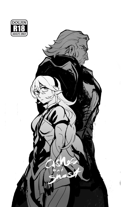
this strip will be part of a printed gunter/corrin r18 doujinshi called ashes and ghost
2024.09.02 21:17:05 編集
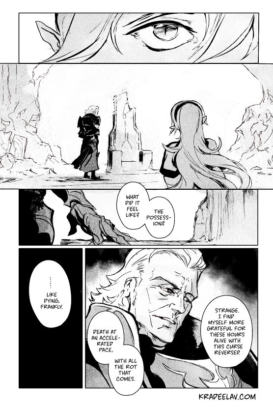
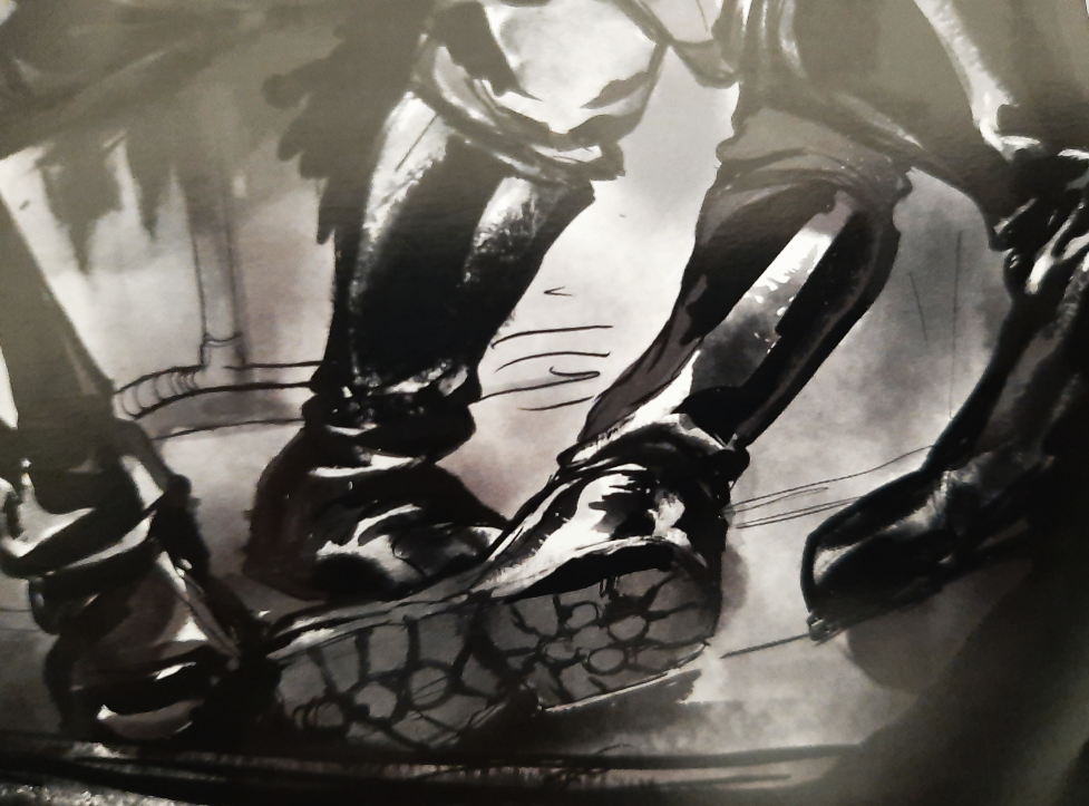
JD Riley and kradeelav curated an #original nazisploitation anthology during spring 2024 called NaZine I with over fifteen contributors - since my copy came in, have a nice crop of my piece.
cover art by the wonderful kmclaude
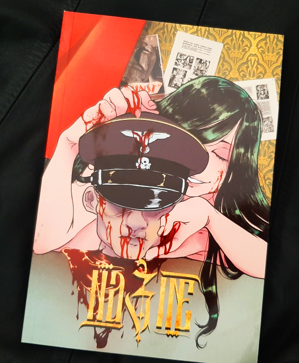
A beautiful, refined, and uniquely unsettling full-color collaborative work of both art and prose delving into the fantasies of those who find particular joy in the aesthetic of Nazisploitation–a genre long misunderstood and abhorred by the uninitiated. Are you ready to be In The Know?
Contributors:
DES ABRAHAM / IDAL WAVES / JACKBOOT / J.D. RILEY / K. M. CLAUDE / KRAD / MISCELLANIUM / OZZY / ANTON RICHTER / MORO / SALT LICK / EC12 / L.F.
Creator Chose Not To Use Warnings
Print - 124 Pages (Full Color) 6.5x9.5in
FREE digital DRM-free low-resolution PDF included
If there’s any questions, happy to answer via email (overlord (at) kradeelav (dot) com)

cover art by the wonderful kmclaude

A beautiful, refined, and uniquely unsettling full-color collaborative work of both art and prose delving into the fantasies of those who find particular joy in the aesthetic of Nazisploitation–a genre long misunderstood and abhorred by the uninitiated. Are you ready to be In The Know?
Contributors:
DES ABRAHAM / IDAL WAVES / JACKBOOT / J.D. RILEY / K. M. CLAUDE / KRAD / MISCELLANIUM / OZZY / ANTON RICHTER / MORO / SALT LICK / EC12 / L.F.
Creator Chose Not To Use Warnings
Print - 124 Pages (Full Color) 6.5x9.5in
FREE digital DRM-free low-resolution PDF included
If there’s any questions, happy to answer via email (overlord (at) kradeelav (dot) com)
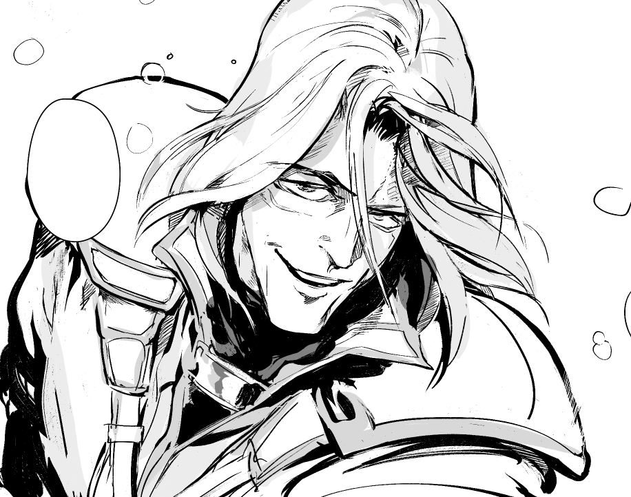
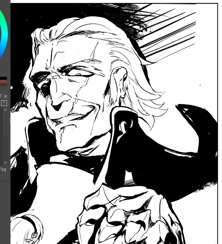
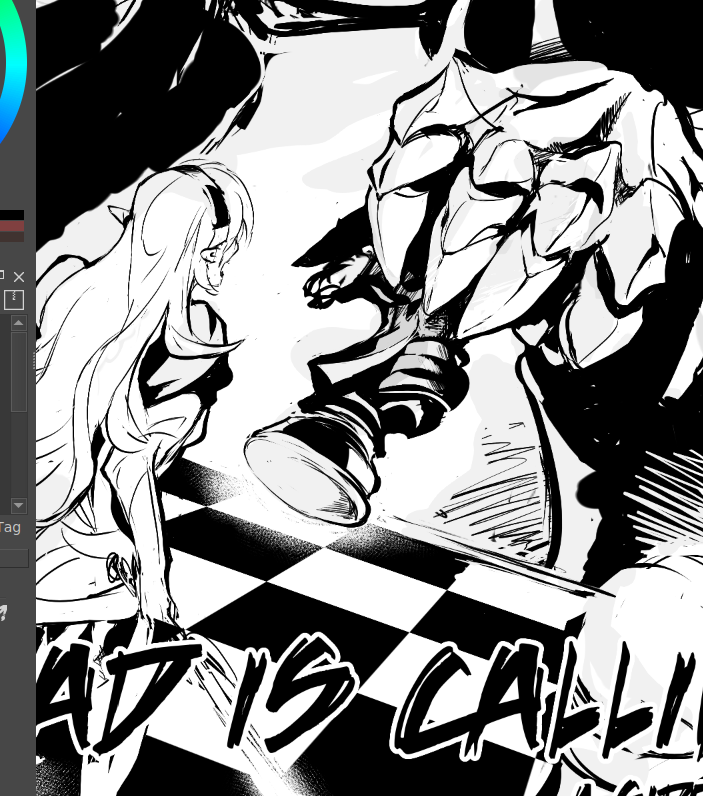
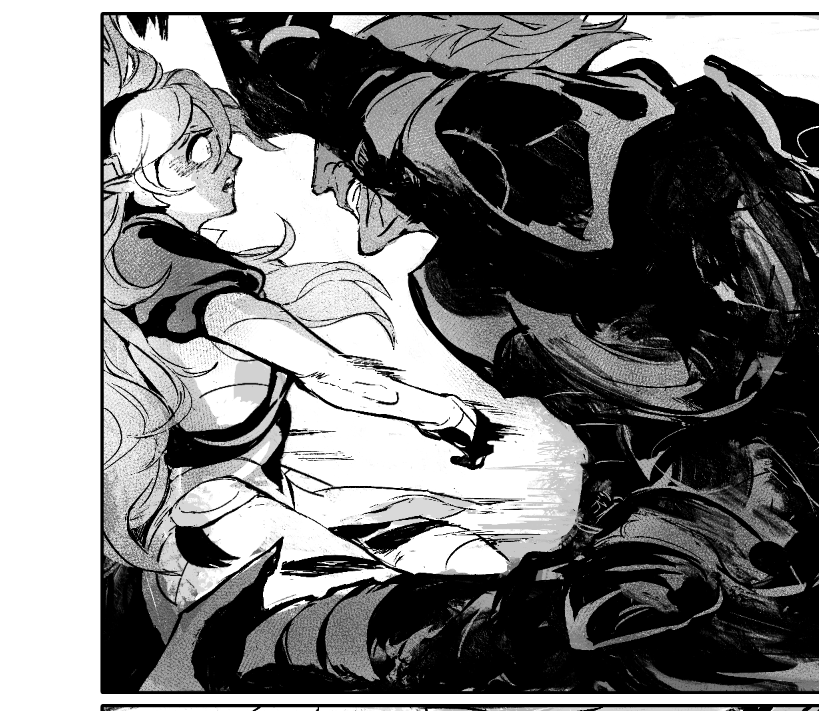
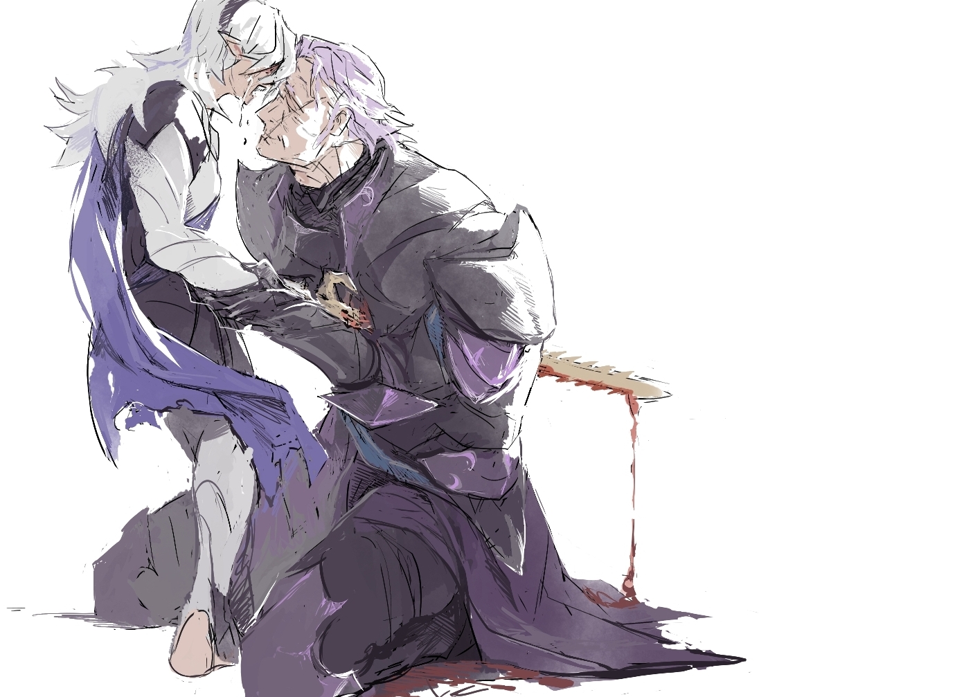
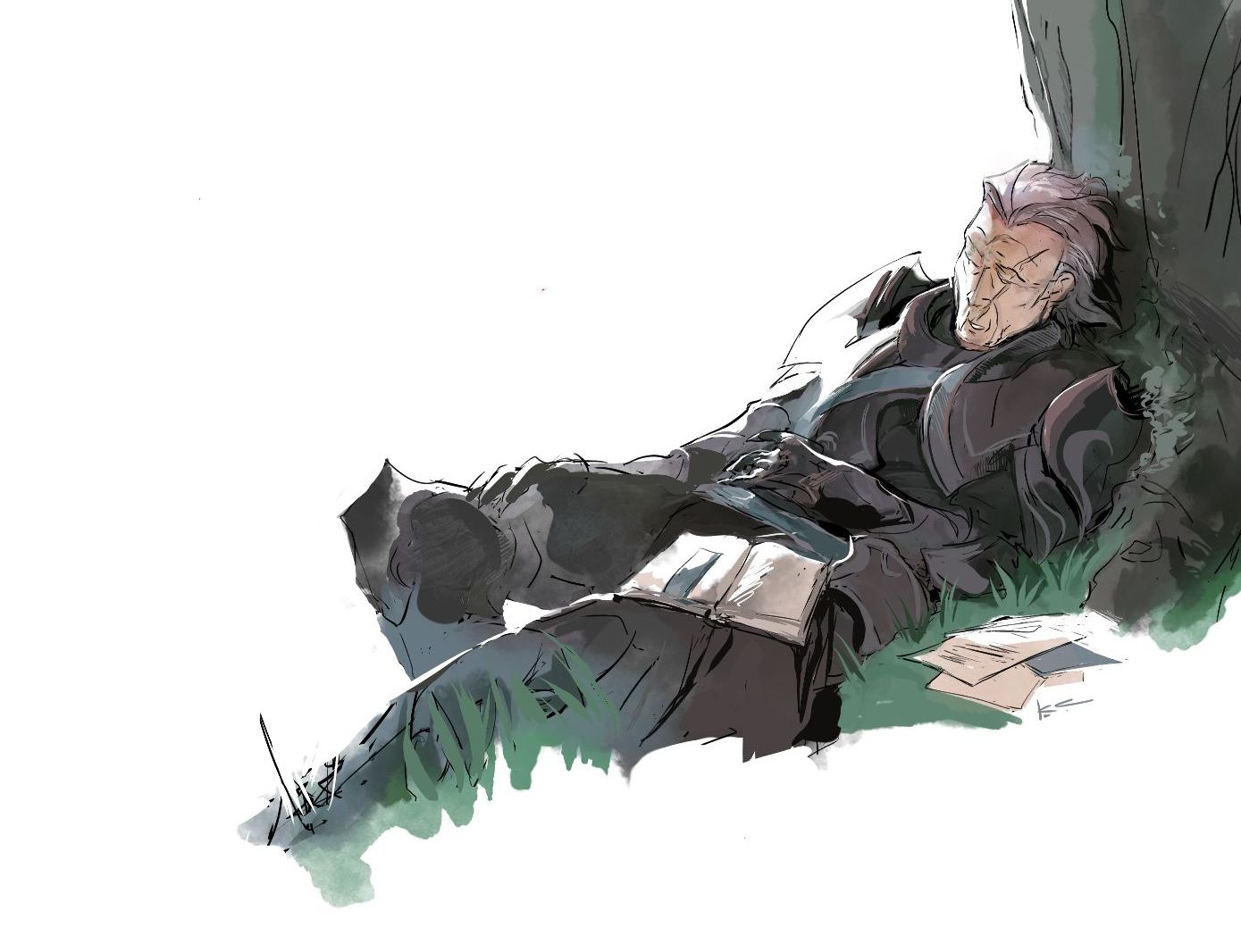
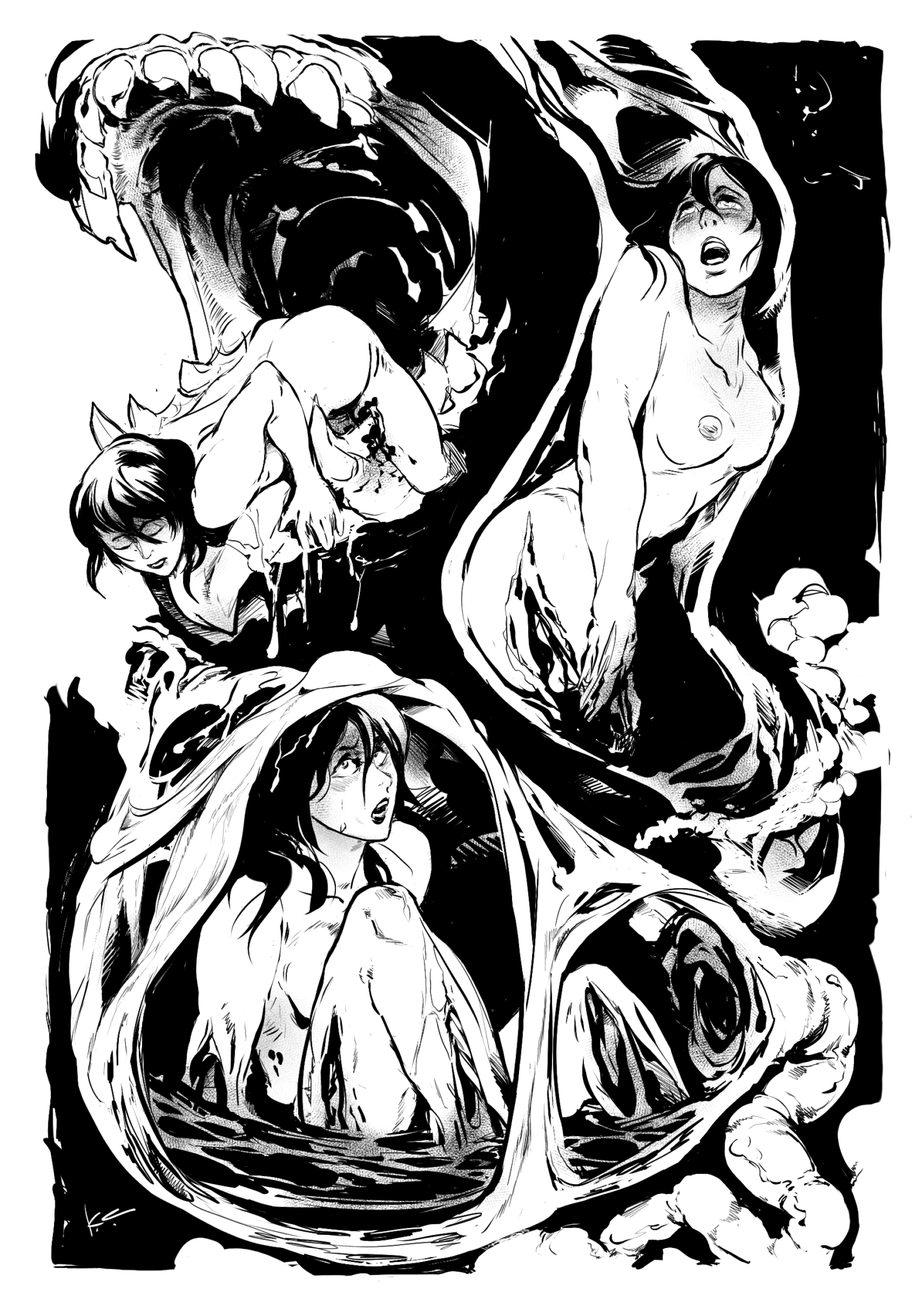
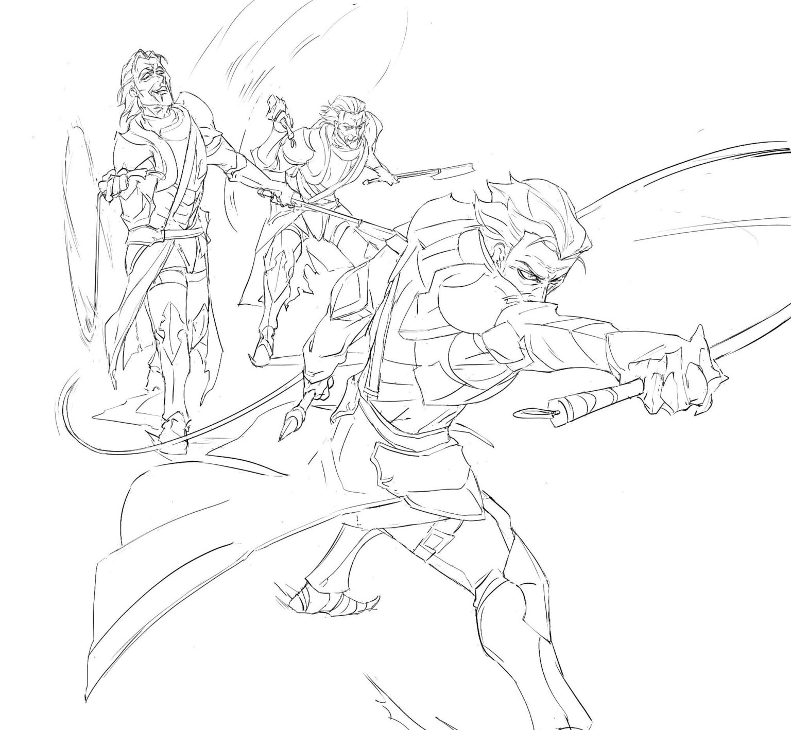
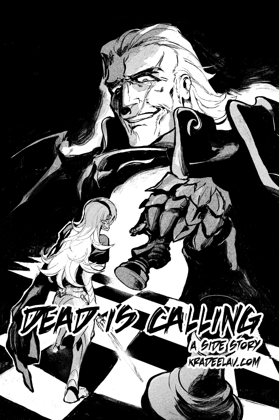
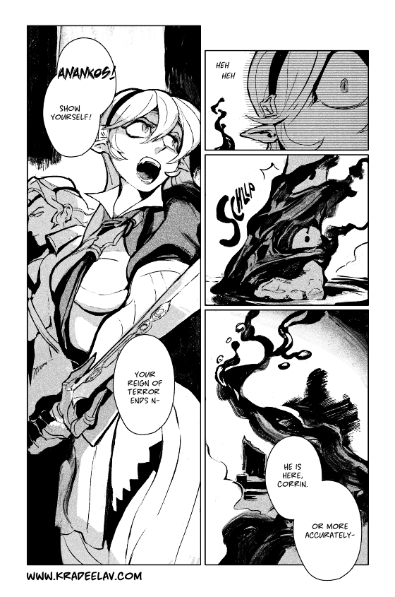
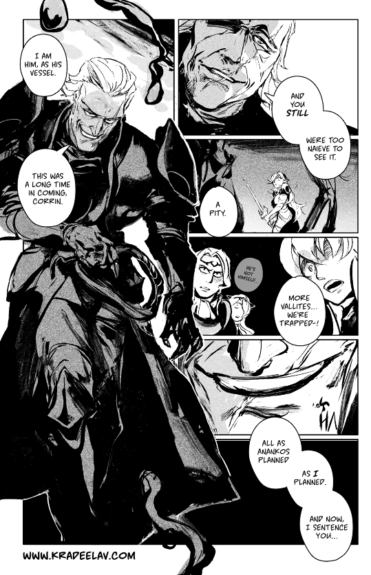
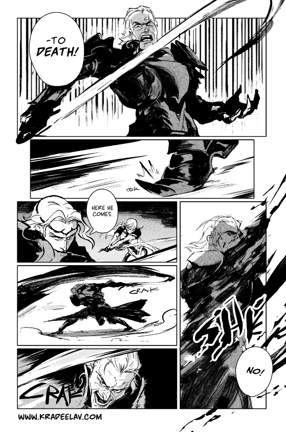
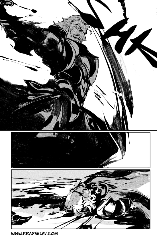
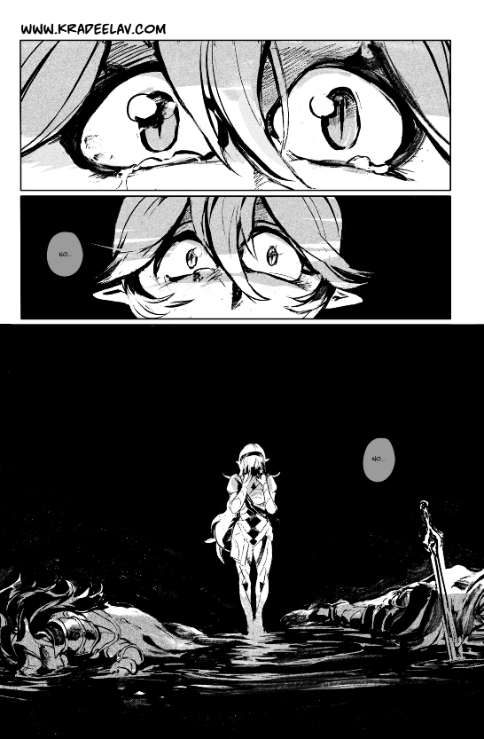
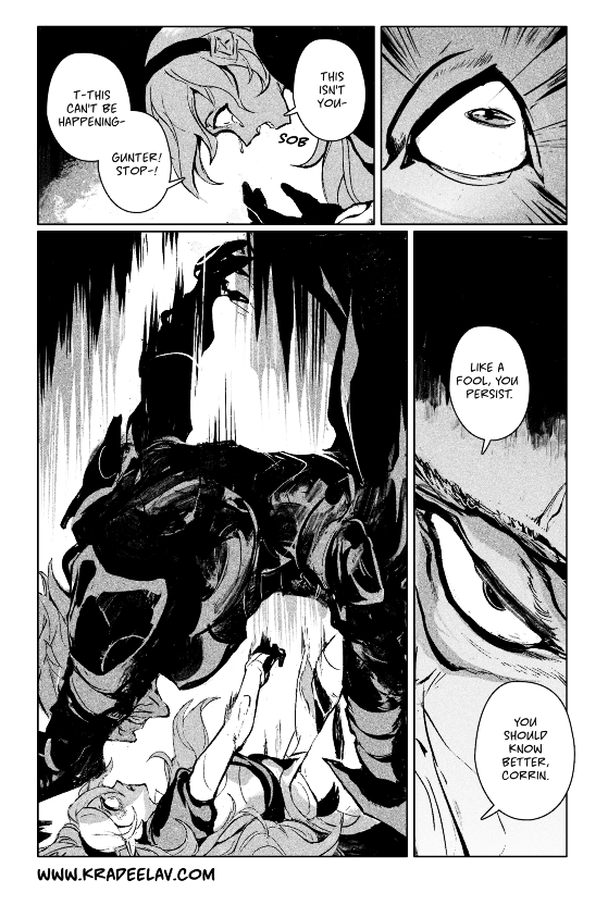
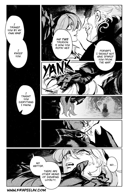
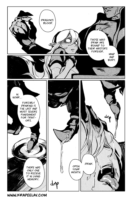
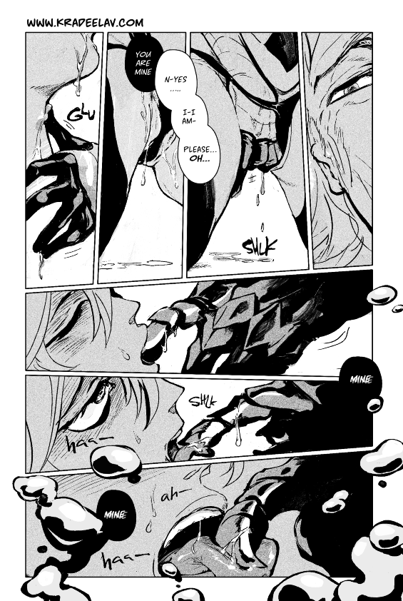
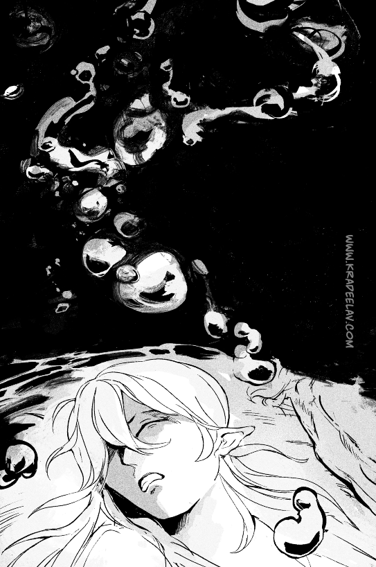
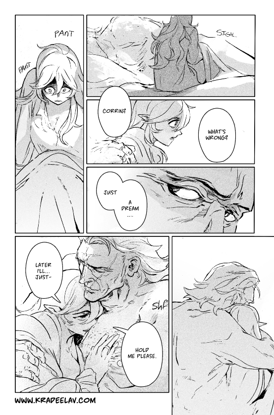
DEAD IS CALLING // a gunter/corrin doujinshi side strip; revelation route.
even after anankos is defeated in valla and her lover is returned, corrin wonders… what would have happened if he had won?
⚠ share on tumblr / read on ao3 / share on bsky
⚠ this strip will be part of a printed #fefates r18 doujinshi called ashes and ghost
 COLLAPSE
even after anankos is defeated in valla and her lover is returned, corrin wonders… what would have happened if he had won?
⚠ share on tumblr / read on ao3 / share on bsky
⚠ this strip will be part of a printed #fefates r18 doujinshi called ashes and ghost


 COLLAPSE
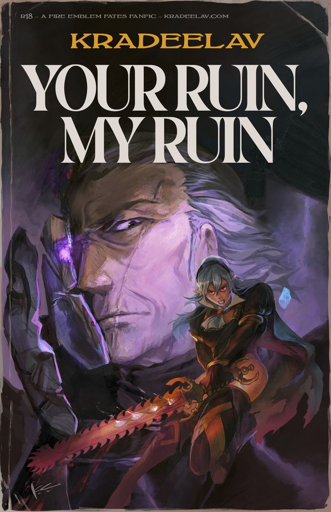
'your ruin, my ruin' is my 120k #fefates gunter/corrin slowburn romance where they both earn their happy ending. 💕 complete, revelation route ~
📚 to read on Ao3
🌐 site mirror
📚 to read on Ao3
🌐 site mirror

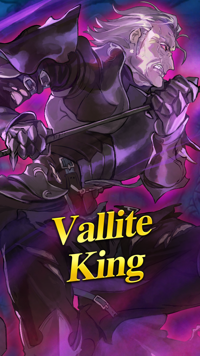
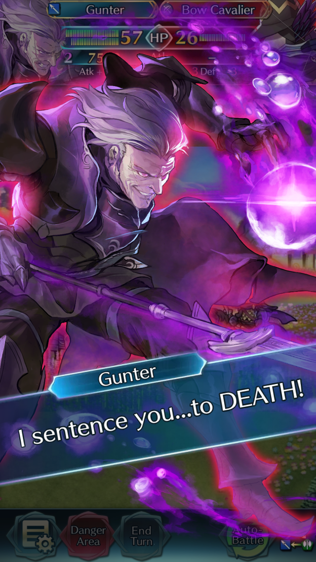
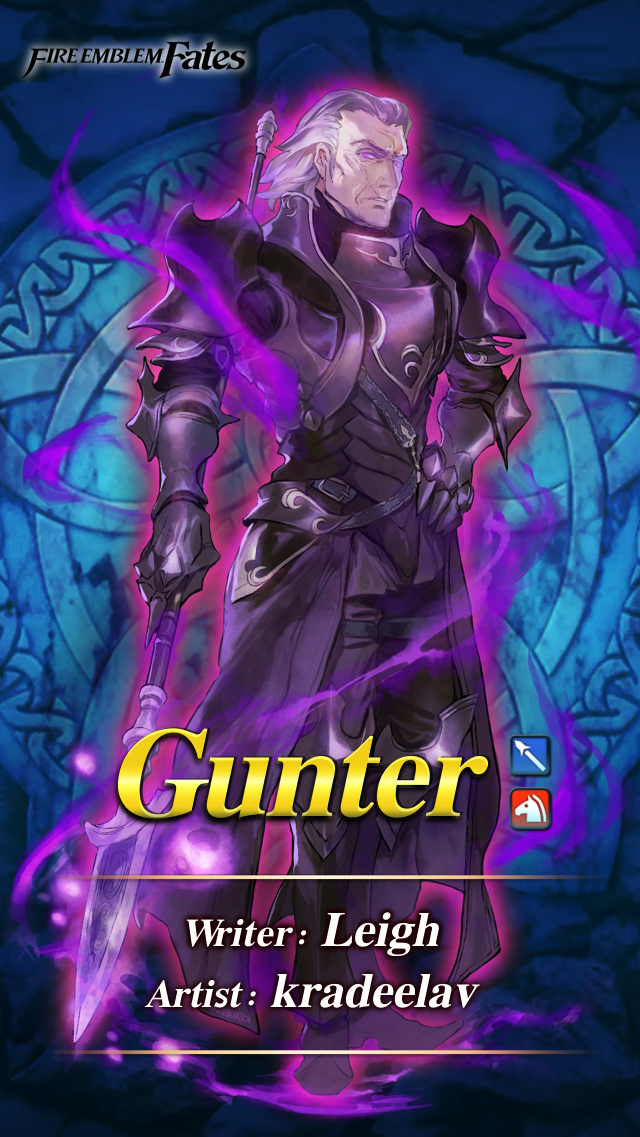
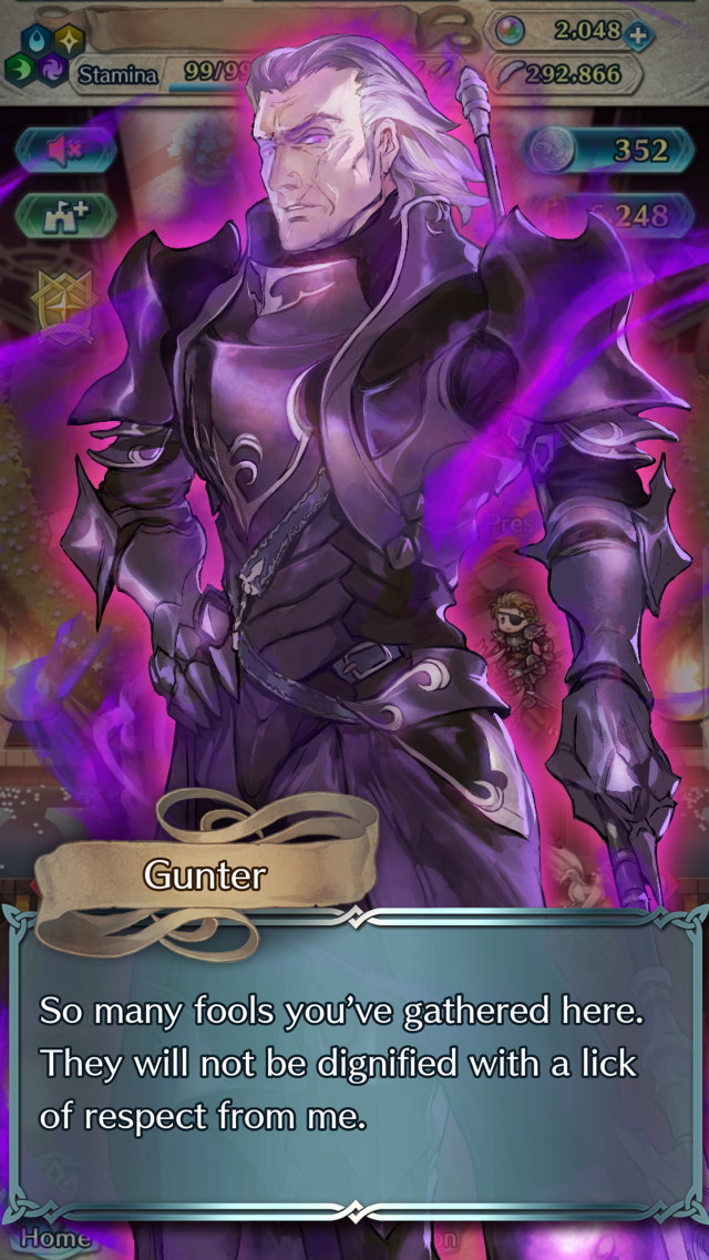
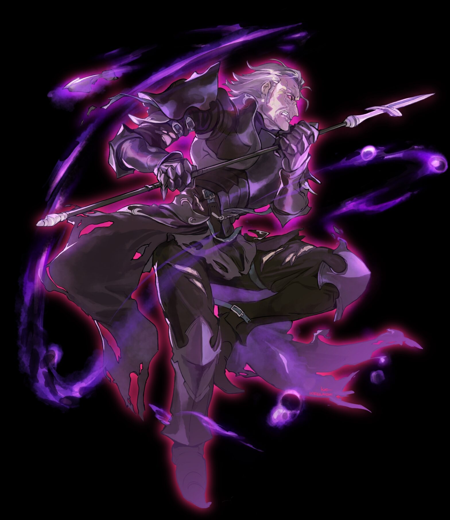
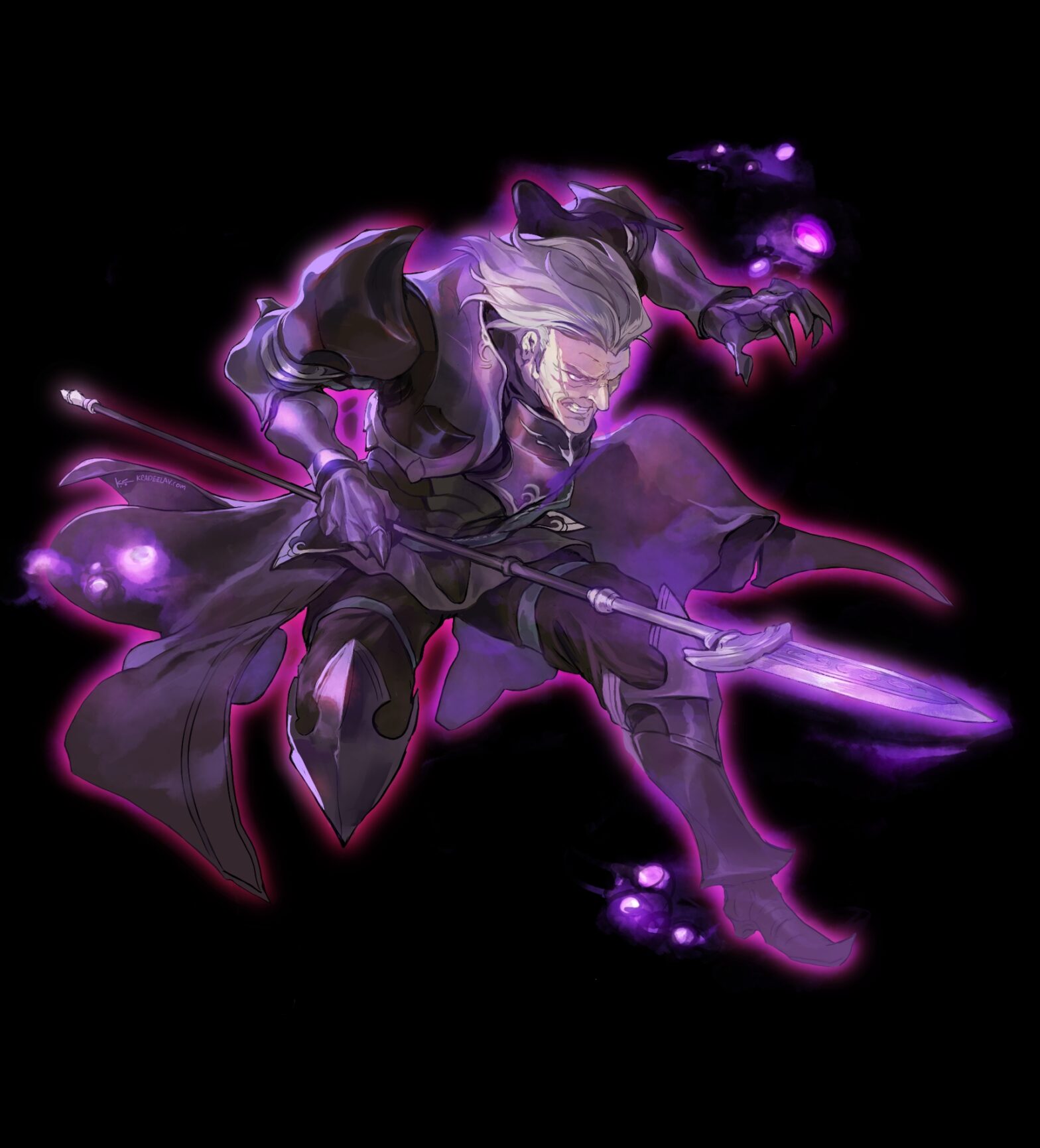
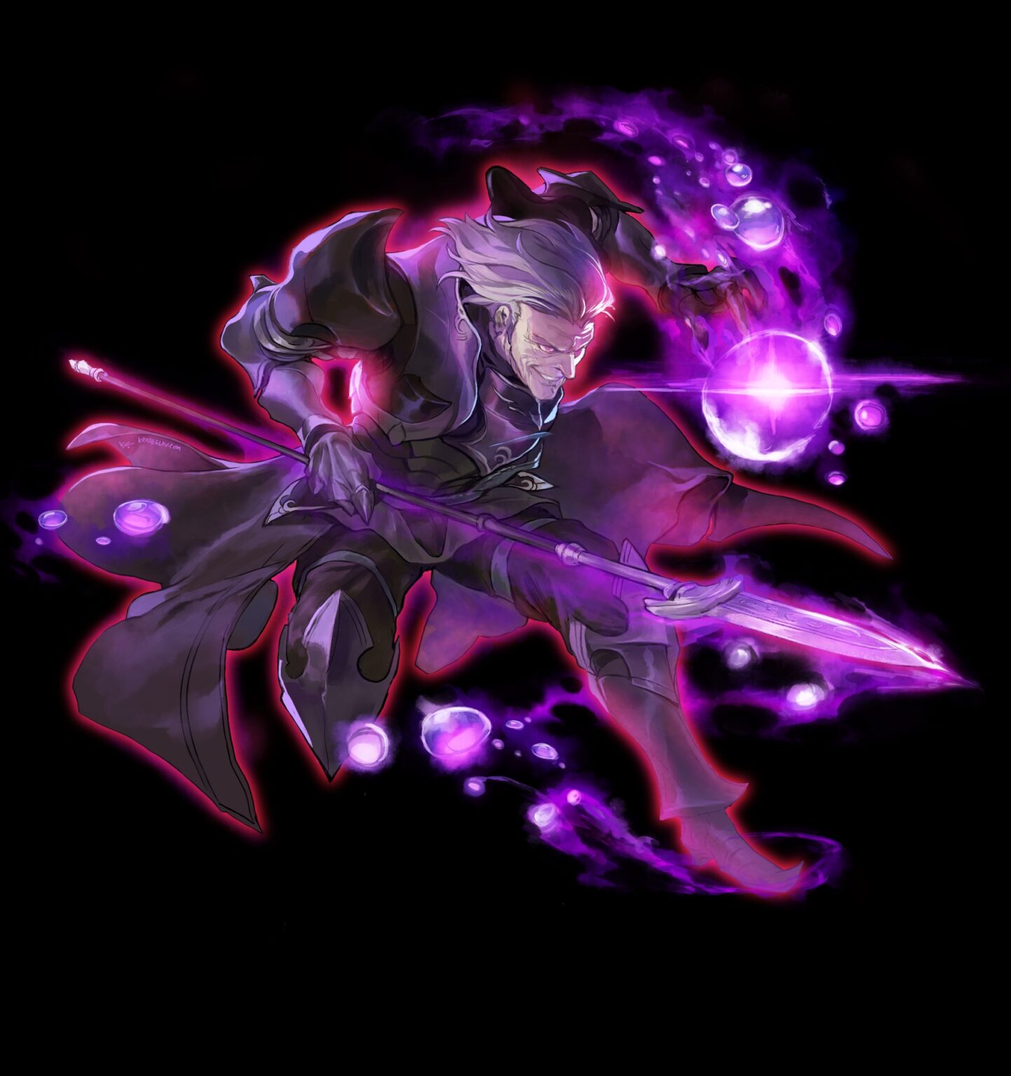
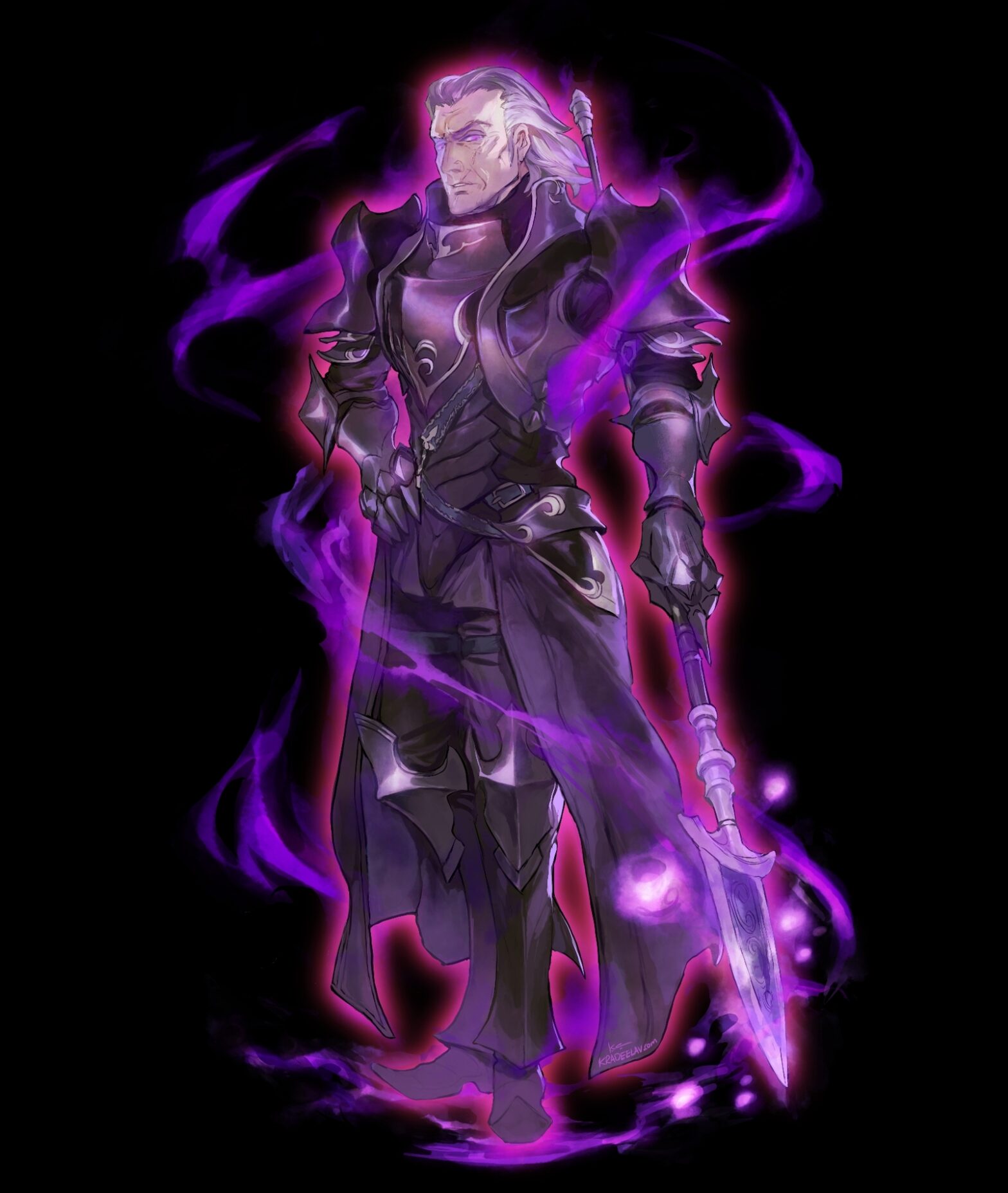
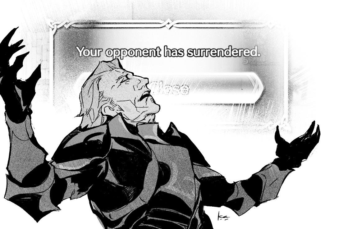
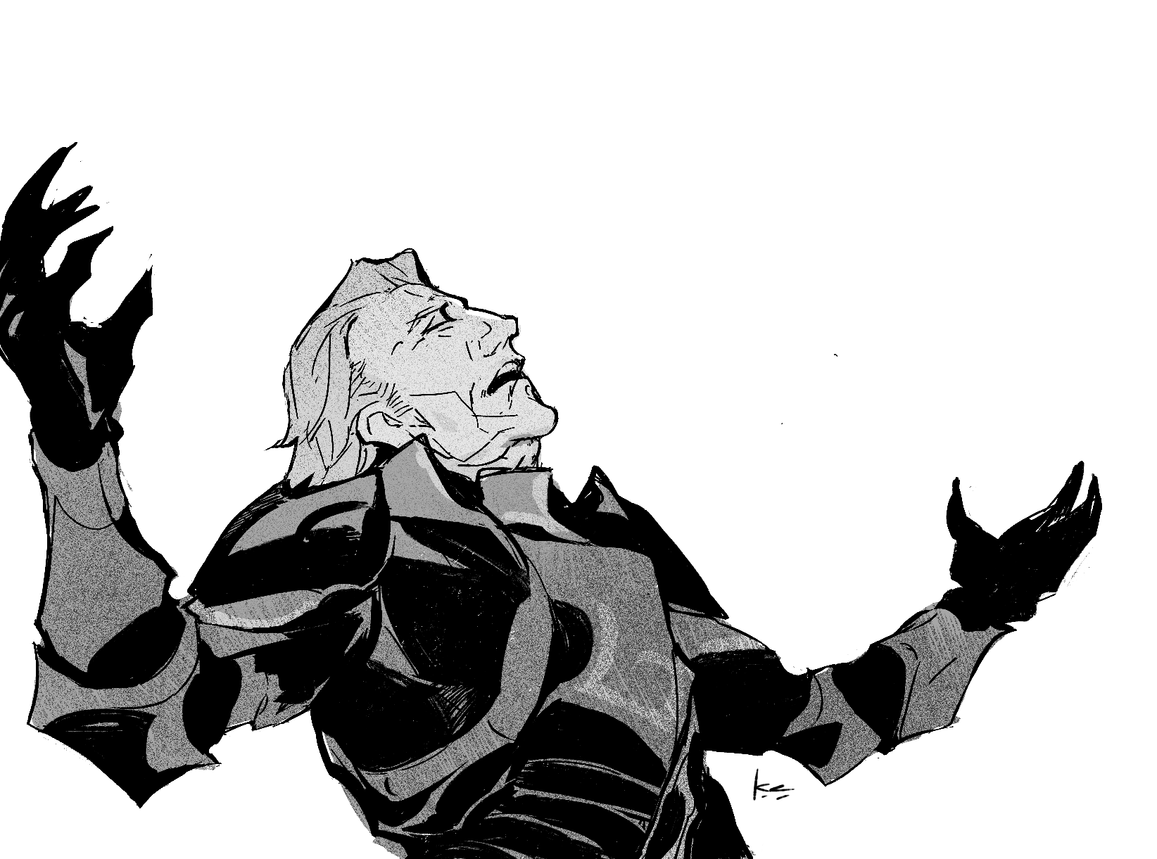
lululeighsworld and I got together to make a possessed!Gunter FE: Heroes (gacha) unit! crossposted on Ao3 with writing
Leigh did the fantastic writing, and yours truly stitched together the art & UI. Leigh’s inspired me with their unshakeable devotion to the character not to mention talented writing and so it felt like a delightful inevitability, and an honor nonetheless, to collaborate here.
i made a cover for my #fefates gunter/corrin 120k fanfiction, your ruin, my ruin
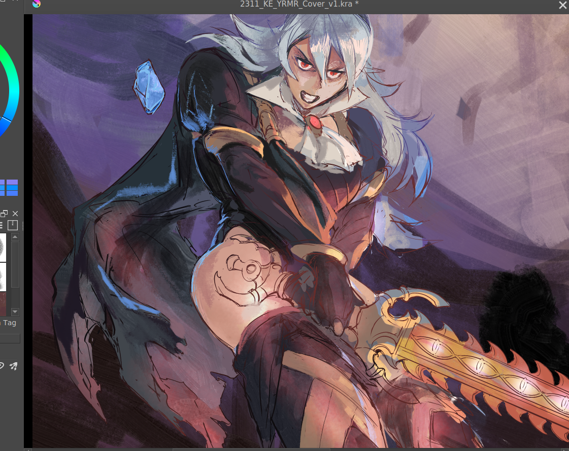
here's the step-by-step cover progress for the curious, under the cut!
before drawing, there were a few things i knew that the cover had to have/show:
*critically, had to have vibes of an enemies-to-lovers dynamic in the sense of … the power tilt? even though that’s not “technically” the true nature of their dynamic. gunter’s not a nice guy in this fic, even aside from the possession, and i also didn’t want anybody to run into this unsuspecting the darker parts to the fic. him more looming/threatening than you’d expect in base game, etc.
* wanted to emulate kozaki’s style through the whole cover in line qualitty, coloring, and composition. thankfully he gives a few tips over on his twitter. it’s both a neat little nod at the source material, and also as a style experiment.
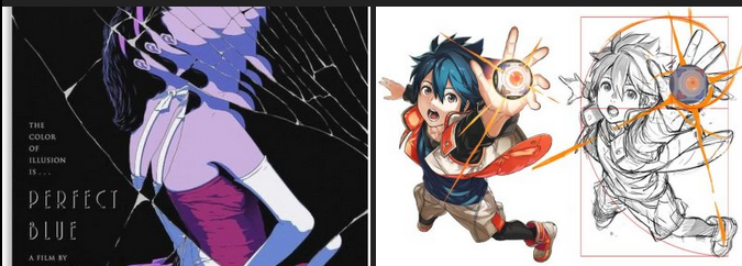
* a big theme in this fic is gunter being made of so many masks/shells (there’s a perfect blue cover, see below, that specifically made me think this composition could work.)
* learning that kozaki hews pretty close to grids + the golden ratio was another big lightbulb moment, here’s a drawing yoinked from his twitter where he shows it himself.
after scraping/studying from kozaki’s twitter, i made one or two thumbnail doodles below. you can see the solid one had a golden ratio + general line dynamic check squiggled to the side. there’s room for the title, the focus is on corrin, it’ll work both in a horizontal and vertical crop, looking good so far.
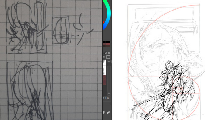
you can see how pretty tightly to the thumbnail i kept, other than moving the vertical text to the top since i didn’t have as much room there. i’m a little worried about the different line quality between how big the face is vs corrin but we’ll see. something i also realized i like about the composition is corrin “could” look like she’s attacking the viewer, but she also looks like she could be guarding him with her back to him, which…. heh. comes up in some interesting ways in the last third of the fic (possession wise). bunch of cleaning up.
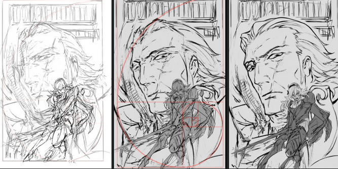
as I suspected since this is 11x17in (much bigger than what i normally draw) i had to grab a different brush for gunter since thin lines were not going to work as they did for corrin. i think kozaki’s real genius is how he treats texture with his linework; where he does thin lines, where he puts the thick ones, etc. corrin’s coming along great but there’s a spirit to the first face on the left i think i’m missing now, so i’ll probably re-insert that. (also decided to at least draw in his face there even though the masks/slices will distort that). i think what also helps is gunter’s face is very low contrast and needs to remain low contrast, to help corrin pop out in front.
then i started thinking about typography. a lot of the fonts i had were either way too masculine/bland/modern, or way too feminine/curvy. this title needs a hint of masculinity to nod at FE’s general action-adventure RPG roots, but it’s also very distinctly the kind of erotica that doesn’t easily lend itself to a genre. it’s tender horror, it’s daddy kink, it’s vicious romance, it’s … a lot of things. here’s another thing: when thinking about title typography, another consideration is genre. briefly i considered something like lovecraftian covers; my doujin circle and i had been sharing pictures of old pulp covers. i also noticed a lot of my favorite JP erotic horror doujin have very spiky titles. this title also needs to be scrunched up in a tight space so it’s not like we got a sprawl of acreage here either. what doesn’t help is enemies to lovers doesn’t really have a visual language in mainstream media. it’s a staple of Ao3 (written) genres, but the closest you’d get otherwise would be romantic horror (kind of says a lot about who makes what huh?). for example, the shape of water (movie) isn’t a 1:1, but it’s pretty damn close — unfortunately that poster dodged the question by using an art deco-inspired font typeface that was more about the setting than the genre. and then i had an epiphany. maybe i was approaching this from the wrong direction: it’s the knight/liege romance that’s the heartbeat to YRMR. think more old dragonlance novels. old medieval/fantasy pulp novels; plenty of kinky sex and ass in there, and still close enough to FE. remember everyone and their mamma having a bi ass crush for bad boy raistlin? that’s the vibe i want.
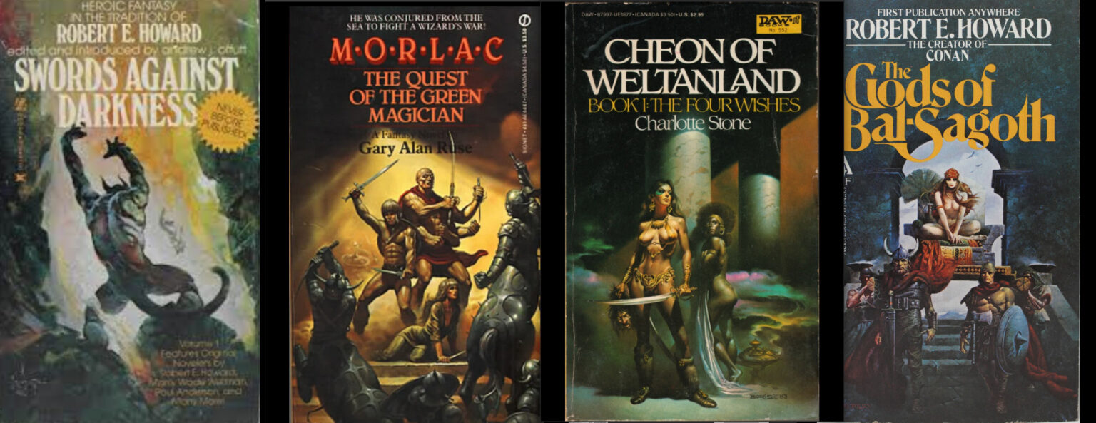
this kind of glorious deranged shit. you’re not gonna be surprised at possessed grandpa whip kink if you read these on the regular. after ~*arcane designer magic*~ (I do this for a living) bolton and magiona display were the two fonts that were gonna work just fine together. god that looks so much better. this looks believable now.
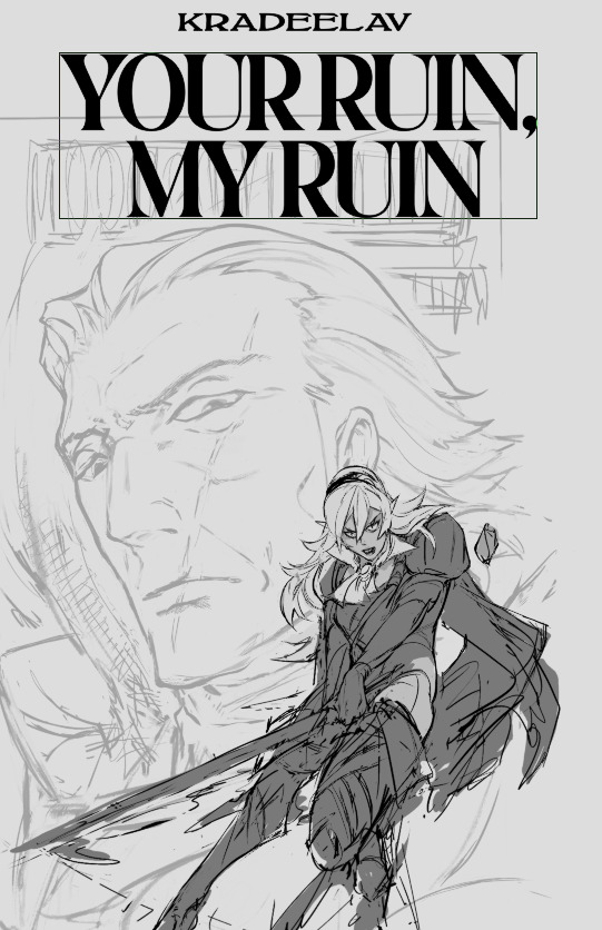
the thin/thick line weight contrast in magiona display is going to accentuate the lineart in a way that might be tricky with other fonts that work better on painted covers. bolton’s “squished” vertically enough it doesn’t compete with the other one, and makes for a good secondary/tertiary font. few other things happened. i shrunk gunter’s face because not being able to see his jawline (sex appeal u see) was bothering me from a composition standpoint. it’s the same reason frank frazetta didn’t censor his glorious asses. (said seriously, by the way. so many people don’t give their lust in art enough credit.)
i also needed more room for the title to show, and the line quality/scale difference between his face was also bugging me. does this mess up the golden ratio composition? sure, temporarily, but his armor’s weirdly flexible that we can adapt it pretty easily. it’s about this time i’m also looking through my hydrus network stash of favorite covers for what color palette and contrast to use. kozaki tends to skew purple/cooler hues for nohr characters, and that’d go well with these two. purple/green hues that play well with light purple and the yellow from those old covers i love so much, low contrast midground, and something that’d contrast well with text above. dark/black background for the gothic vibes, and the text will probably need to be white or some sort of light-warm hue for that “pop”. doing color tests is more of a leap of faith and intuition than an exact science, but damn it is it satisfying when you nail it in one go and go ‘holy shit i want to read this. 😀
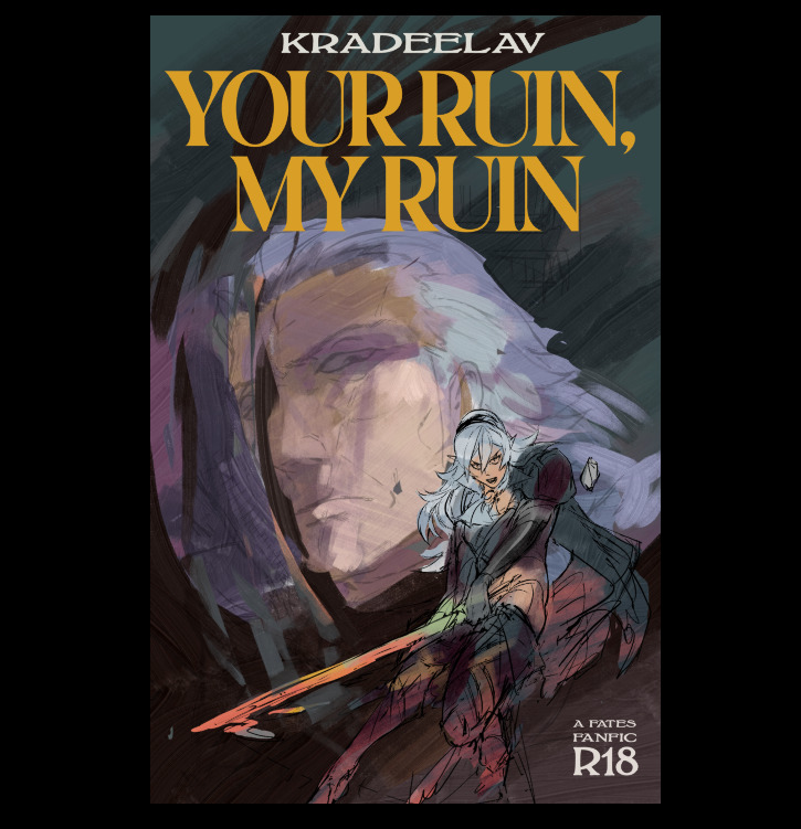
(green/gold for the hint of anankos’ mask, also matching the yato and her warmer skin tone. purple flames for him, but the high contrast armor to separate her from his larger shapes. we’ve got the dragonstone and the yato as flexibility for lighting and emphasizing contrast with her. ) i kind of like how i accidentally made the mask shards reflect(?) a bit of his own face. hell yeah throw it in. this is something that’s more likely to work than not. this is something that has that mix of id and horror i’ve been going after. here’s another version with references to the side and the golden ratio laid on again.
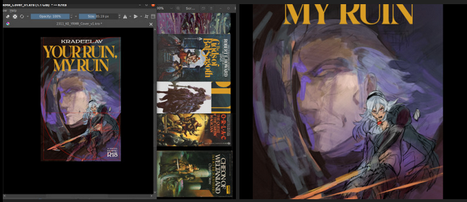
honestly a lot of it at this step is going ‘dude you know what would be SO DOPE…. PURPLE FIRE…’ ‘dude….. fuck yes….’ ‘what about some sick ass sword effects?’ ‘YEAH….’ and saving a bunch of backups in case of the idea didn’t work out. (am i going so much harder on a literal gilf porn fanfic cover than i need to? hell yeah. gunterfuckers deserve better. 😀 ) anyway here is when i start questioning everything, so i’ll take a break from the colors to tighten up the lineart. now that the composition’s settling in much tighter, i’m also thinking about how the two shapes interact with each other and if there’s any potential issues with tangent points (where two lines intersect each other in a way that makes an optical illusion.)
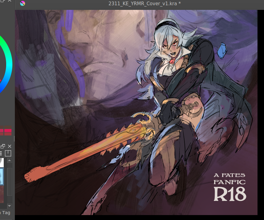
that said i love how his jawline “points” at her face, that kind of line you want. grinding away on corrin’s lineart. also double checking that the shapes/colors/forms for her “make sense” both standalone and with the composition too. what’s nice is she’s at the point where i can just turn off my brain and polish up. naturally couldn’t resist poking at it more and this is when the rest of it clicked after figuring out which bit was anankos’ mask, which bit was possessed!gunter vs himself (polished up the armor a bit too. at this point i’m pretty confident that it’ll stay “set”; the biggest thing i’m likely to change is the blue silhouette to the dragonstone side for corrin.
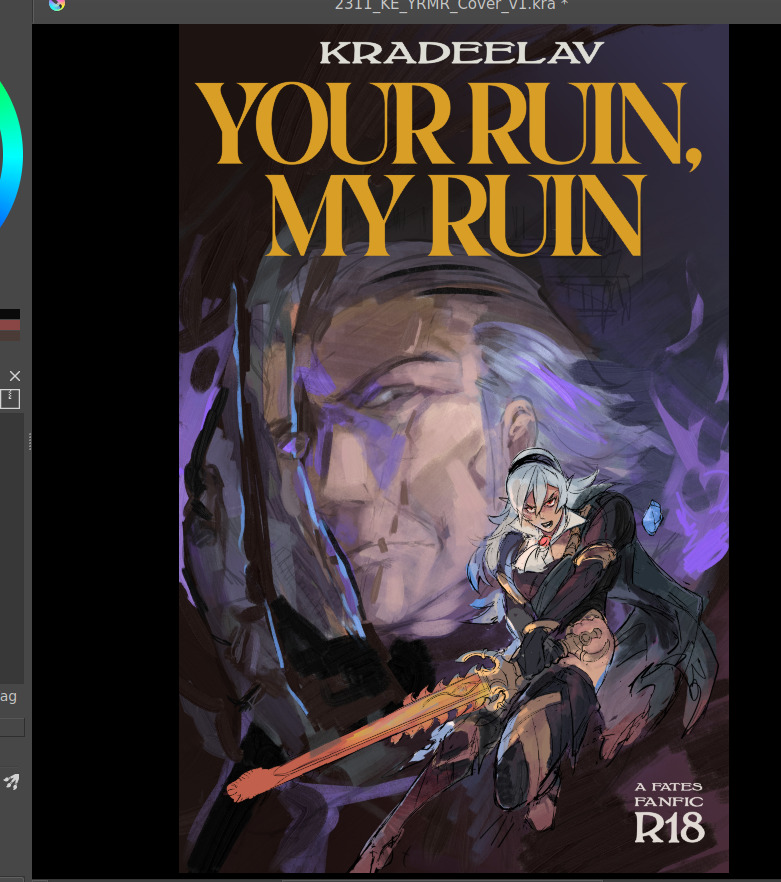
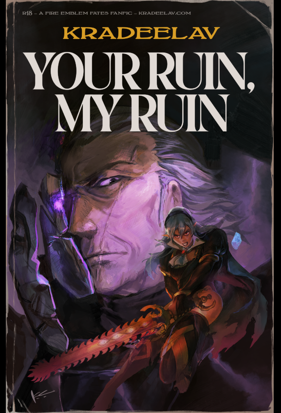
thanks for reading. 😀 COLLAPSE

here's the step-by-step cover progress for the curious, under the cut!
before drawing, there were a few things i knew that the cover had to have/show:
*critically, had to have vibes of an enemies-to-lovers dynamic in the sense of … the power tilt? even though that’s not “technically” the true nature of their dynamic. gunter’s not a nice guy in this fic, even aside from the possession, and i also didn’t want anybody to run into this unsuspecting the darker parts to the fic. him more looming/threatening than you’d expect in base game, etc.
* wanted to emulate kozaki’s style through the whole cover in line qualitty, coloring, and composition. thankfully he gives a few tips over on his twitter. it’s both a neat little nod at the source material, and also as a style experiment.
* a big theme in this fic is gunter being made of so many masks/shells (there’s a perfect blue cover, see below, that specifically made me think this composition could work.)
* learning that kozaki hews pretty close to grids + the golden ratio was another big lightbulb moment, here’s a drawing yoinked from his twitter where he shows it himself.

after scraping/studying from kozaki’s twitter, i made one or two thumbnail doodles below. you can see the solid one had a golden ratio + general line dynamic check squiggled to the side. there’s room for the title, the focus is on corrin, it’ll work both in a horizontal and vertical crop, looking good so far.

you can see how pretty tightly to the thumbnail i kept, other than moving the vertical text to the top since i didn’t have as much room there. i’m a little worried about the different line quality between how big the face is vs corrin but we’ll see. something i also realized i like about the composition is corrin “could” look like she’s attacking the viewer, but she also looks like she could be guarding him with her back to him, which…. heh. comes up in some interesting ways in the last third of the fic (possession wise). bunch of cleaning up.

as I suspected since this is 11x17in (much bigger than what i normally draw) i had to grab a different brush for gunter since thin lines were not going to work as they did for corrin. i think kozaki’s real genius is how he treats texture with his linework; where he does thin lines, where he puts the thick ones, etc. corrin’s coming along great but there’s a spirit to the first face on the left i think i’m missing now, so i’ll probably re-insert that. (also decided to at least draw in his face there even though the masks/slices will distort that). i think what also helps is gunter’s face is very low contrast and needs to remain low contrast, to help corrin pop out in front.
then i started thinking about typography. a lot of the fonts i had were either way too masculine/bland/modern, or way too feminine/curvy. this title needs a hint of masculinity to nod at FE’s general action-adventure RPG roots, but it’s also very distinctly the kind of erotica that doesn’t easily lend itself to a genre. it’s tender horror, it’s daddy kink, it’s vicious romance, it’s … a lot of things. here’s another thing: when thinking about title typography, another consideration is genre. briefly i considered something like lovecraftian covers; my doujin circle and i had been sharing pictures of old pulp covers. i also noticed a lot of my favorite JP erotic horror doujin have very spiky titles. this title also needs to be scrunched up in a tight space so it’s not like we got a sprawl of acreage here either. what doesn’t help is enemies to lovers doesn’t really have a visual language in mainstream media. it’s a staple of Ao3 (written) genres, but the closest you’d get otherwise would be romantic horror (kind of says a lot about who makes what huh?). for example, the shape of water (movie) isn’t a 1:1, but it’s pretty damn close — unfortunately that poster dodged the question by using an art deco-inspired font typeface that was more about the setting than the genre. and then i had an epiphany. maybe i was approaching this from the wrong direction: it’s the knight/liege romance that’s the heartbeat to YRMR. think more old dragonlance novels. old medieval/fantasy pulp novels; plenty of kinky sex and ass in there, and still close enough to FE. remember everyone and their mamma having a bi ass crush for bad boy raistlin? that’s the vibe i want.

this kind of glorious deranged shit. you’re not gonna be surprised at possessed grandpa whip kink if you read these on the regular. after ~*arcane designer magic*~ (I do this for a living) bolton and magiona display were the two fonts that were gonna work just fine together. god that looks so much better. this looks believable now.

the thin/thick line weight contrast in magiona display is going to accentuate the lineart in a way that might be tricky with other fonts that work better on painted covers. bolton’s “squished” vertically enough it doesn’t compete with the other one, and makes for a good secondary/tertiary font. few other things happened. i shrunk gunter’s face because not being able to see his jawline (sex appeal u see) was bothering me from a composition standpoint. it’s the same reason frank frazetta didn’t censor his glorious asses. (said seriously, by the way. so many people don’t give their lust in art enough credit.)
i also needed more room for the title to show, and the line quality/scale difference between his face was also bugging me. does this mess up the golden ratio composition? sure, temporarily, but his armor’s weirdly flexible that we can adapt it pretty easily. it’s about this time i’m also looking through my hydrus network stash of favorite covers for what color palette and contrast to use. kozaki tends to skew purple/cooler hues for nohr characters, and that’d go well with these two. purple/green hues that play well with light purple and the yellow from those old covers i love so much, low contrast midground, and something that’d contrast well with text above. dark/black background for the gothic vibes, and the text will probably need to be white or some sort of light-warm hue for that “pop”. doing color tests is more of a leap of faith and intuition than an exact science, but damn it is it satisfying when you nail it in one go and go ‘holy shit i want to read this. 😀

(green/gold for the hint of anankos’ mask, also matching the yato and her warmer skin tone. purple flames for him, but the high contrast armor to separate her from his larger shapes. we’ve got the dragonstone and the yato as flexibility for lighting and emphasizing contrast with her. ) i kind of like how i accidentally made the mask shards reflect(?) a bit of his own face. hell yeah throw it in. this is something that’s more likely to work than not. this is something that has that mix of id and horror i’ve been going after. here’s another version with references to the side and the golden ratio laid on again.

honestly a lot of it at this step is going ‘dude you know what would be SO DOPE…. PURPLE FIRE…’ ‘dude….. fuck yes….’ ‘what about some sick ass sword effects?’ ‘YEAH….’ and saving a bunch of backups in case of the idea didn’t work out. (am i going so much harder on a literal gilf porn fanfic cover than i need to? hell yeah. gunterfuckers deserve better. 😀 ) anyway here is when i start questioning everything, so i’ll take a break from the colors to tighten up the lineart. now that the composition’s settling in much tighter, i’m also thinking about how the two shapes interact with each other and if there’s any potential issues with tangent points (where two lines intersect each other in a way that makes an optical illusion.)

that said i love how his jawline “points” at her face, that kind of line you want. grinding away on corrin’s lineart. also double checking that the shapes/colors/forms for her “make sense” both standalone and with the composition too. what’s nice is she’s at the point where i can just turn off my brain and polish up. naturally couldn’t resist poking at it more and this is when the rest of it clicked after figuring out which bit was anankos’ mask, which bit was possessed!gunter vs himself (polished up the armor a bit too. at this point i’m pretty confident that it’ll stay “set”; the biggest thing i’m likely to change is the blue silhouette to the dragonstone side for corrin.


thanks for reading. 😀 COLLAPSE
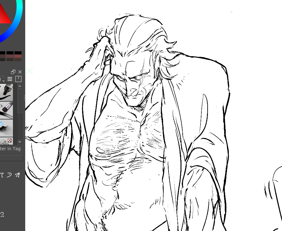
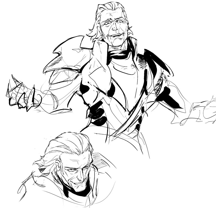
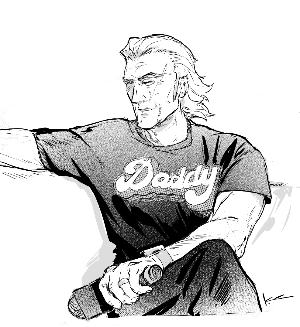
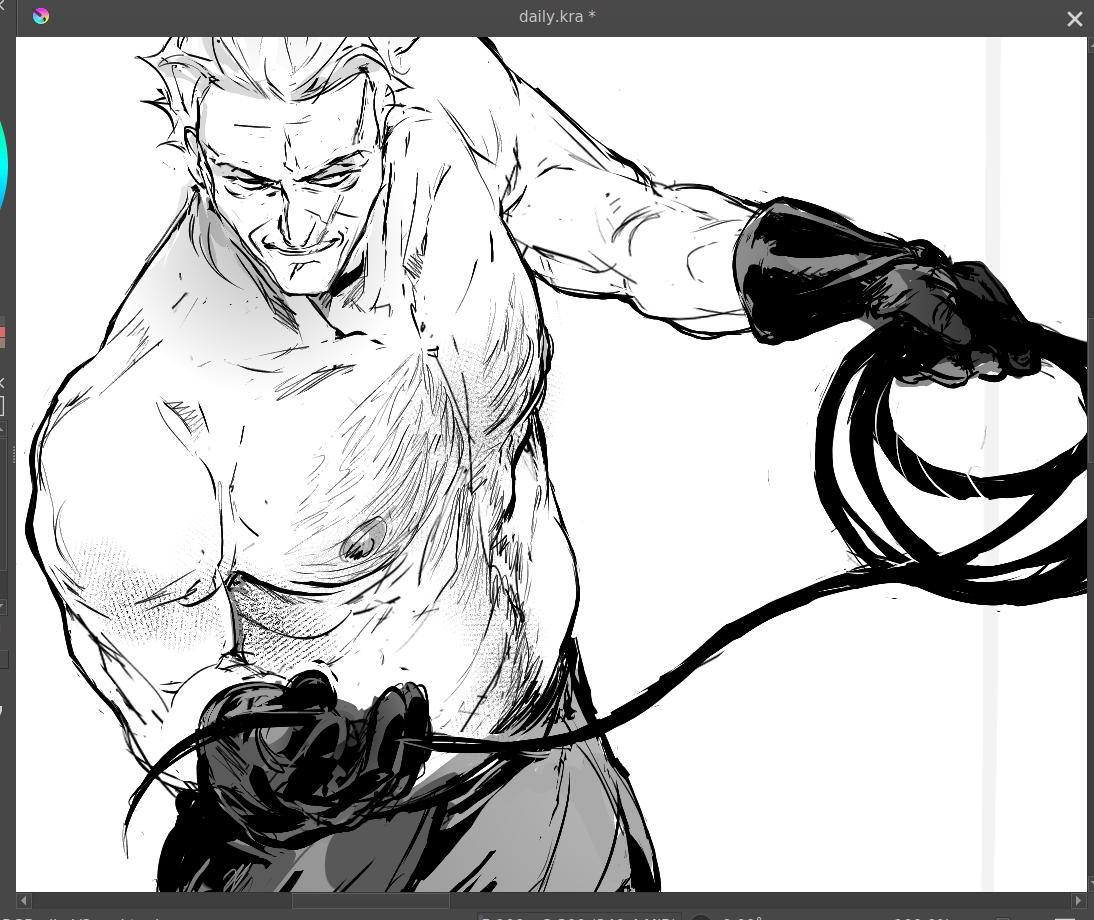
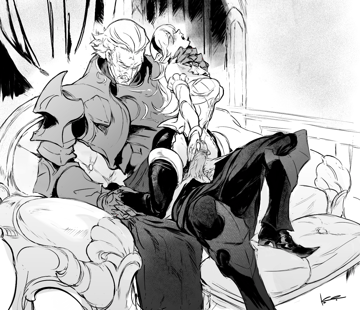
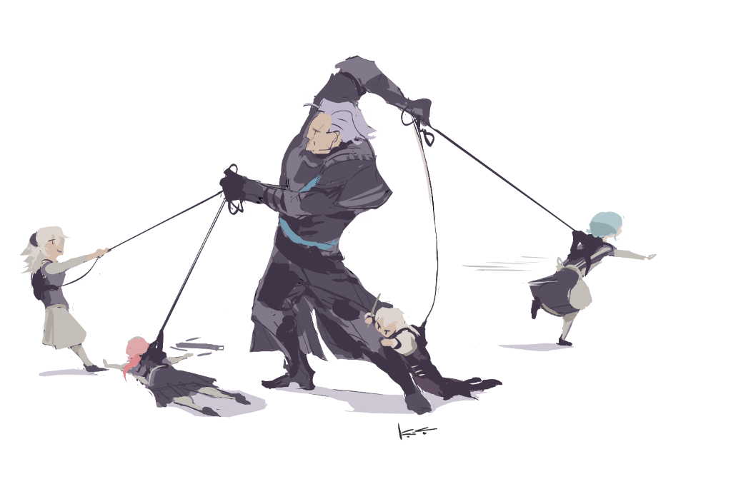
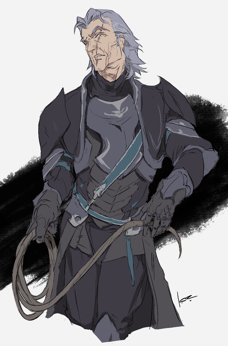
thirsty as sin for fucked up senile meow meows rn
#hellsing
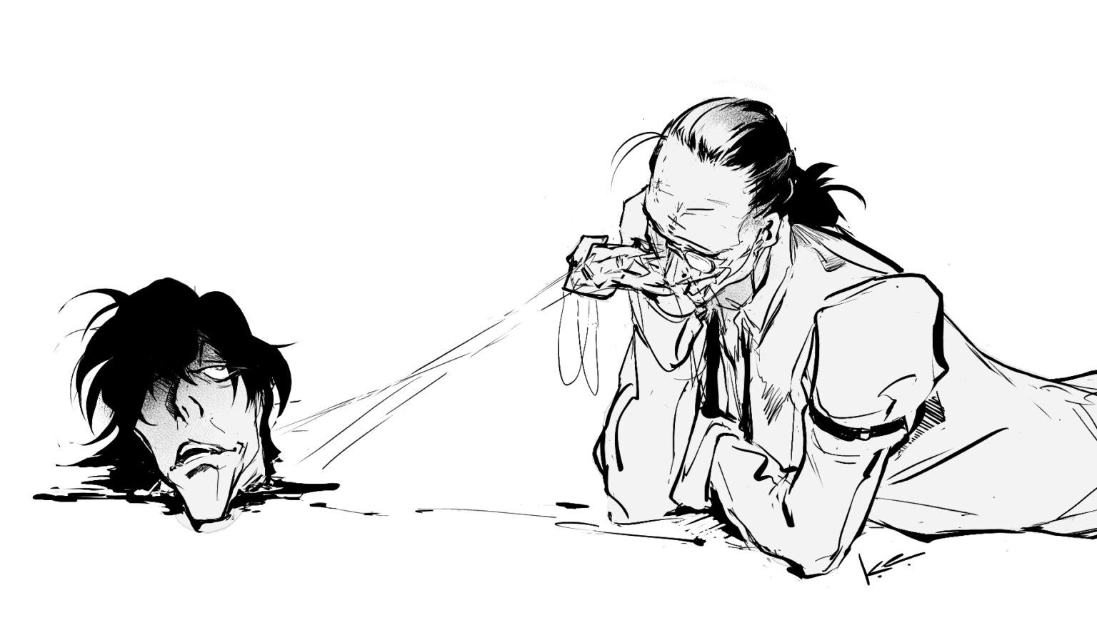
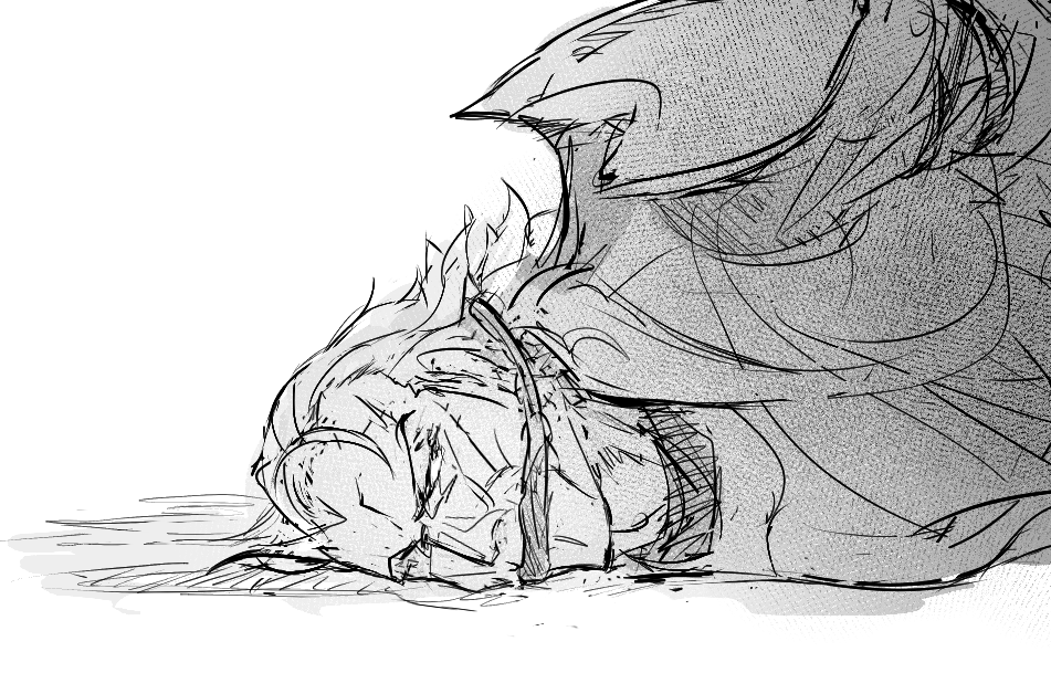
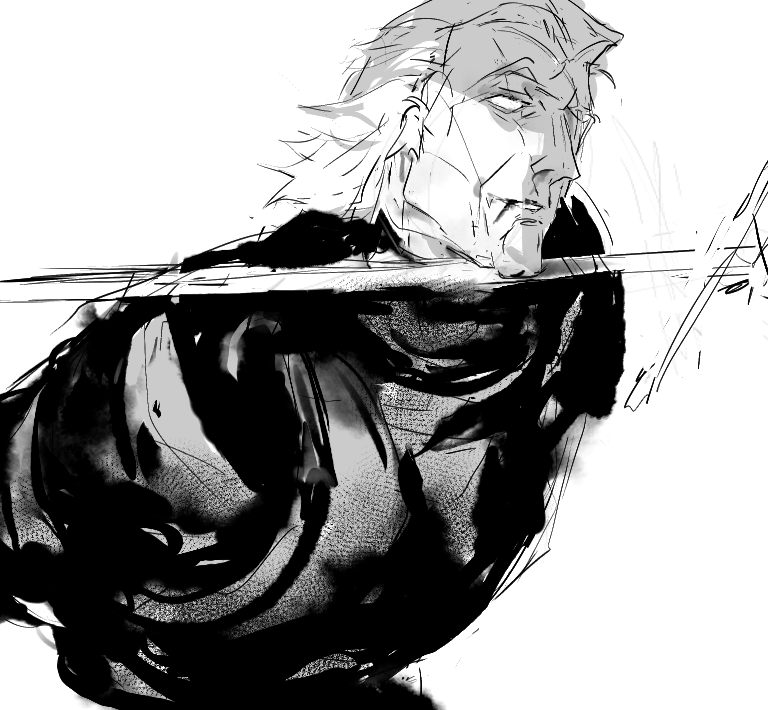
+ extra walter doodle because been reading some of the most well written, but really fucked up fics of old!walter by an author who described him as every bit as mad as the rest of the hellsingers, he just hides it best.
anyway he’s been on my mind lately. fascinating dude.
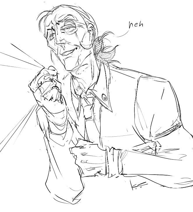
#hellsing

+ extra walter doodle because been reading some of the most well written, but really fucked up fics of old!walter by an author who described him as every bit as mad as the rest of the hellsingers, he just hides it best.
anyway he’s been on my mind lately. fascinating dude.

2024.09.02 19:41:18 編集
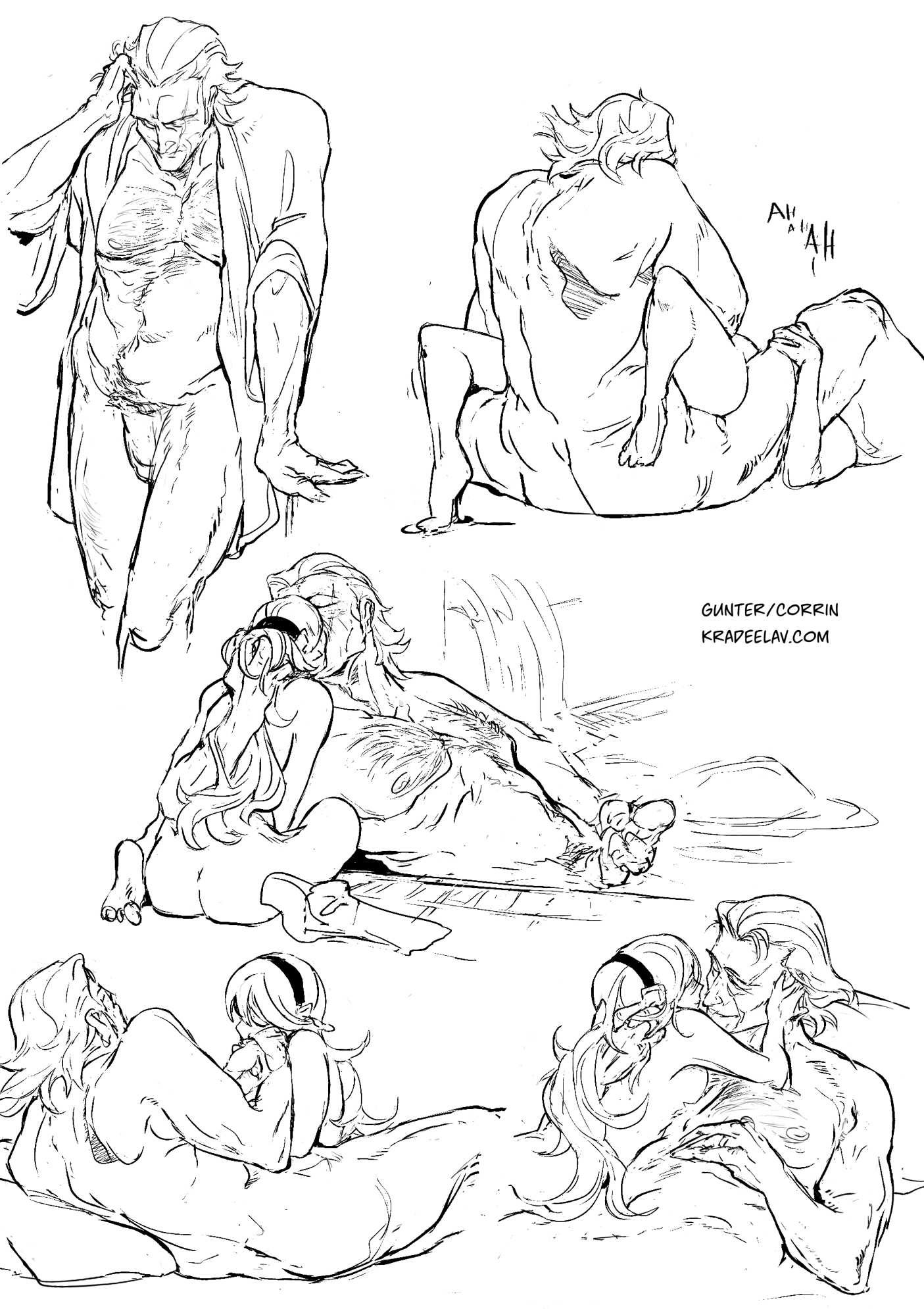
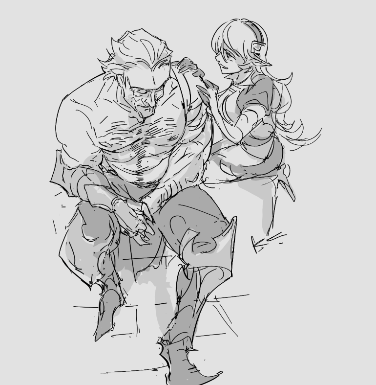
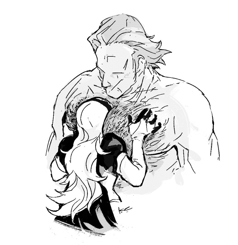
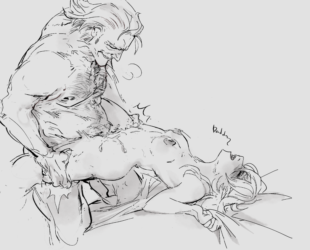
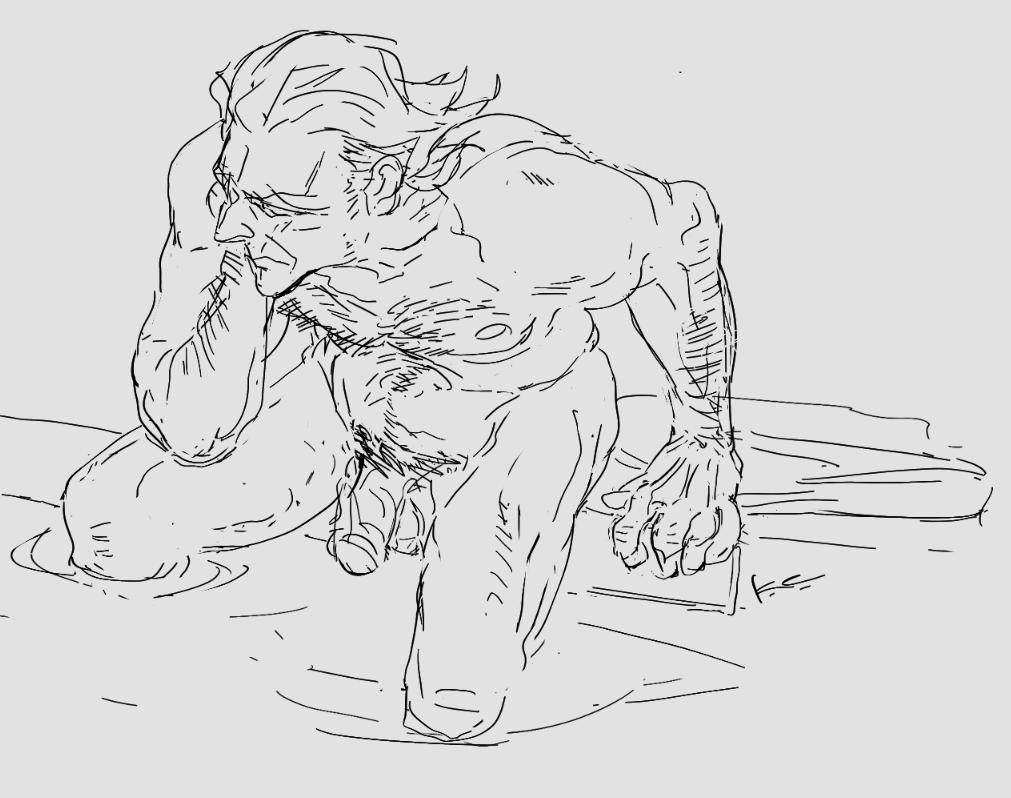
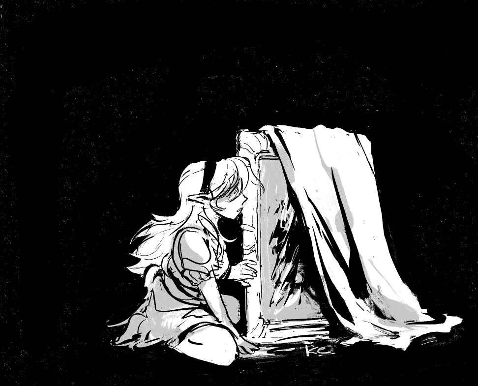
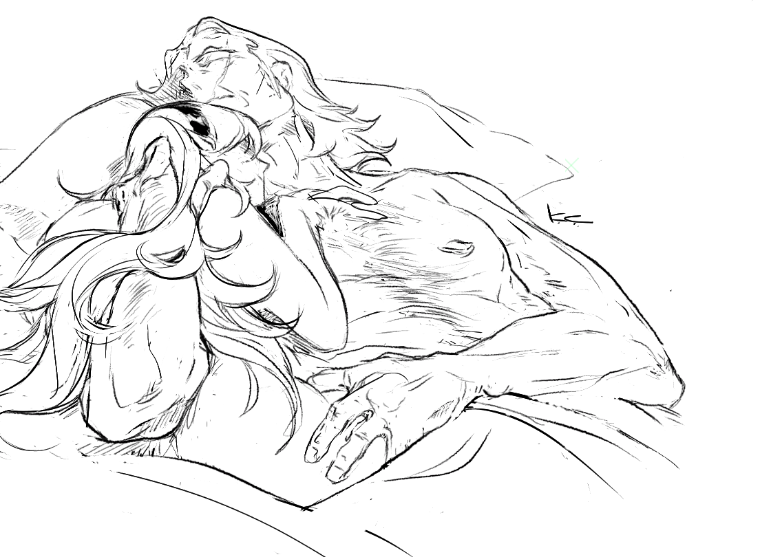
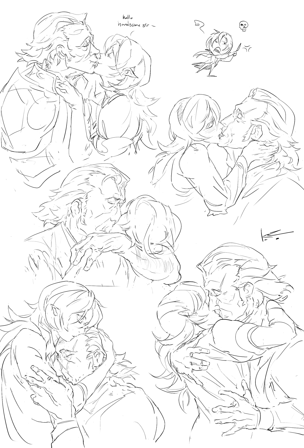
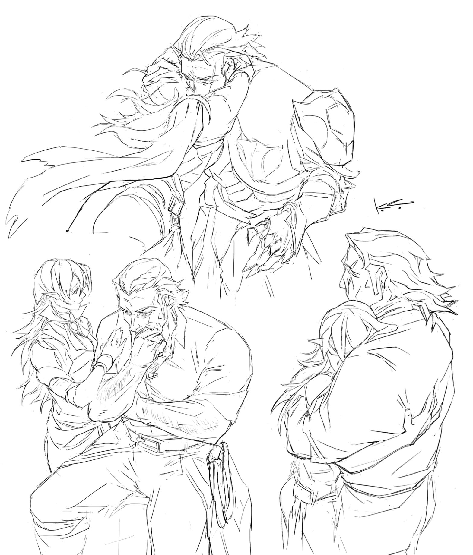
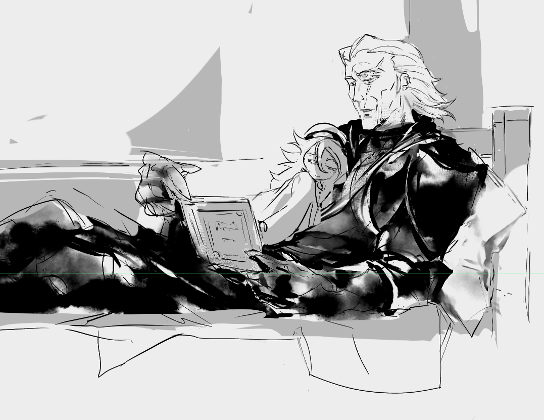
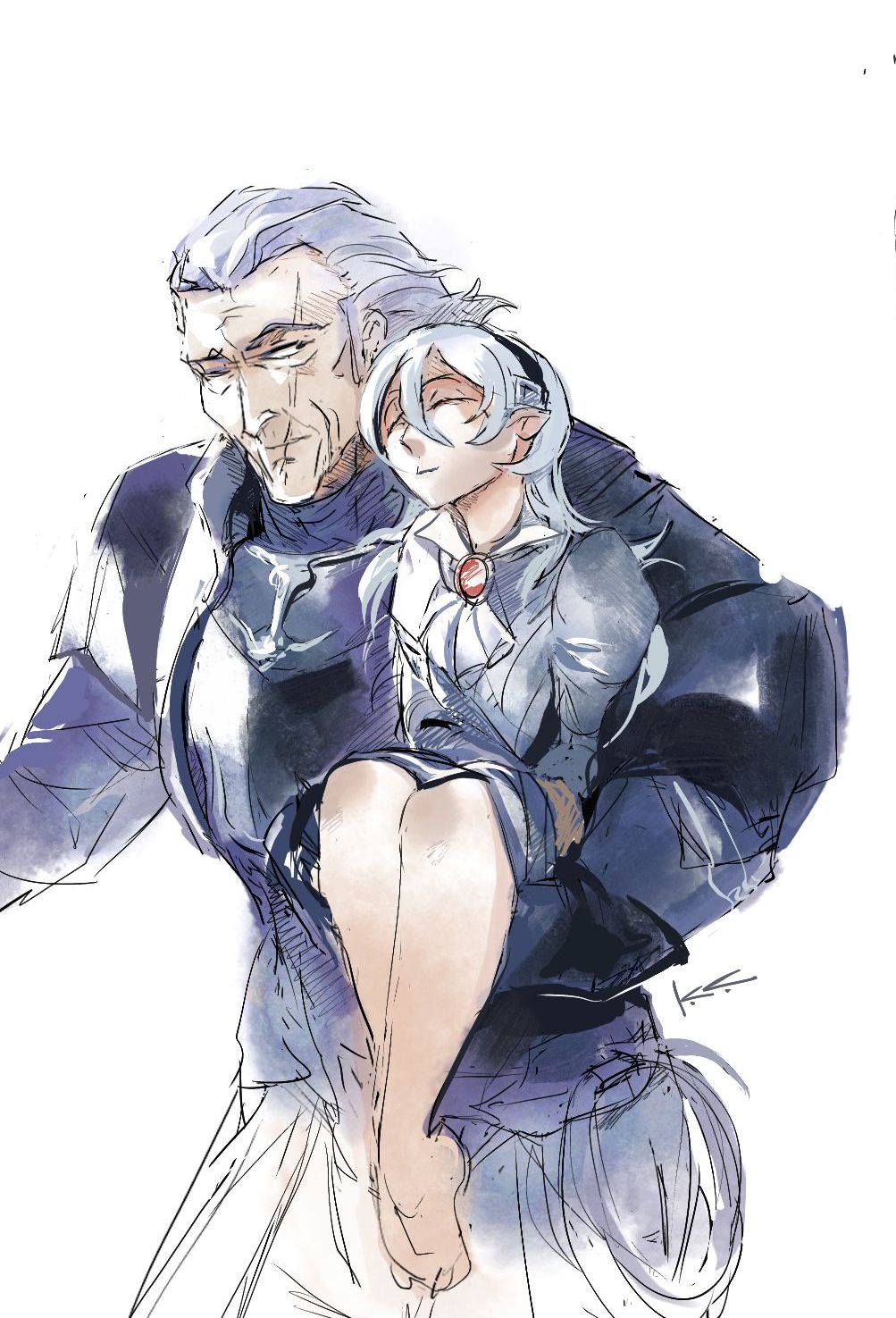
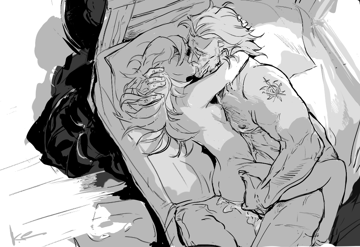
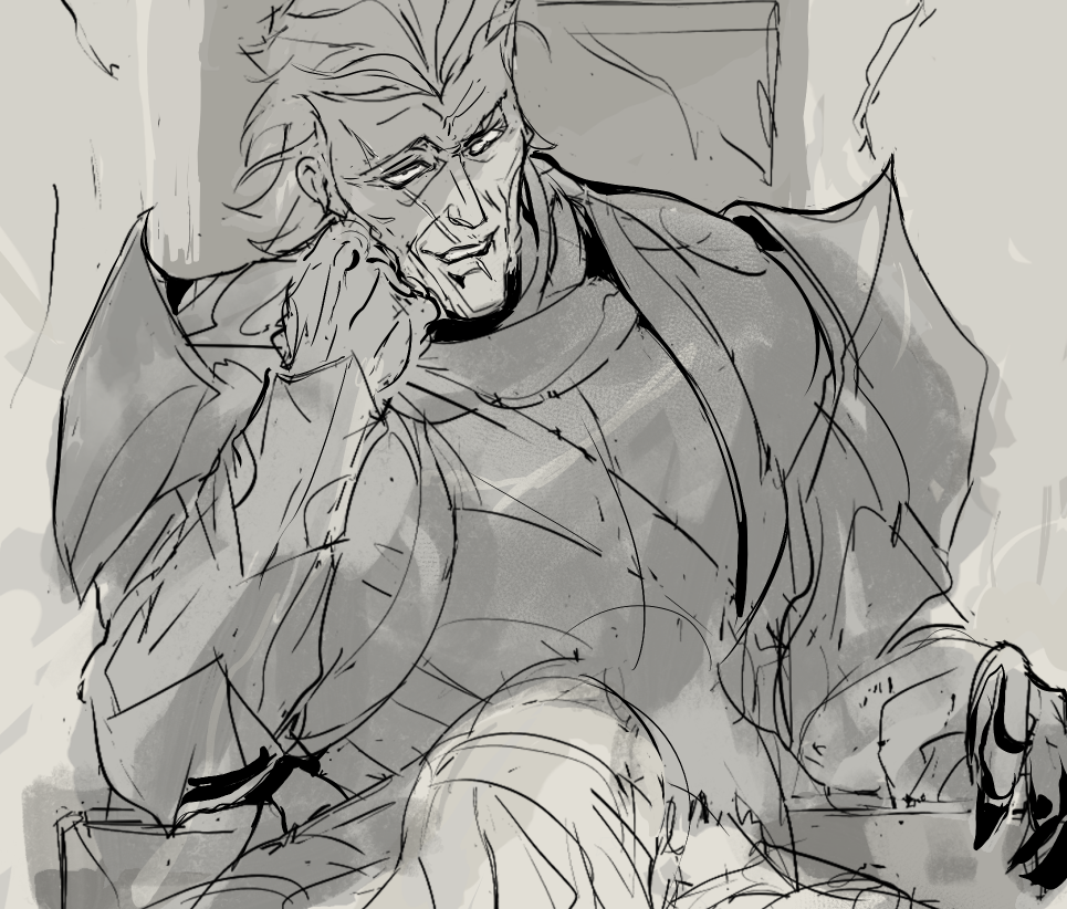
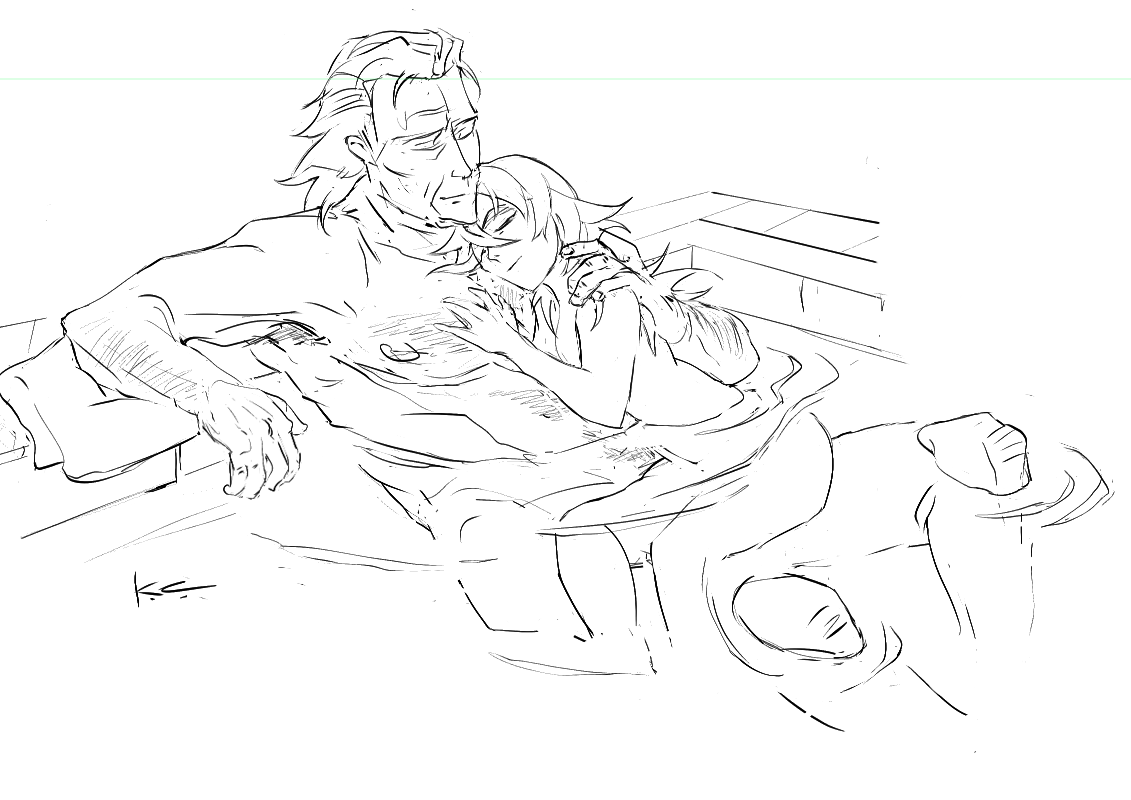
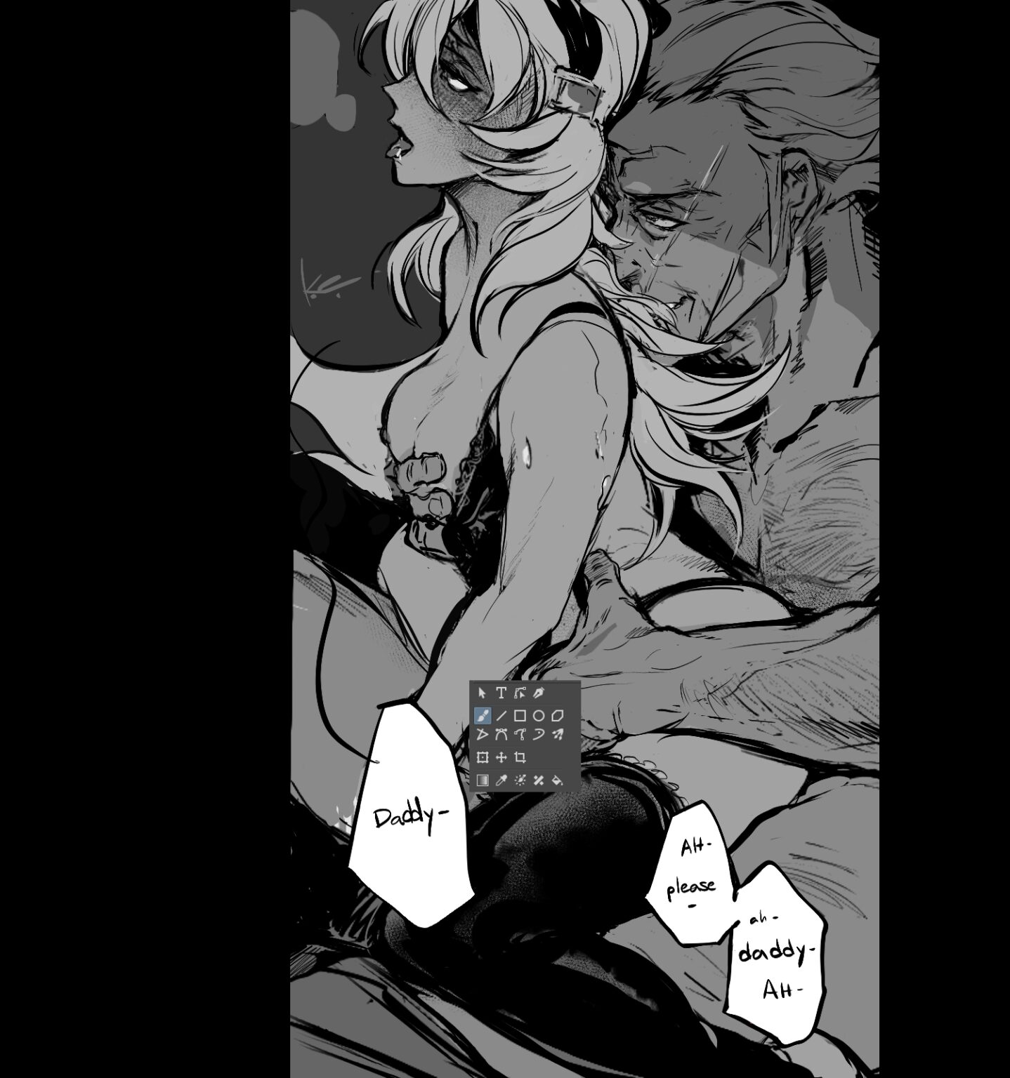
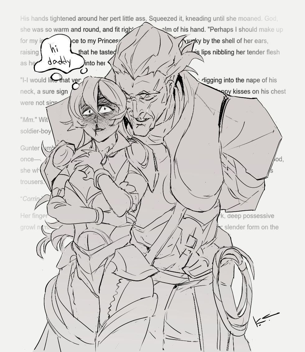
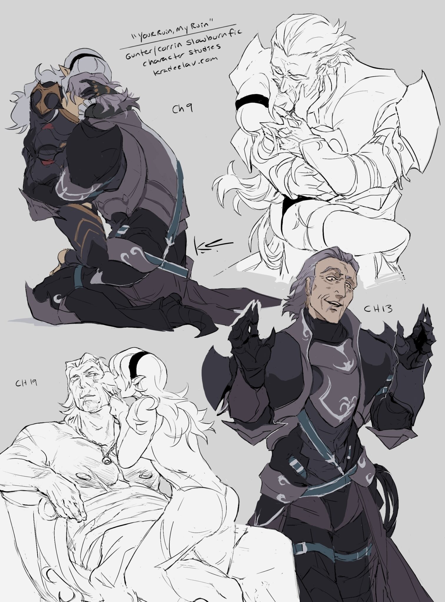
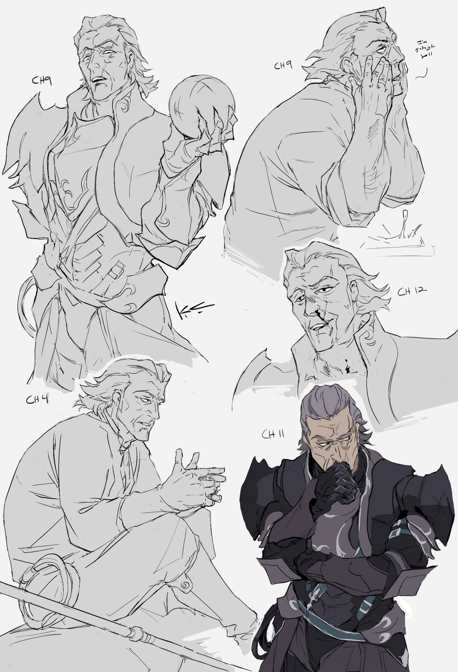
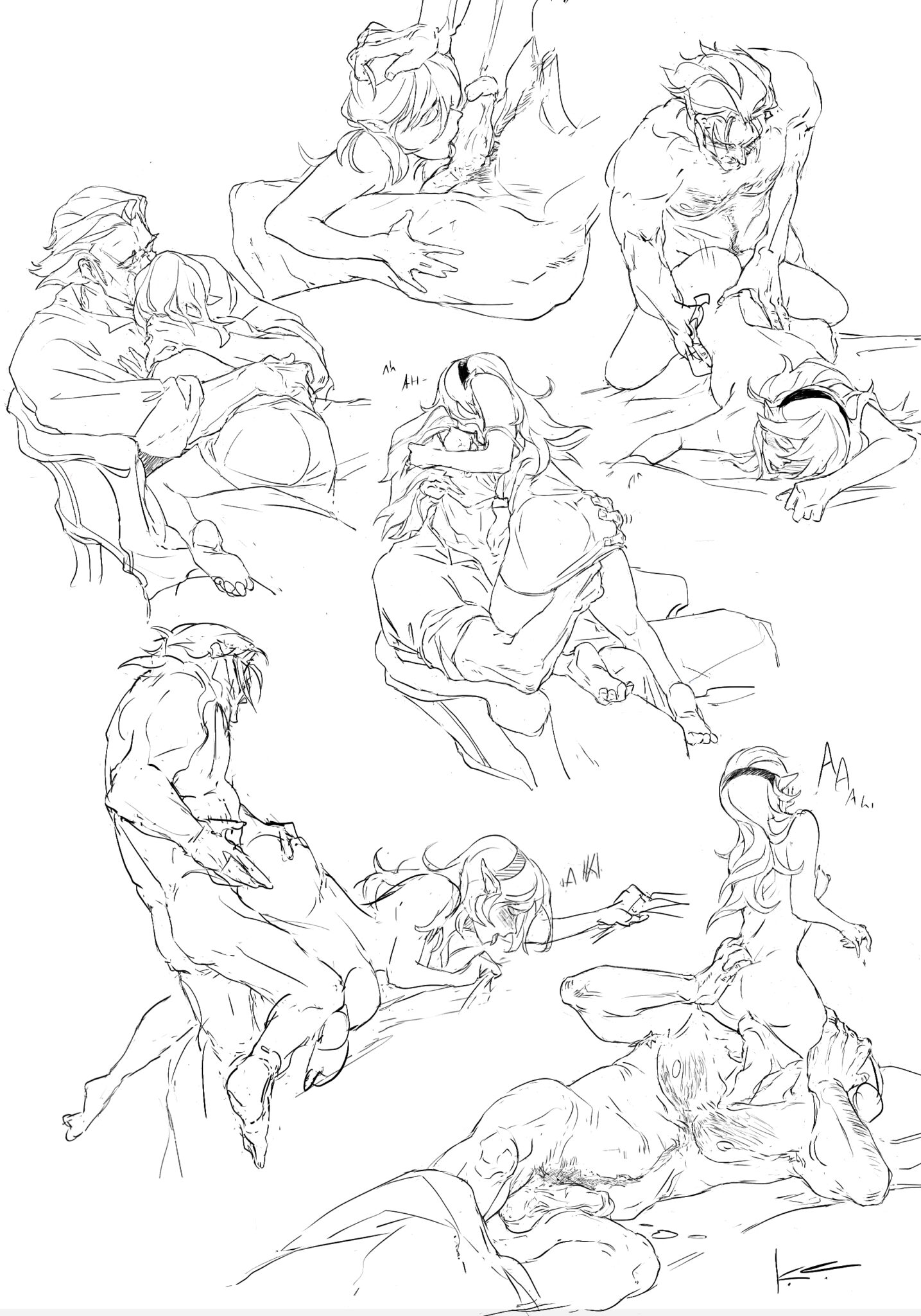
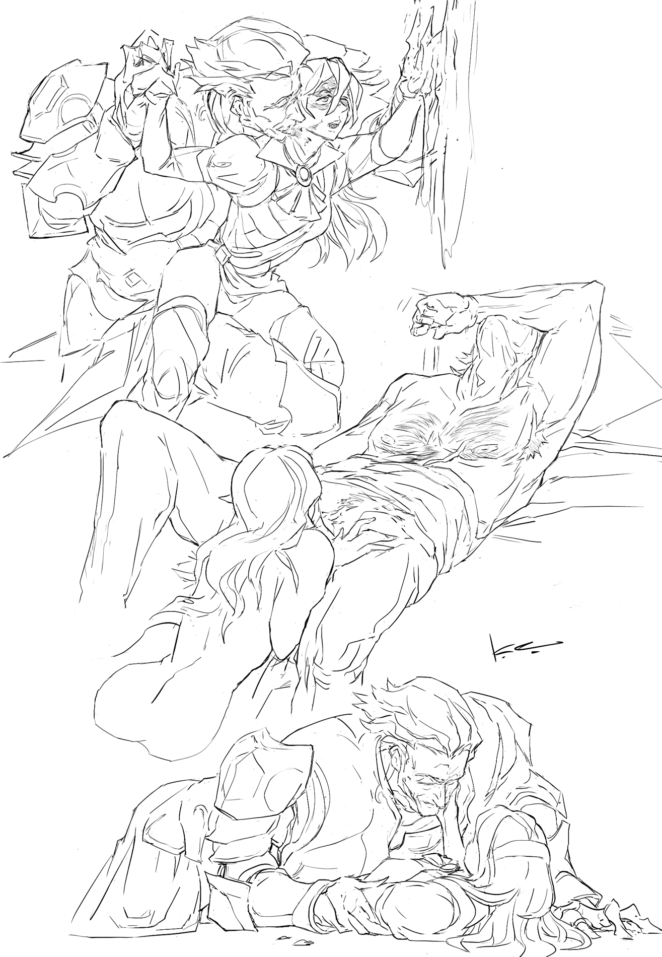
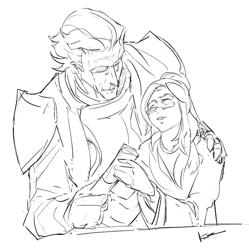
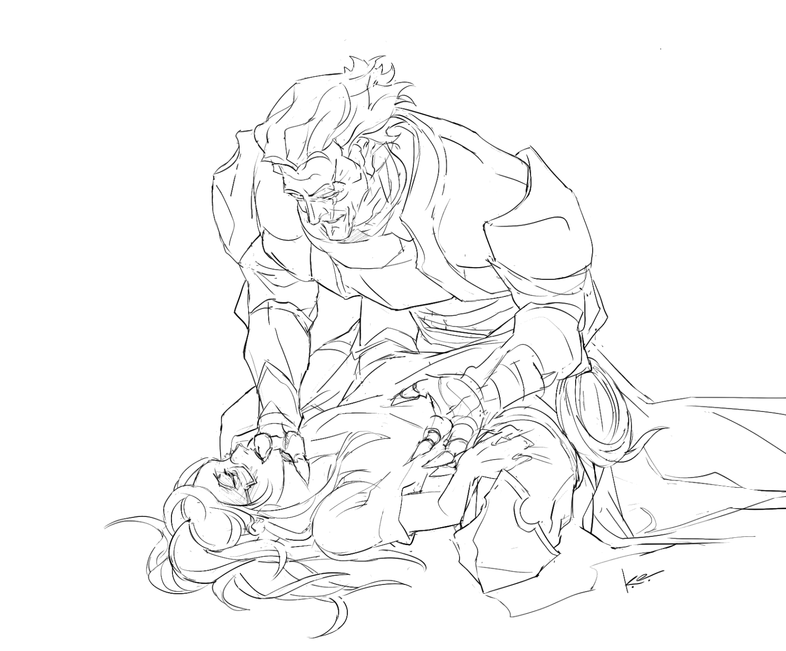
assorted sketchdumps of scenes from your ruin, my ruin my 120k #fefates gunter/corrin slowburn fic. even getting bad wrist problems in spring 2024 didn't slow me down... nsfw under the cut!
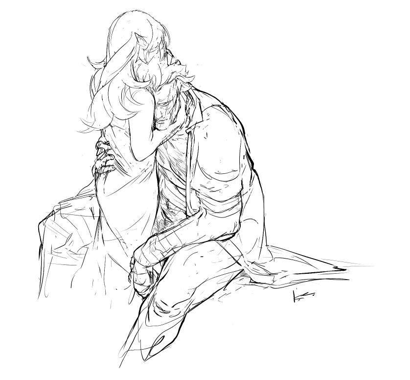
unclench your fists, my lover, the war is over now.
(i’ve forgotten how to uncurl my fingers from the trigger.)
be gentle, my lover, the war is over now.
(i don’t remember what it’s like not to have gunsteel in my bones.)
come home, my lover, the war is over now.
(i’m back at the place i left but home is gone where i cannot find it.)
sleep, my lover, the war is over now.
(the war follows me into sleep. i’m afraid i’ll never leave it behind.)
kiss me, my lover, the war is over now.
(my fingers still drip red and i do not want to stain you with them.)
— teach me how to be at peace again ( j.p. )
 COLLAPSE


unclench your fists, my lover, the war is over now.
(i’ve forgotten how to uncurl my fingers from the trigger.)
be gentle, my lover, the war is over now.
(i don’t remember what it’s like not to have gunsteel in my bones.)
come home, my lover, the war is over now.
(i’m back at the place i left but home is gone where i cannot find it.)
sleep, my lover, the war is over now.
(the war follows me into sleep. i’m afraid i’ll never leave it behind.)
kiss me, my lover, the war is over now.
(my fingers still drip red and i do not want to stain you with them.)
— teach me how to be at peace again ( j.p. )

 COLLAPSE
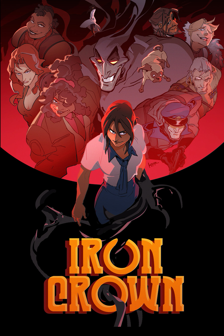
final #ironcrown banner i did for the official hiatus announcement. you can read the comic for free here

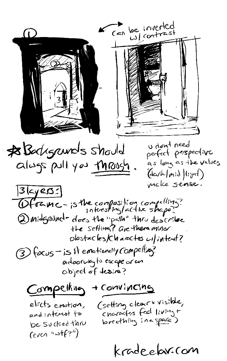
one of the best and most unironic pieces of art advice i can give is to draw yourself with your favorites. whatever you want to call it, self insert, self shipping, hanging out with your muse, doesn’t matter; draw yourself and your favorite characters in the same space and interacting.
you don’t have to post it, but make it for the love of god.
I’m serious, by the way, and it doesn’t matter what kind of dynamic you’re imagining, either.
if it’s platonic or familial– play with the body language. does your favorite’s body language change around you versus other people? if they’re a villain, how would they relax in that sense of privacy versus in the public or “keeping the face”? what are the gestures you’d draw for both of you talking? do they touch their face while talking? how would you draw yourself leaning in with attention?
if it’s romantic– how do you draw them relaxing in the space with you, and/or vice versa? if they give comfort with tactile quality, how would they give a hug, and how does the overlapping forms of the bodies interact on paper? how do you draw longing vs satisfaction, and playing with the distance of space of both?
(and yes, if it’s sexual– what kind of kinks have you always hidden away? what’s the shit you can’t imagine poking at with a stick in daylight or in reality? how would you render the textural implements of fetish items? how does the anatomy work in 3D/perspective/the space itself? how do you draw the raw tension lines of intimacy to the point you “feel” the intimacy and/or it feels believable? how do you convincingly portray shyness or lust?)
this exercise, for lack of a better word, also has a funny but cool side effect of letting you play with how you want to present yourself too. are you not feeling your own shape language? change it up! want to wear the clothes you’ve always felt a little too scared to put on? want to play drag? use this chance to study how clothes look, how to render the tactile quality of fabric, what makes silk feel different than leather, how would you draw confidence in a person?
how would you erase the idea of artistic shame in your vocabulary?
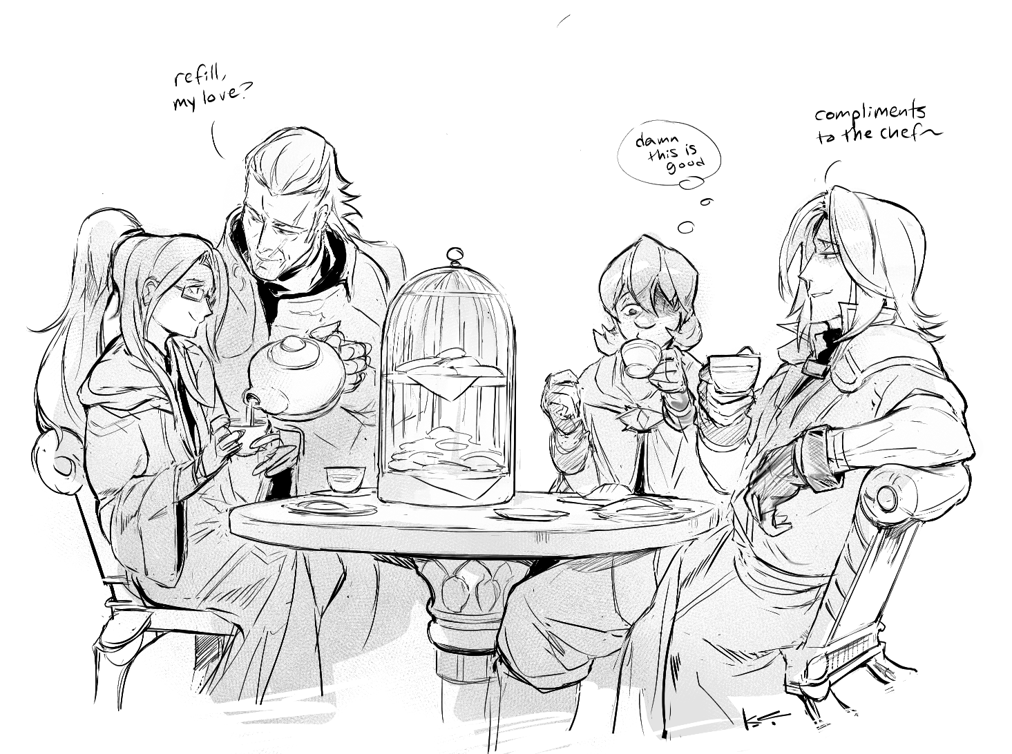
gunterleigh gifts to lululeighsworld for being so kind to me as i loose my mind over their FE hubby <3
first pic is us having a teatime double date :) the refill line is actually an easter egg nod to their adorable fic as it felt apropos. filed under #fefates & #zihark
 COLLAPSE
first pic is us having a teatime double date :) the refill line is actually an easter egg nod to their adorable fic as it felt apropos. filed under #fefates & #zihark


 COLLAPSE
what greater sin wip’s. love i can remove almost every iconic element from alucard and he’s still recognizable. more nsfw pix and talking about the #hellsing doujin under the cut
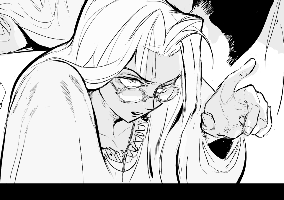
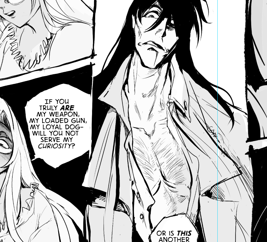
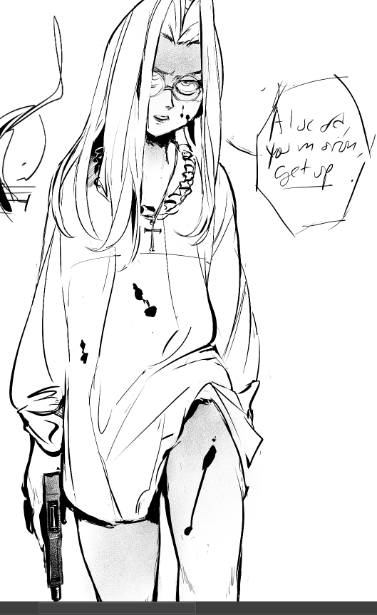
WGS was originally created as an alucard/integra-centric doujinshi since it’s been one of my mainstay ships from day one.
halfway through creating WGS, i started getting into walter/integra for various reasons.
firstly, old man walter’s hot. porque no los dos.
secondly, now, before the audience starts pelting me with tomatoes and molotov cocktails, I find i like walter/integra in large part because it brings up deeply uncomfortable questions about why integra/alucard feels so delightful to ship but why walter/integra feels viscerally wrong in comparison when arguably alutegra is just as skewed in a consent and power tilt sense.
integra’s raised in a deeply fucked situation where she kills for the first time before her teens, is raised by two men who are at *best* platonically obsessed with her, and have each already killed hundreds. that’s at best. personally i’m under no delusions that they both have designs on her to various degrees.
i intentionally drew her with lolita style in mind to point harder at that.
when and where does she try to reclaim her agency (sexually, with violence, with coercion)? when does she succeed? when does she not? when is her diminutive quality an advantage?
when do all three of them find the humanity in each other? when do they bite harder at each other’s psychic wounds?
COLLAPSE
so one of the technical bits i challenged myself with this gunter/corrin doujin was to:
(a) figure out an efficient process for professional multi-page artistic works in linux/true OSS programs - from ideation all the way to printer hand-off.
(b) and a process that fit well with my brain and kept me from spinning my wheels endlessly redoing pages. it’s a common problem with longer projects (aka why you see reboots of webcomics all the time, and also why i haven’t been able to get “what greater sin” out for three years cuz i sucked at this lol).
why the focus on process though?
after mastering a certian degree of technical proficiency. it’s what separates the hobbyist artists from the pros. not to toot my horn, but i’m quite good at project management process at work, and about two years ago it dawned on me to take some of that learned knowledge and actually apply it here if only to save eyestrain/wrist-strain time.
worklazier smarter, not harder etc.
before i get into the process outline, there’s two programs that are doing the heavy lifting since i gave them a trial run with the last anthology and they worked great in tandem. (both cost no money and are available on all major OS’s btw)
krita - my main drawing program. sketching/inking/speech bubbles/coloring/vector stuff can all be done here.
libreoffice writer - basically microsoft word for linux. i use it for arranging multiple pages, reordering, and exporting as .pdf to give to the printer (while amazing at rendering, krita can’t export as pdf or show multi-pages)
so!
process wise, it occurred to me not too long ago that i needed to consolidate my multi-page creative projects into 3 major gates.
thumbnail sketches
proof of concept layout
“last 10” final
thumbnail sketches
thumbnails are a common concept in comics, but they’re great for print front/back matter too. thumbnails ain’t here to look pretty, their sole purpose to get the idea from your noggin to on the page.
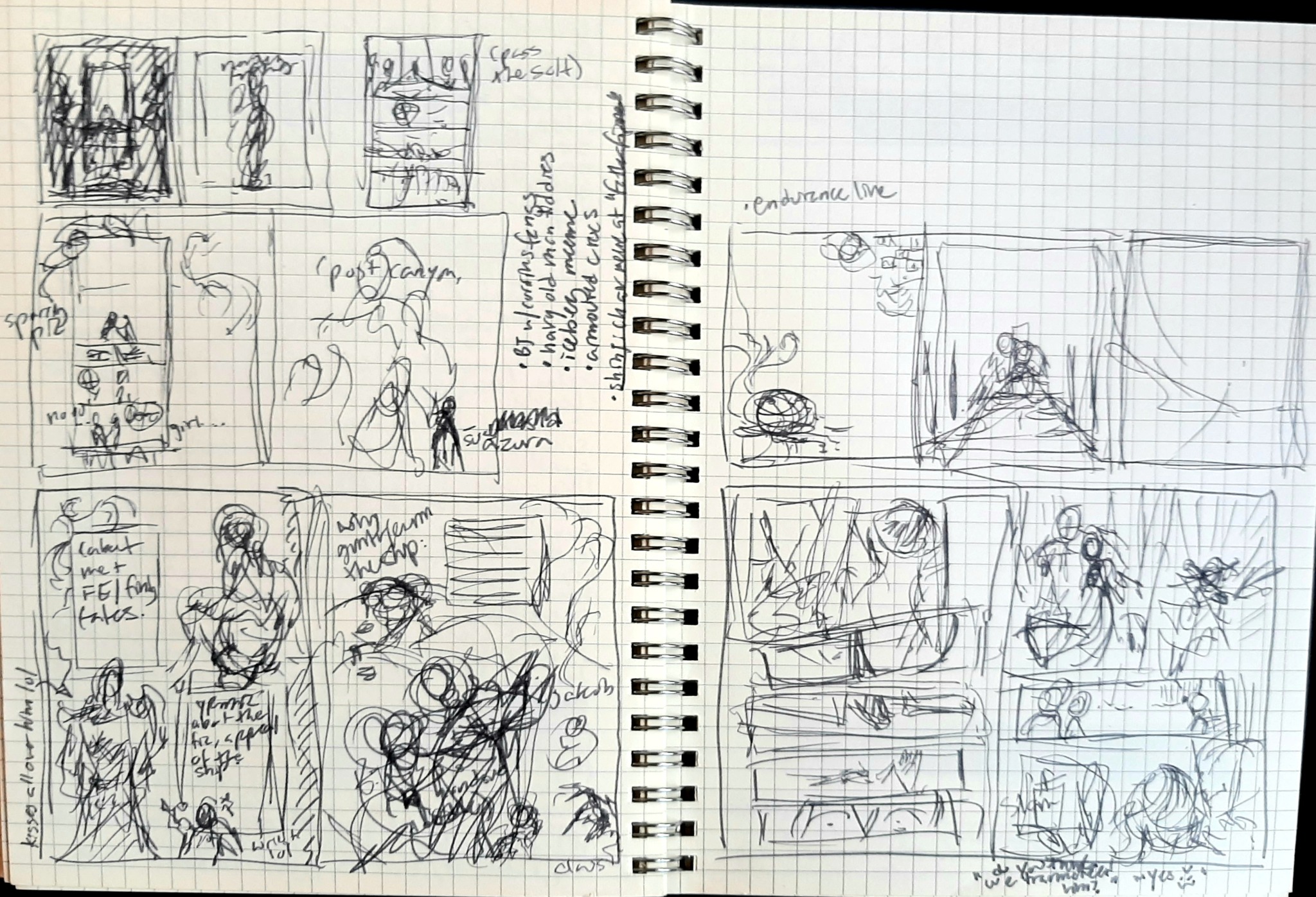
here’s a completely unaltered spread from my journal with a ton of thumbs and notes for this doujin.
so what’s the kind of stuff i think about with thumbs?
how panels in a comic fit together with the major emotional beats + line of action. does the eye follow the pages naturally? do you “feel” the emotional impact?
does the compositions work with each other? negative/positive space, weight on top or bottom or diagonally, etc. do the pages feel claustrophobic or too empty? do they breathe?
decorative framing elements that reflect the tone you want + how they generally lead the eye across the page
random notes about overall tone or potential future pages
etcetc
at this point i import that digitally, and start drawing a proper sketch off of it.
fast forward from that sketch to: “proof of concept” layout
i’m calling this proof of concept instead of a draft as they serve different purposes. a draft is a half-finished work you can just screenshot and show to anyone for feedback (like comms). proof of concept here is showing a certian level of completeness across draft pages to measure consistency.
lack of consistency is the mind killer killer of comics.
proof of concept is specifically meant to nip the ‘fizzled out halfway’ issues in the bud. it’s to show you how cool it looks altogether already, but also shed a light on problem areas that are potentially popping up on the earlier side, so there’s less time wasted.
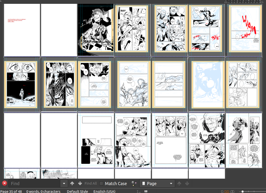
this is a little premature in the process for a proof of concept screenshot, but you get the idea here in a later strip, shown here as screenshots imported into libreoffice writer:
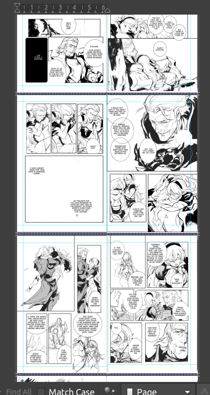
another reason that made libreoffice writer essential is the accurate 2-page spread view. between that, being able to resize the page to whatever you need, and the very easy pdf exporter (with customizable compression), i don’t know if i could do this kind of project here.
now, backing up - what kinds of consistency are we checking for here?
does the inking/coloring style change noticeably in a jarring way?
is there one comic strip that the pacing/paneling sucks in comparison to the others? or feels awkwardly added in tone and perhaps better saved for a different project?
is there one panel within a sequential series that’s torturing you? what’s the best way to throw it out and redo it even faster?
do the front/back matter support the meat of the inside in a clever, on-tone way?
did you accidentally change the font halfway through after you liked your new shiny toy? which one works better?
etc
keep in mind we’re not just checking the consistency in one strip, it’s for the book as a whole.
and then lastly, “the last ten” final
“the last ten” is a mental concept i’ve used for the last ten years for single comic pages. it’s especially tempting to noodle over endlessly making one comic page perfect, when you could have done ten reasonably good ones in the same time, and so i made this my last step making IC pages.
once when you approach a level of reasonably done, but kinda hate the page and are procrastinating on getting it out, stop, rest your eyes overnight, and list the last ten minor things you’d change.
once when you’ve changed those? out the door it goes. now, i’m gonna switch to a different project but here’s a good example of a “last ten” stage applied to illustrations when i did fallen!gunter’s FEH mockups.
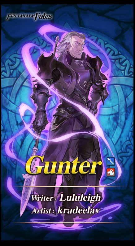
looks pretty complete, right? WRONG :D i can’t remember the exact last ten i used, but it was something like:
too much of one specific glowy purple on both, i wanted more contrast with the red glow + “water” texture
needed more effects on the first image to better match FEH’s aesthetic
change Leigh’s credits after they got a chance to see it and give the thumbs up
knee/shin on left looks unfinished painting wise, clean up
missing chest plate silver decorations on left, clean up
etc
this is the last hail mary check to hack your brain into being satisfied with the page. you’ve had your say, onwards to the next one. now, you can also have an additional 'last ten’ for the project as a whole. but it’s especially critical for comic pages to help keep the momentum/tempo/pace going.
anyway! we’ll see how all of this actually works in practice depending on how fast i can get this doujin out. :)
COLLAPSE
(a) figure out an efficient process for professional multi-page artistic works in linux/true OSS programs - from ideation all the way to printer hand-off.
(b) and a process that fit well with my brain and kept me from spinning my wheels endlessly redoing pages. it’s a common problem with longer projects (aka why you see reboots of webcomics all the time, and also why i haven’t been able to get “what greater sin” out for three years cuz i sucked at this lol).
why the focus on process though?
after mastering a certian degree of technical proficiency. it’s what separates the hobbyist artists from the pros. not to toot my horn, but i’m quite good at project management process at work, and about two years ago it dawned on me to take some of that learned knowledge and actually apply it here if only to save eyestrain/wrist-strain time.
work
before i get into the process outline, there’s two programs that are doing the heavy lifting since i gave them a trial run with the last anthology and they worked great in tandem. (both cost no money and are available on all major OS’s btw)
krita - my main drawing program. sketching/inking/speech bubbles/coloring/vector stuff can all be done here.
libreoffice writer - basically microsoft word for linux. i use it for arranging multiple pages, reordering, and exporting as .pdf to give to the printer (while amazing at rendering, krita can’t export as pdf or show multi-pages)
so!
process wise, it occurred to me not too long ago that i needed to consolidate my multi-page creative projects into 3 major gates.
thumbnail sketches
proof of concept layout
“last 10” final
thumbnail sketches
thumbnails are a common concept in comics, but they’re great for print front/back matter too. thumbnails ain’t here to look pretty, their sole purpose to get the idea from your noggin to on the page.

here’s a completely unaltered spread from my journal with a ton of thumbs and notes for this doujin.
so what’s the kind of stuff i think about with thumbs?
how panels in a comic fit together with the major emotional beats + line of action. does the eye follow the pages naturally? do you “feel” the emotional impact?
does the compositions work with each other? negative/positive space, weight on top or bottom or diagonally, etc. do the pages feel claustrophobic or too empty? do they breathe?
decorative framing elements that reflect the tone you want + how they generally lead the eye across the page
random notes about overall tone or potential future pages
etcetc
at this point i import that digitally, and start drawing a proper sketch off of it.
fast forward from that sketch to: “proof of concept” layout
i’m calling this proof of concept instead of a draft as they serve different purposes. a draft is a half-finished work you can just screenshot and show to anyone for feedback (like comms). proof of concept here is showing a certian level of completeness across draft pages to measure consistency.
lack of consistency is the mind killer killer of comics.
proof of concept is specifically meant to nip the ‘fizzled out halfway’ issues in the bud. it’s to show you how cool it looks altogether already, but also shed a light on problem areas that are potentially popping up on the earlier side, so there’s less time wasted.
this is a little premature in the process for a proof of concept screenshot, but you get the idea here in a later strip, shown here as screenshots imported into libreoffice writer:

another reason that made libreoffice writer essential is the accurate 2-page spread view. between that, being able to resize the page to whatever you need, and the very easy pdf exporter (with customizable compression), i don’t know if i could do this kind of project here.
now, backing up - what kinds of consistency are we checking for here?
does the inking/coloring style change noticeably in a jarring way?
is there one comic strip that the pacing/paneling sucks in comparison to the others? or feels awkwardly added in tone and perhaps better saved for a different project?
is there one panel within a sequential series that’s torturing you? what’s the best way to throw it out and redo it even faster?
do the front/back matter support the meat of the inside in a clever, on-tone way?
did you accidentally change the font halfway through after you liked your new shiny toy? which one works better?
etc
keep in mind we’re not just checking the consistency in one strip, it’s for the book as a whole.
and then lastly, “the last ten” final
“the last ten” is a mental concept i’ve used for the last ten years for single comic pages. it’s especially tempting to noodle over endlessly making one comic page perfect, when you could have done ten reasonably good ones in the same time, and so i made this my last step making IC pages.
once when you approach a level of reasonably done, but kinda hate the page and are procrastinating on getting it out, stop, rest your eyes overnight, and list the last ten minor things you’d change.
once when you’ve changed those? out the door it goes. now, i’m gonna switch to a different project but here’s a good example of a “last ten” stage applied to illustrations when i did fallen!gunter’s FEH mockups.

looks pretty complete, right? WRONG :D i can’t remember the exact last ten i used, but it was something like:
too much of one specific glowy purple on both, i wanted more contrast with the red glow + “water” texture
needed more effects on the first image to better match FEH’s aesthetic
change Leigh’s credits after they got a chance to see it and give the thumbs up
knee/shin on left looks unfinished painting wise, clean up
missing chest plate silver decorations on left, clean up
etc
this is the last hail mary check to hack your brain into being satisfied with the page. you’ve had your say, onwards to the next one. now, you can also have an additional 'last ten’ for the project as a whole. but it’s especially critical for comic pages to help keep the momentum/tempo/pace going.
anyway! we’ll see how all of this actually works in practice depending on how fast i can get this doujin out. :)
COLLAPSE
Powered by てがろぐ Ver 4.2.0.
